Packaging design helps shoppers make buying decisions in under three seconds. Before a customer reads a single word of copy, the packaging has already done its job (or it hasn't).
Put simply, packaging design is how a product presents itself to the world. It’s the physical form it takes, what's printed on it, what it's made from, and how it feels in shoppers’ hands. It's one of the few places where brand, manufacturing, and retail strategy all come together at once, which is part of what makes it interesting and part of what makes it complicated.
We’ve used our experience producing packaging for more than 45 Fortune 500 brands to bring you this guide that covers the full product packaging design process. It includes the core design elements, materials and finishes, print production, sustainability requirements, and the trends reshaping packaging in 2026.
What is packaging design?
Packaging design is the process of creating the structure, graphics, and materials that present a product to the consumer. It covers everything from the shape of the box and the paper weight of the stock to the typography on the front panel and the finish on the surface.
Good packaging incorporates the same identity that runs across a website, a campaign, and a retail environment, but with harder constraints than any of those. A box has to meet regulatory requirements, survive a potentially bumpy supply chain, and communicate the brand promise in under three seconds on a shelf it shares with dozens of competitors. That's a lot to ask of a piece of printed material.
Structural packaging design vs graphic packaging design
Packaging design is often used as an umbrella term for two different types of design:
- Structural packaging design deals with the physical form of the package, like how it protects the product, stacks on a pallet, and how a customer finally opens it.
- Graphic packaging design deals with what’s actually printed on that structure. It covers brand identity, product info, and imagery.
Both are important and both need to work together to create a package that looks good but is also functional, fun, and easy to open.
Apple’s a great example of a brand that understood the assignment. Ive and Jobs are said to have spent a ton of time on packaging, knowing how important that initial unboxing moment is for new (and existing) customers.
Why packaging design is important
Packaging design is still one of the easiest ways to stand out on shop shelves. But today, with the growing popularity of the digital shelf, it needs to do a lot more than look good.
A recent report found that custom packaging design influences consumer behavior in four ways:
- Its role in the decision-making process
- How it shapes product expectations
- How it communicates information
- Its environmental impact
The same report puts the global consumer packaging market at 655 billion USD, projected to hit 950 billion USD by 2034. So, despite the rise of the digital shelf, packaging is still (and will continue to be) an incredibly important part of retail. It’s the first thing customers see and one of the only ways they can differentiate between similar products before they try them.
The core elements of packaging design
As per the Humanities and Social Sciences Communications review, color, typography, imagery, structure, materials, and finish each independently influence what and why people choose to buy. But rather than one element taking all the glory, they work together as a sequence of impressions that builds on or undermines the last.
Color
People take 2.5 seconds to pick a product off a shelf, so the first impression is pretty critical. And obviously, color is one of the first things we take in. But you can’t just splash any old color on a package and hope it stands out on the shelf.
In fact, research from Hamburg University of Applied Sciences found that people attach different meanings to different colors:
- 62% of consumers associate green packaging with health and sustainability.
- 54% find red designs stimulate their appetite.
- 48% read black packaging as a marker of luxury.
Note that colors that look vivid on screen can dull down when converted to the CMYK gamut used in print. Understanding RGB vs CMYK really helps here. For brand colors where consistency is non-negotiable, Pantone color matching system gives printers a fixed reference to verify against.
The industry measure for color accuracy is Delta E, where a score of two or under means the naked human eye can’t tell the difference.
Lock your brand color as a Pantone reference before briefing any printer, even if your final print method is CMYK.
Typography
Typography, or the text and font you use on your packaging, needs to do two jobs: be functional and be expressive. It has to be legible at the size it will be printed, but the typeface you choose should also hint at your brand personality.
Plenty of studies have found typography affects how someone sees the quality of a product as well as how much they trust a brand:
- A serif typeface is professional, established, and traditional.
- A geometric sans-serif is modern and fun.
- A script font is handcrafted and bespoke.
Most packaging needs two typographic systems that work together: a brand voice typeface for the product name and hero messaging, and a highly legible secondary typeface for the functional layer (the nutritional panels, legal copy, barcodes, etc).
Set your hierarchy before you choose your fonts. Know which information needs to be read first, second, and third, then choose typefaces that support that order.
Imagery and graphics
Packaging imagery can be anything from a product photo to a bold geometric pattern or a botanical illustration.
Whatever you choose, it needs to represent your brand and product. For example, photography is often used for food products because it sets expectations, but illustration might be better for premium spirits or artisan products because it indicates craft and heritage.
Before finalizing imagery, check what your design looks like at actual shelf scale alongside three or four competitor packs.
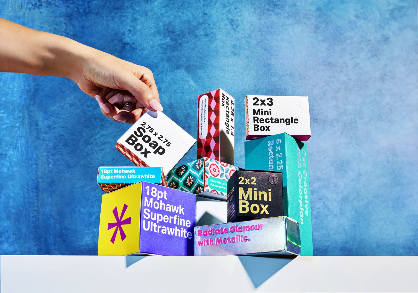
Structure and dieline
The dieline is the flat template that defines every panel, fold, flap, and glue tab of a package before it becomes a 3D form.
Box styles range from standard retail formats, such as straight tuck ends and reverse tuck ends, through to sleeve-and-tray combinations, hinged lid boxes, and crash-lock bases for heavier products.
FEFCO codes give you a standard reference system for corrugated structures to make it easier for everyone involved.
Share the dieline with your graphic designer at briefing stage, not after concepts are approved. If you're early in the process, custom mini boxes are a low-cost way to test structure before committing to a full run.
Materials
The material of your packaging shapes how people see it. Research shows that a flimsy carton makes the product inside feel cheaper, even before the customer has actually laid eyes on it.
Some common board types include:
- Solid bleached sulphate (SBS), which is the standard for retail cartons where a clean white surface is important (e.g., cosmetics, healthcare, premium food, etc).
- Folding boxboard (FBB) weighs less but is still pretty rigid.
- Kraft, which is unbleached and brown, has a more natural feel.
- Corrugated cardboard is structurally sound for shipping.
Premium specialty stocks are great for adding a luxury feel. Colorplan paper (a through-dyed uncoated stock) gives a good depth of colour and texture. Mohawk and Neenah are also good tactile options.
If your product doesn’t need a box, premium roll labels and custom belly bands are good for bottles, tubes, and jars.
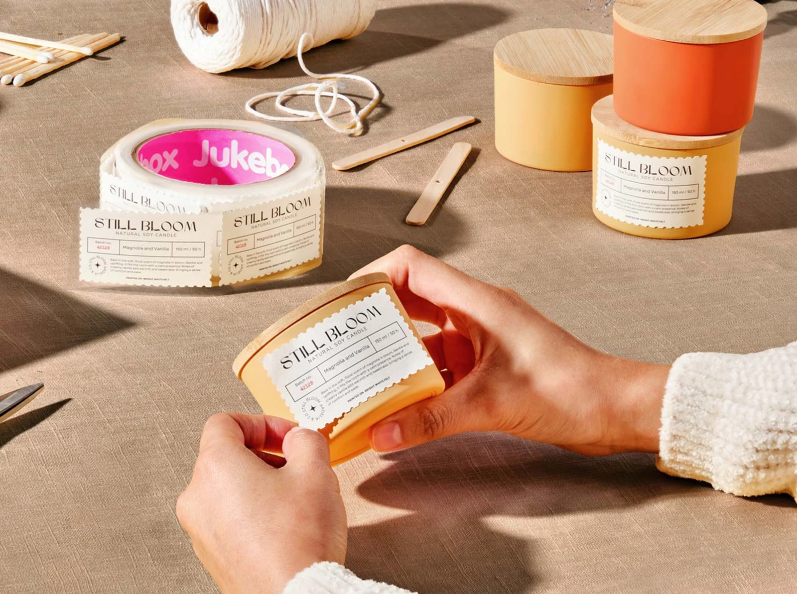
Before specifying a base material to print your packaging on, order physical samples to see what they look and feel like in person.
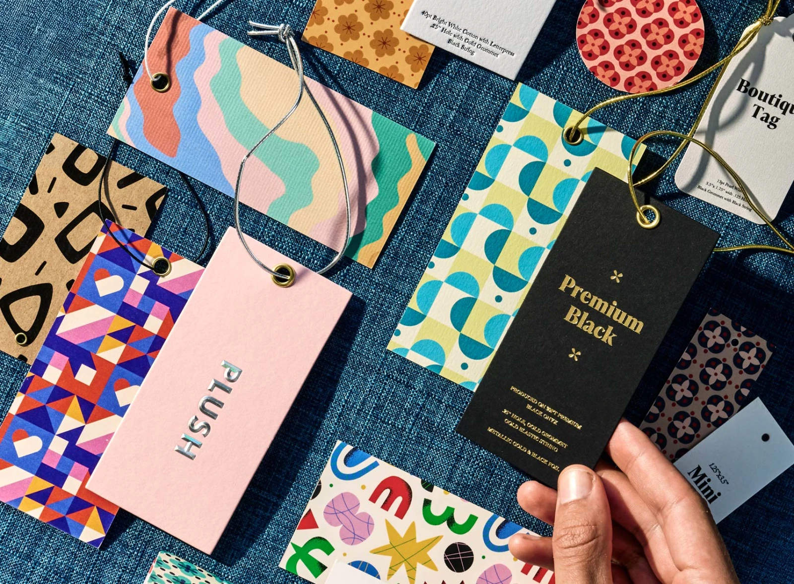
Finishes
A finish changes the physical surface of the packaging after printing:
- Soft touch lamination is velvety with a premium feel perfect for photographs.
- Foil stamping adds eye-catching metallic or holographic reflections.
- Spot UV applies a high-gloss varnish to selected areas to create a contrast.
- Embossing and debossing press raised or recessed impressions into the board to give it a more 3D feel.
Tip: Get a sample of each finish type so you can feel it in person before committing to a full run.
3 things to consider before you design your packaging
Before you get stuck into the actual design process, thinking about overall cost and any regulatory requirements will stop you hitting a bottleneck further down the line.
Consumers want sustainable but affordable
While consumers still care about sustainability, they’re having to weigh it against the higher costs of a sustainable lifestyle. McKinsey’s 2025 global packaging survey corroborates this. It found that food safety and shelf life are the most important characteristics influencing purchasing decisions. The environmental impact of packaging ranked much lower.
Consumers haven’t stopped caring, but there are more immediate concerns like value for money that are driving their decisions in this economic climate. So what does this mean for you and your packaging? It means you should lead with packaging that works, and then make it sustainable.
The most credible routes for this are FSC chain of custody certification for paper and board, the How2Recycle labelling system for clear disposal guidance, PCR content in your base material, and mono-material structures that avoid hard-to-separate laminates. Finally, choose the right sizing so you’re not paying extra to ship unnecessarily large packages.
Different governments have different regulatory requirements
Mandatory label requirements differ from category to category, but they’re tightening up across the board. Food, cosmetics, supplements, and medical products all carry non-negotiable elements, e.g., ingredient lists, allergens, net weight, country of origin, batch codes etc.
The EU specifies a minimum 1.2mm x-height for required food label text, while the US FDA has guidelines about the hierarchy of your display panels and how nutrition facts are formatted.
Get a head start by building these guidelines into your dieline and briefing your designer on every target market upfront.
Weigh up costs and perceived value
The main costs of packaging are the material, finish, print method, and run length. Premium stocks like Colorplan tend to cost more than standard SBS or FBB but communicate your positioning to shoppers straight away. Weigh up whether the extra cost is worth it or whether it’s adding disproportionate perceived value.
Higher volume print runs are often more economical. Per-unit cost typically drops significantly at 500, 2,000, and 10,000 units. Adding extras like printed hang tags or die cut stickers used as packaging seals are nice touches but also bump up the price.
The packaging design process from start to finish
Here’s a quick rundown of how the packaging design process usually works:
- Brief. Write down the non-negotiables before a designer touches anything. What does this product do, who is buying it, and where will it be sold (online, independent retail, supermarket shelf)? What's the budget and what's the print deadline, working backwards from launch?
- Research. Audit the shelf where your product will be. What colors dominate the category? What does the typography tell you about positioning? Where is the gap? Good packaging design is partly about standing out and partly about fitting in.
- Dieline and structure. If your packaging has unusual dimensions, have the structural design agreed before any graphic work starts.
- Concept and design. Choose your color palette, typography, images, and hierarchy across panels. Expect two or three directions at the concept stage. Review concepts as printed mock-ups wherever possible.
- Prepress and file prep. Check that color has been converted to CMYK, bleed and safe zones are applied, fonts outlined, images at 300dpi minimum, and die lines are on a separate layer.
- Print production.
- Sampling and approval. Request a printed, folded, finished sample of the actual pack before the full run.
12 real packaging design examples
Here are some real examples of packaging design in the wild by talented packaging designers.
Emily Cary Design and Kouyou
Emily Cary Design built the full brand identity for premium Japanese skincare retailer, Kouyou. It features a kraft shipping box, red branded tissue paper, and individual product packaging that carries the brand's deep red and a fine botanical line illustration. It’s also a great example of making the most of the inside of the packaging.
Good Spark Design and Bare Earth
This project from Good Spark Design is a masterclass in using color to do the heavy lifting. There are four skincare products with four distinct colors: deep burgundy, soft lavender, sage green, and warm terracotta, all unified by vintage botanical engraving illustration and bold numbering. It proves that earthy and natural doesn't have to mean neutral, and that a strong illustration system can hold a range together across an entire product line.
Morgan Hastie and Just Chillin’
This freezer snack packaging by Morgan Hastie has absolutely no interest in blending in. The illustrated character, wobbly typography, and playful copy ("Stop checking out our bottom!") work together as a complete world, not just a decorated box. It's a good reminder that when the brand personality is loud, the packaging should be too, and that every panel, including the ones facing away from the customer, is an opportunity.
Monique Vasconcelos and Arami Skincare
The all-over orange print pattern on this Aramí skincare range communicates the hero ingredient before you read a word. Monique Vasconcelos developed the full system from brand identity through to boxes, labels, and outer packaging, with hand-drawn illustration details that give the finished product a warmth that stock assets never quite manage. The soft peach base and retro wordmark tie it all together.
Fables and Food
Deep teal, script typography, and a fine-line horse illustration give this candle packaging a calm, storytelling quality that fits the brand name. The cylindrical box is designed to be kept and reused, which means the branding sticks around in someone's home after the candle is gone.
Funkyenough and AOP Skincare
With a black box, white illustration, and celestial motifs, this hyaluronic acid serum packaging for AOP Skincare is dark and considered in a category that usually defaults to clean and clinical. The illustrated hands and moon detail give it a distinctive shelf presence without tipping into gimmick. Proof that skincare packaging doesn't have to look like every other skincare brand.
Designs by Aleena and Bellish
A single strong green and a confident serif wordmark is all this Bellish haircare kit needs. Designs by Aleena keeps the system tight with consistent color across every box face, a small daisy motif as a secondary brand element, and copy that feels warm ("Packaged with love & gratitude"). It's a good example of how a limited color palette applied consistently across a product range can create more shelf impact than a complicated design.
Lily Ilvest and Peak Protein
Peak Protein by Lily's Design Studio makes the flavour the hero with a white pouch, bold typography, and an oversized photographic strawberry that takes up half the pack. The brief was to make science feel safe and feminine without sacrificing credibility, and the stripped-back label system with clean hierarchy does exactly that. It sits confidently in the premium end of a crowded category without resorting to the pink-and-pastel shorthand that women's nutrition brands so often default to.
Courtney Kim Studio and Aqida
Courtney Kim Studio’s packaging for Aqida features black pouches, a colored arch label for each variant, and a geometric pattern across the top that references Islamic tile work. There’s one structural template but with three accent colors and clean typography, which results in a range that feels considered and distinctive.
Dinger Creative and Twisted Hemp
This redesign for Twisted Hemp’s Hemp Wraps by Dinger Creative features purple, green, oversized stacked type, and a hypnotic bubble pattern pulled from 1960s and 70s psychedelic design. It’s definitely not subtle. Yet despite this, the typography is legible and the pattern gives it instant shelf recognition. The whole thing feels like a deliberate rejection of the clean, understated direction most brands default to.
Stitch Co Design and Sfizi Taralli
Stitch Design Co’s packaging for Sfizi Taralli incorporates a checkerboard pattern borrowed from Italian tablecloths, a fluid script wordmark, and a die-cut window showing the product inside. It earns its shelf space through cultural specificity rather than generic food packaging conventions. Three colorways hold the range together and the nostalgia reference is clear but not heavy-handed, which is harder to pull off than it looks.
Ribrand Studio and Iont
Ribrand Studio's concept for iont is built on total transparency, and the design reflects that literally: the brief was material and form doing the work, nothing else. Each variant has a different illustration (passionfruit, wildflowers, bamboo), which differentiates the range without introducing any color or visual noise.
Packaging design trends for 2026
Design trends change all the time, but there are clear themes emerging in 2026 that go beyond aesthetics and are rooted in howpeople are shopping.
Here are the top graphic design trends in 2026 for packaging.
Tactile finishes
We spend a lot of time looking at screens, so it makes sense that current packaging trends are pushing back against that. Tactile finishes are having a moment because you can actually feel them. Think soft touch lamination, embossed textures, and rough uncoated stocks showing up across most verticals.
Eco-materials
Eco-friendly materials are also having their moment in the spotlight. Consumers are paying more attention to how planet-friendly the brands they buy from are and packaging is becoming a key touchpoint in that discovery journey. Kraft, recycled board, and moulded fibre now give a preview of the environmentally-friendly products inside.
Imperfect designs by humans
In a recent survey, 73% of consumers said they could spot AI-generated content and view it as less credible than human-created designs. They’re brushing off perfect, uniform AI-obvious designs and favoring imperfection, whether that’s rough edges or hand-drawn details.
Connected packaging
The packaging may well be the first thing a shoppers sees when they buy a product, but that’s exactly it: the start. Some brands are now using QR codes and augmented reality (AR) on packaging as a springboard to valuable post-purchase information, like recipes, recycling instructions, ingredient information, and more.
Where to find packaging designers
You have a couple of options for packaging designers. The most common choices are freelance designers or specialist agencies that offer packaging design services, both of which have their pros and cons. The best choice for you depends on your budget, timeline, and how complex the project is.
Search platforms like Dribbble, Behance, and Upwork for packaging designers. If you can, look for designers that also have dieline experience, as they’ll have a better understanding of printing constraints. Ask to see work that’s actually been manufactured rather than just rendered in a mockup tool.
Alternatively, Instagram and Google are good for finding specialist packaging agencies. While a generalist branding studio can produce beautiful concepts, they’re not always fluent in base materials, print methods, and prepress. Before choosing a packaging design agency, check they include dieline development and print management.
If your next project calls for premium short run packaging printed on HP Indigo presses with the kind of stocks (Mohawk, Colorplan, Neenah) and finishes (foil, soft touch, sculpted emboss) used by leading brands, request a sample pack to feel the difference in person.
Frequently asked questions
Packaging design is the process of creating the structure, graphics, and materials that present a product to the consumer. It covers everything from the shape of a box and the choice of material to the typography, color, and finish on the surface. Good packaging protects the product, meets regulatory requirements, communicates brand identity, and influences purchase decisions all in just a few seconds.
The core elements are color, typography, imagery, structure, materials, and finish. Color communicates brand personality. Typography carries both functional information and brand voice. Imagery indicates product quality and audience. Structure defines the physical form through the dieline. Material choice affects how a package feels, which directly influences perceived quality. Finish adds the tactile layer that can separate premium packaging from standard print.
Start with a written brief covering the product, target audience, retail environment, budget, and print deadline. Research the category before any creative work begins. Get the structural dieline from your printer before briefing a designer. Then, develop concepts, review them as printed mock-ups rather than on screen, and prepare print-ready files with correct color mode, bleed, and safe zones.
Good packaging communicates the brand promise clearly, stands out in its retail context, and works at every scale. It aligns the visual system with the product's price point and audience, uses material and finish choices that reinforce the brand positioning, and survives a supply chain without losing its integrity. The best packaging also considers what happens after purchase.
Strong examples span every category and budget. Bare Earth by Good Spark Design uses vintage botanical illustration across a color-coded skincare range. Sfizi Taralli by Stitch Design Co draws on Italian tablecloth patterns to create instant cultural recognition. Aqida Coffee Roasters by Courtney Kim Studio uses a single structural template with three accent colors and geometric tile-work detail. Iont Skincare by Ribrand Studio strips everything back to white board, black type, and botanical illustration.
Packaging design cost varies depending on scope, designer experience, and what's included. A freelance designer might charge between $500 and $3,000 for a single SKU. A specialist packaging agency can start anywhere from $5,000 and can run significantly higher. Print costs depend on material, finish, run length, and print method. Per-unit cost drops significantly at 500, 2,000, and 10,000 units.