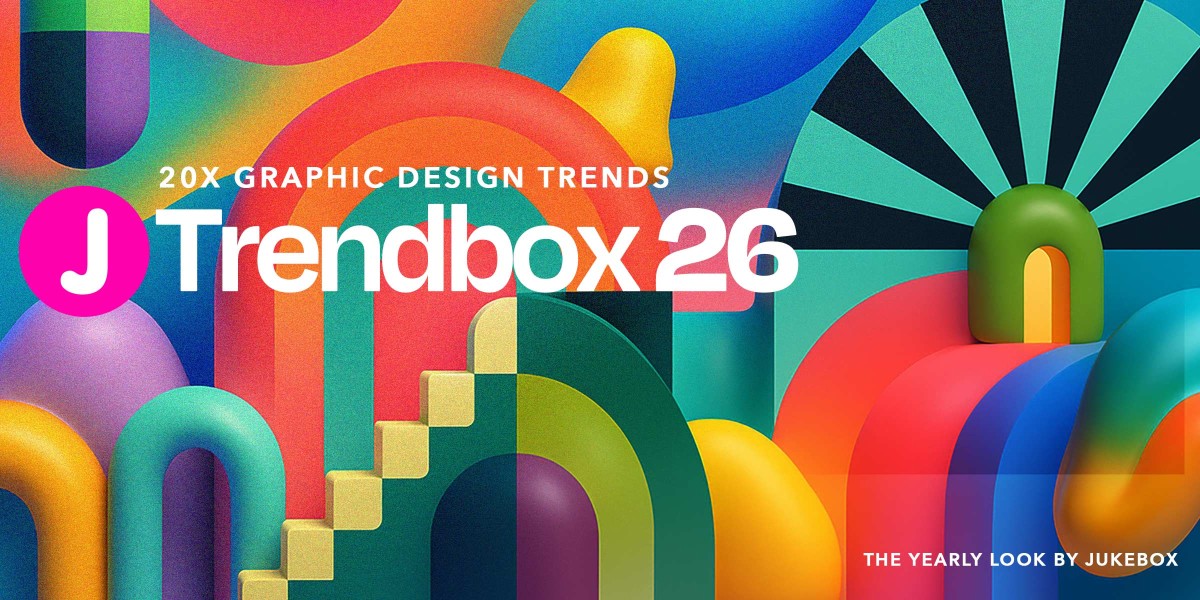


Graphic design is always evolving, and 2026 is shaping up to be one of the most exciting years yet. Whether you’re a seasoned pro or just getting started, this year is all about bold ideas, fresh approaches, and new ways to bring visuals to life.
In this Trendbook 2026 edition, we’ve rounded up the key trends set to define the year. From custom icons and expressive typography to 3D elements, mixed-media compositions, and AI-assisted design, these are the directions helping brands and creatives connect, inspire, and communicate in new ways. When applying these styles to real projects, you can also remove image background to create clean compositions and layouts.
Think of it as your guide to what’s next in visual design, and a little spark for your next project.
Update for early 2026: Several of these trends are now appearing in real design work, from independent studio portfolios to brand campaigns and packaging systems. Where relevant, we’ve noted specific examples that illustrate how these trends are being used right now.
Want to see how design has evolved? Be sure to check out our Trendbooks from 2022, 2023, 2024, and 2025.
Here are 20 graphic design trends to keep on your radar in 2026.
1. Custom Iconography
In 2026, icons continue to play a major role in defining how a brand feels. While clean, flat icons remain a popular and practical choice, we’re seeing more designers explore illustrated and expressive icon styles that add depth and emotion. This shift brings warmth, storytelling, and handcrafted personality to even the smallest digital elements.
![]()
Design Credit: Doordash
The illustrated icon style that defined the early internet era, seen across platforms like Yahoo and MSN, is making a big return. This time, it is reimagined with modern craft and purpose. Designers are moving beyond simple outlines and embracing icons that feel alive, colorful, and human.
![]()
Design Credit: Airbnb
Illustrated icons have evolved into a form of visual storytelling. Whether it’s the playful food icons in modern delivery apps or the detailed digital scenes used by creative platforms, each design feels personal and intentional. It is a shift away from cold minimalism and toward design that feels warm, tangible, and emotionally connected.
![]()
Design Credit: Microsoft
![]()
Design Credit: Get Illustrations
This growing blend of flat and illustrated styles shows how design is becoming more adaptable. The illustrated icons that once defined early web aesthetics are finding new relevance, setting the tone for a more human and expressive digital future.
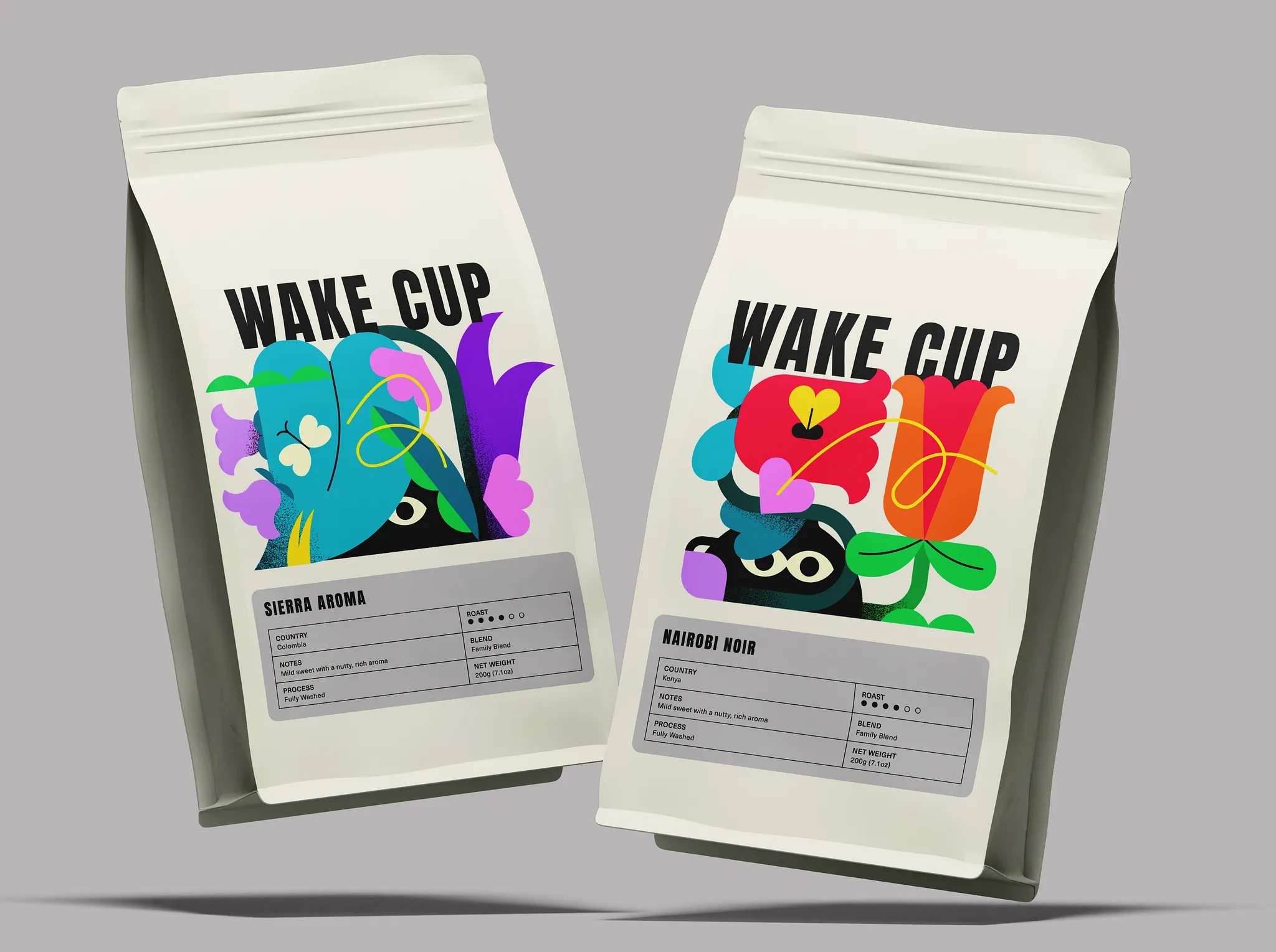
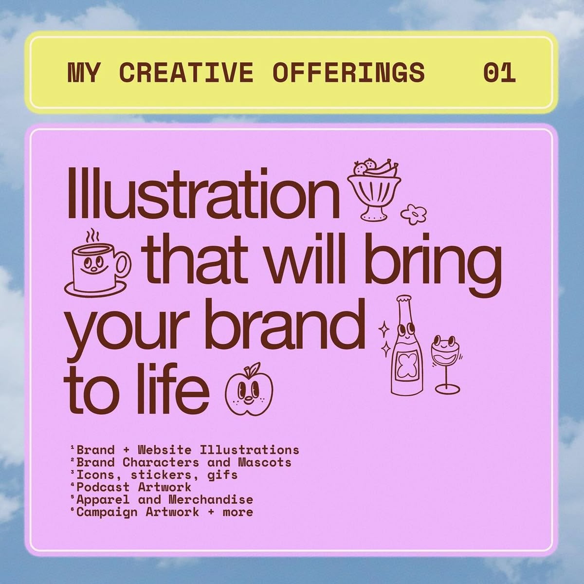
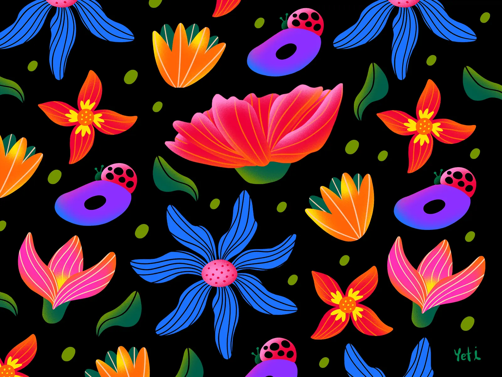
2. Illustrations
Illustration keeps proving it’s one of the most expressive tools in a designer’s kit, and in 2026, it’s evolving in bold, unexpected directions. Forget the perfectly polished vector look, the new wave is raw, textured, and wonderfully human. We’re seeing hand-drawn imperfections, layered brushwork, and painterly details that bring warmth and individuality back to brand storytelling.
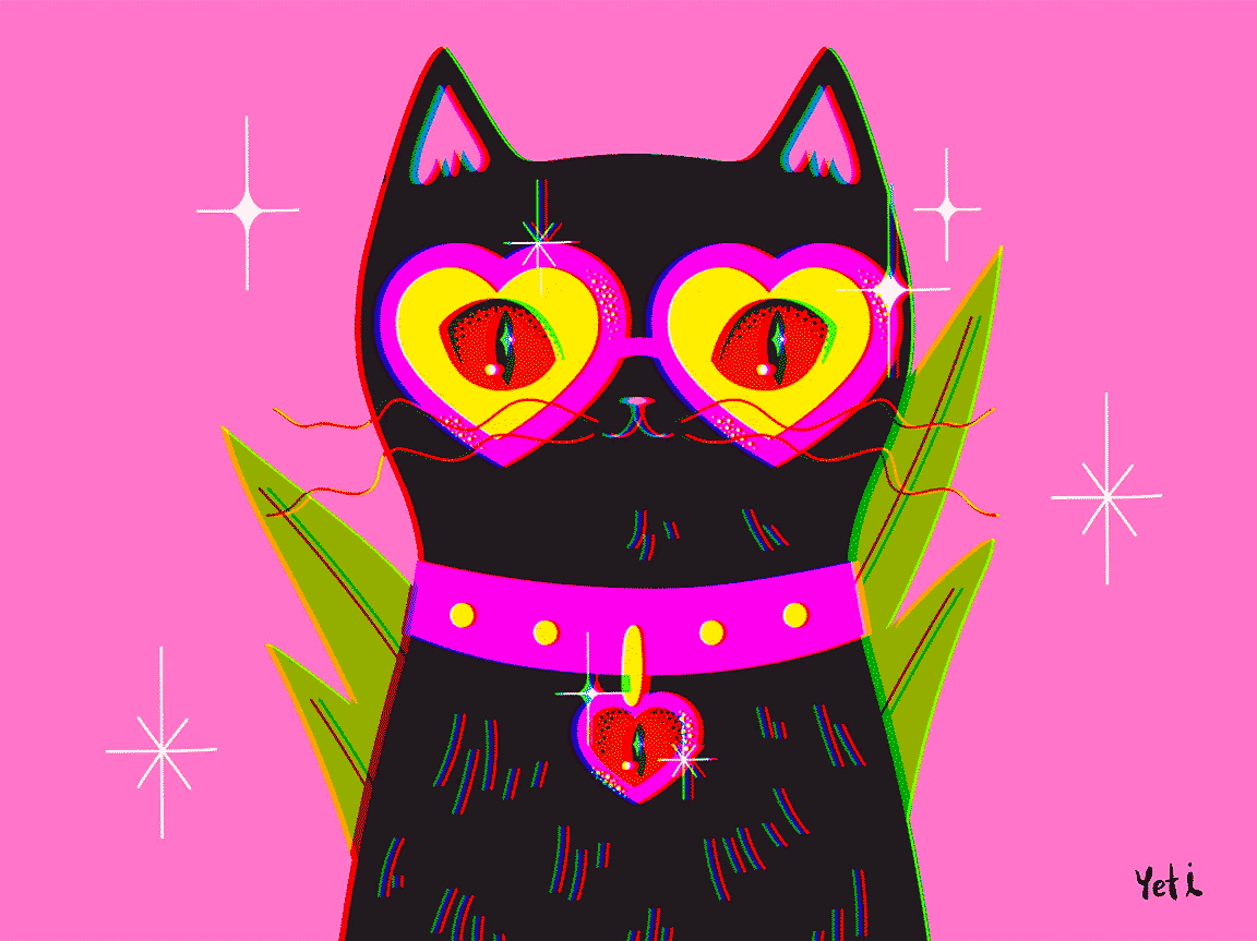
Design Credit: Yeti Iglesias

Design Credit: David Oku
What’s fueling this shift is a growing appetite for authenticity. As AI-generated visuals flood the internet, custom illustration stands out as the mark of something truly made by a person. Designers are mixing traditional techniques with digital tools to create artwork that feels tactile, emotional, and alive. From packaging to motion graphics, these illustrations add a level of charm that stock imagery simply can’t match.
Design Credit: Brad Cuzen
Design Credit: Commence Studio
Design Credit: Marina Kozlova
Design Credit: Jelee Jelee
Illustration in 2026 isn’t just about decoration, it’s about voice. Whether it’s quirky doodles that make a landing page more inviting or detailed scenes that build entire brand worlds, these visuals turn information into personality. They remind us that creativity doesn’t always need to look perfect; sometimes it just needs to feel real.
Design Credit: NienowBrand
Design Credit: Tubik Arts
Design Credit: Lisa McCormick
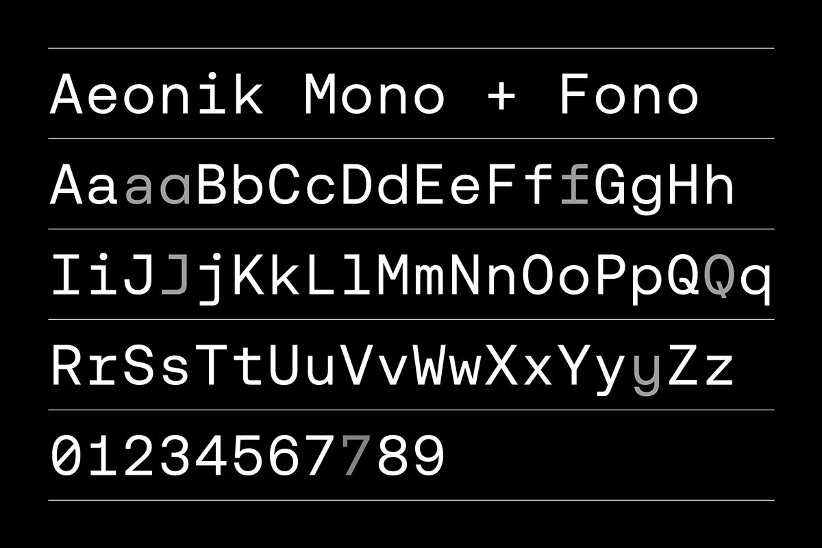
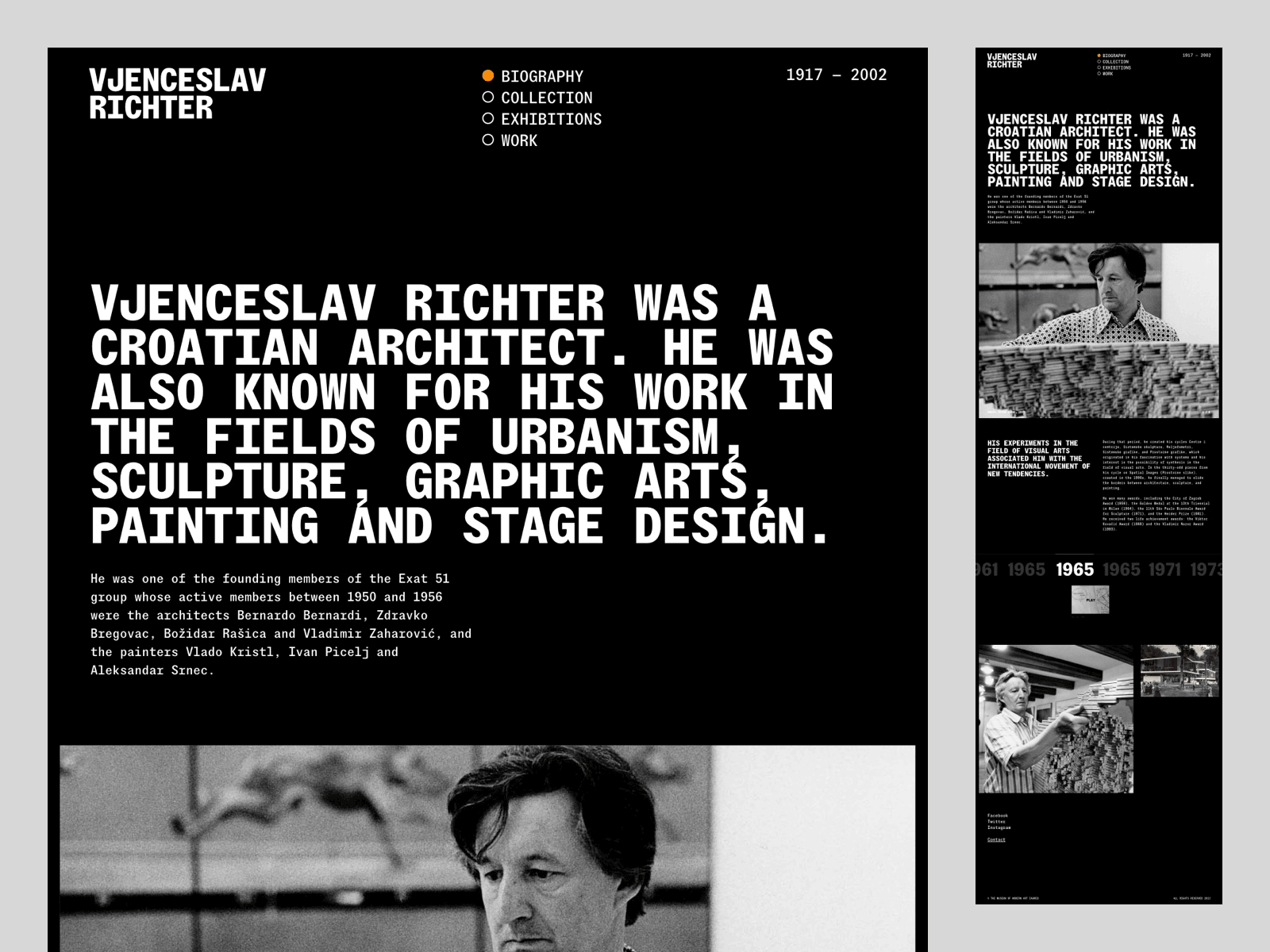
3. Mono Fonts
Monospaced typefaces are stepping out of the code editor and into the spotlight in 2026. Once reserved for developers and retro tech lovers, mono fonts have found their place in modern branding, editorial design, and UI. Their precise spacing and utilitarian charm give layouts a sense of order, and a touch of nostalgia that feels refreshingly honest.
Design Credit: Emily Wylde
Design Credit: Colophon Foundry
What’s driving their comeback is balance. In a world full of expressive, fluid type, mono fonts offer structure and calm. Designers are pairing them with vibrant colors, bold imagery, and playful compositions to create something that feels both disciplined and daring. They lend an instant sense of credibility, especially for brands that want to blend creativity with a grounded, tech-forward edge.

Design Credit: Craft Supply Co
Design Credit: Mash Creative
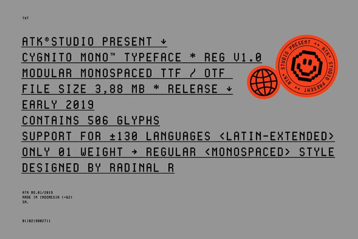
Design Credit: ATK® Studio
From digital products to streetwear branding, mono fonts are proving their range. They’re clean without being cold, consistent without being dull. And when used intentionally, maybe in all caps, oversized, or with a subtle texture overlay, they become design elements in their own right. Sometimes, precision can be personality.
Design Credit: Fran Mubrin
Design Credit: EmType Foundry
Design Credit: Nham
4. AI-Generated Design
AI-generated design isn’t a futuristic concept anymore. It’s here, shaping how creatives work in 2026. Instead of replacing designers, it’s becoming a new kind of collaborator. Tools like ChatGPT, Adobe Firefly, and Adobe’s Generative Expand are giving artists faster ways to explore ideas, refine directions, and spark inspiration. The magic isn’t in what AI makes for you, it’s in what you make with it.
AI Engine: ChatGPT
AI Engine: FluxUltra
The best results come from treating AI as a sketch partner, not a shortcut. Designers are learning to guide these tools with intention, crafting prompts that reflect their own voice and aesthetic. The outcome is a fascinating blend of human intuition and machine precision, something that feels both experimental and deeply personal.
AI Engine: FluxPro
AI Engine: ImageGen
This trend is also expanding visual diversity. Designers are using AI to reimagine historical styles, explore surreal mashups, and build custom assets that once took days to craft by hand. AI-generated design sits at the intersection of speed and creativity, proving that technology can amplify originality when used thoughtfully. In the evolving world of graphic design trends 2026, it’s one of the most transformative shifts yet.
AI Engine: ImageGen
AI Engine: Imagen4
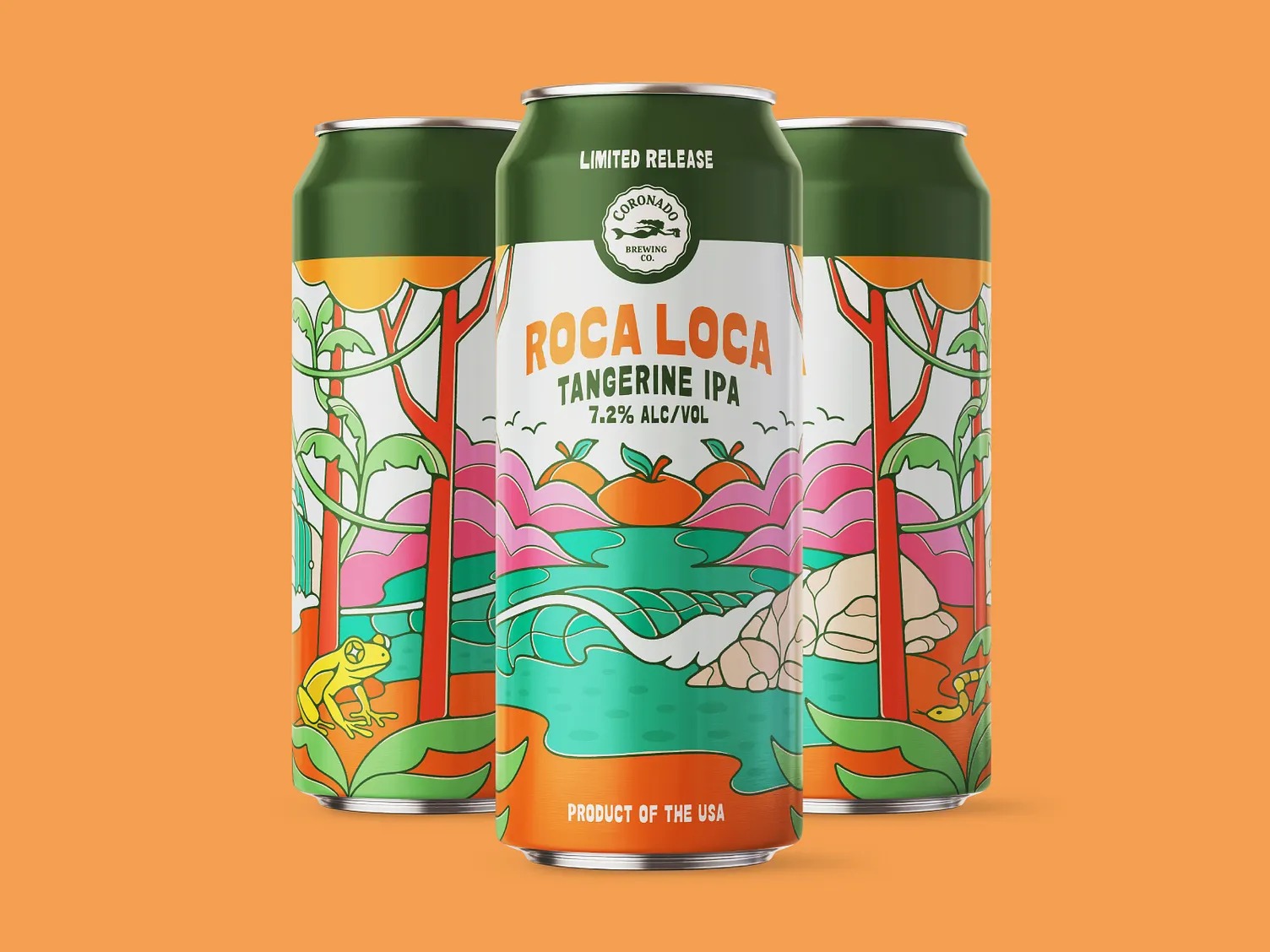
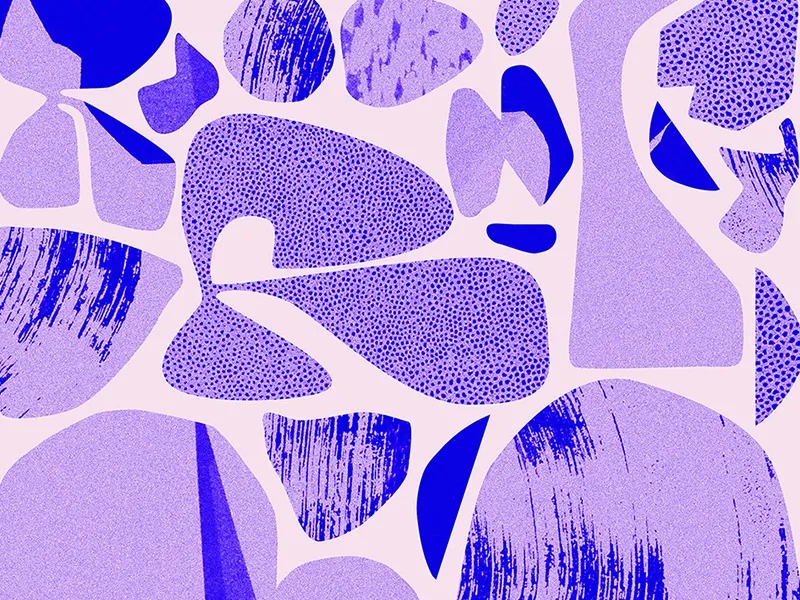
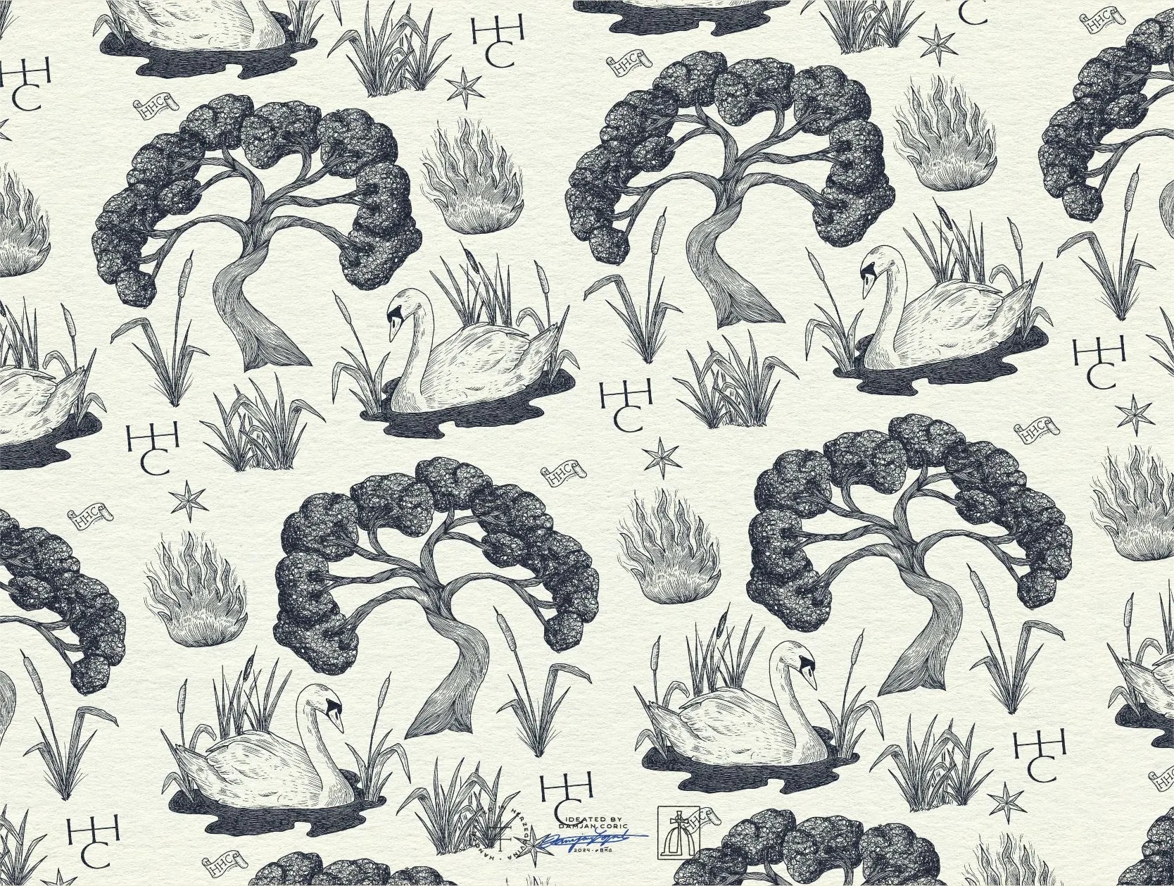
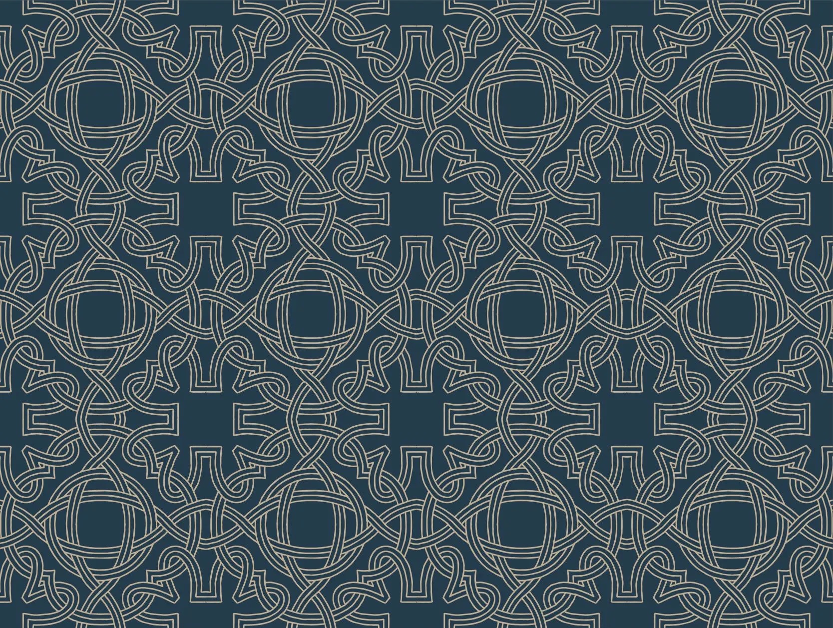
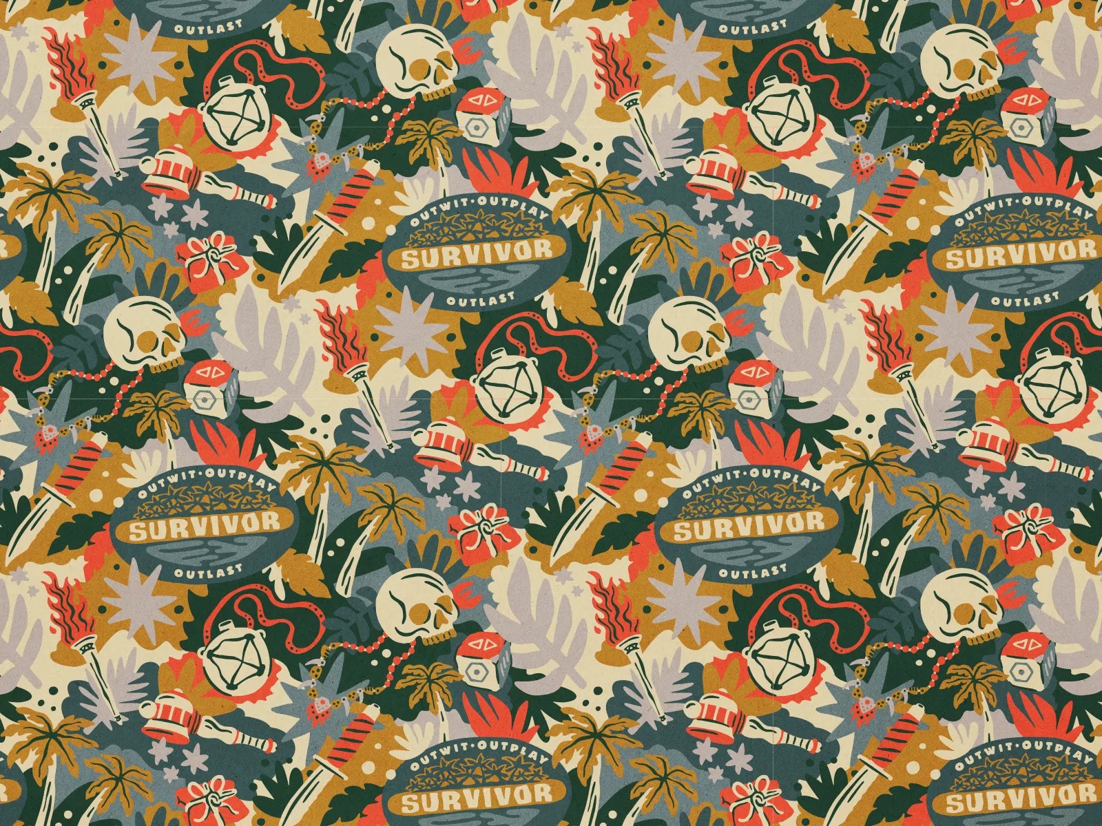
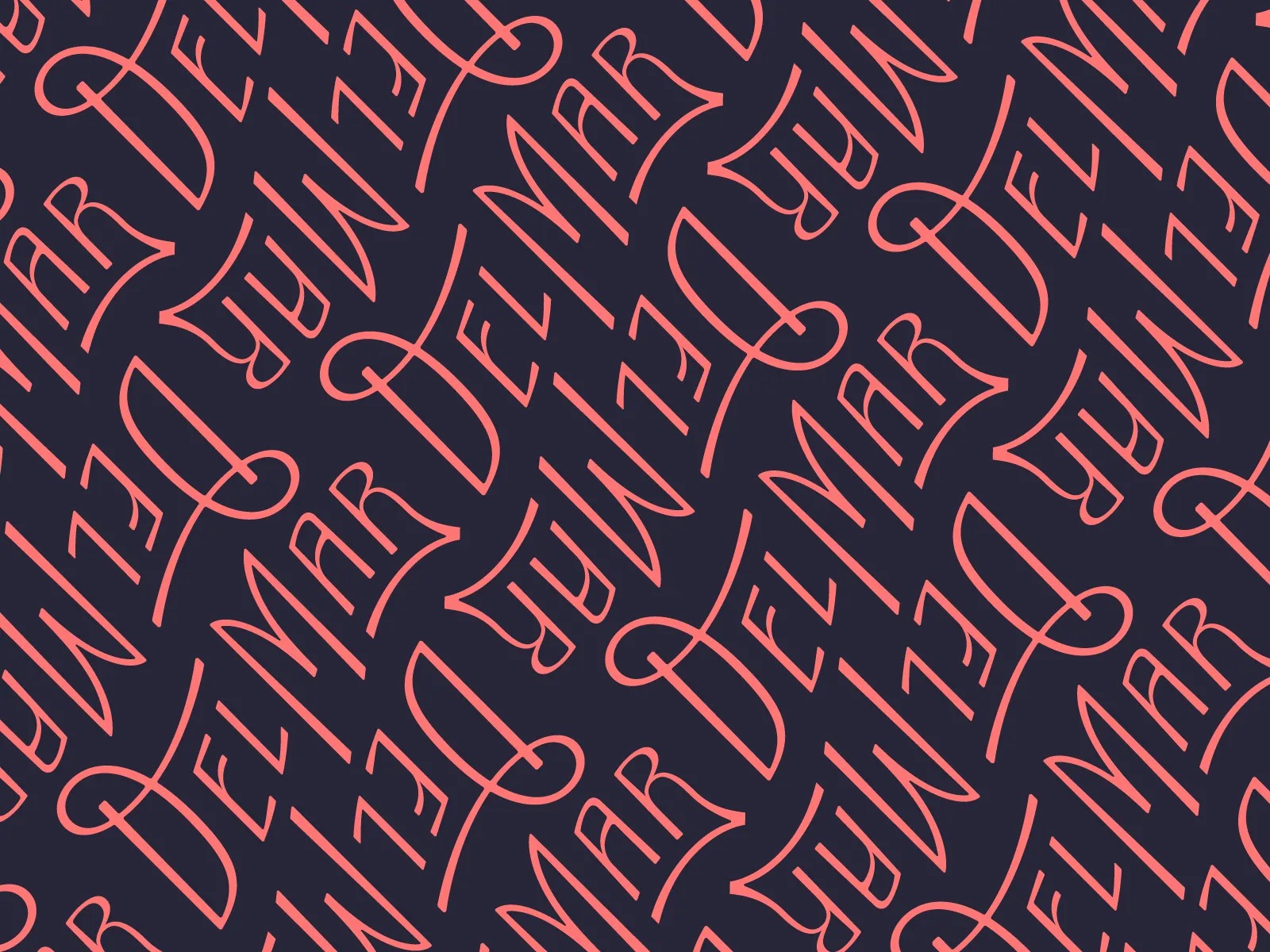
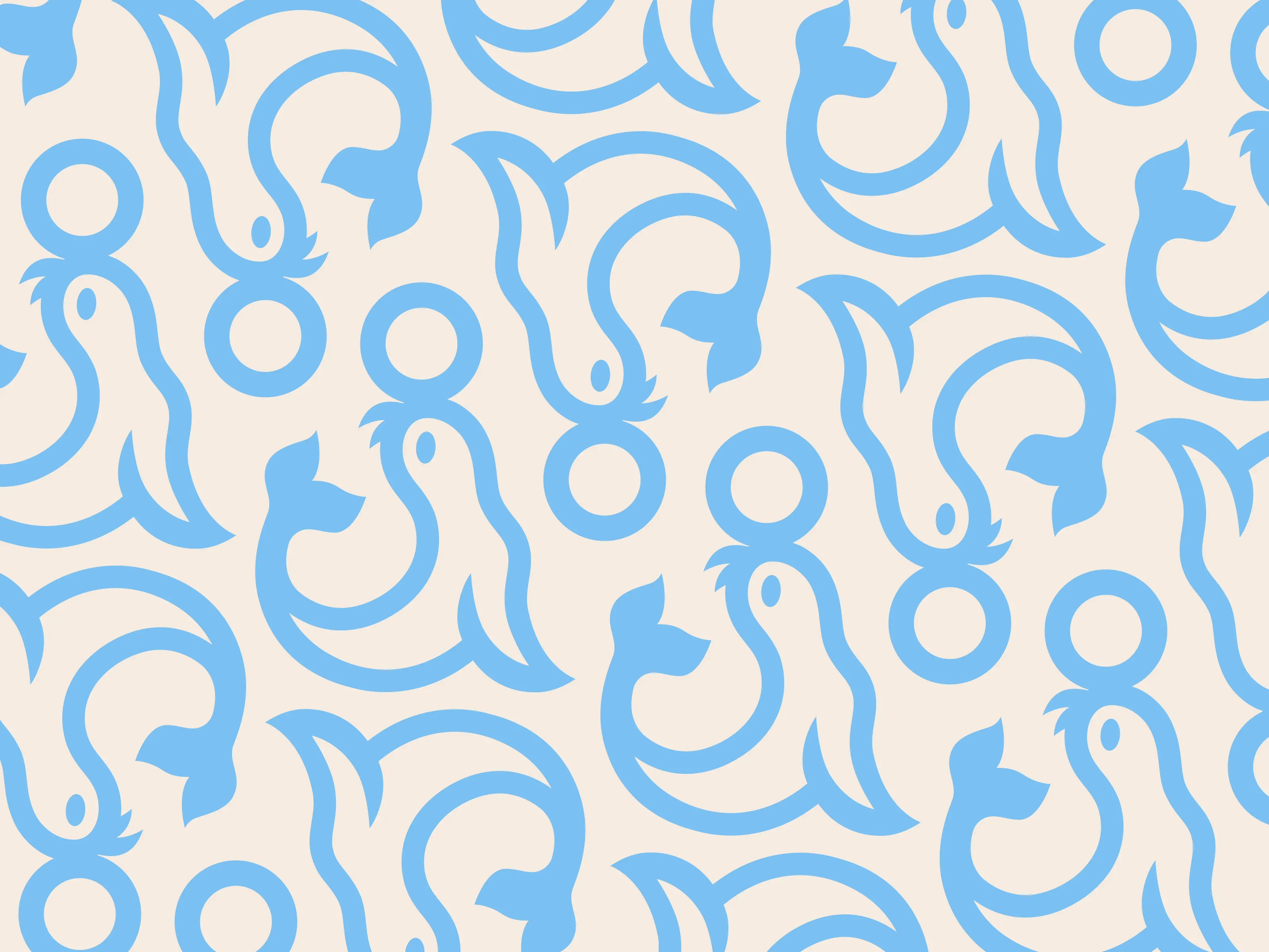
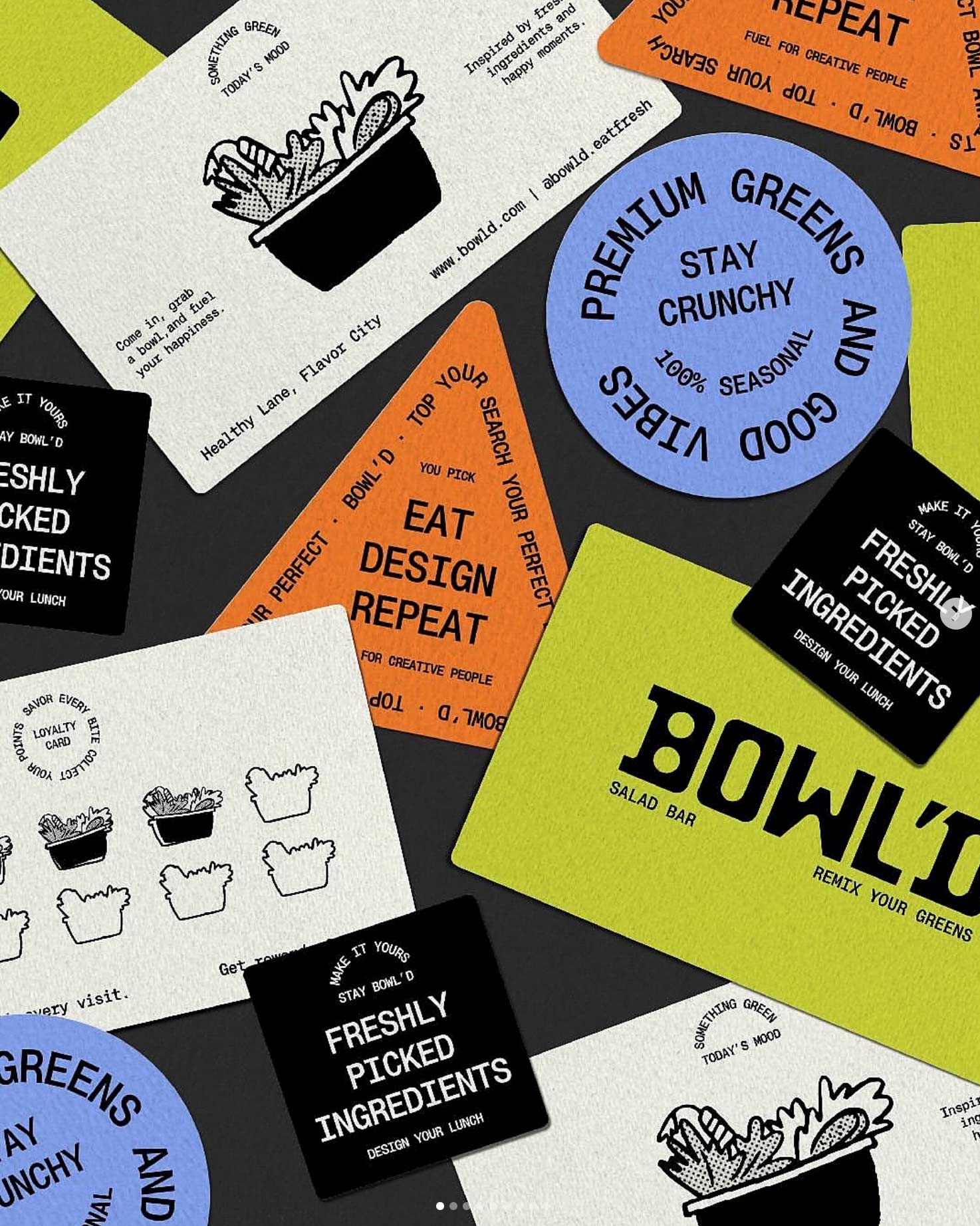
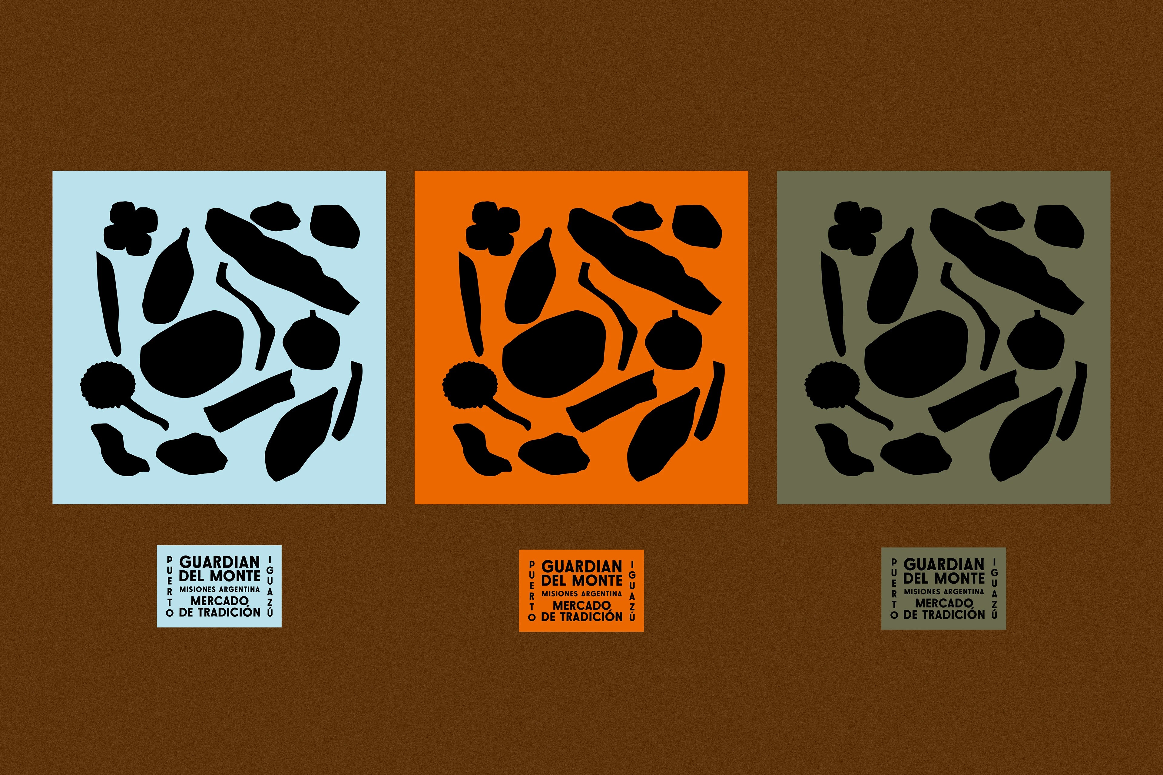
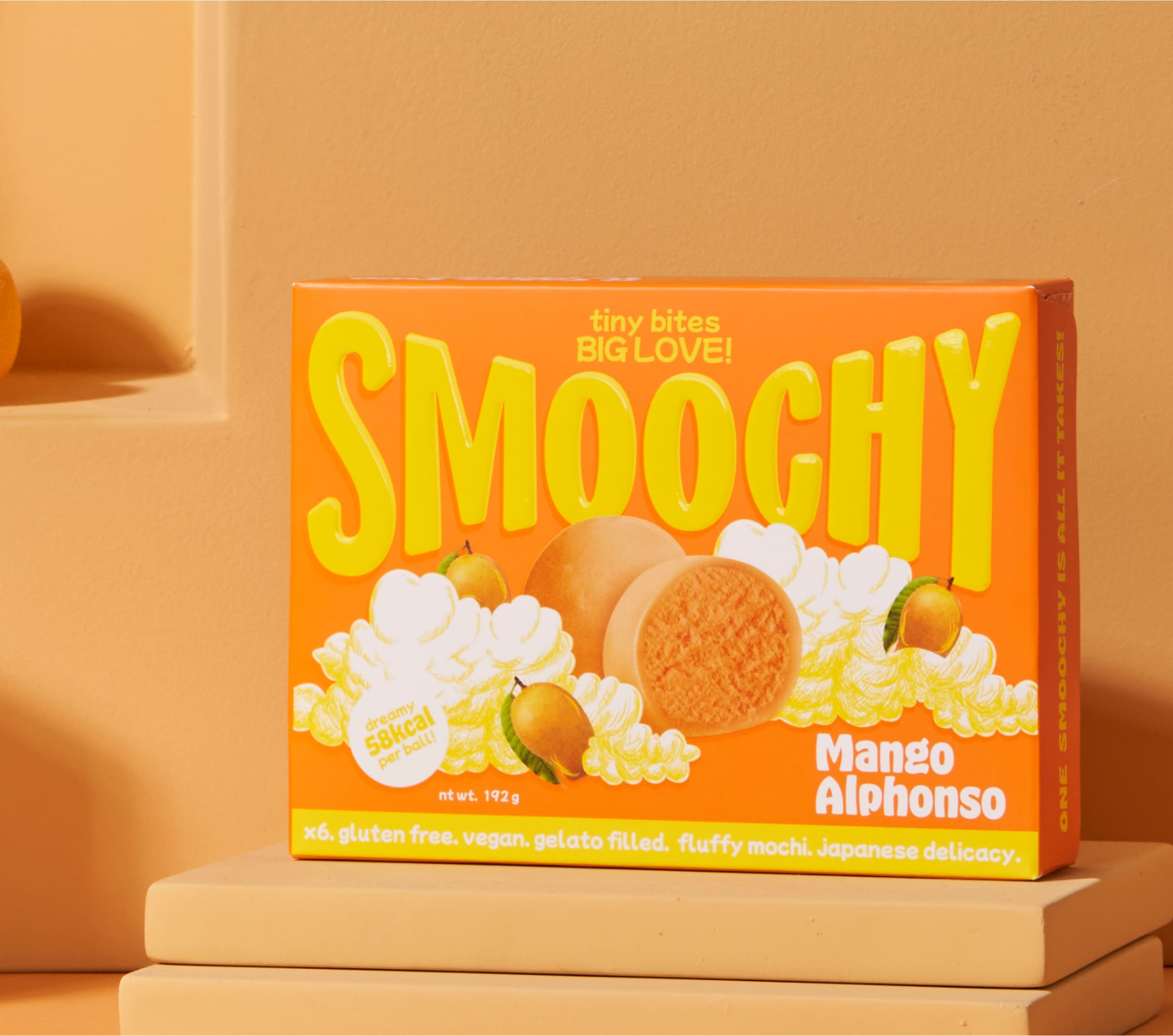
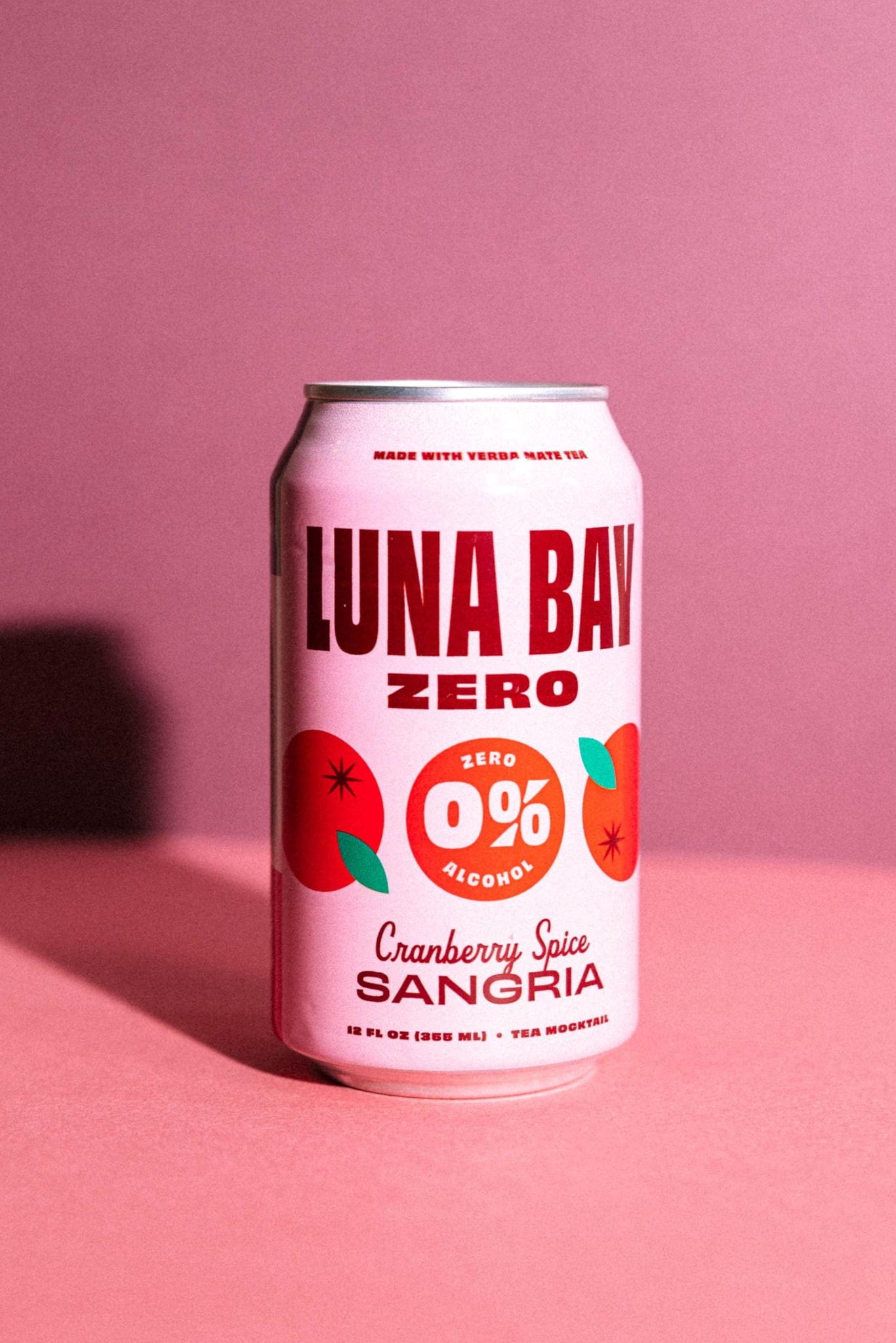
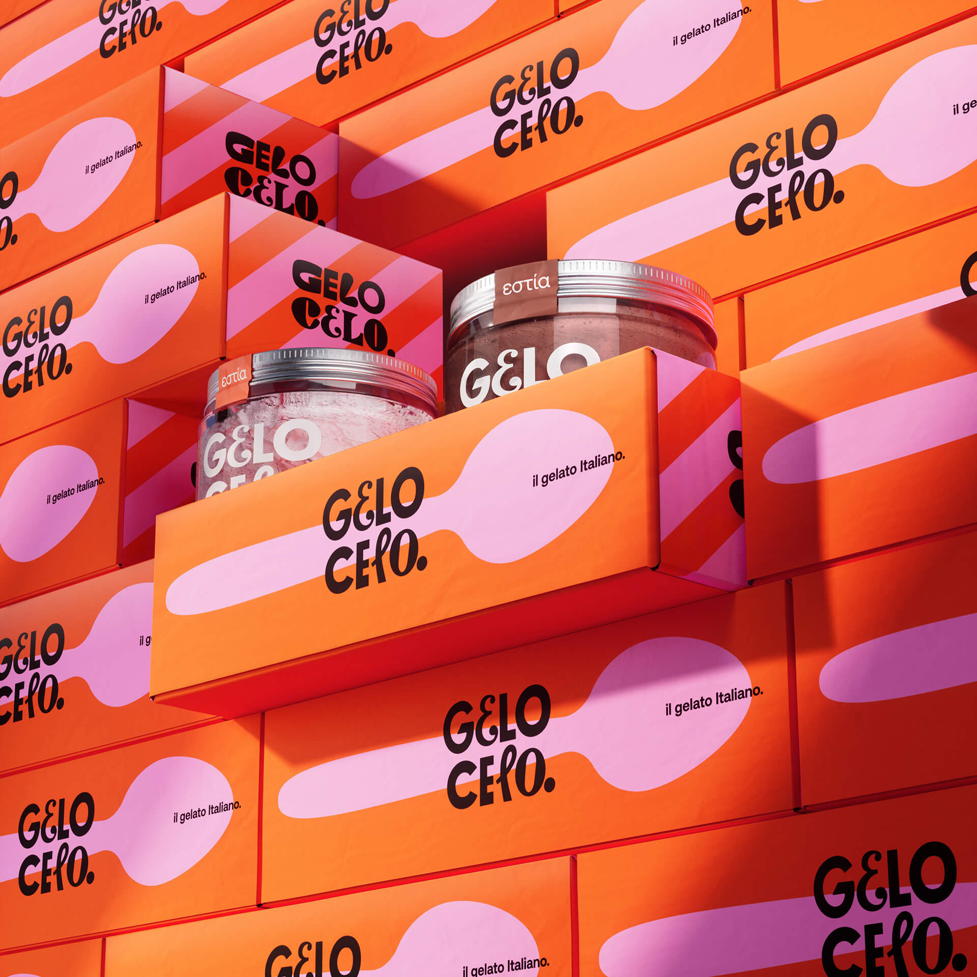
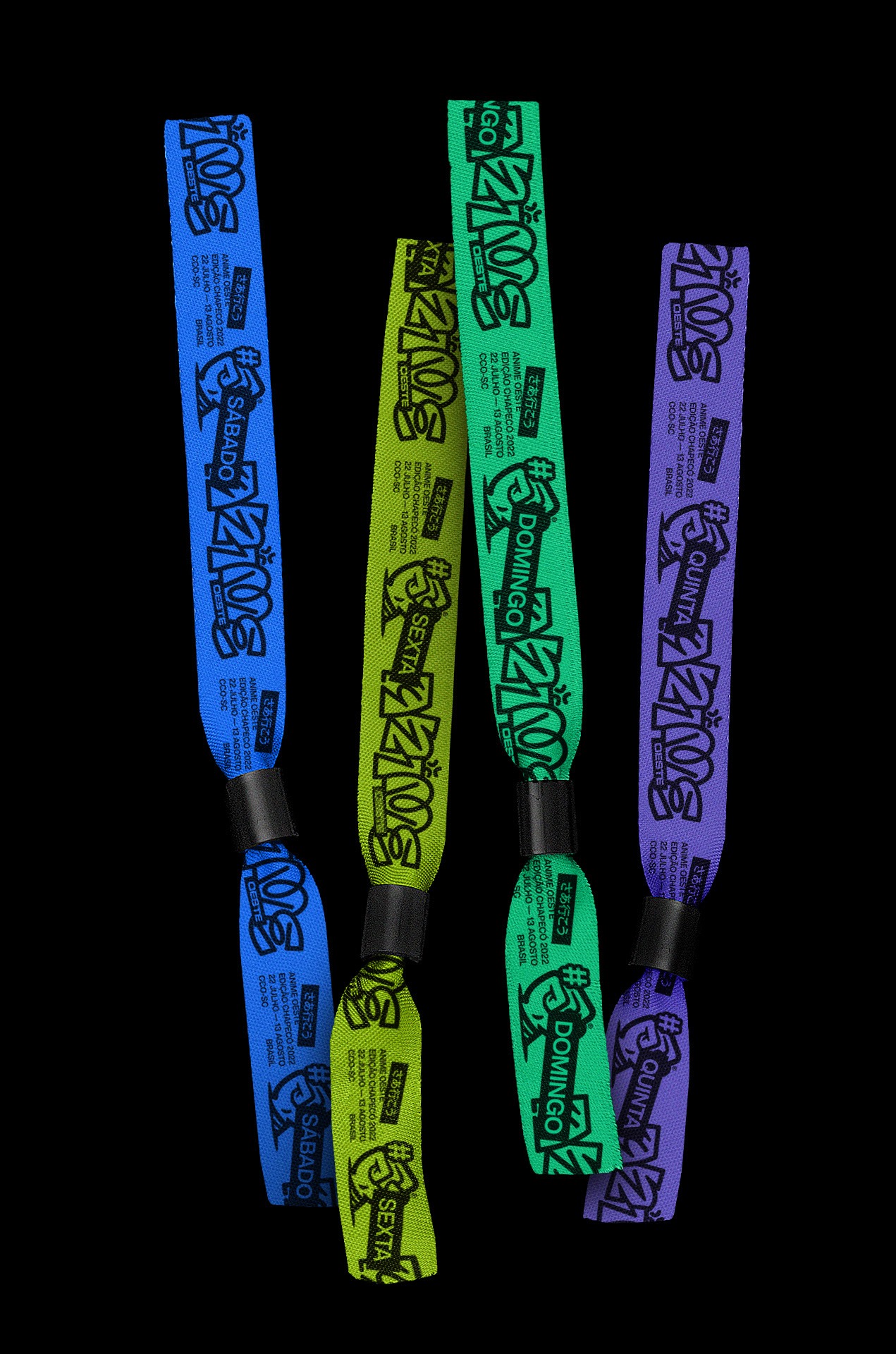
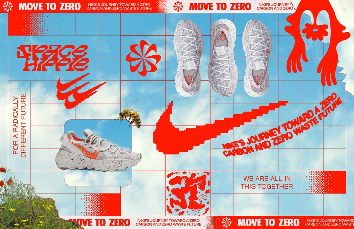
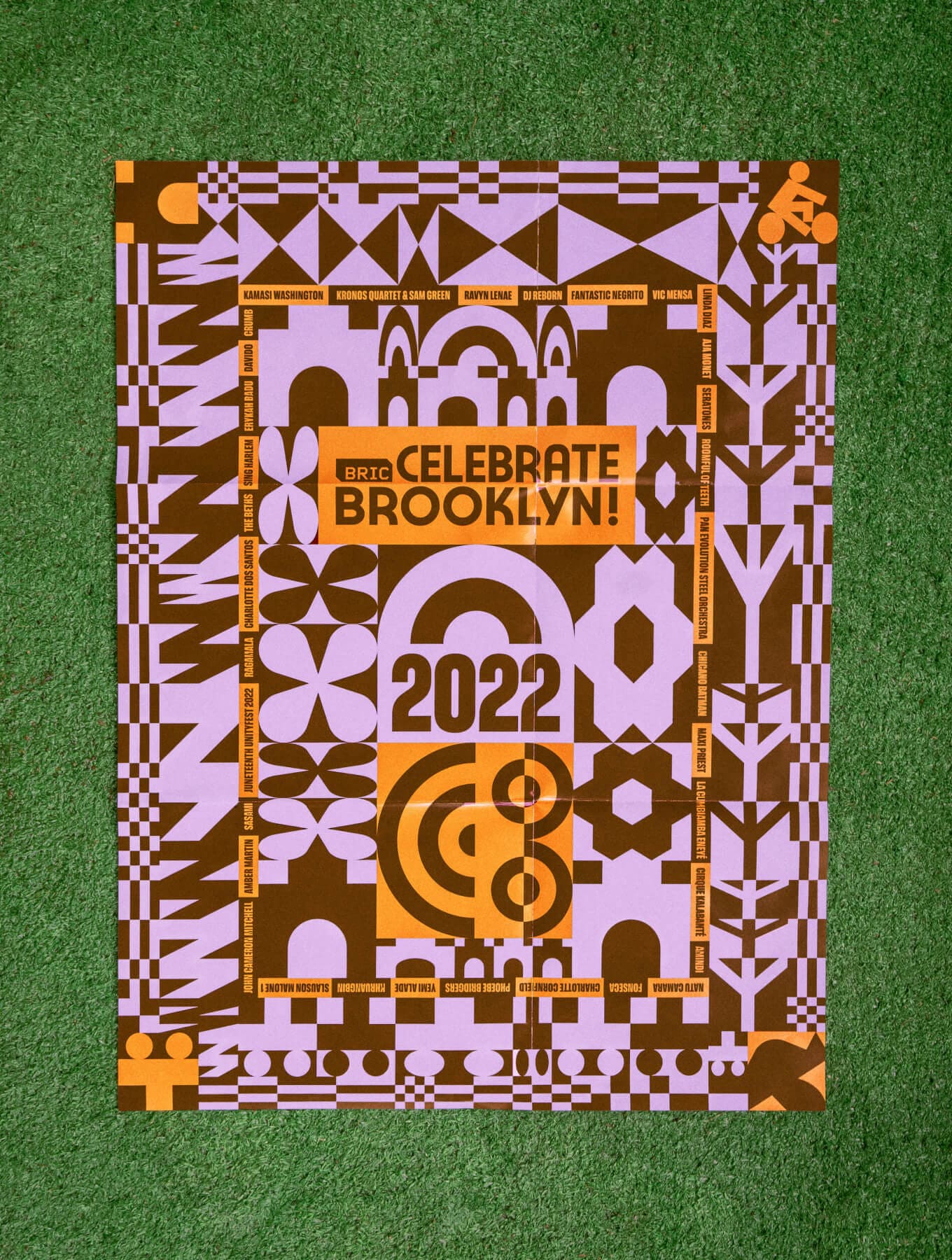
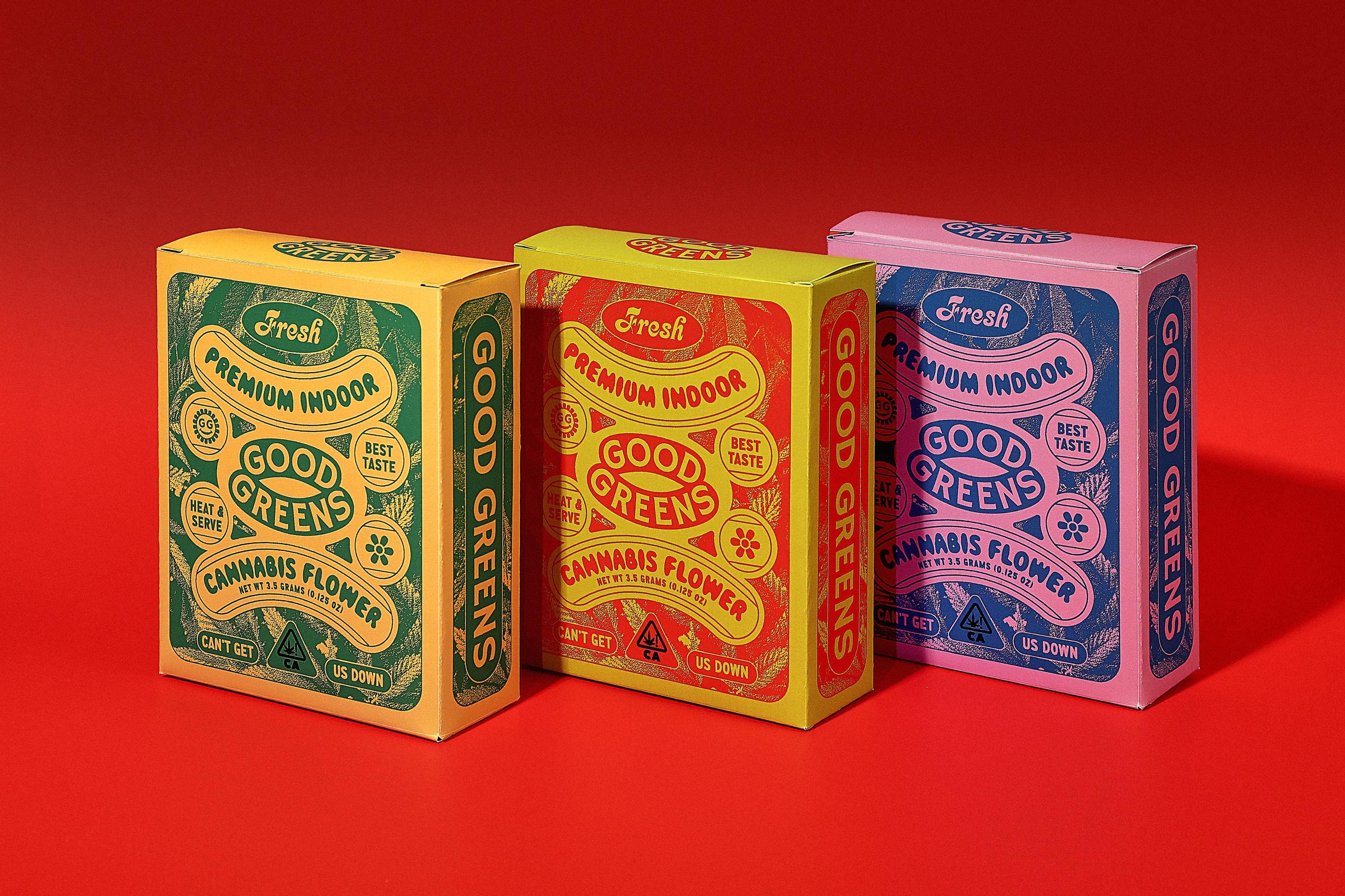
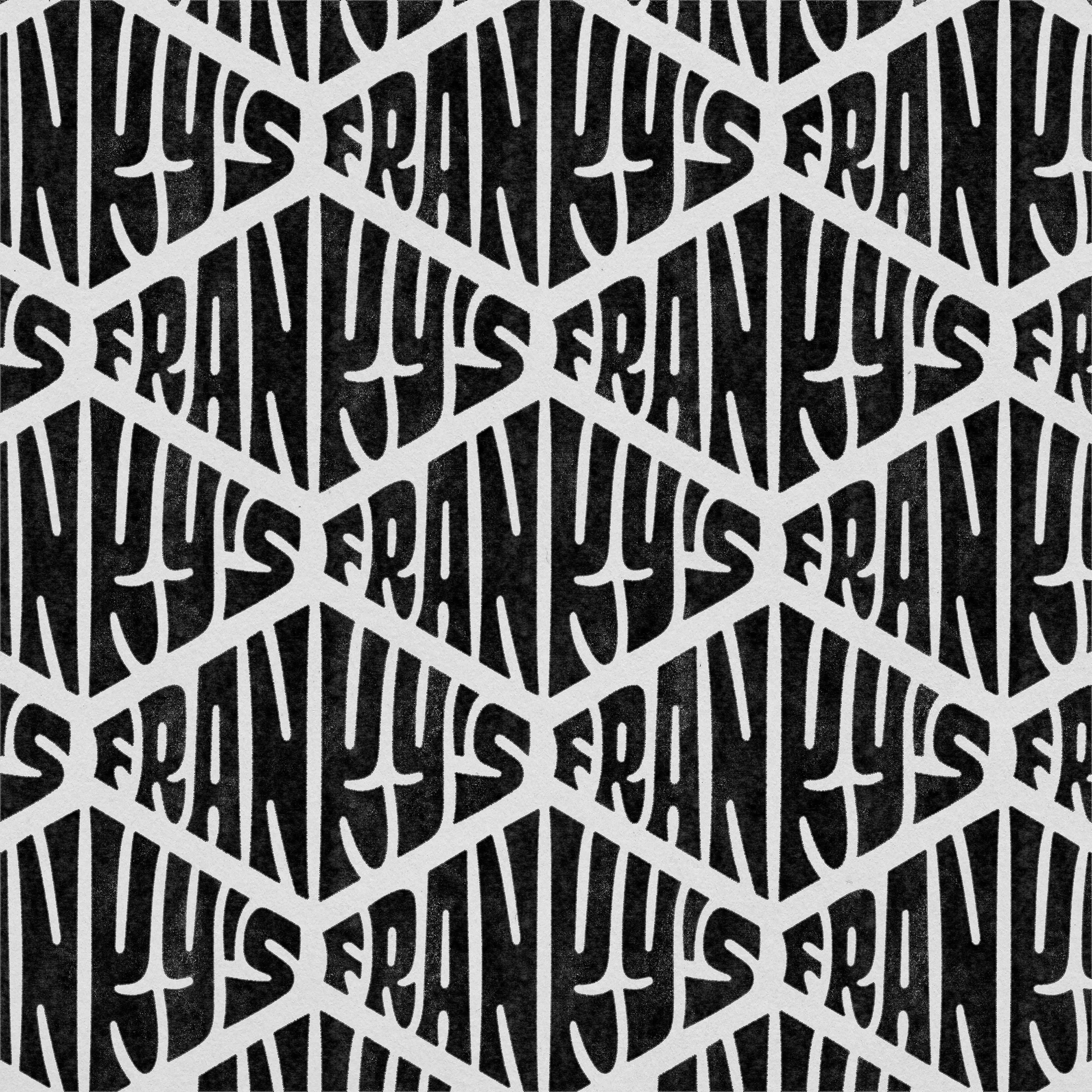
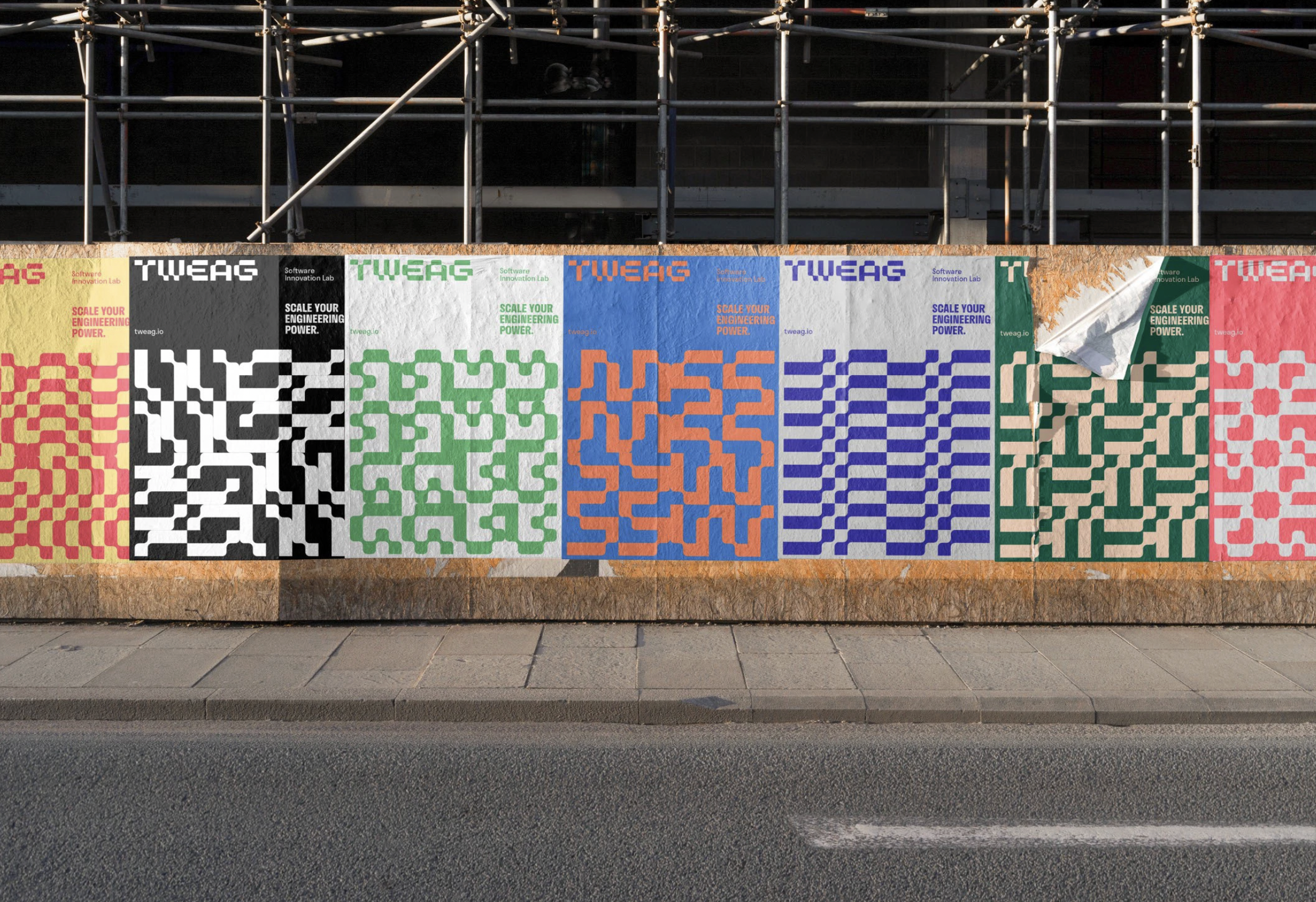
5. Patterns
Patterns are making a strong comeback in 2026, not as background filler, but as full-fledged brand elements. Designers are taking familiar logos, icons, and visual shapes and turning them into repeatable motifs that feel distinctly ownable. These brand-specific patterns go beyond decoration; they extend a company’s personality across every touchpoint, from packaging and social posts to entire environments.
Design Credit: Steve Wolf
Design Credit: Adam Grason
Credit: Coric Design
The power of this trend lies in consistency without repetition. Each pattern feels instantly recognizable while still allowing room for creative variation. A brand’s logo mark might repeat in subtle overlays, or abstracted shapes might evolve into a flowing system of forms that tell a story. When done well, these patterns create rhythm, movement, and depth, all while reinforcing brand identity in a fresh, flexible way.
Design Credit: Yeti Iglesias
Design Credit: Coric Design
Design Credit: Jesse Bowser
Design Credit: Wells Collins
As minimalism matures, patterns are reintroducing visual richness with intention. They give brands a way to be bold without shouting and to stand out without relying solely on typography or color. In the evolving landscape of graphic design trends 2026, custom patterns prove that repetition, when designed thoughtfully, can be one of the most expressive tools in a brand’s toolkit.
Design Credit: Pierre Huet
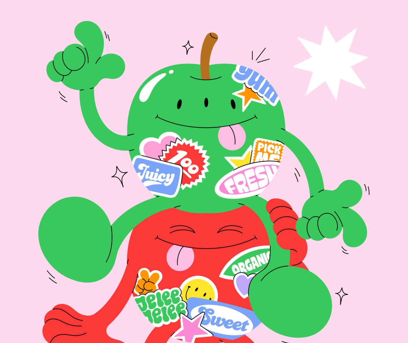
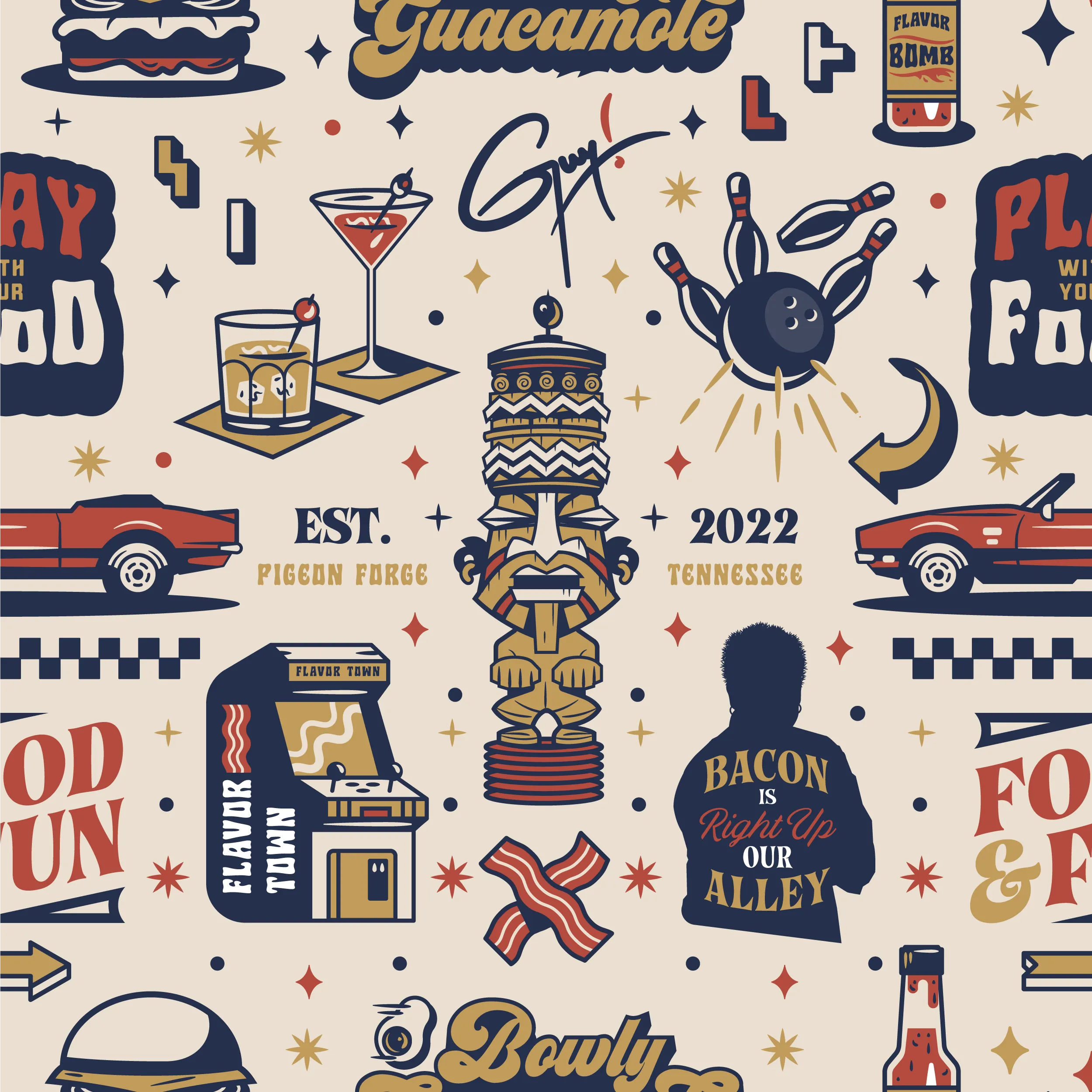
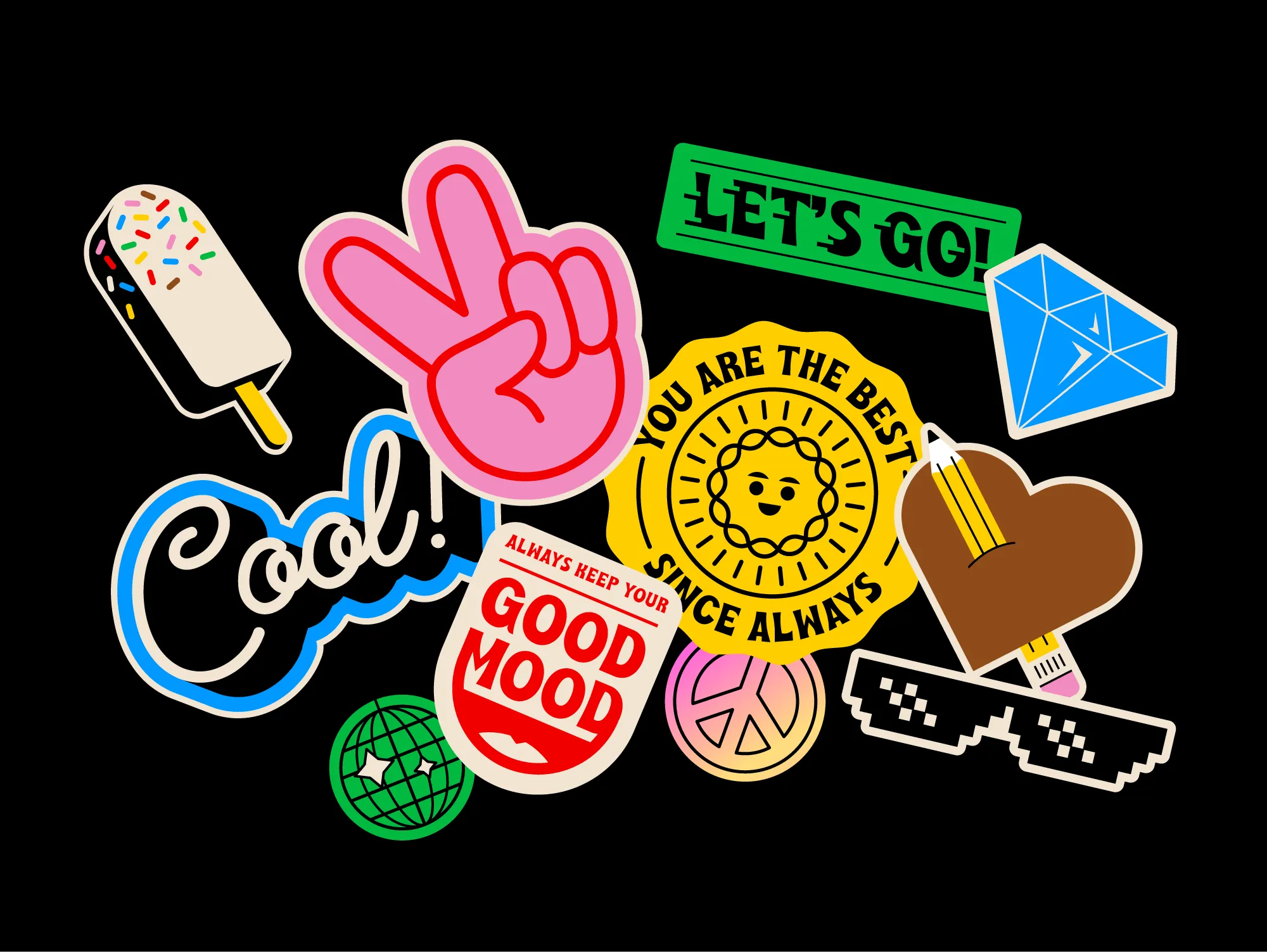
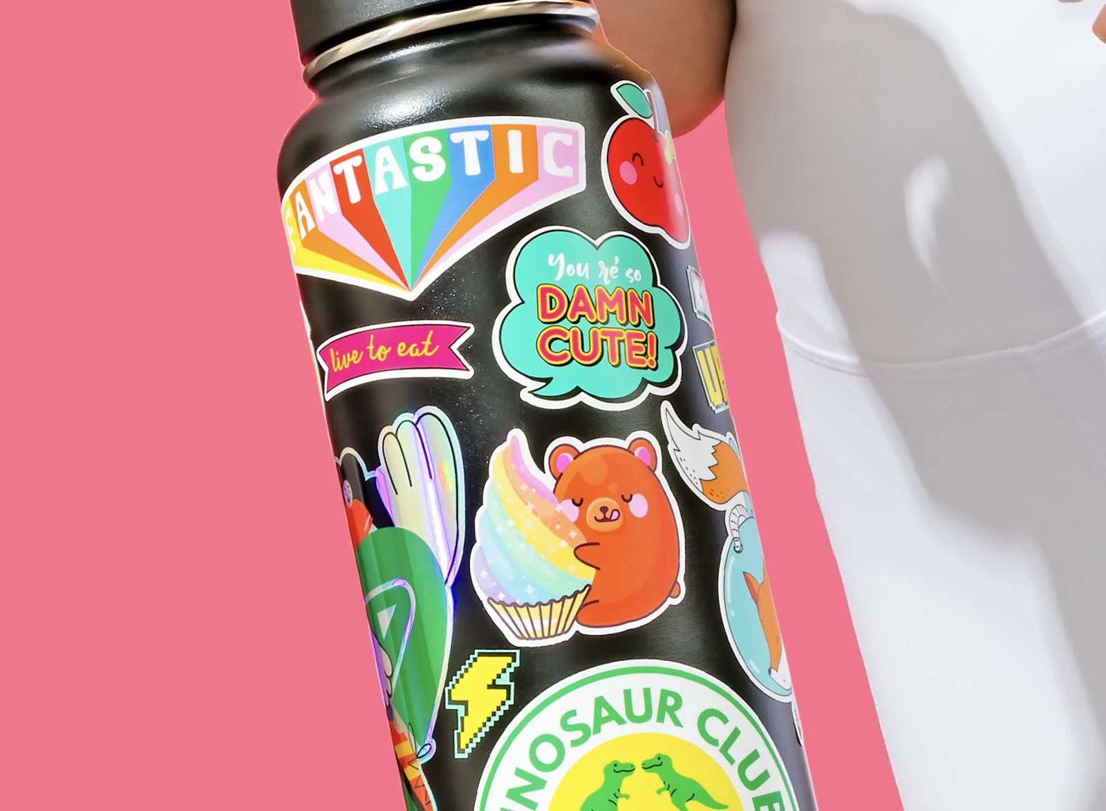
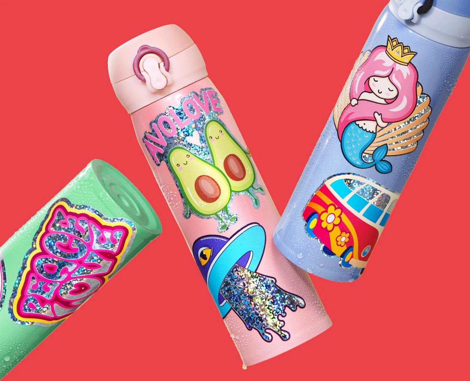
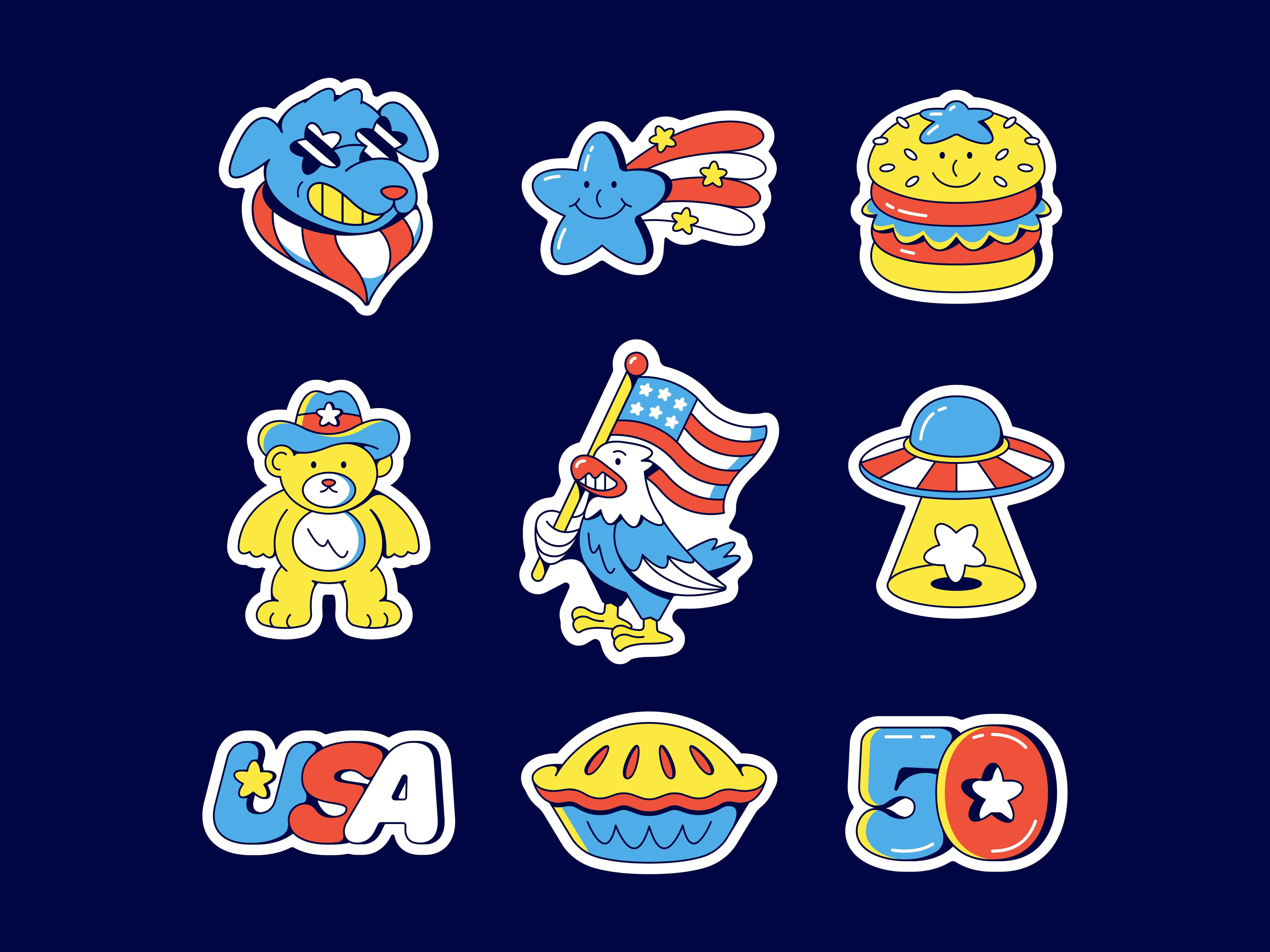
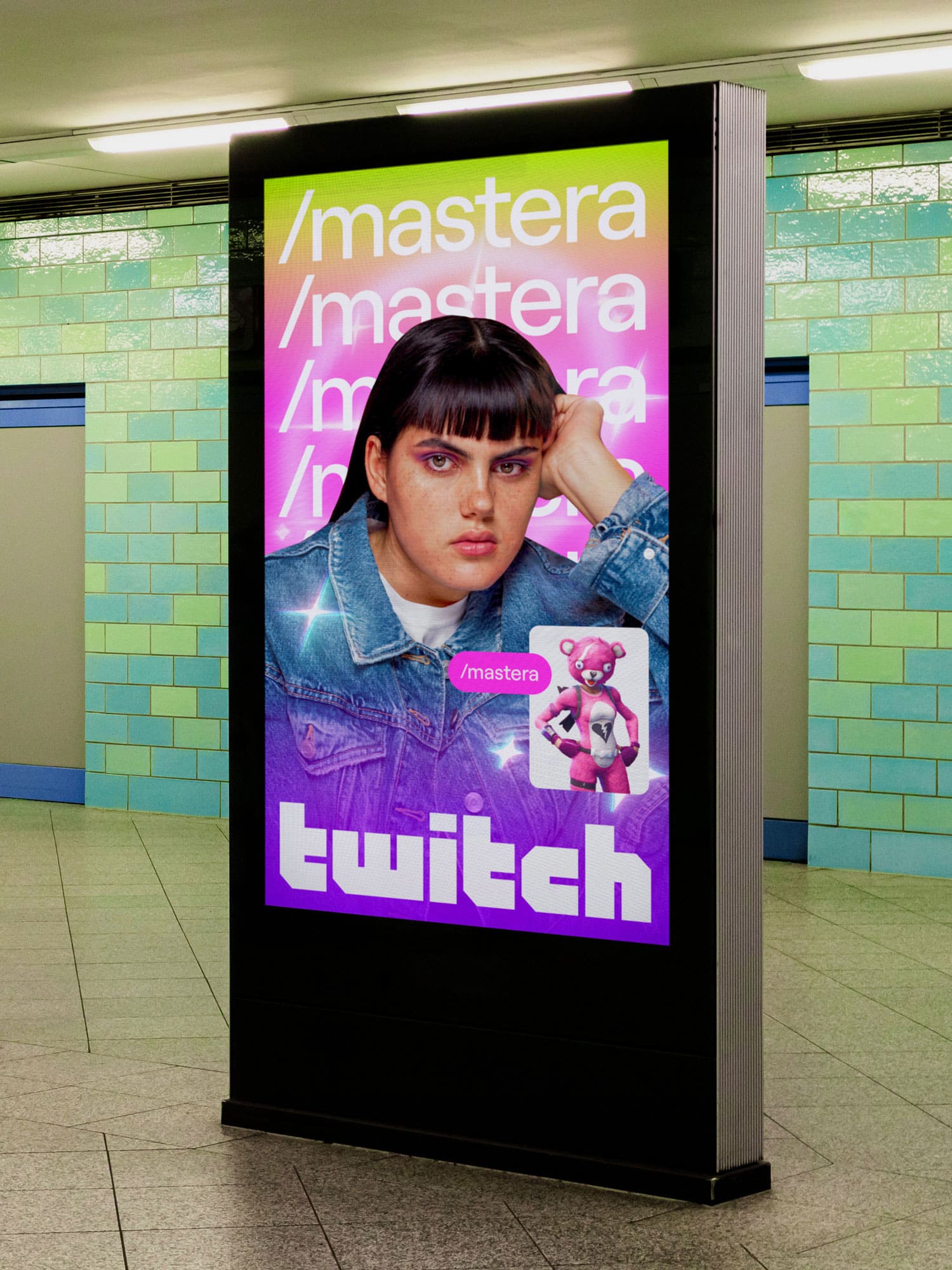
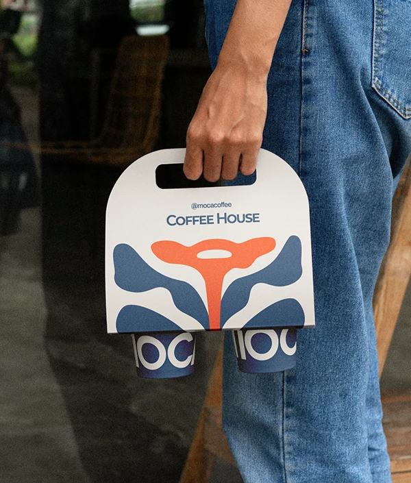
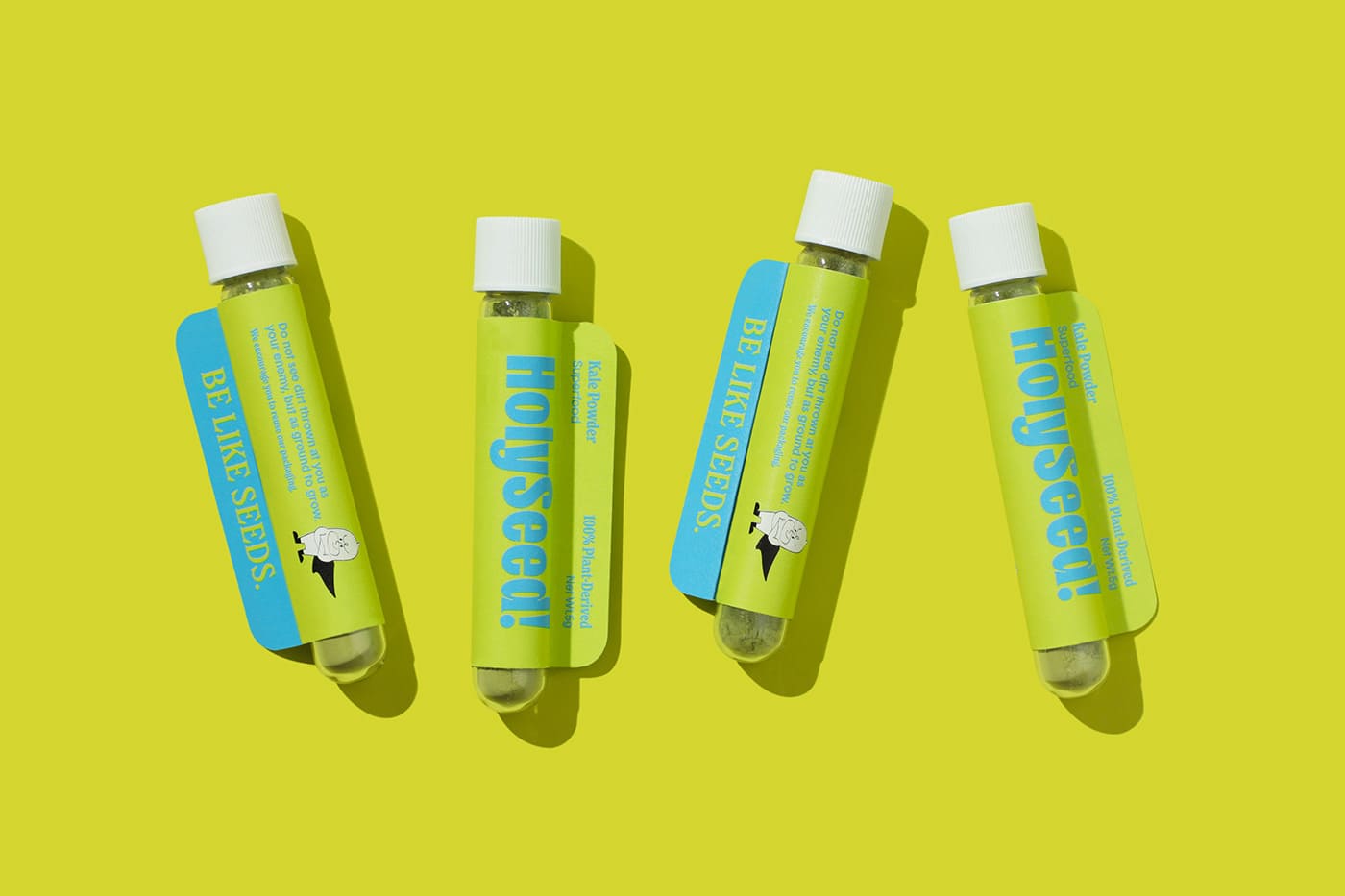
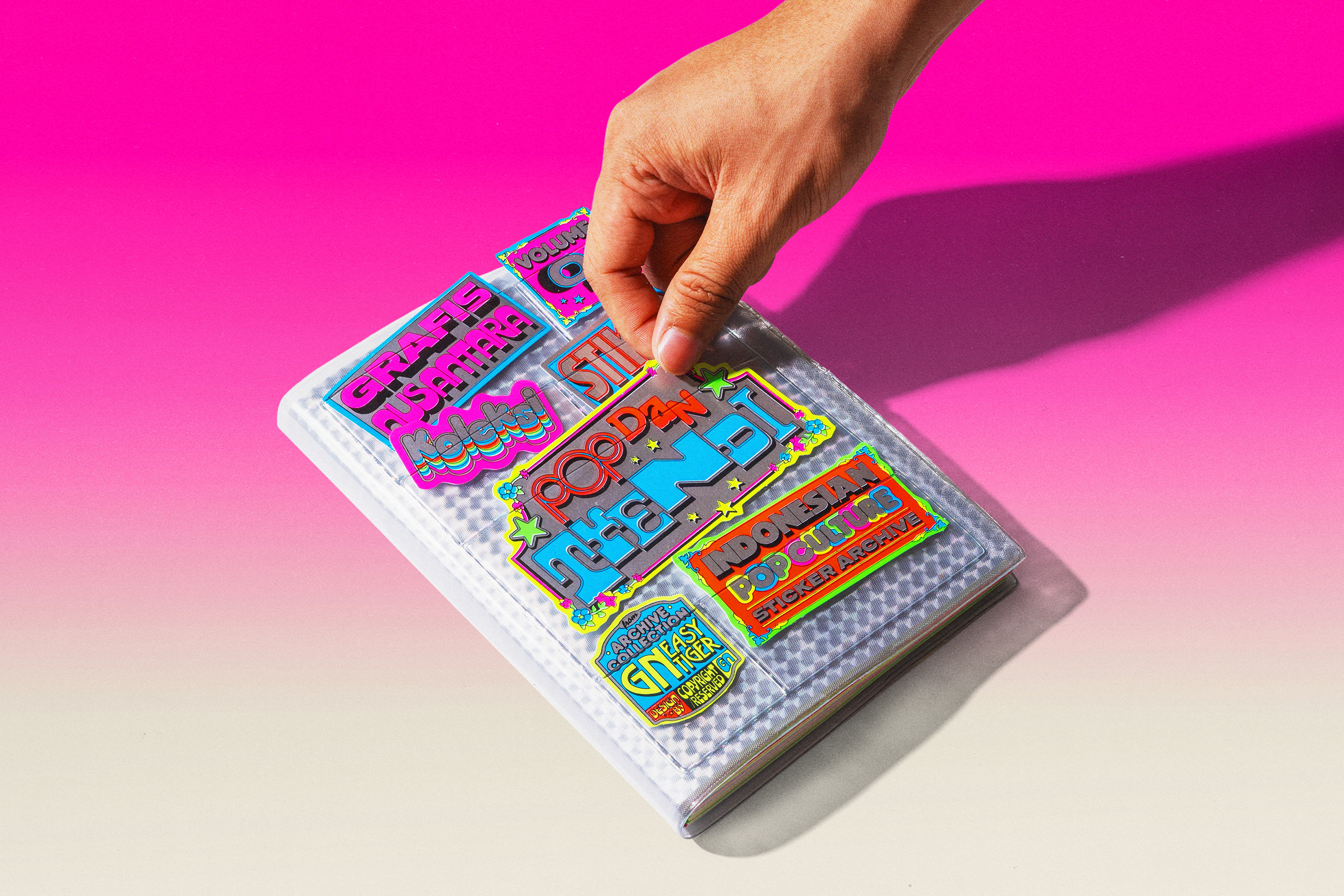
6. Stickers
Designers are sticking with what they love, literally. One of the big graphic design trends for 2026 is the rise of Custom Stickers. Both the real, peel-and-stick kind and the digital versions showing up in layouts, motion graphics, and branding.

Design Credit: Ovcharka Industrie
Design Credit: Gino van Lierop
There’s something refreshingly simple about them. Stickers feel playful, personal, and a little rebellious, like design’s way of coloring outside the lines again. Drop a few into any design, and it suddenly feels more alive and unpolished in the best way.
Design Credit: Damian Orellana
At Jukebox, stickers have always been about how design lives beyond the screen. We’re seeing more brands experiment with bold shapes, layered graphics, and finishes that work just as well digitally as they do in print. That crossover has made it easier to design, preview, and refine ideas early, whether you’re mocking up concepts online or preparing them for production. Tools like our sticker maker help bridge that gap by letting designs take shape before they ever hit the press.
Design Credit: Leena Kisonen
What’s driving it is nostalgia and tactility. After years of digital minimalism, people are craving something that feels more personal, something they can actually touch or make their own. Stickers capture that perfectly. They remind us that good design doesn’t always need to be serious; sometimes it just needs to make you smile.
Design Credit: Jukebox
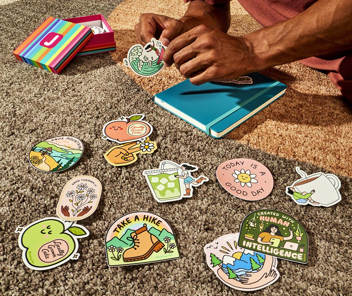
Design Credit: Ashleigh Green
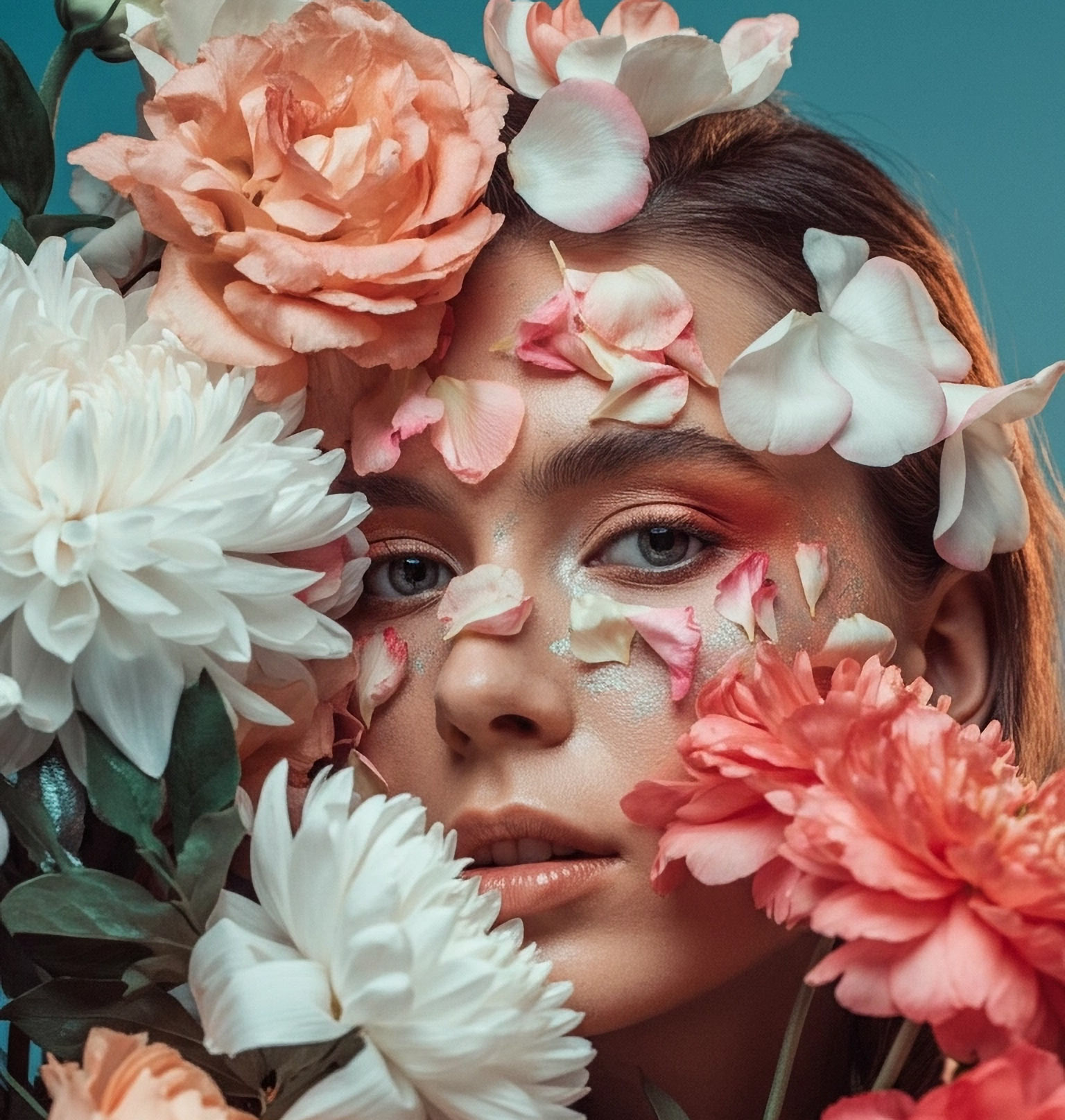
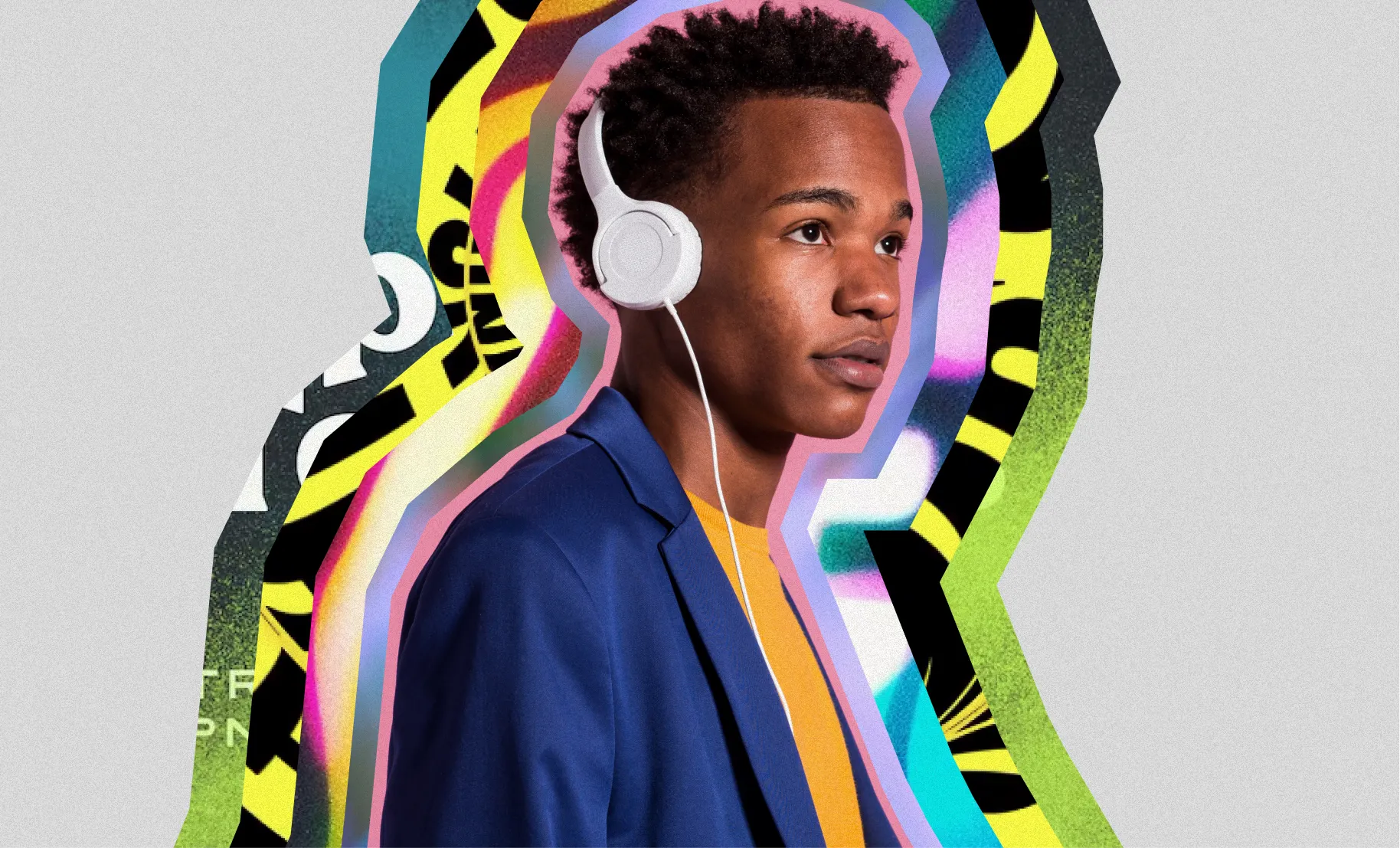
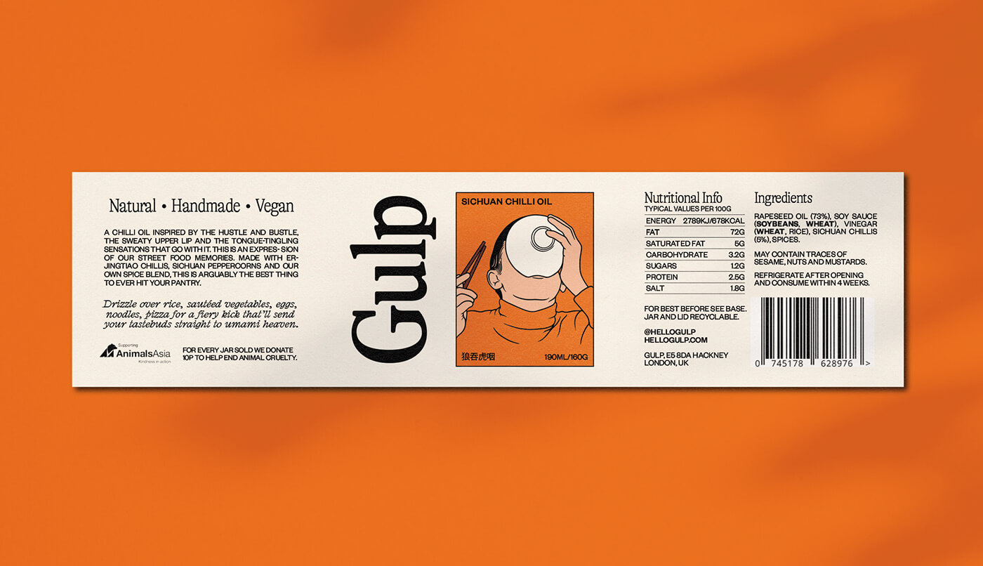
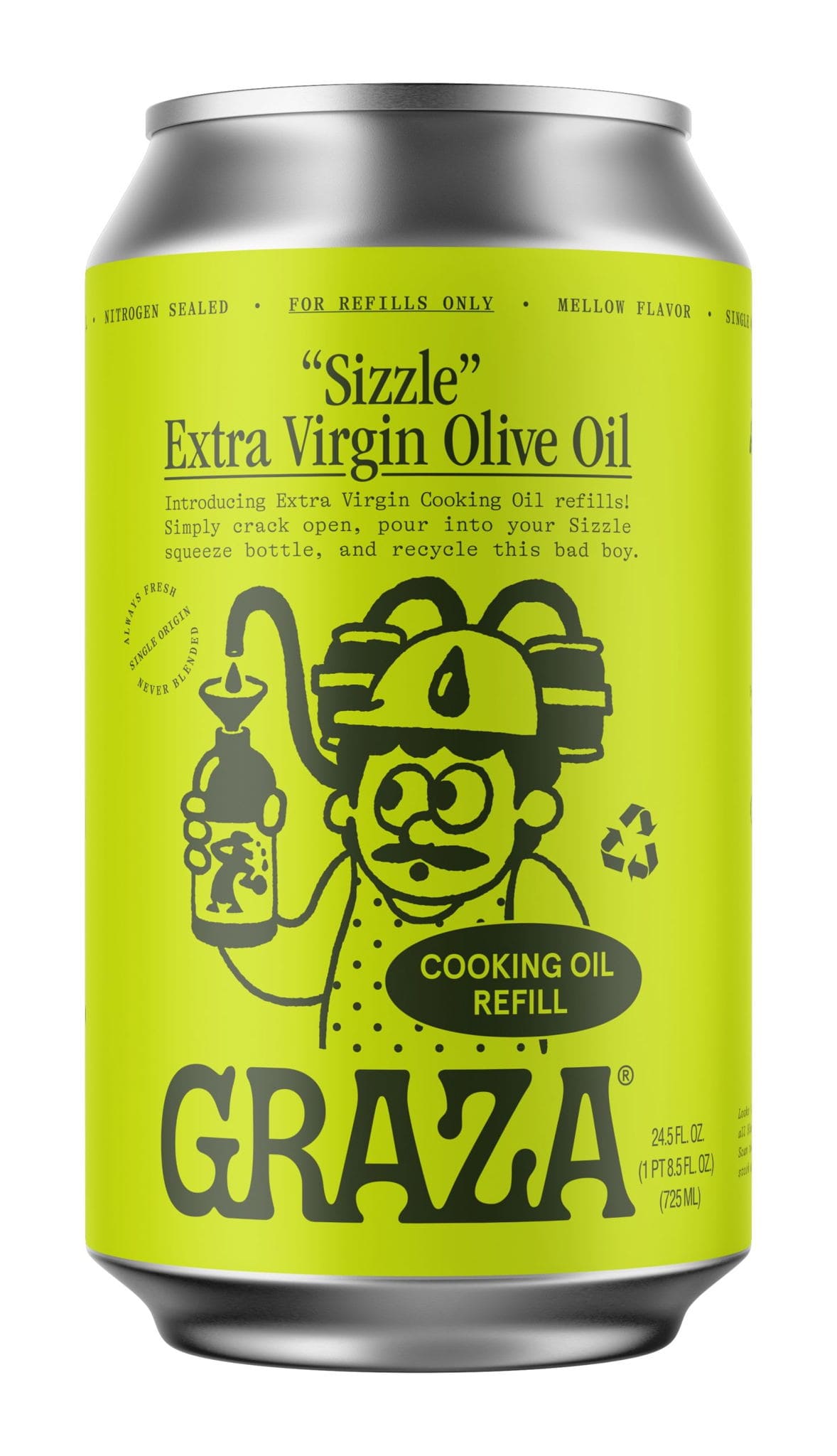
7. Cinematic Photography
In 2026, cinematic photography is less about perfection and more about presence. It’s about creating images that make you feel something, even if that feeling is a little offbeat. The glossy, hyper-filtered era is behind us; what’s taking over now is raw energy and intentional imperfection. Photographers are leaning into contrast, character, and unexpected storytelling to make images that stop you mid-scroll.
Photo Credit: Justin Bettman
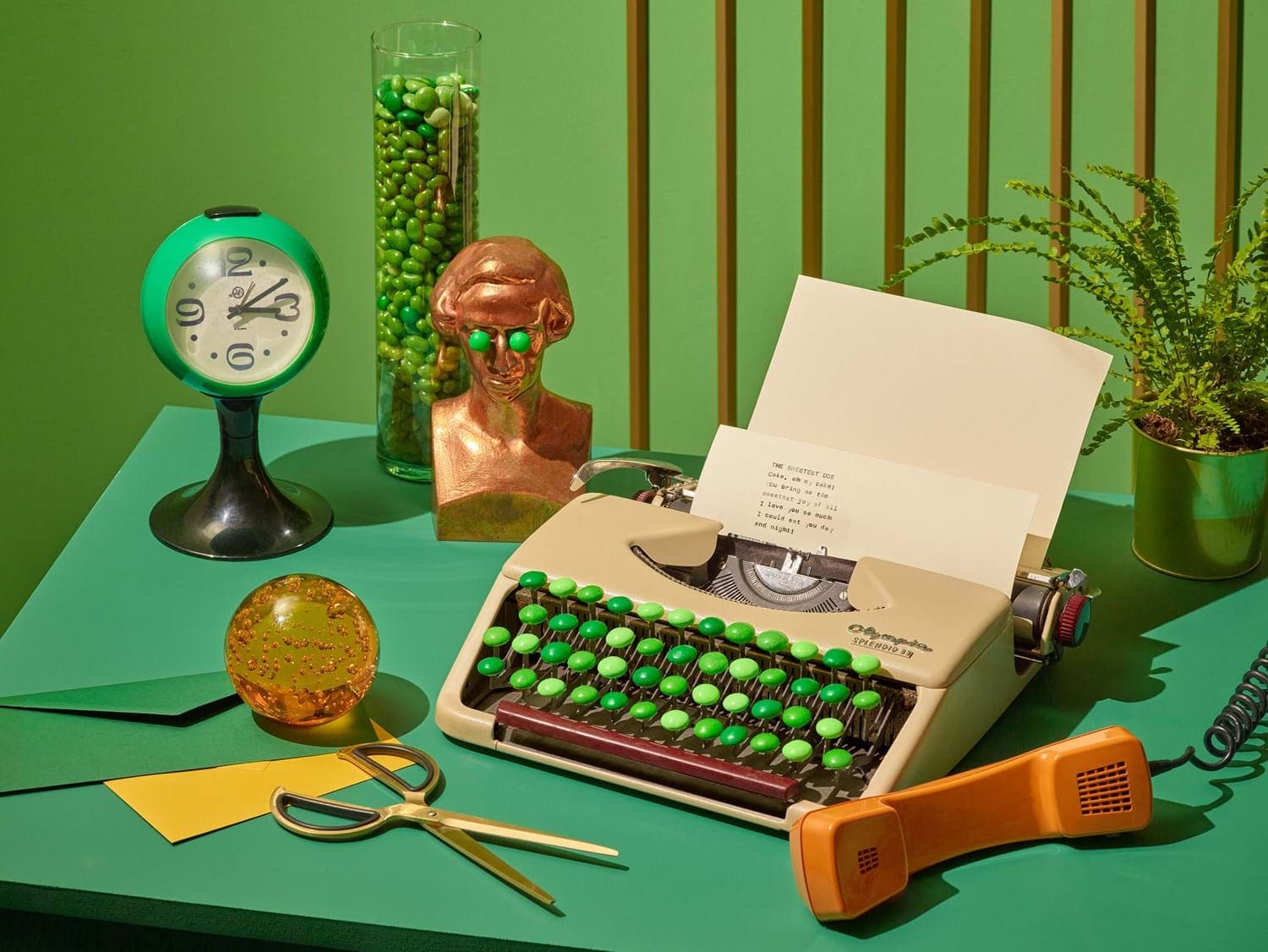
Photo Credit: Maciek Miloch
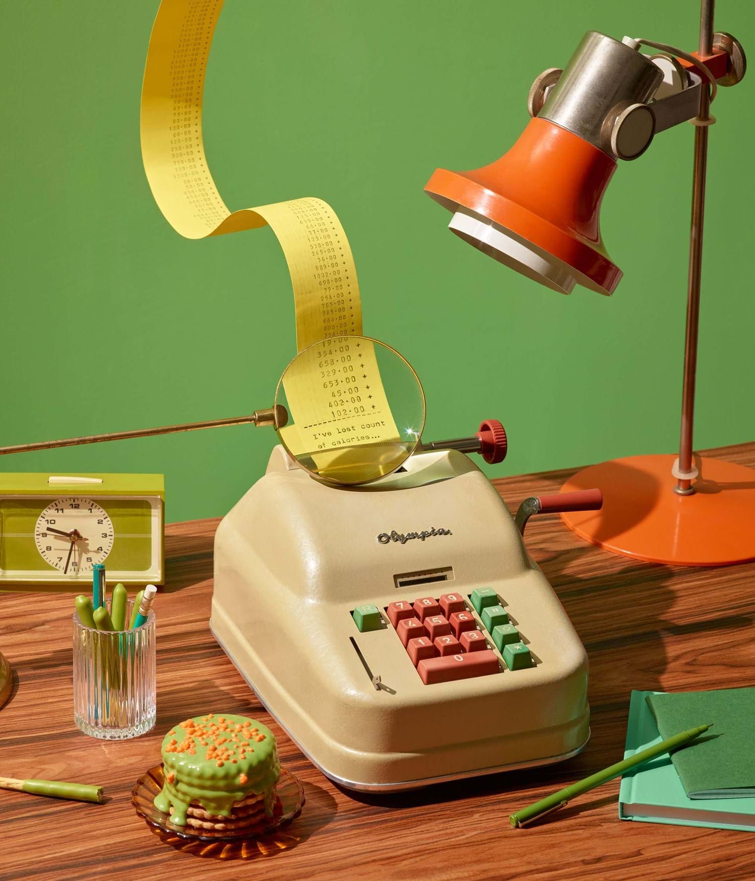
Photo Credit: Maciek Miloch
What’s interesting is how this trend blends theatrical setup with genuine emotion. Think saturated lighting, cinematic shadows, and color stories that bend reality just enough to make you look twice. Props and styling have become tools for narrative, not decoration, every detail feels like part of a world the brand is building. Even staged chaos has meaning when it’s done with clarity and confidence.
Photo Credit: Scott Semler
Photo Credit: Lenna and Artem Studio
This kind of photography is bold not because it’s loud, but because it’s honest about its artifice. It invites you into the creative process rather than hiding it. Whether used in campaigns, packaging, or social content, these visuals prove that authenticity doesn’t have to look casual. Sometimes, it looks like a scene carefully crafted to feel beautifully alive.
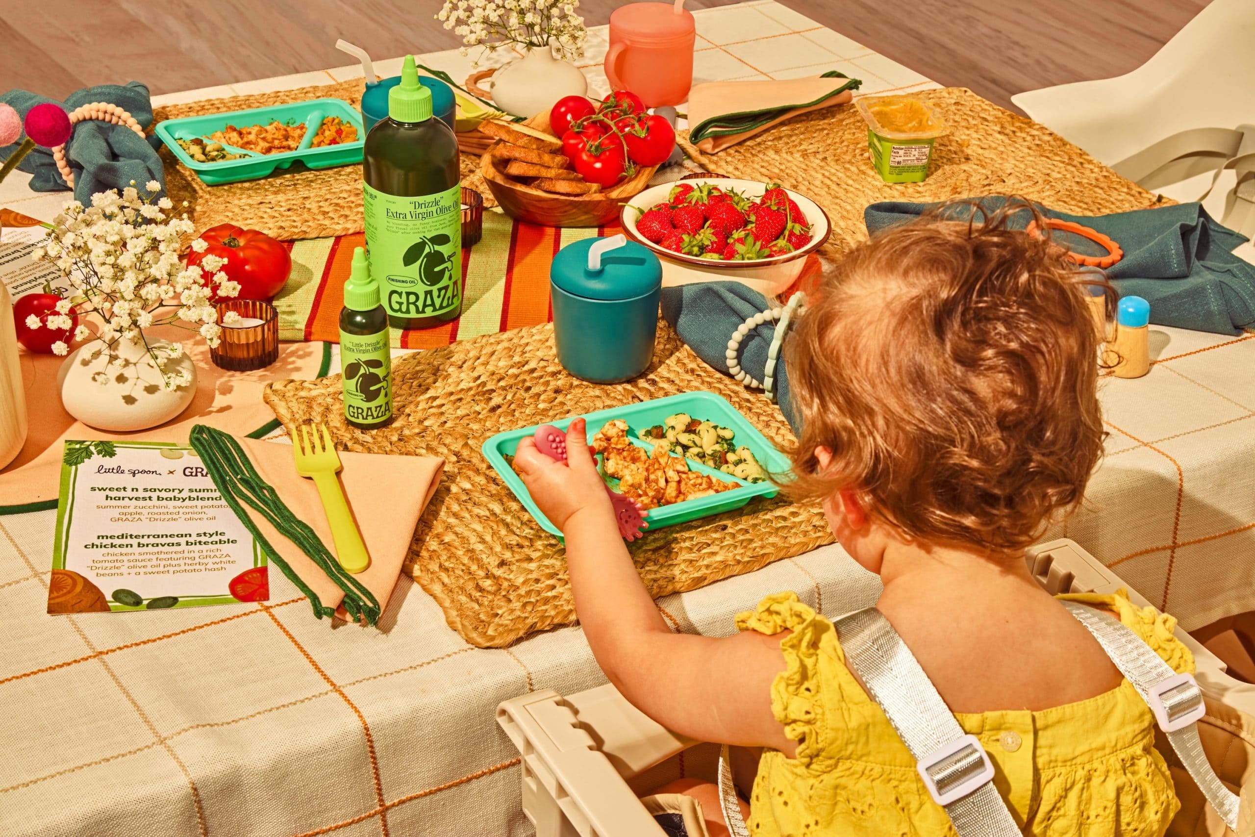
Photo Credit: Graza
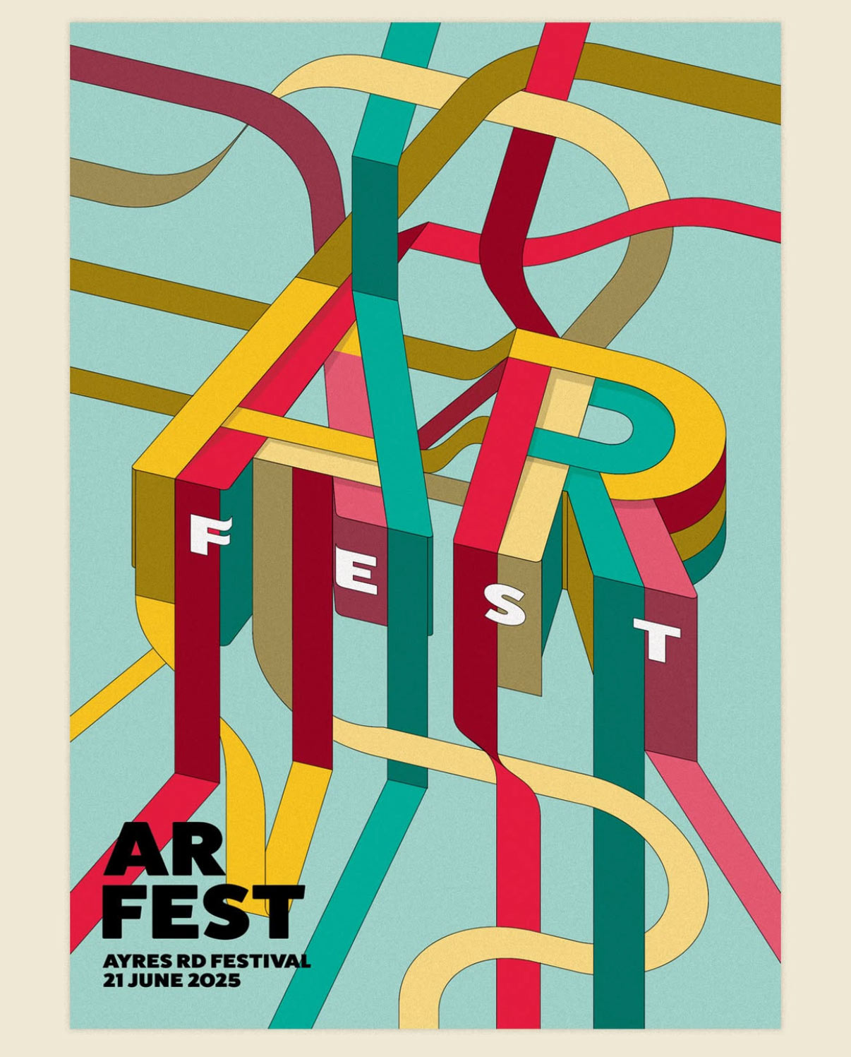
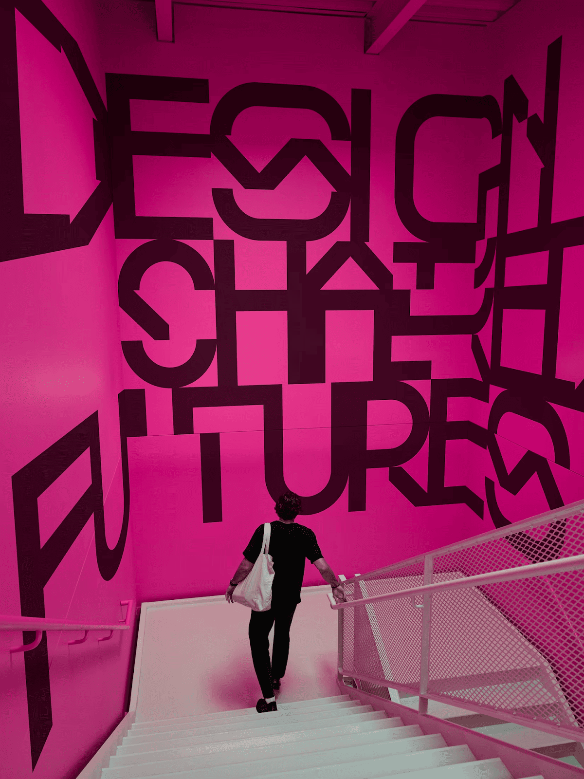
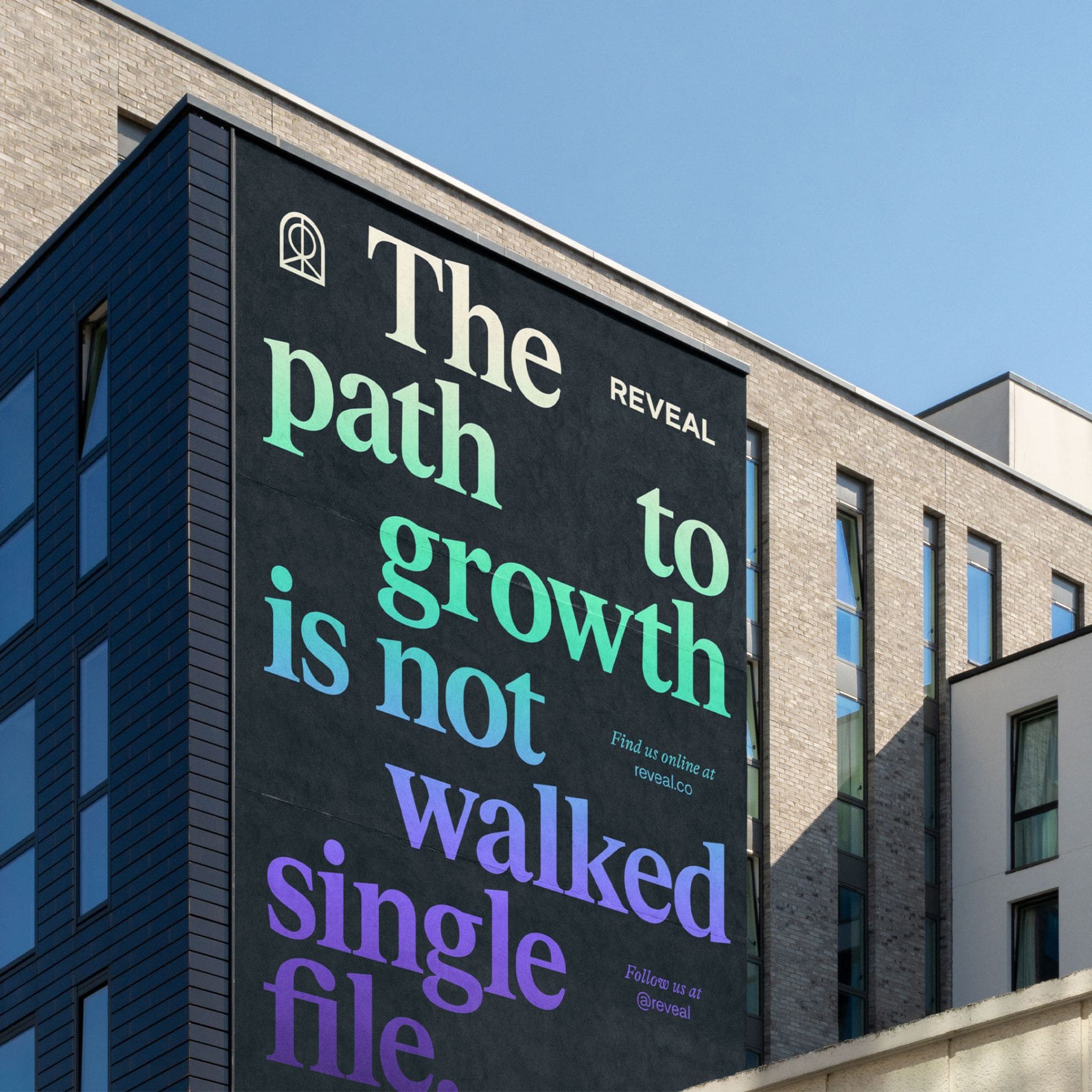
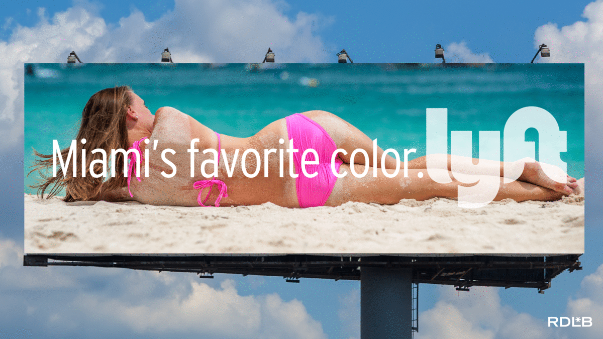
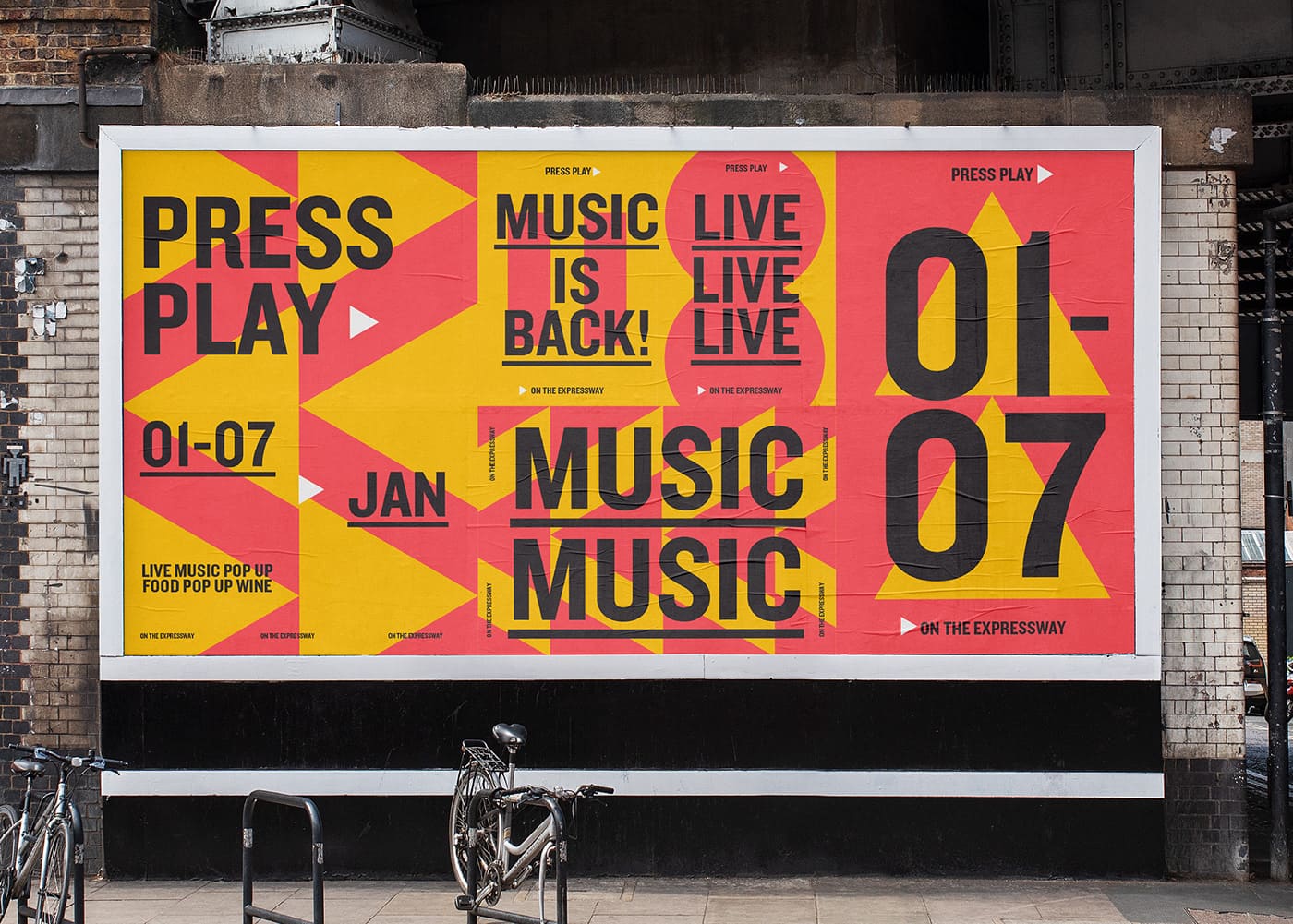
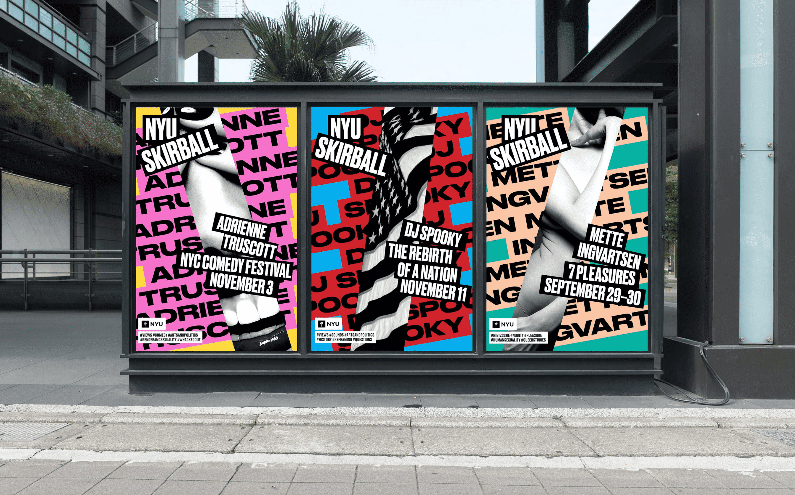
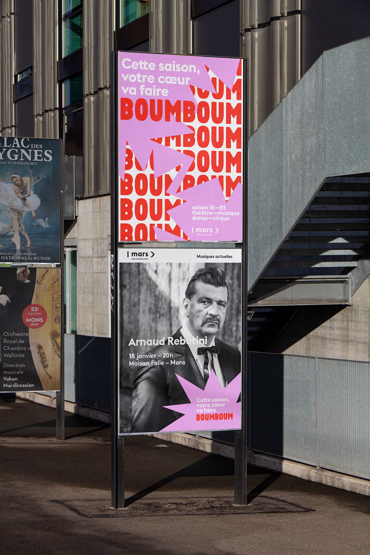
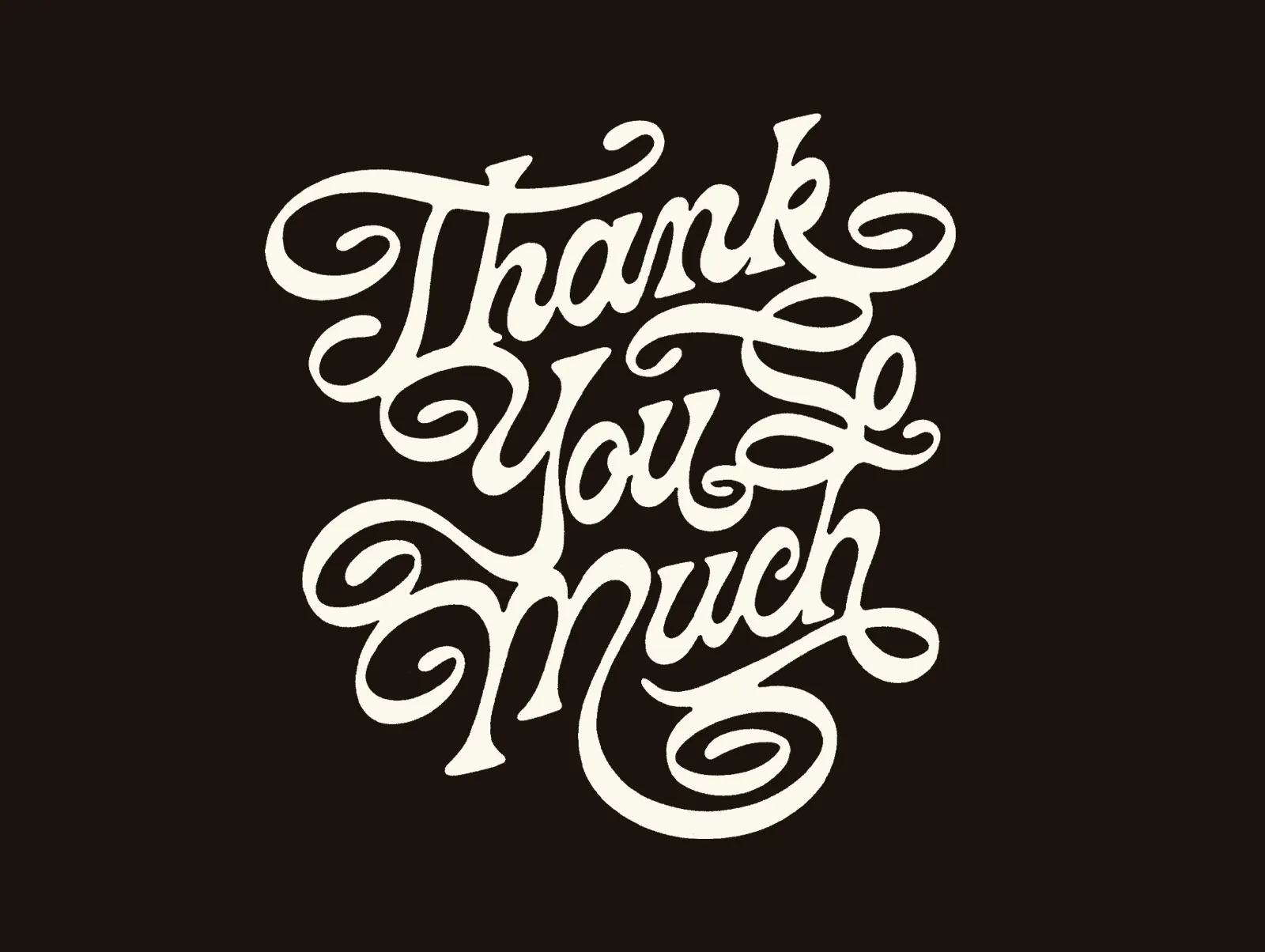
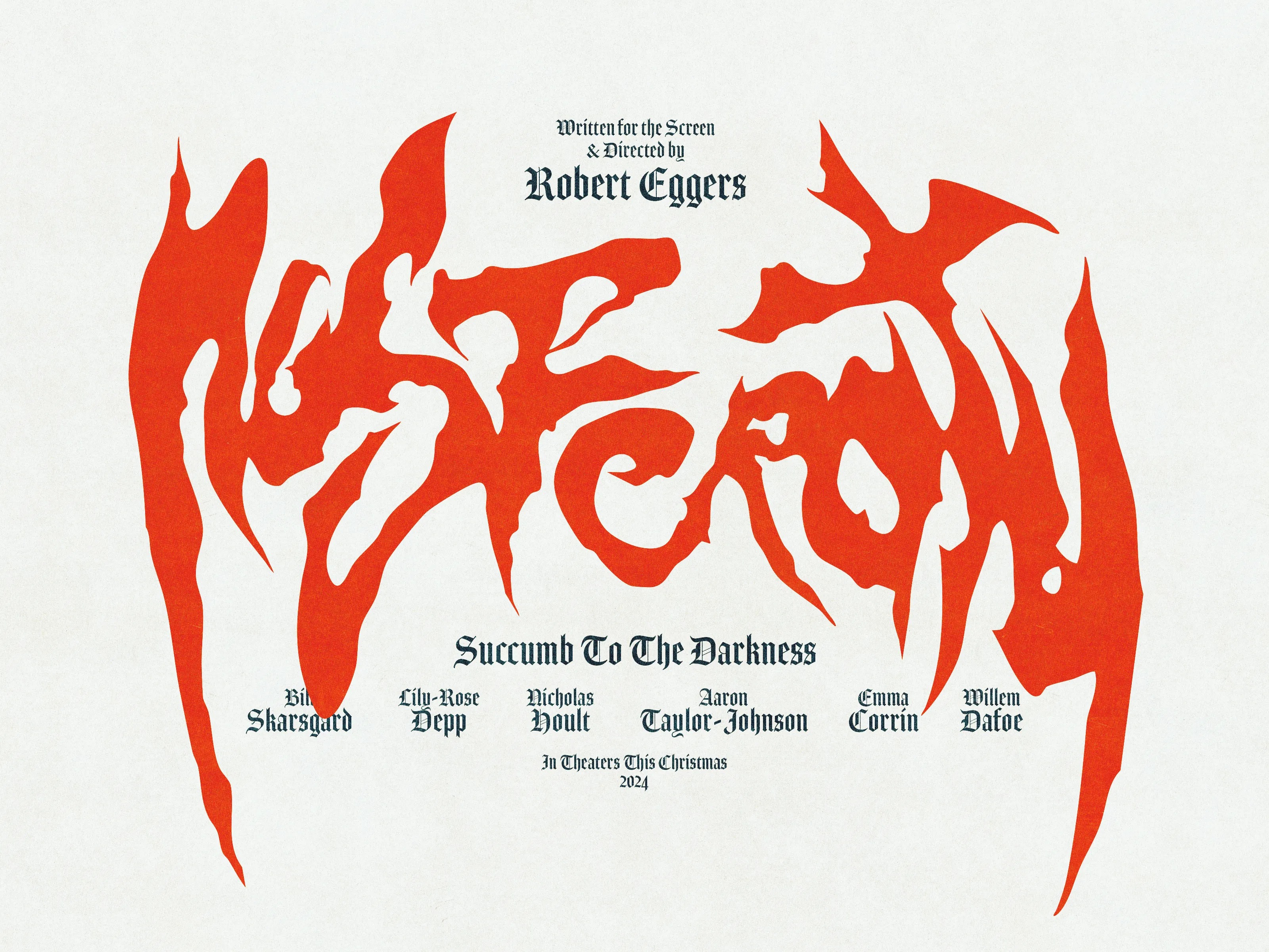
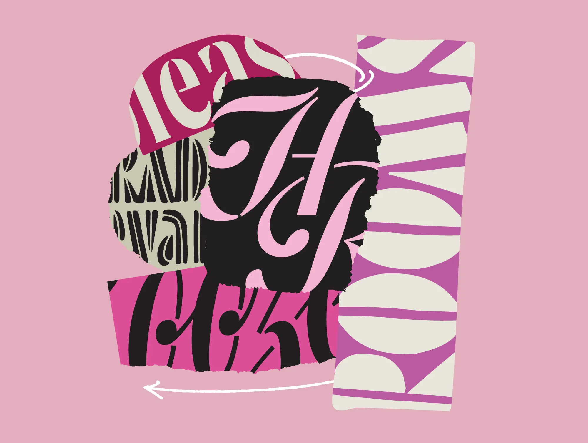
8. Expressive Typography
Typography in 2026 is loud, emotional, and unapologetically personal. Designers are moving past the idea of letters as static shapes and into type that feels performative, like it’s acting out the message. Words stretch, shrink, and sway to create rhythm on the page or screen. The result is typography that feels more like visual music than written language.
Design Credit: Anastasia Sharapova
Design Credit: Boo Republic
This shift is being driven by motion and mood. Type is increasingly dynamic, not just in animation but in spirit. Designers are layering textures, mixing analog and digital influences, and embracing imperfections that feel human. Experimental kerning, shifting baselines, and expressive ligatures are giving even familiar fonts a sense of character. It’s typography that moves, even when it’s standing still.
Design Credit: Marb Studio
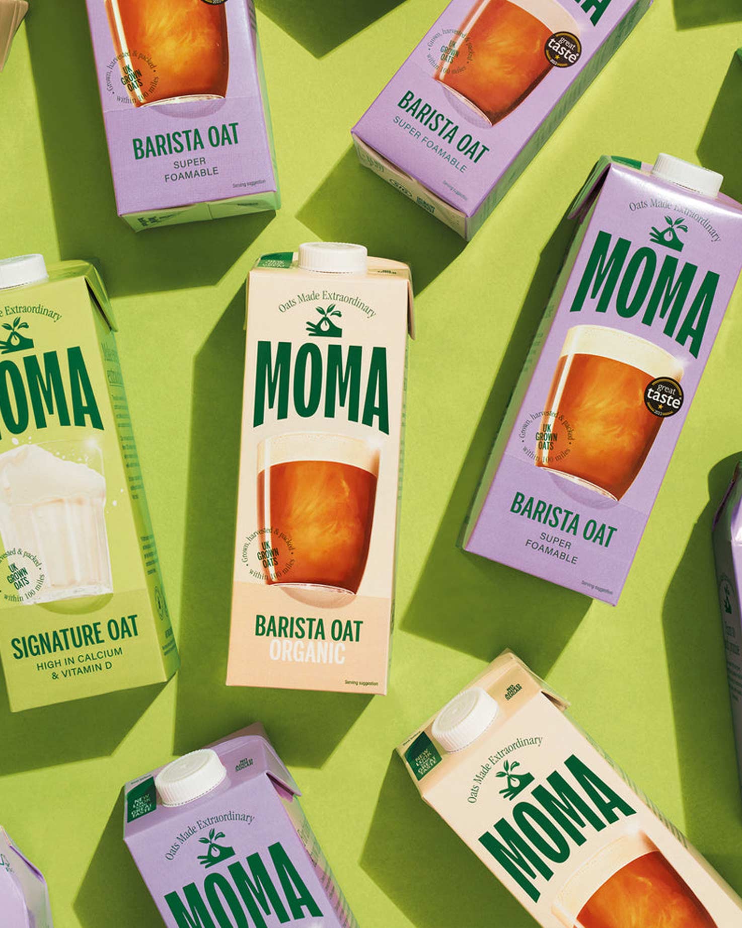
Design Credit: Moma Foods
Design Credit: Made Up Studio
Design Credit: Coen Pohl Design
In a landscape where minimalism still dominates, expressive typography adds the spark. It invites curiosity, emotion, and a bit of rebellion. Whether splashed across a poster or woven into a brand identity, this trend shows how letters can do more than communicate, they can connect. Tip: Visit Future Fonts for your quick dose of expressive, experimental typefaces.
Design Credit: Hugeiko
Design Credit: Omni Design
Design Credit: COLLINS
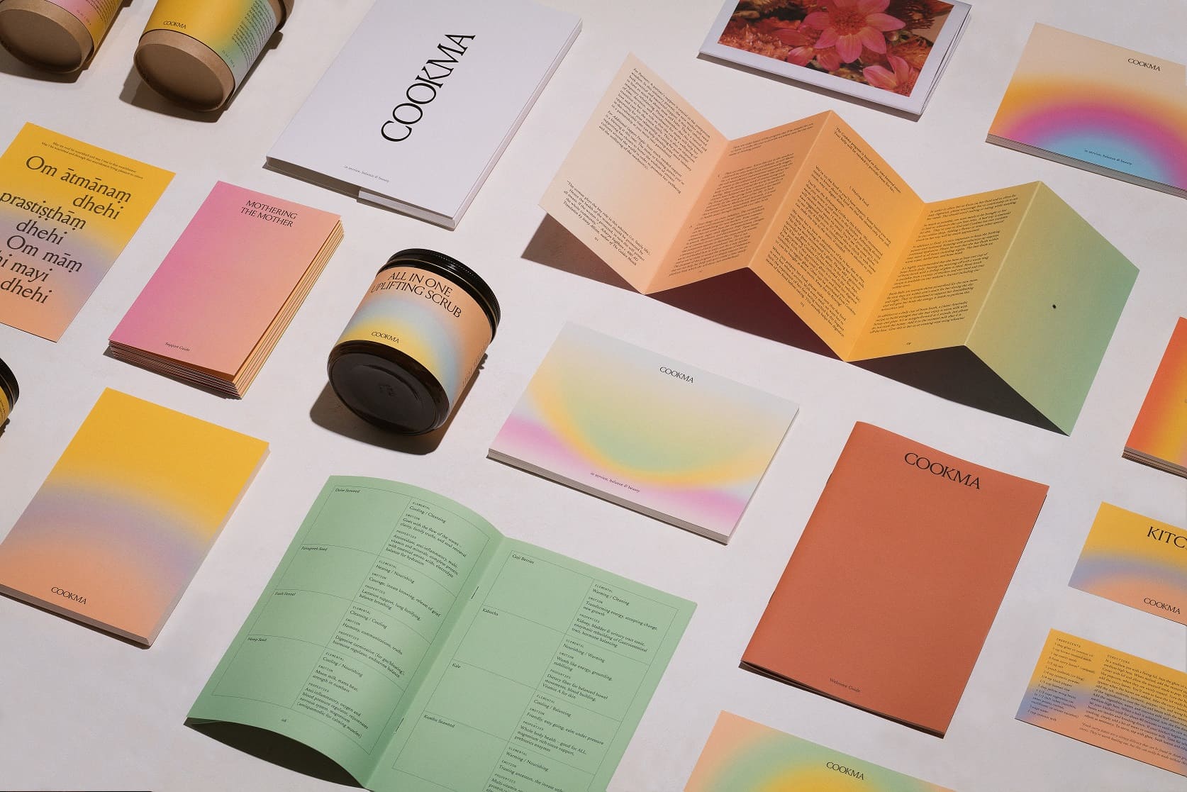
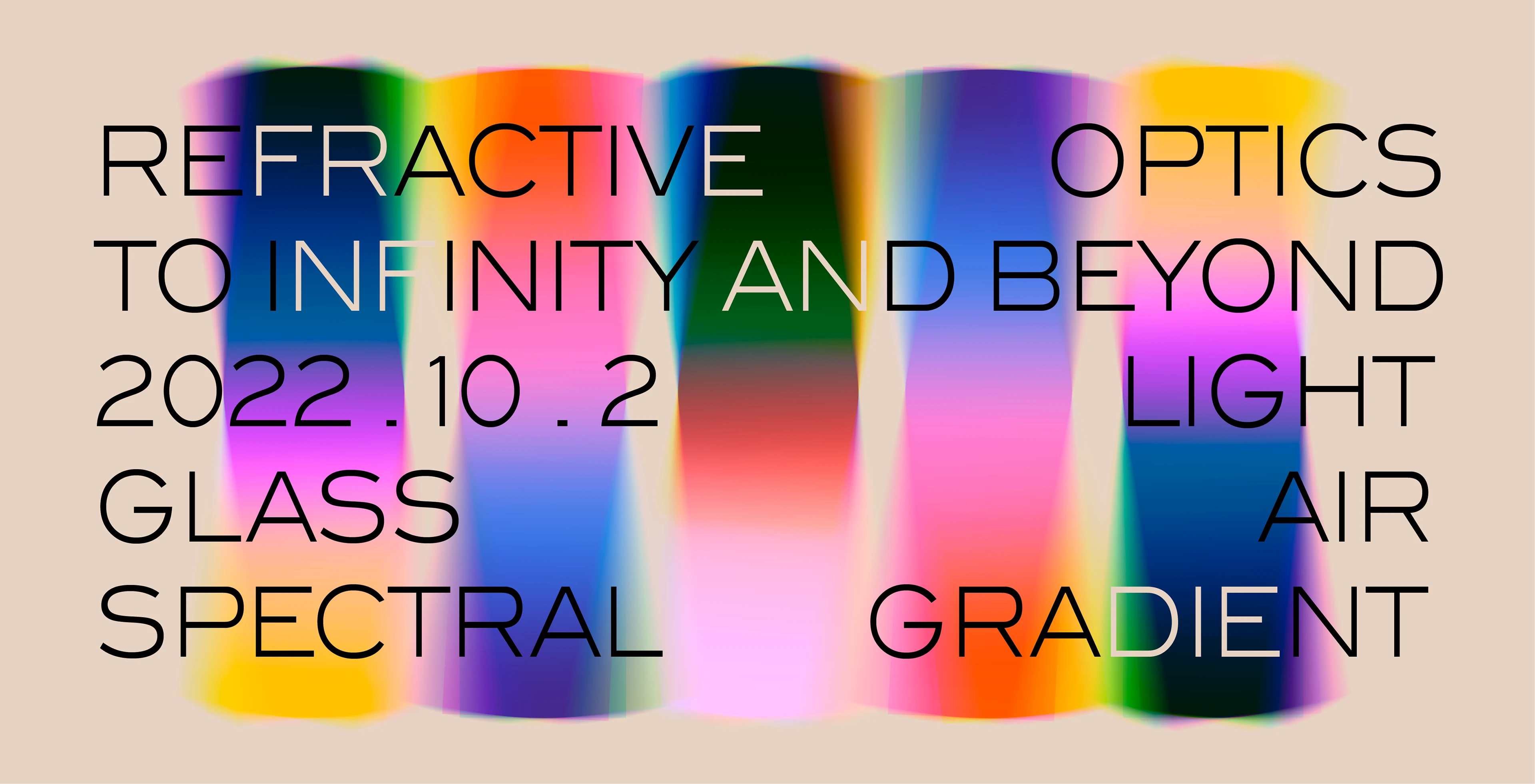
9. Gradients
Gradients have officially shed their early-2010s tech-startup reputation and become one of the most versatile graphic design trends of 2026. What used to feel like a flashy background effect is now a sophisticated design language in its own right. Today’s gradients are subtle, atmospheric, and used with intention, more painterly than neon.
Design Credit: Ragged Edge
Designers are using gradients to add depth, emotion, and movement without overwhelming the composition. We’re seeing soft transitions between natural tones, layered transparencies, and blends that mimic light or texture rather than flat color fades. In branding, they’re helping bridge minimalism and expressiveness, creating visual richness that still feels clean and modern.
Design Credit: Porto Rocha
Design Credit: All Right Graphics
Design Credit: Landscape
Design Credit: Necula Creative
Free tools are popping up more and more to give designers access to quick gradients for web and print use. The beauty of this trend is how adaptable it is. Gradients work beautifully across digital, print, and motion, adding that hint of energy that static color blocks can’t. Whether it’s a faint blur behind typography or a bold shifting spectrum in a hero image, gradients in 2026 remind us that color doesn’t have to stay still, it can tell a story all on its own.
Design Credit: Damon Xart
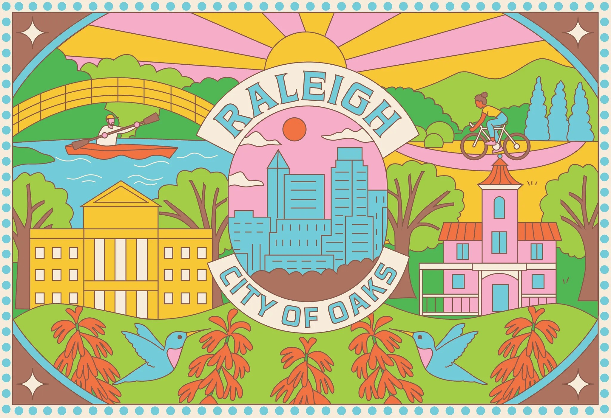
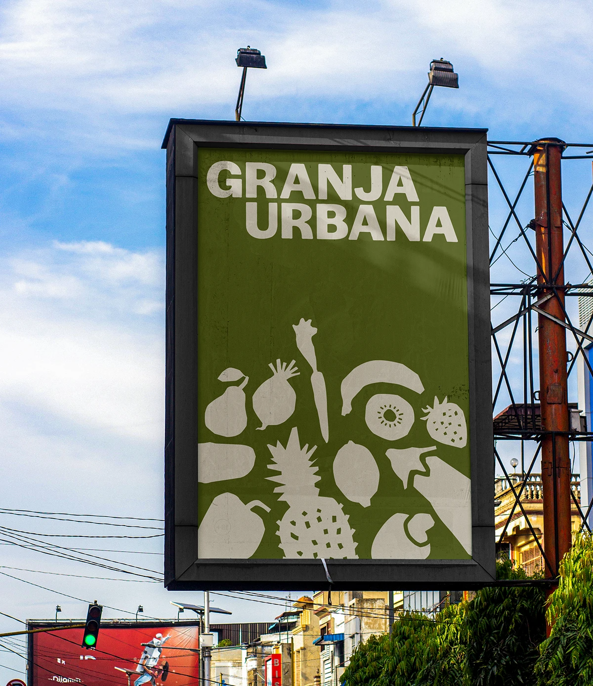
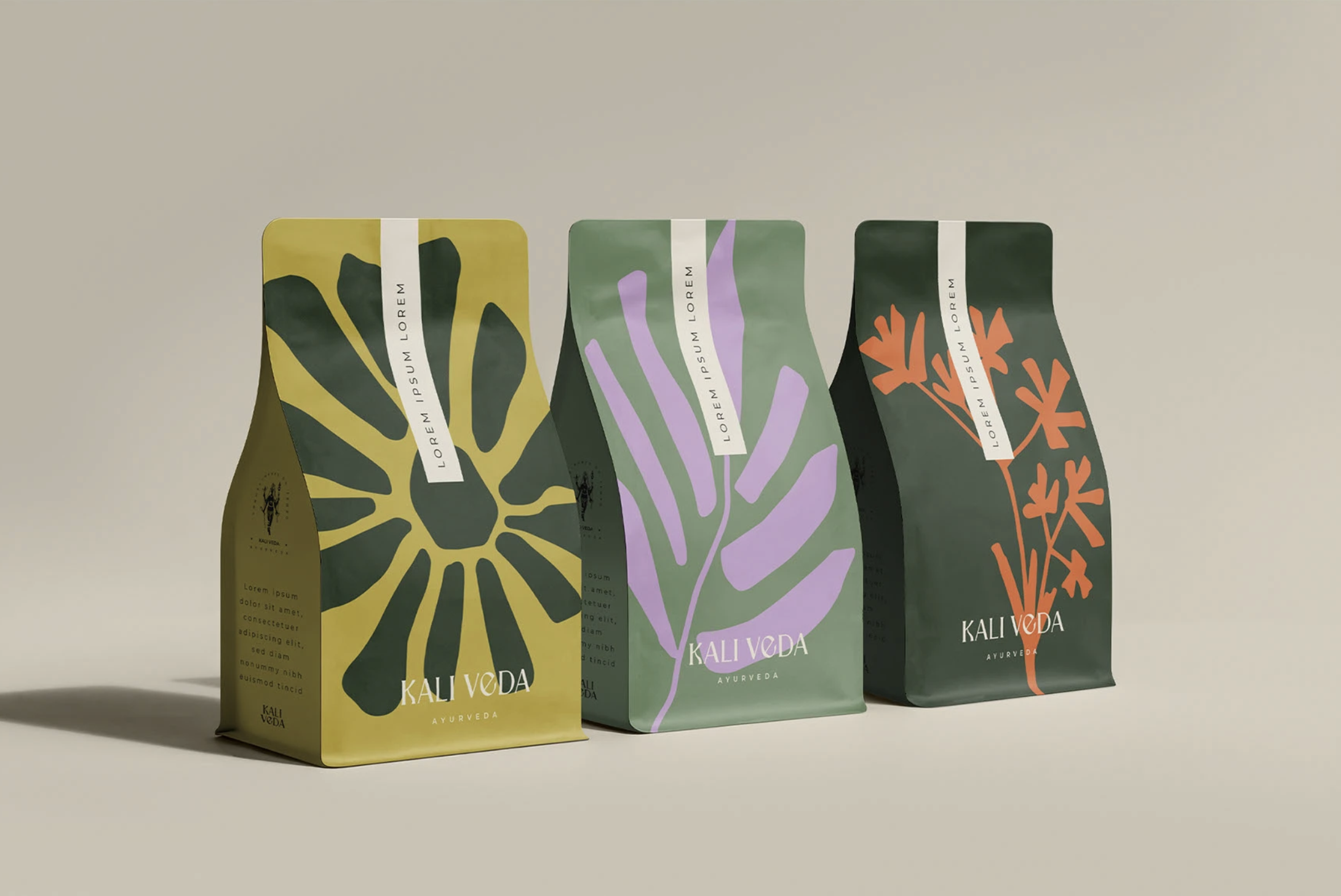
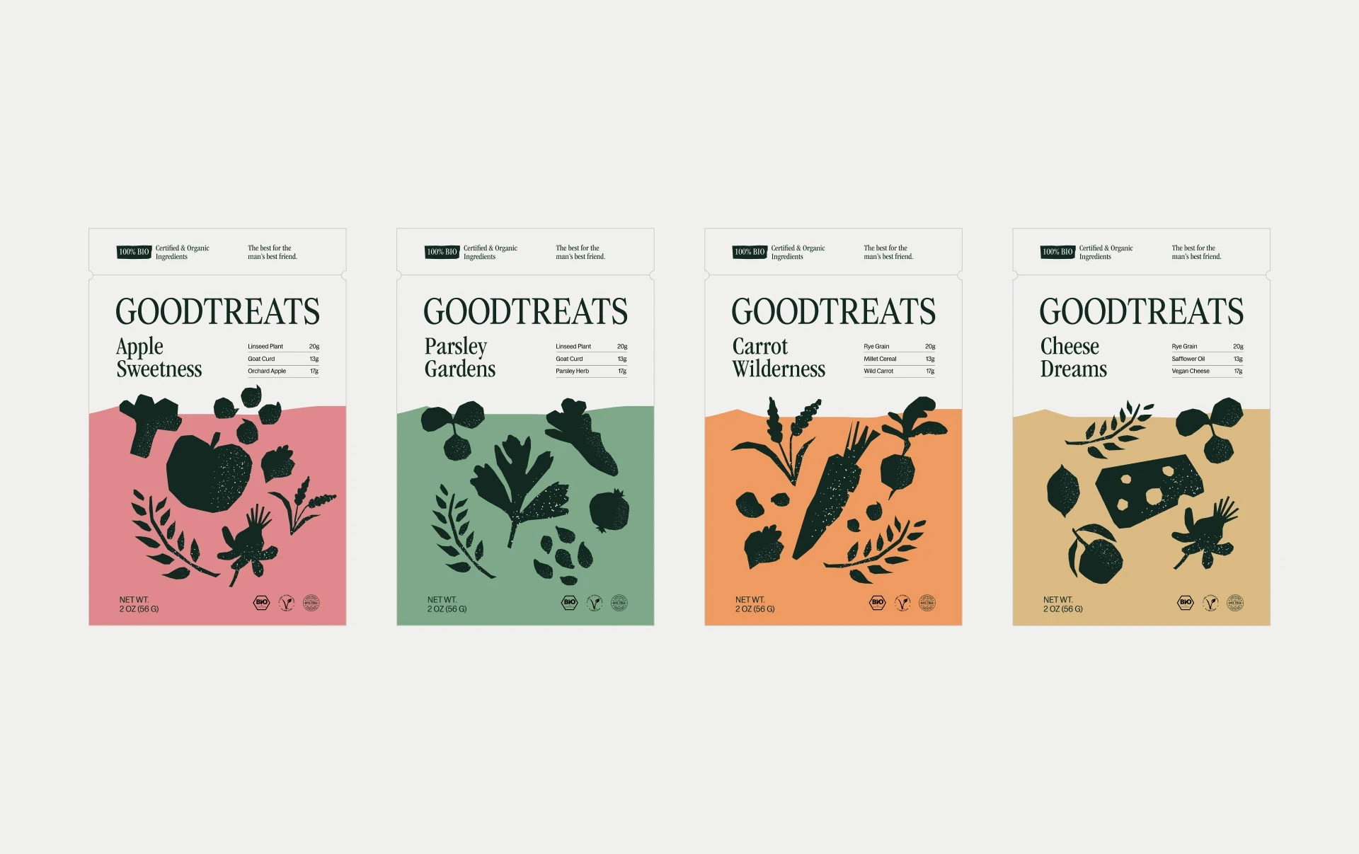
10. Organic Shapes
The sharp edges of geometric design are softening in 2026, giving way to more organic shapes that feel fluid and alive. Think flowing curves, irregular blobs, and forms that look like they were drawn by hand instead of plotted by a ruler. These shapes bring warmth and movement to layouts, balancing the precision of digital design with something more natural and human.
Design Credit: Mihaela Aleksandrova
Design Credit: Heitor Malheiro
Design Credit: Mihaela Aleksandrova
What’s driving this shift is emotion. Organic shapes feel approachable, they invite you in rather than standing at a distance. Designers are using them to frame photography, highlight text, and create subtle motion in digital interfaces. In branding, they work beautifully alongside clean typography or minimalist layouts, adding personality without clutter.
Design Credit: LovHer Studio
Design Credit: Creative Mules Team
Design Credit: Heitor Malheiro
Design Credit: Halo Lab
This trend reminds us that not everything needs to be perfect to be beautiful. The gentle asymmetry of organic forms helps designs feel more grounded and relatable. Whether used in backgrounds, illustrations, or logos, these shapes bring a sense of rhythm and softness that connects with how people actually experience the world. Imperfect, but full of character.
Design Credit: Un Barco
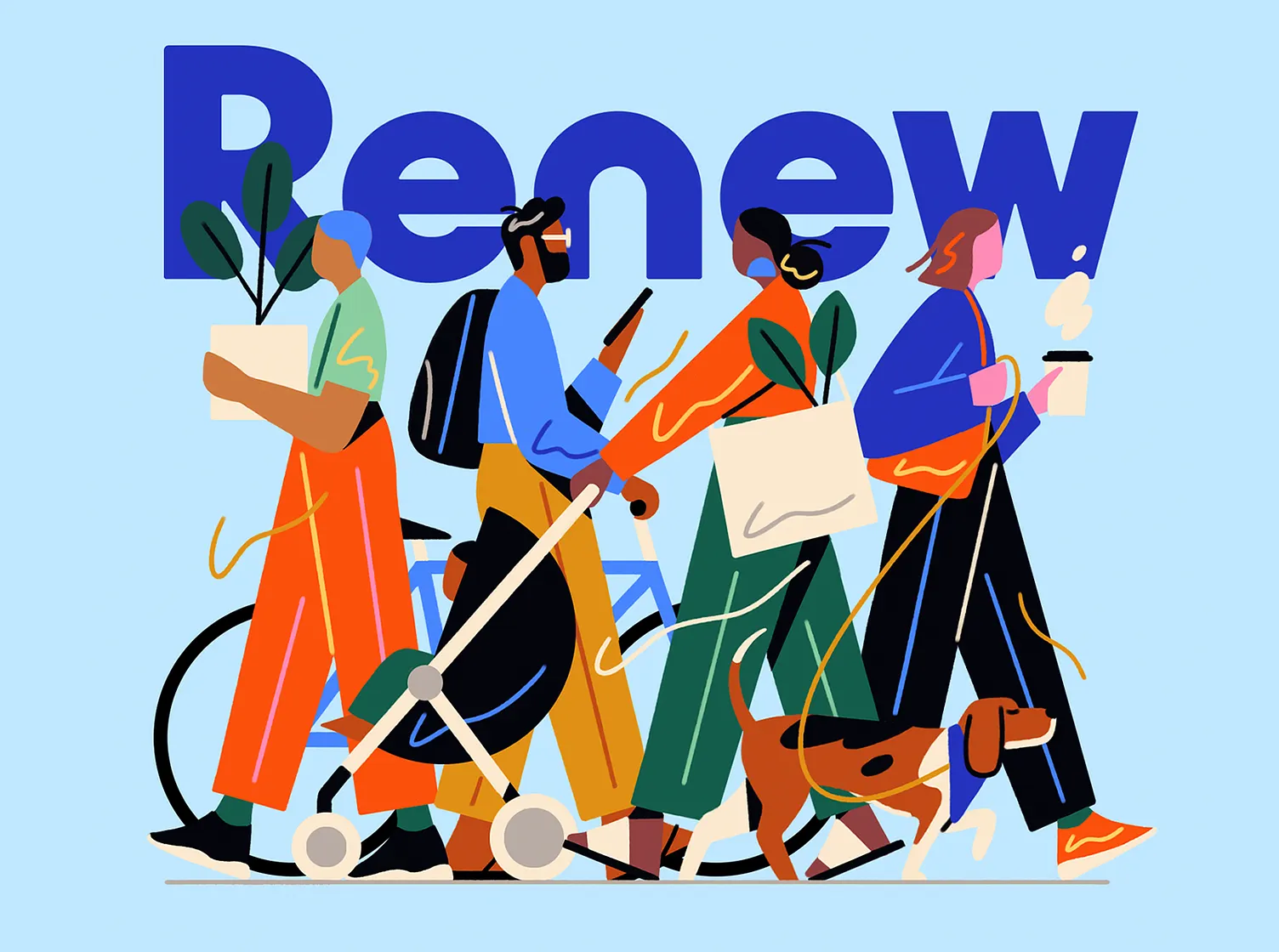
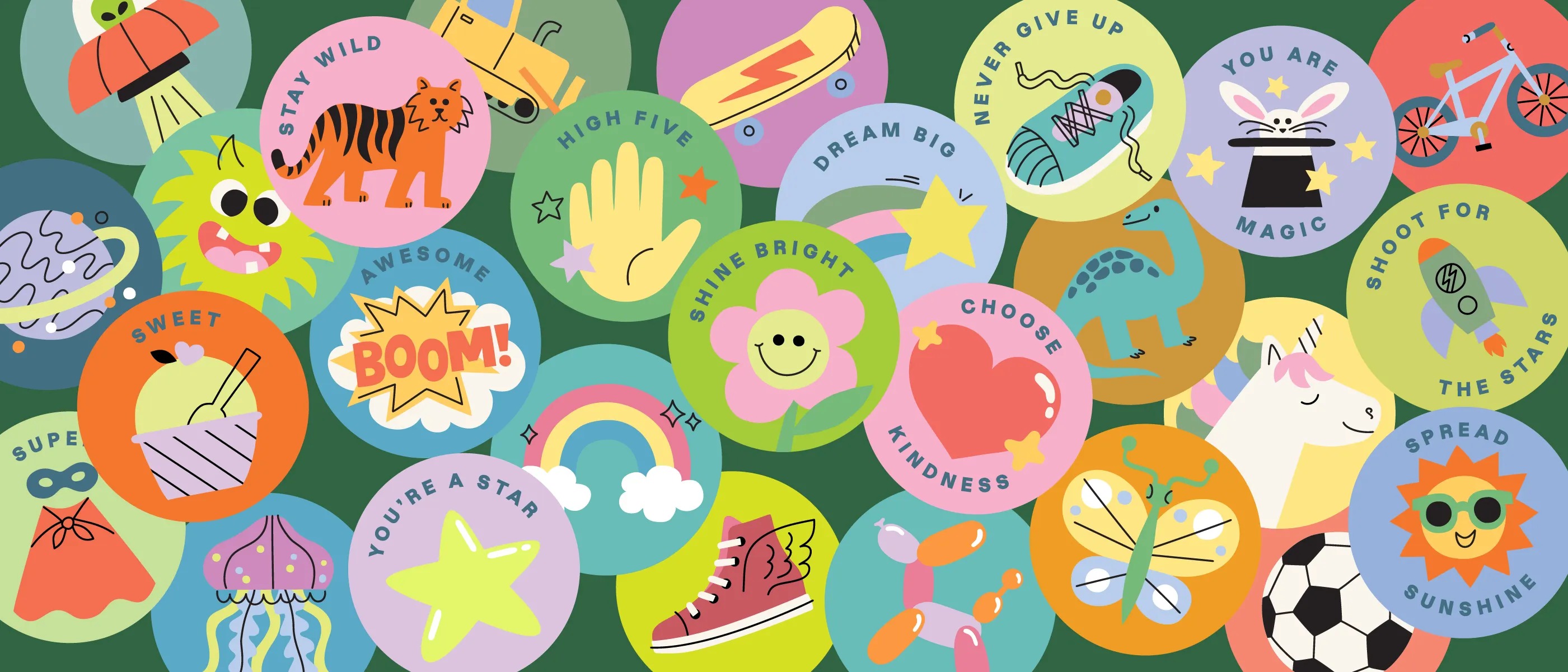
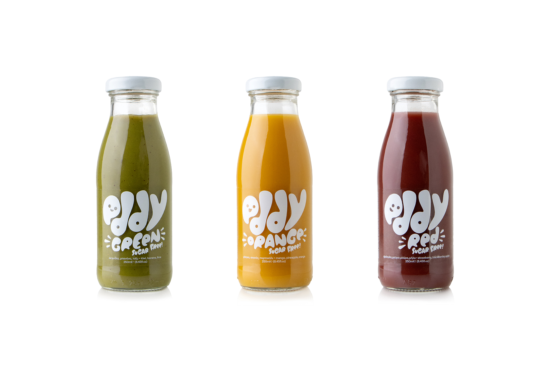
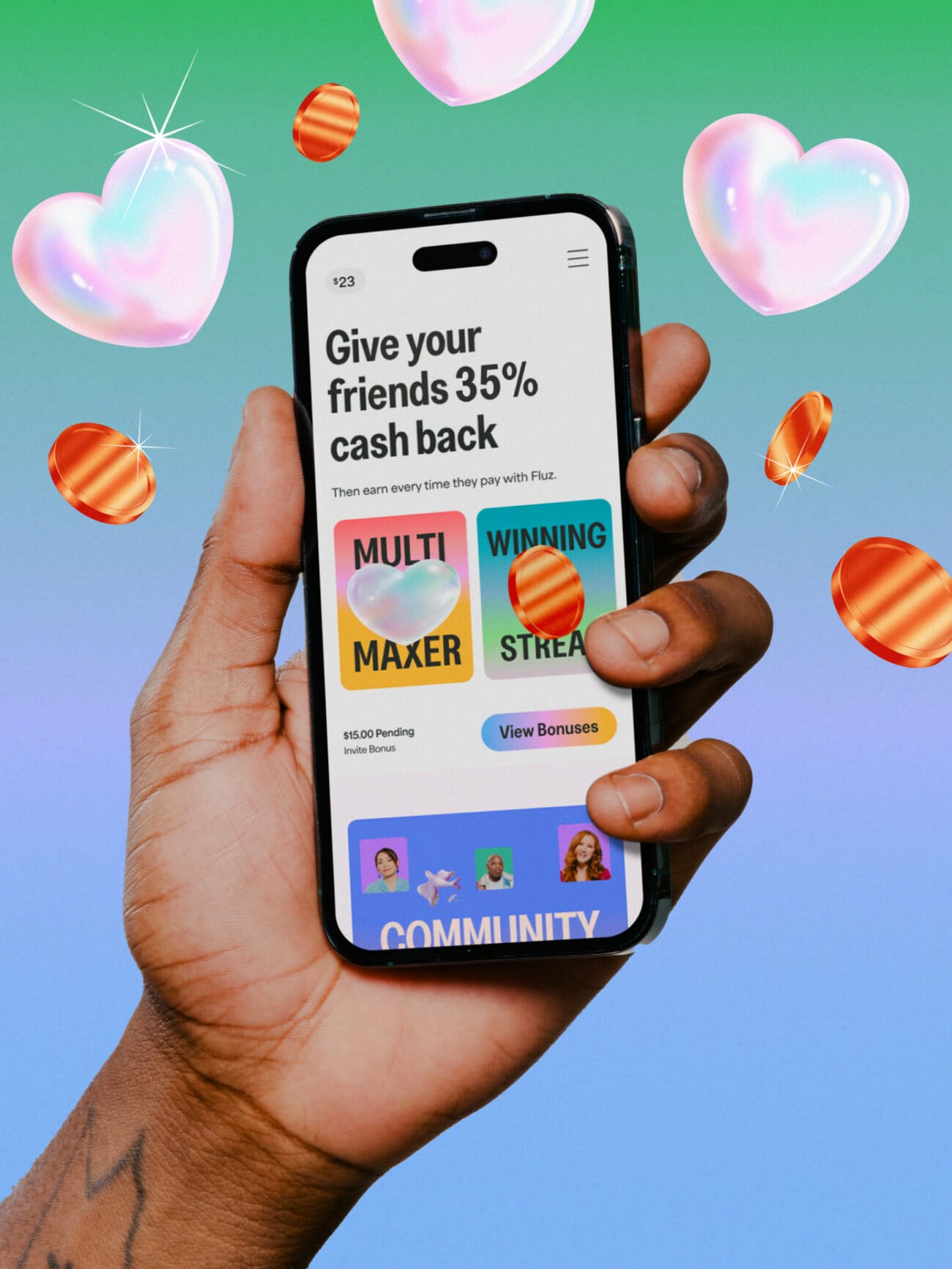
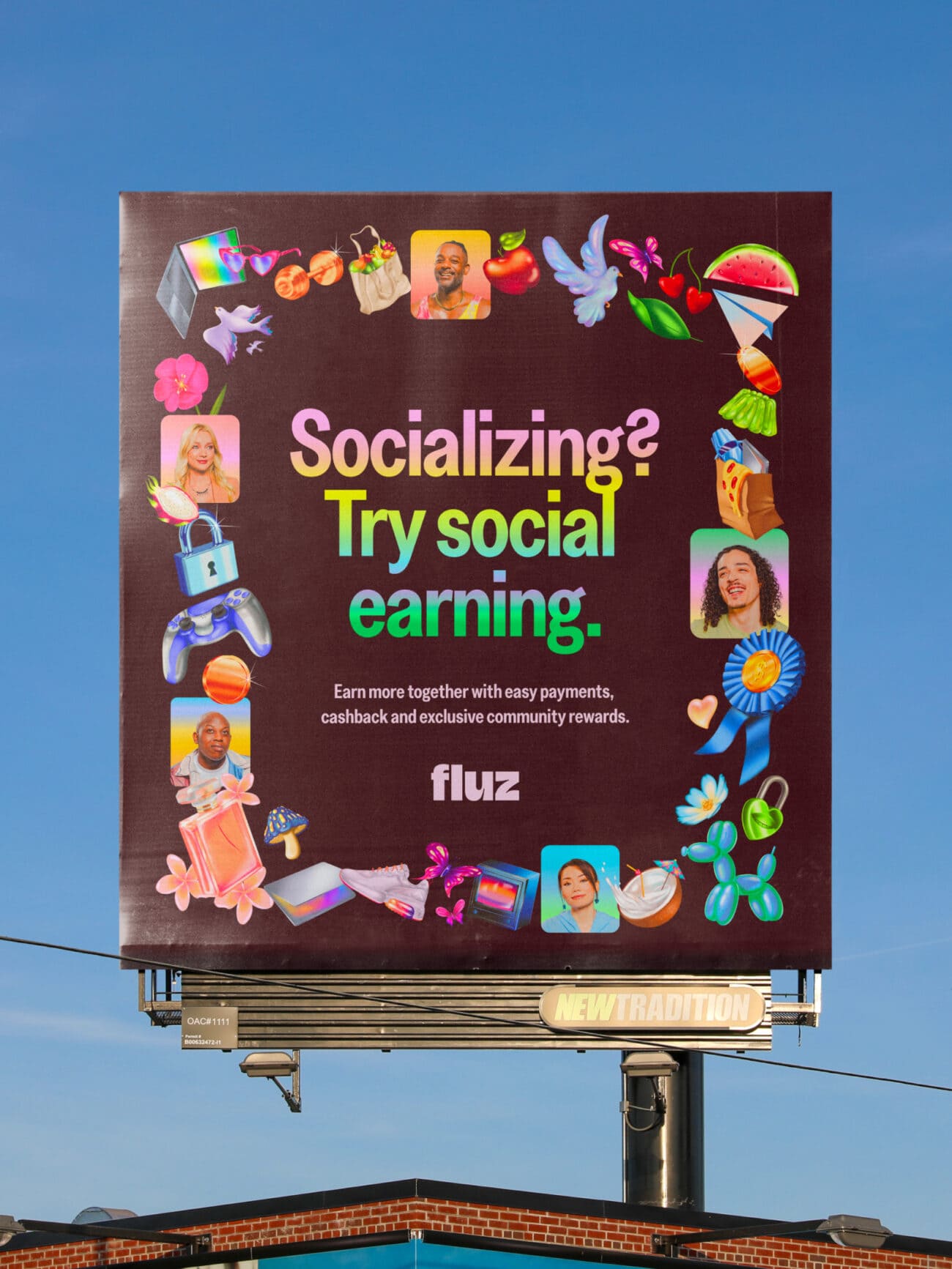
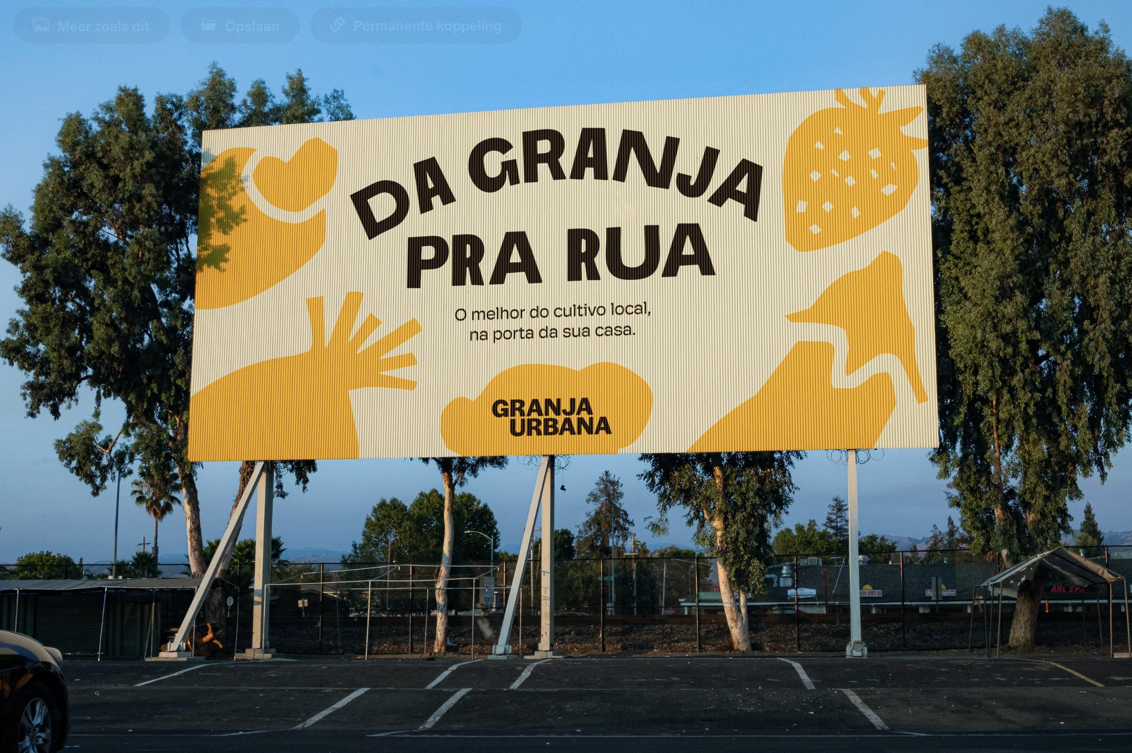
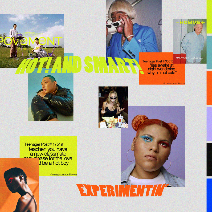
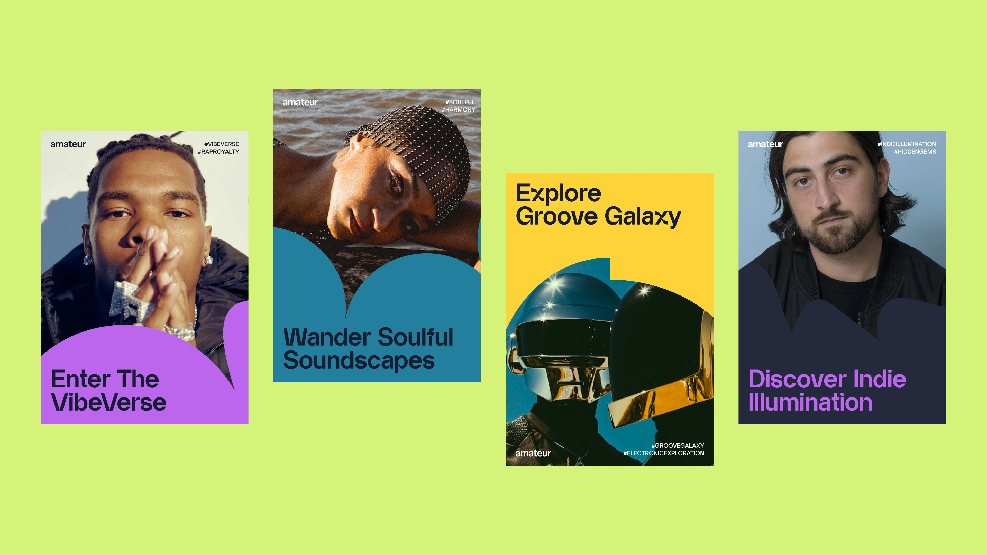
11. Playful Design
Design in 2026 has a sense of humor again, and it’s contagious. The Playful trend is all about designs that don’t take themselves too seriously. Bright colors, experimental typography, and surprising compositions make this style feel alive and spontaneous. It’s the visual equivalent of a good mood. Energetic, optimistic, and impossible to ignore.
Design Credit: STINK STUDIOS
Design Credit: Backbone Branding
Design Credit: Buzz & Co.
Design Credit: STINK STUDIOS
What’s new this year is how refined the chaos has become. Designers are learning to balance bold experimentation with purpose. You’ll see layered patterns, mismatched fonts, and quirky illustrations, but all anchored by smart hierarchy and thoughtful rhythm. It’s not random; it’s intentional joy. That’s what makes it work across so many touchpoints, from packaging and posters to digital campaigns.
Design Credit: Taylor Baystone
Design Credit: Ilía Tuma
Design Credit: Boo Republic
At its heart, playful design is about connection. It reminds us that creativity can be clever and fun at the same time. In a world that often leans toward polish and perfection, this trend brings back personality, warmth, and a wink of surprise. It’s design that smiles first, and gets remembered later.
Design Credit: RDLB
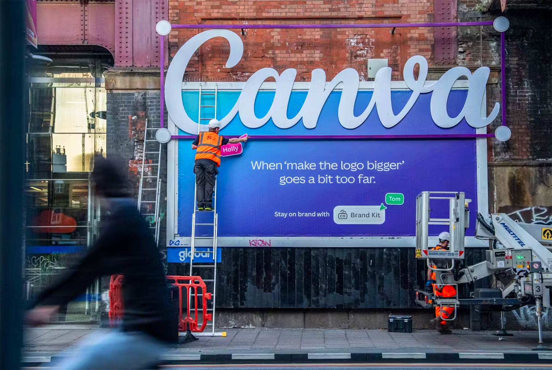
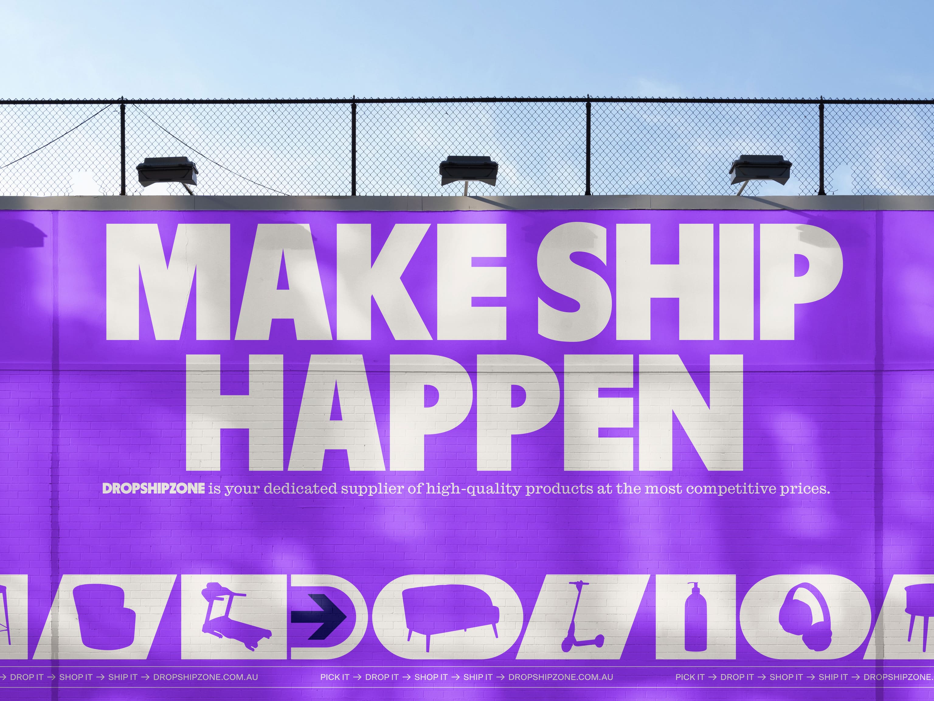
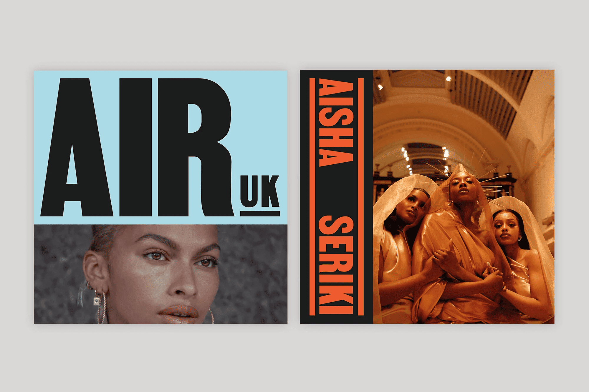
12. Bold Minimalism
Minimalism isn’t going anywhere in 2026, it’s just getting louder. Bold Minimalism takes the clean, structured foundations of classic minimal design and injects them with contrast, character, and attitude. It’s not about stripping things back to the point of emptiness anymore; it’s about knowing exactly what deserves the spotlight and amplifying it.
Design Credit: Christopher Doyle & Co.
Design Credit: Will Holmes
Designers are embracing larger typography, striking color blocks, and purposeful negative space that feels alive rather than empty. The trick is in the balance, enough restraint to stay refined, but enough risk to feel fresh. You’ll see this style everywhere from editorial layouts to brand identities, where one strong visual or phrase carries the whole composition.
Design Credit: Lowkey Design
Design Credit: Millie Tyler
Design Credit: Koto
The appeal of Bold Minimalism lies in its confidence. It’s simple, but never shy. In a landscape overflowing with visual noise, this trend cuts through with clarity and intention. It’s proof that you don’t need to say more, you just need to mean every detail.
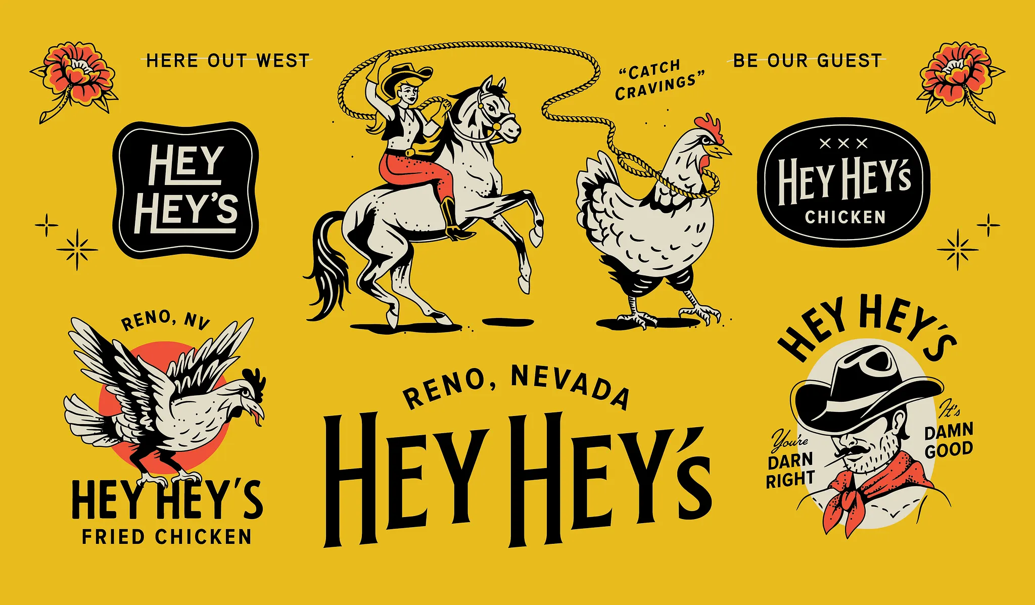
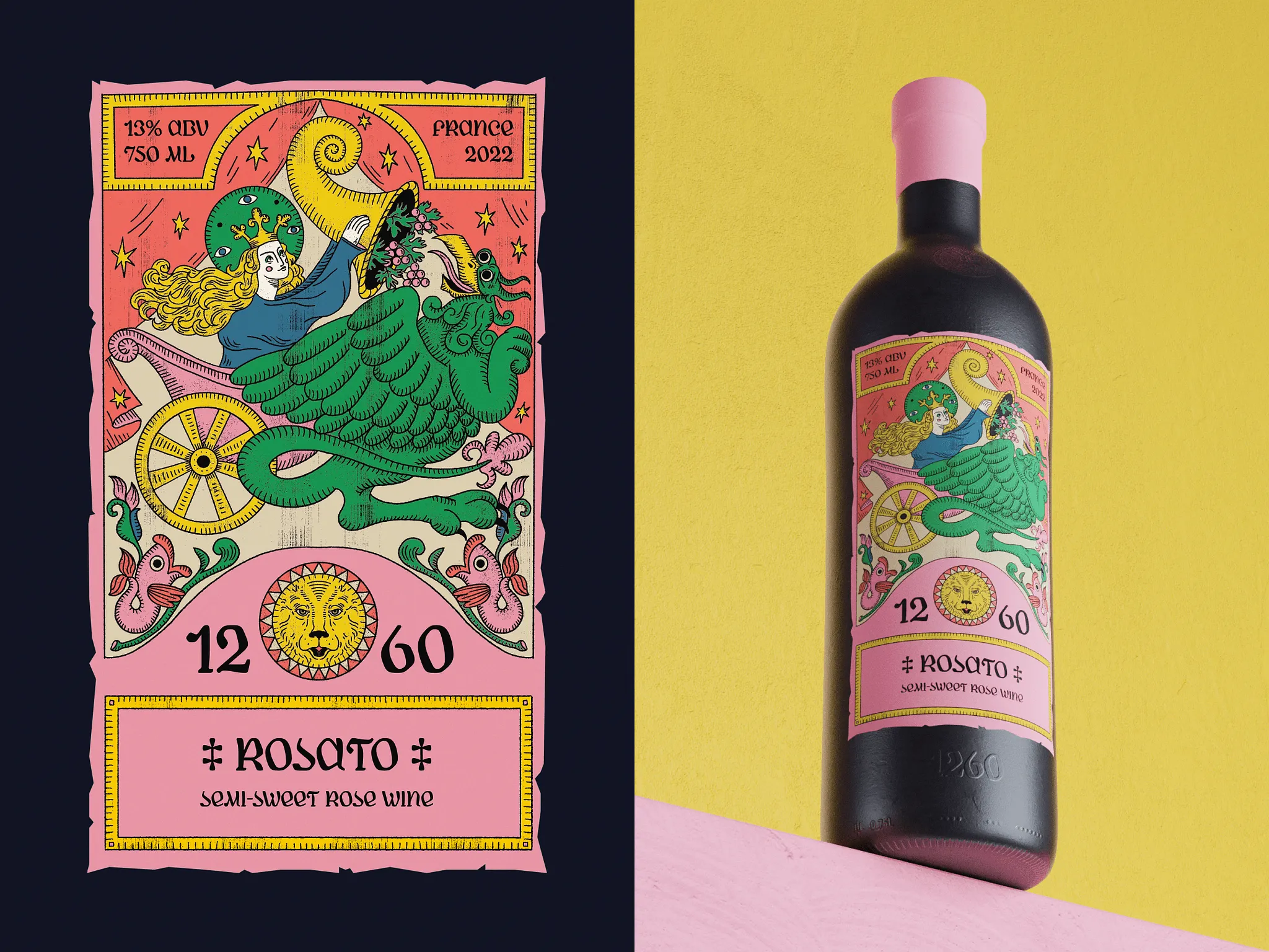
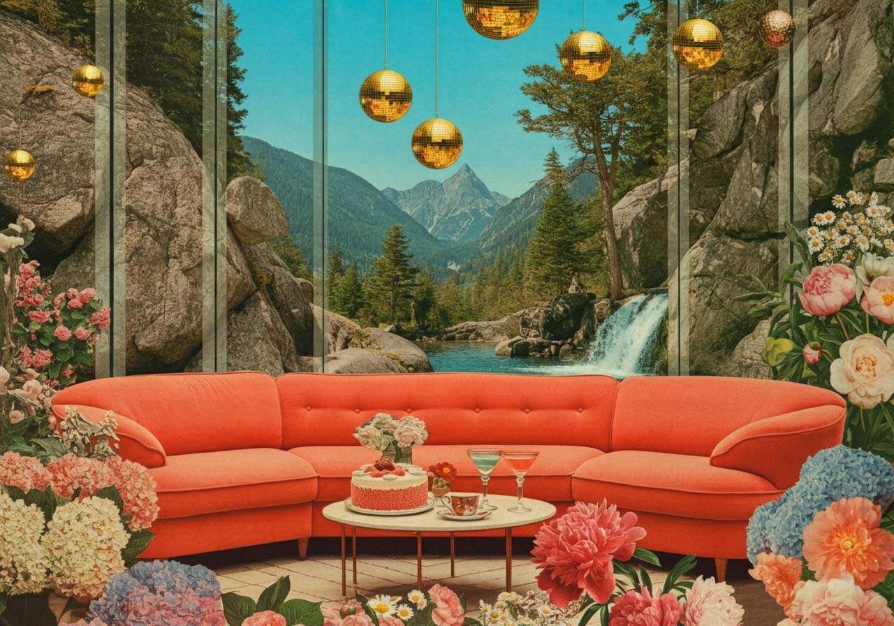
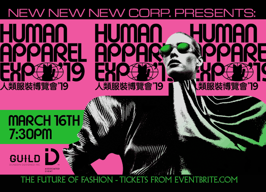
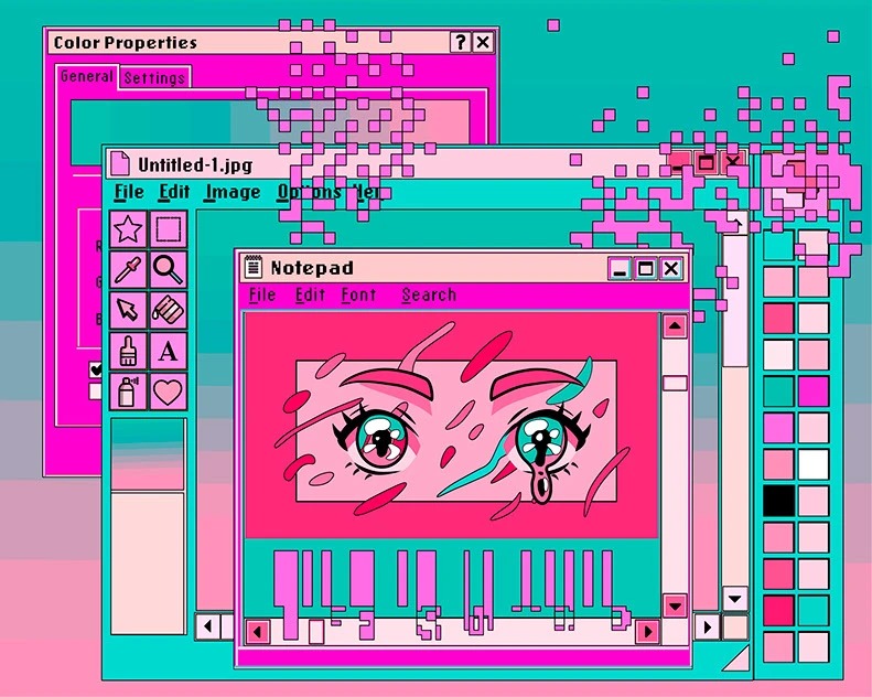
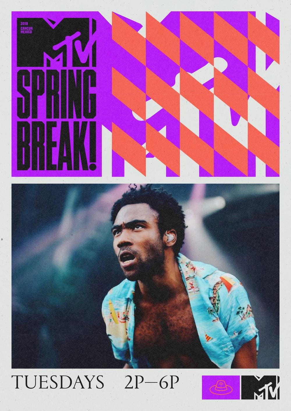
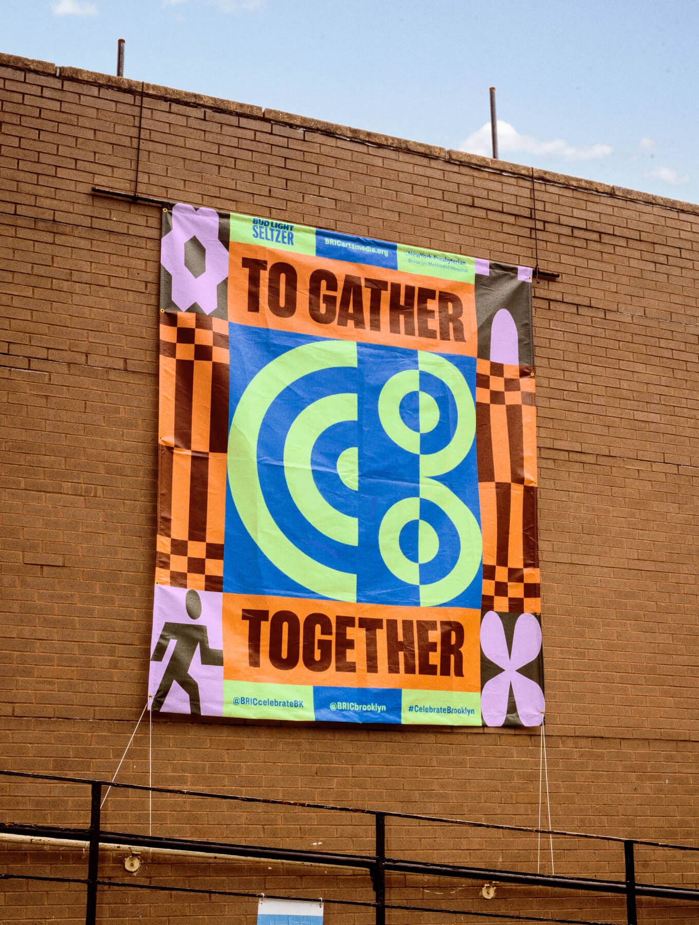
13. Retro-Futurism
Retro-Futurism is shining brighter than ever in 2026. It’s that bold fusion of nostalgia and innovation, where vintage sci-fi meets modern tech. Designers are drawing from the optimism of mid-century space age aesthetics, the glossy rebellion of Y2K, and the stripped-down rawness of Brutalism to create visuals that feel both nostalgic and visionary. Chrome gradients, metallic textures, and pixel-inspired typography meet geometric layouts and experimental lighting to form a look that’s as cinematic as it is digital.
Design Credit: Han Gao
Design Credit: Atnn Design
Design Credit: Daniel Blackball
What makes this trend so magnetic is its sense of contrast. Soft glows pair with sharp edges, grainy textures meet luminous neons, and rigid grids collide with fluid motion. It’s futuristic, but it remembers where it came from. Retro-Futurism works beautifully in branding, motion graphics, and editorial design, where that balance between analog warmth and digital precision makes every piece feel iconic.
Design Credit: Neosaga
Design Credit: Grafis Nusantara
Design Credit: Cyber Magician
Design Credit: Neosaga
At its core, this trend is about wonder, that sense of possibility design once promised us. In the mix of old ideals and new tools, Retro-Futurism reminds us that progress doesn’t mean forgetting the past; it means reimagining it with style.
Design Credit: Córdova Canillas
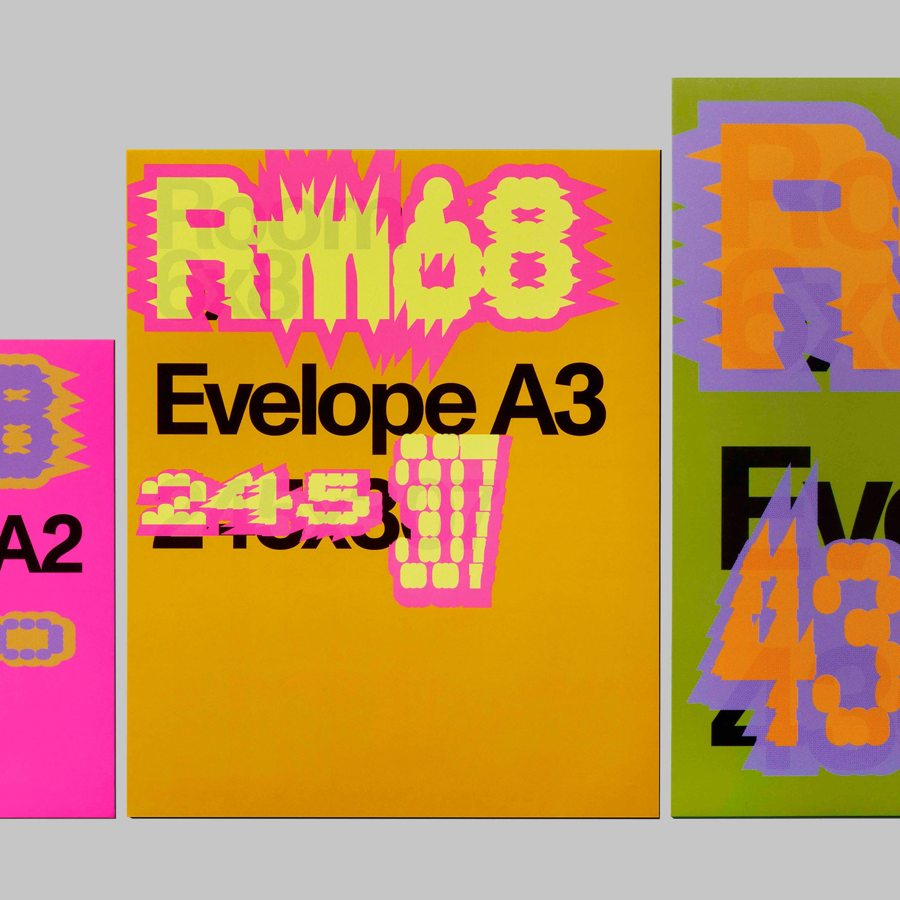
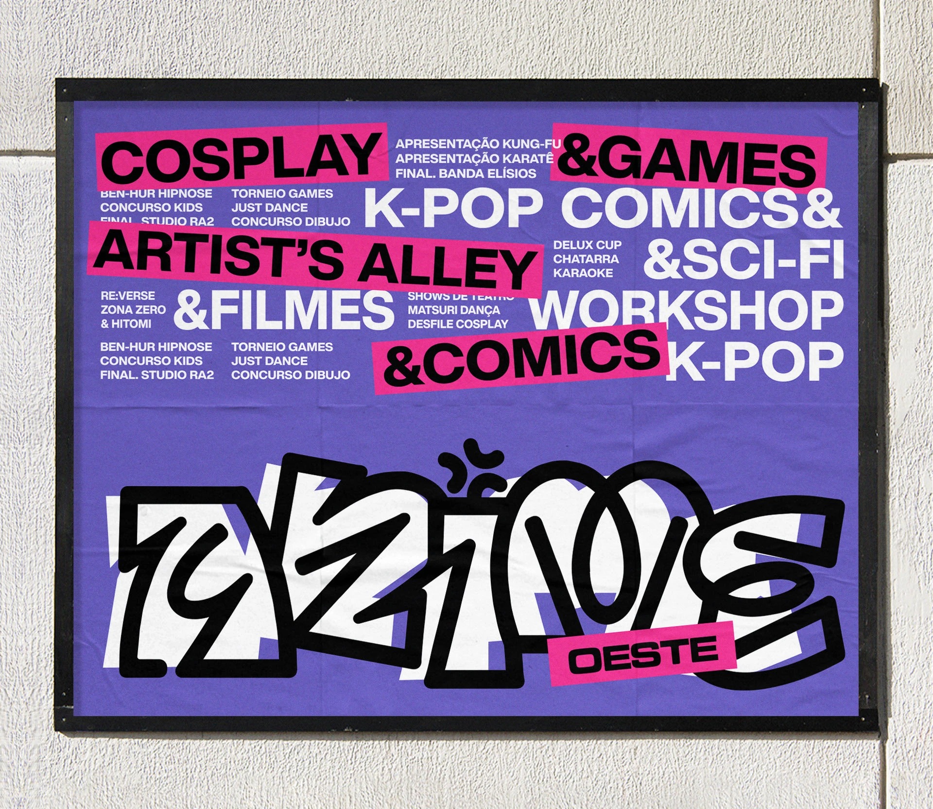
14. Maximalism
After years of stripped-back design and muted palettes, Maximalism is once again stealing the spotlight in 2026. It’s loud, layered, and unapologetically full of attitude. Designers are embracing excess, bold colors, clashing patterns, oversized typography, and compositions that feel like organized chaos. Where minimalism whispers, Maximalism shouts (and looks great doing it).
Design Credit: &Form
Design Credit: Nick Barclay
Design Credit: Michael Bierut
What’s driving the comeback is fatigue with sameness. The internet is saturated with clean grids and safe color palettes, so designers are pushing back by celebrating individuality. Think collaged textures, mismatched fonts, and elements that break out of their frames. Every detail is intentional, even if it looks spontaneous. It’s about letting creativity breathe without worrying if everything “matches.”
Design Credit: Antoine Pilette
Design Credit: Nohawk
The beauty of Maximalism lies in its freedom. It invites play and imperfection, and when done well, it tells a story with personality and emotion. From branding to album art to social graphics, this trend proves that too much can be just enough. In the ever-evolving world of graphic design trends 2026, Maximalism reminds us that sometimes more really is more.
Design Credit: The Young Jerks
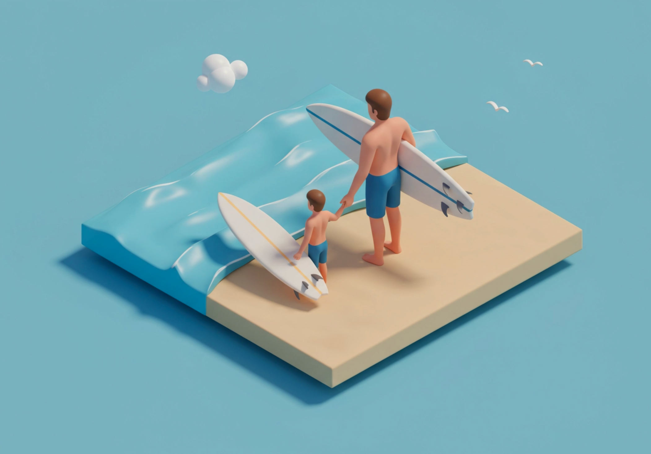
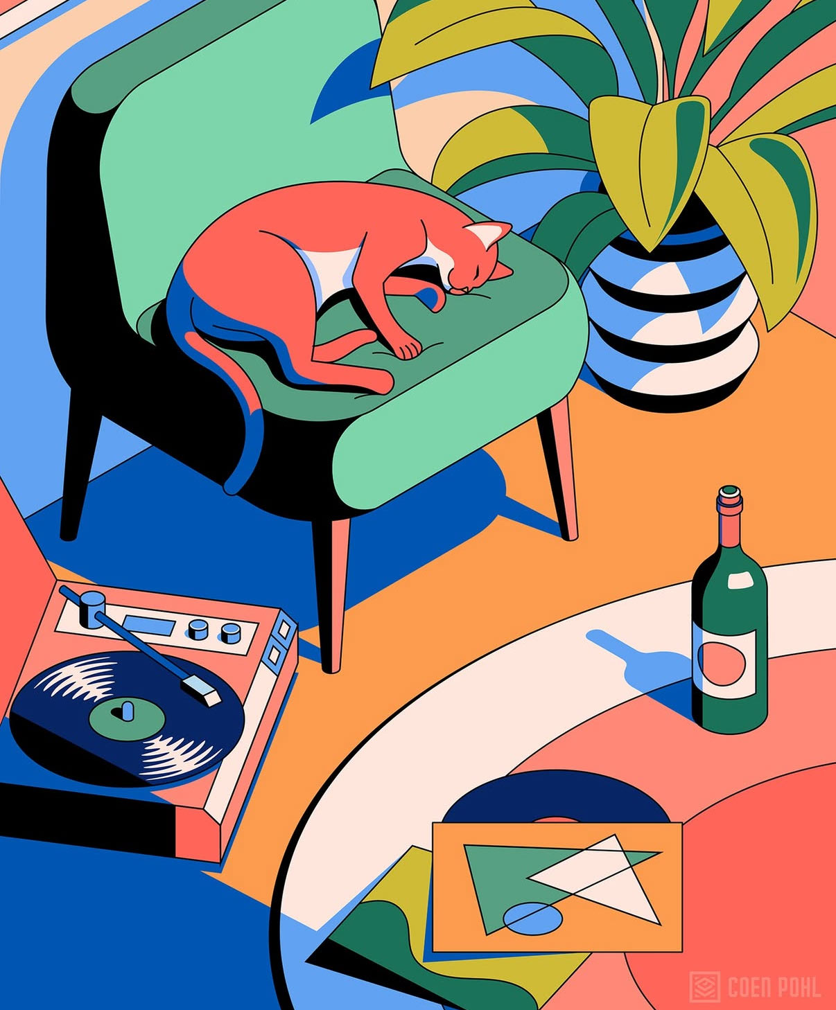
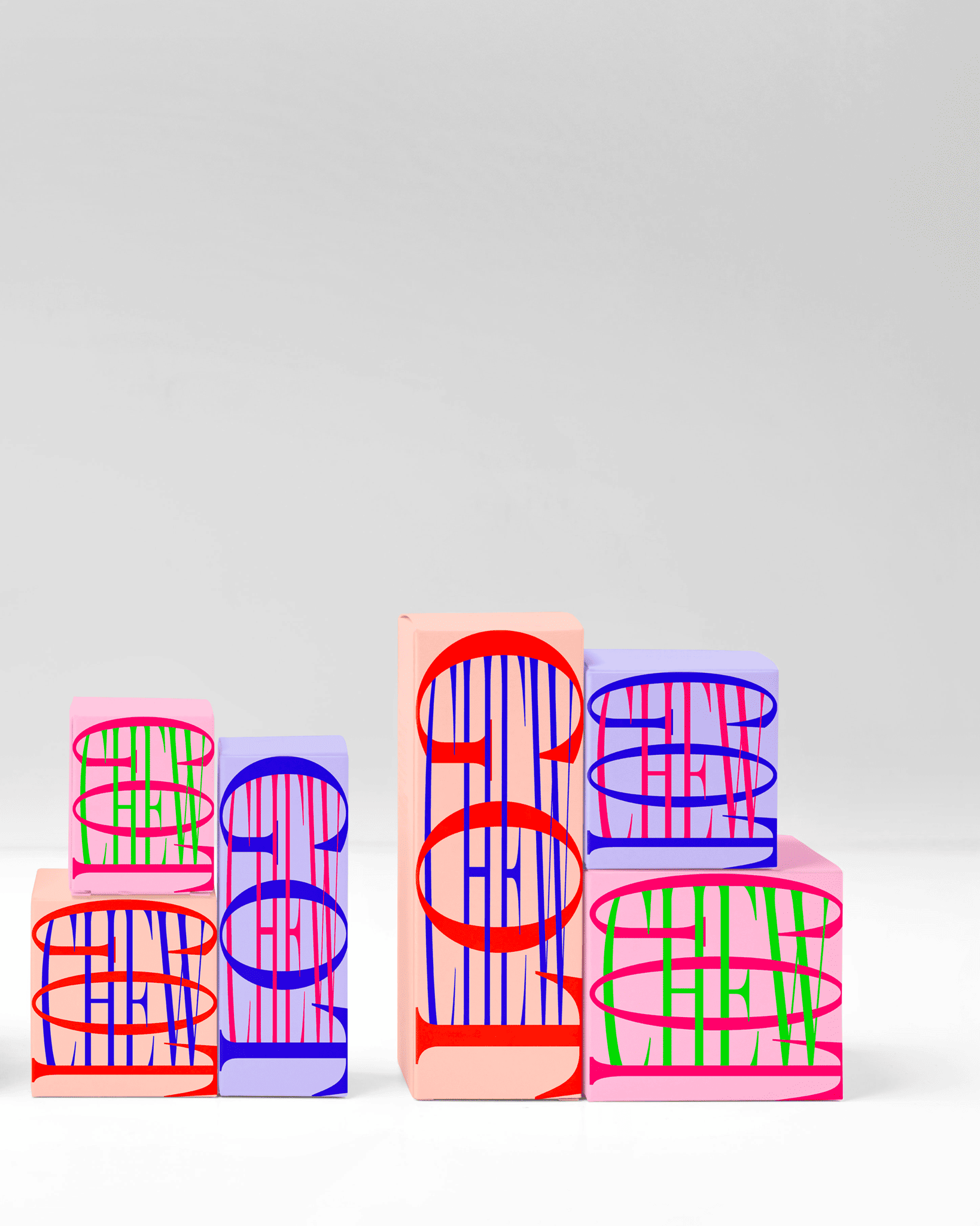
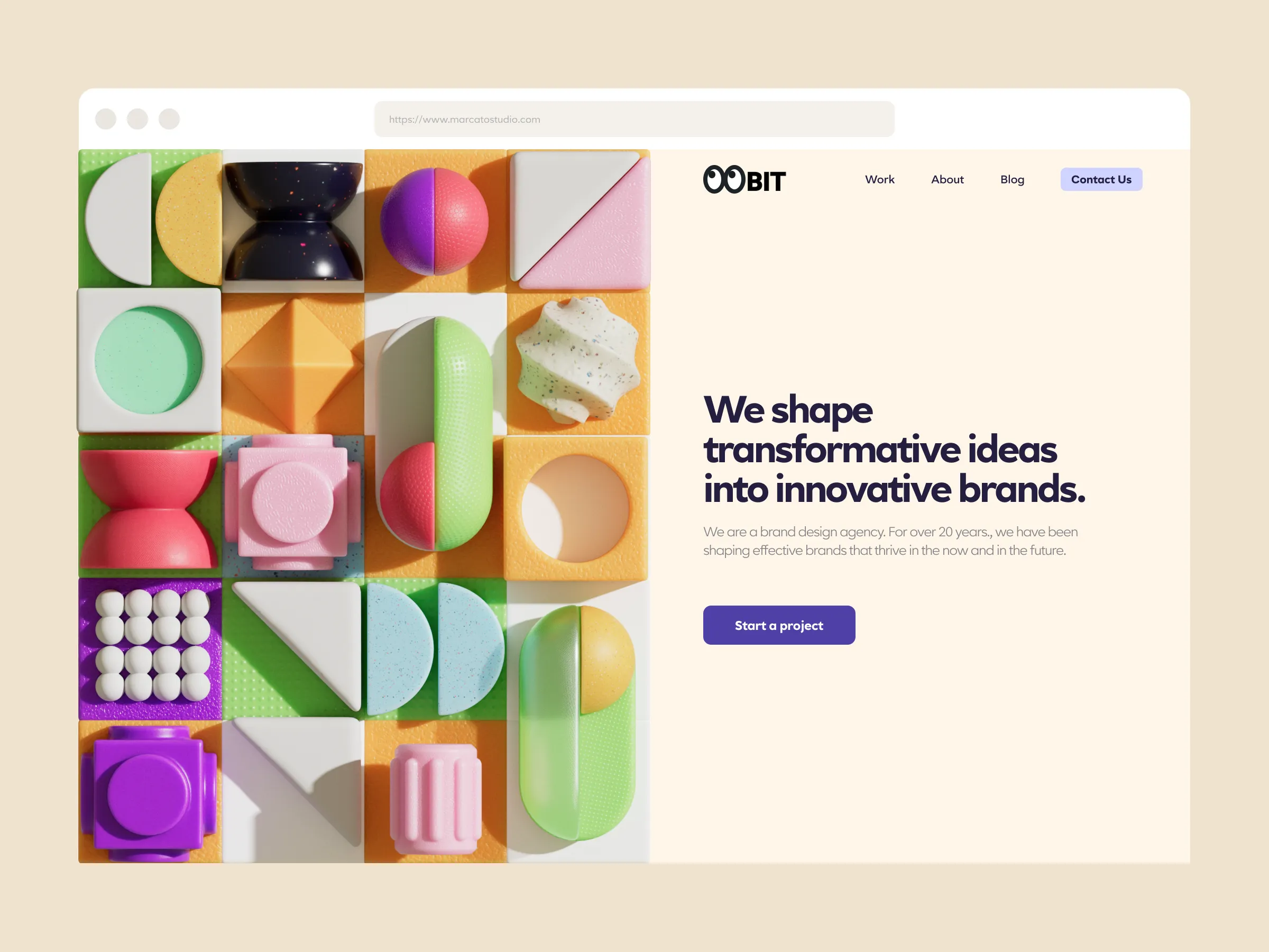
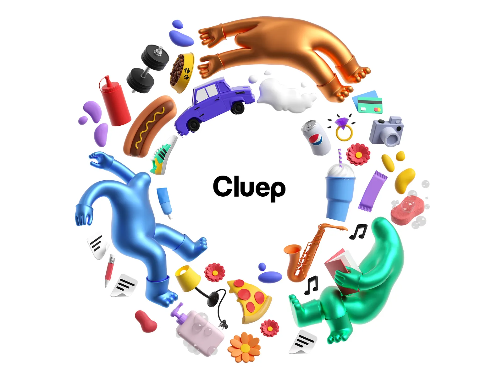
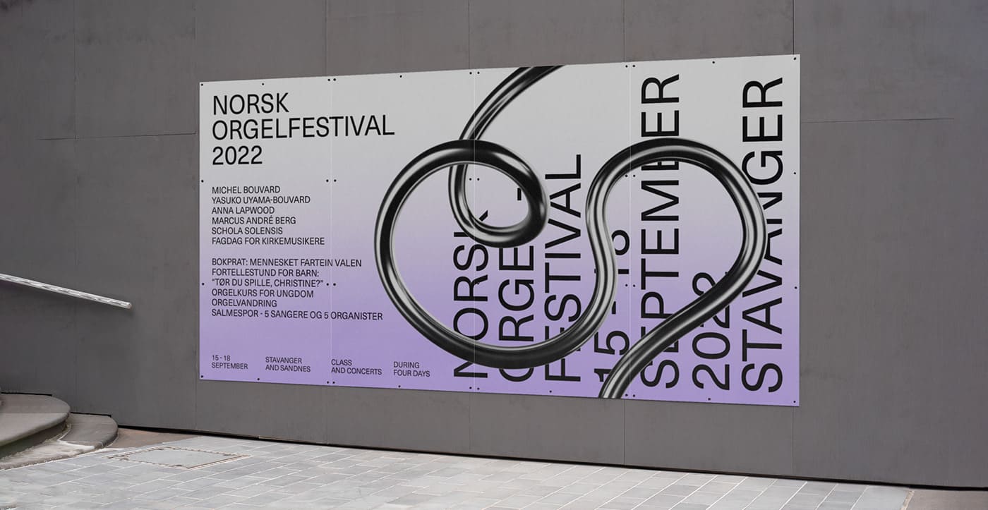
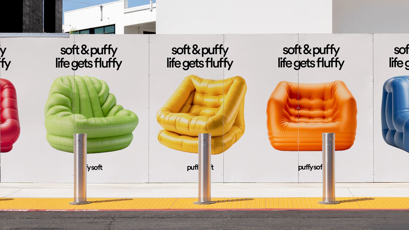
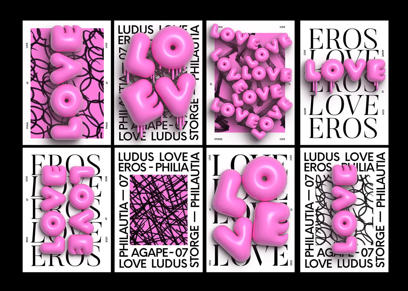
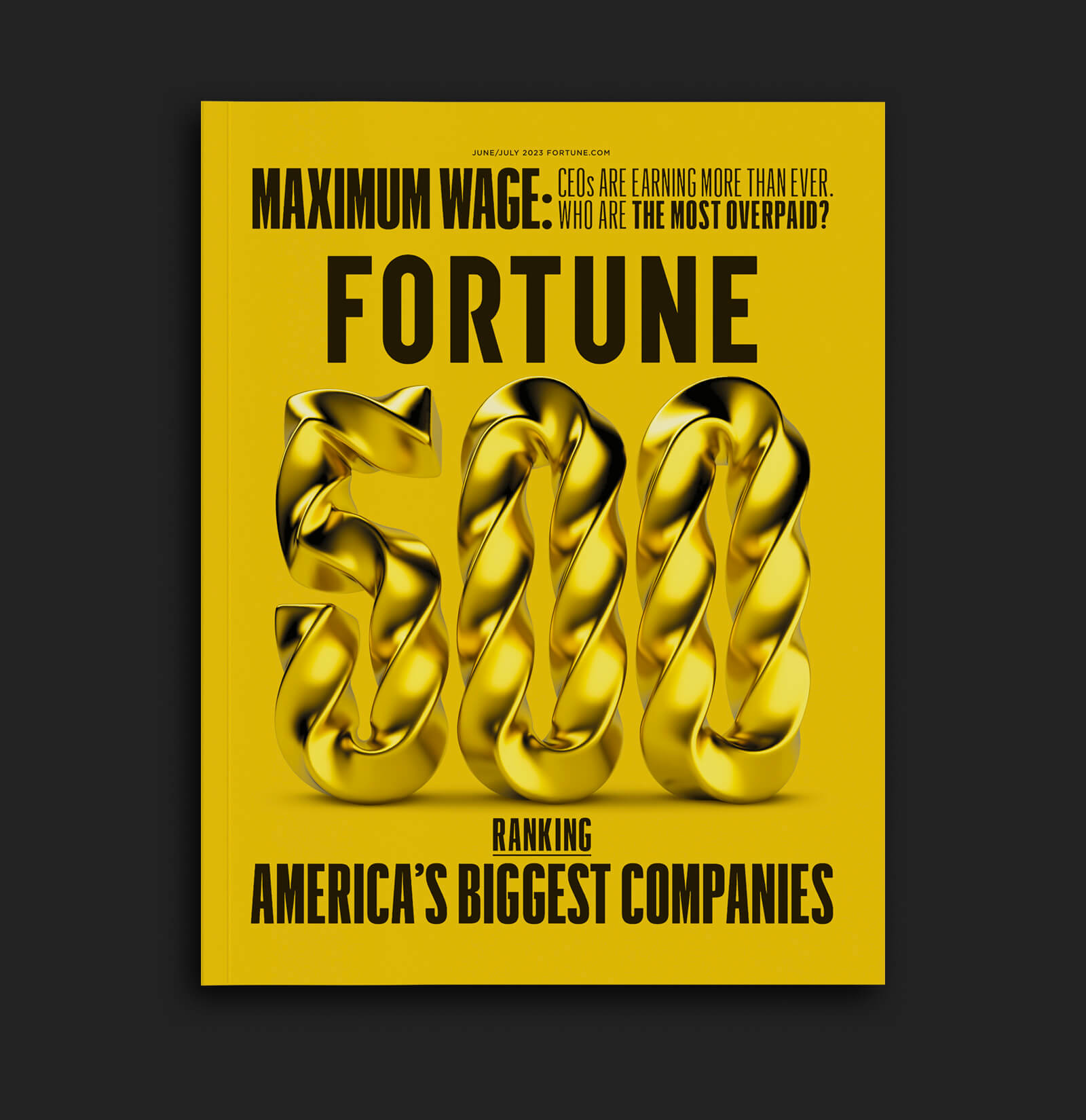
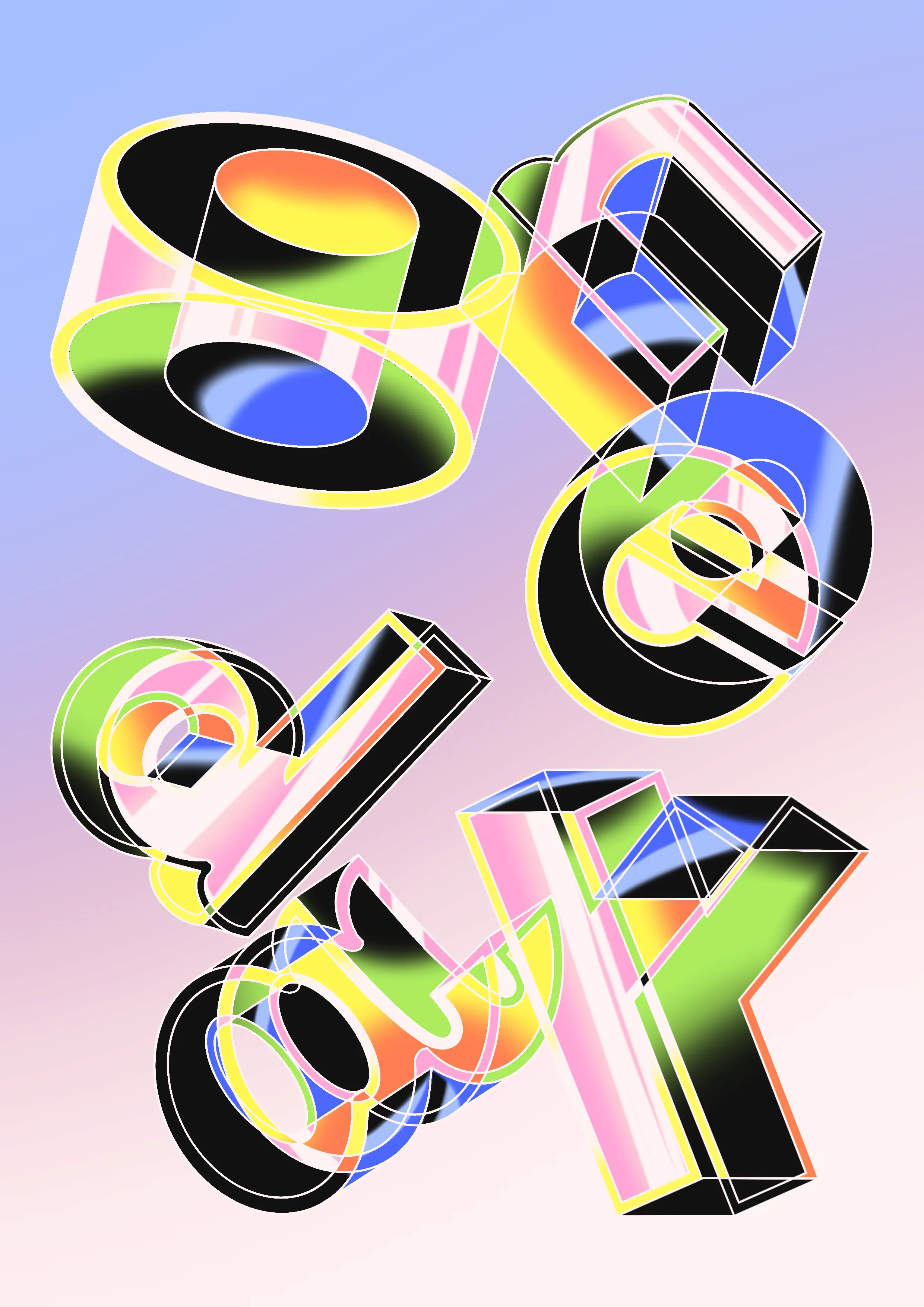
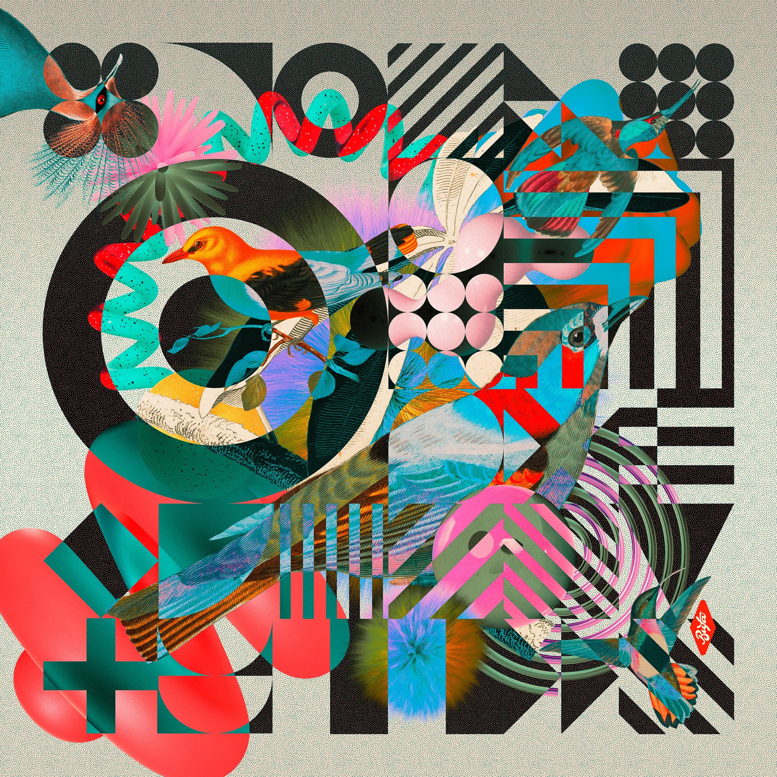
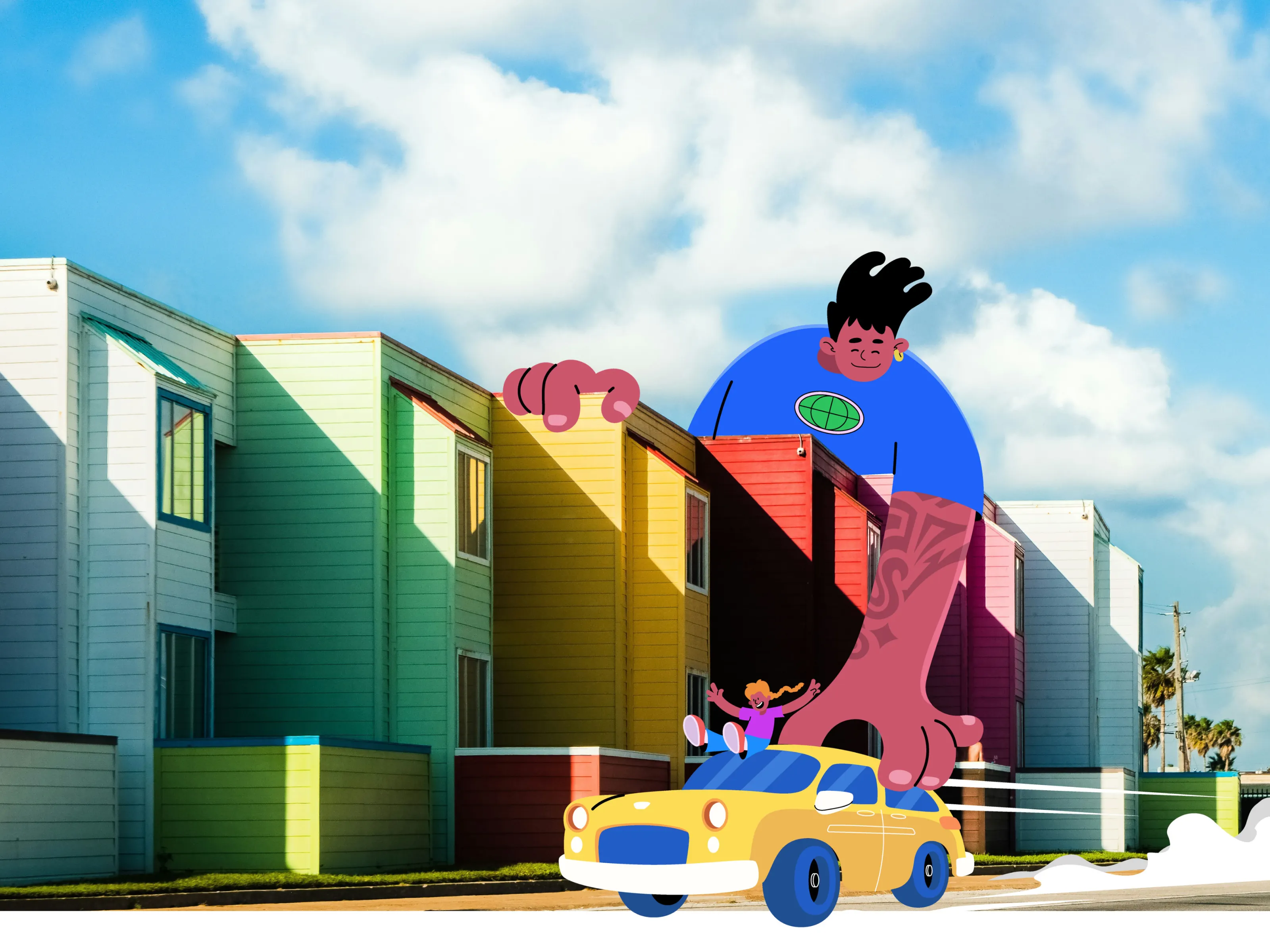
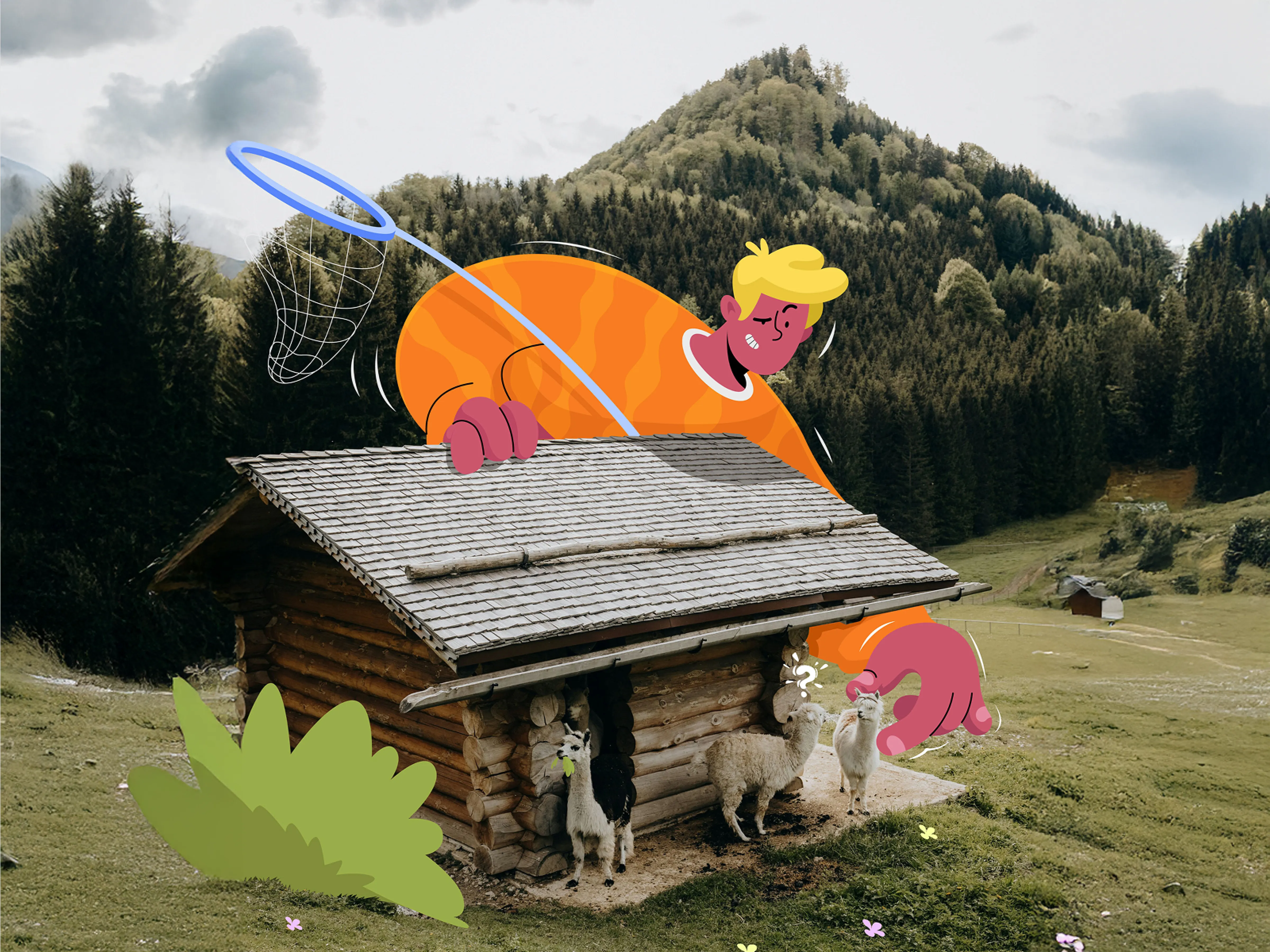
15. 3D Design
3D design continues to shape the visual landscape in 2026, but it’s grown far beyond glossy realism. Designers are using it to build mood, texture, and storytelling — not just spectacle. The focus is on composition and feeling, with softer lighting, sculptural forms, and stylized materials that blur the line between the digital and the handcrafted.

Design Credit: Leo Natsume
Design Credit: Marcato Studio
Design Credit: Vedant Hegde
Design Credit: Lea Bisseau
What makes this trend stand out is how seamlessly it blends into other styles. 3D illustration is merging with photography and typography, creating layered visuals that feel immersive and alive. It’s no longer about making something “look real,” but about using depth and shadow to create emotion and atmosphere. The results feel more cinematic, more tactile, and more intentional than ever before.
Design Credit: OLaF CW
Design Credit: Nick Barclay
Design Credit: Txaber
Design Credit: Illustfire
Across branding and motion design, 3D is giving ideas physical weight and presence. It transforms flat concepts into experiences you can almost touch. Among the most striking graphic design trends of 2026, 3D design reminds us that the most powerful visuals don’t just exist on a screen — they create a world you want to step into.
Design Credit: Obrazur
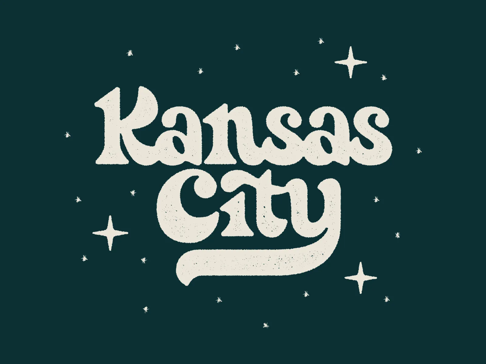
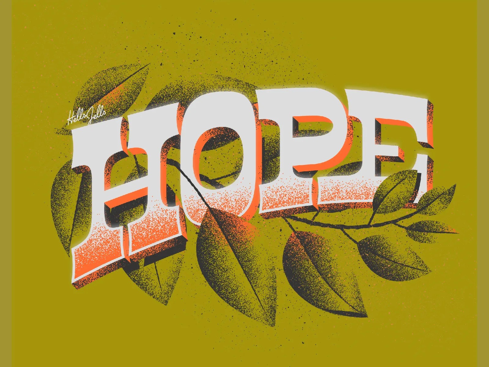
16. Custom Typography
In 2026, custom typography is thriving as designers look for ways to bring warmth and individuality back into their work. In a time when so much is typed, templated, or generated, handmade type feels personal, almost rebellious. Each stroke, curve, and imperfect line carries the human touch that digital design often forgets. Instagram accounts such as Goodtype embrace this art form and bring it to the center stage.
Design Credit: Nathan Holthus
Design Credit: Hellsjells
Design Credit: Paulina Papke
What’s exciting about this trend now is how it blends craft and technology. Designers are sketching by hand, scanning, and refining digitally to create lettering that’s polished but still full of character. You’ll see it in packaging, posters, and brand marks where expression matters more than precision. From loose brush lettering to intricate script, custom typography adds emotion that fonts alone can’t deliver.
Design Credit: Jen Borror
Design Credit: Thom Niessink
Design Credit: Nikita Bauer
Design Credit: Romain Pisa
Its power lies in storytelling. Custom typography doesn’t just say something, it shows who said it. It connects with viewers on a gut level, reminding us that personality doesn’t need perfection. Among the many graphic design trends of 2026, handlettering stands out as a gentle reminder that design made by hand still feels the most human.
Design Credit: Bre McCallum
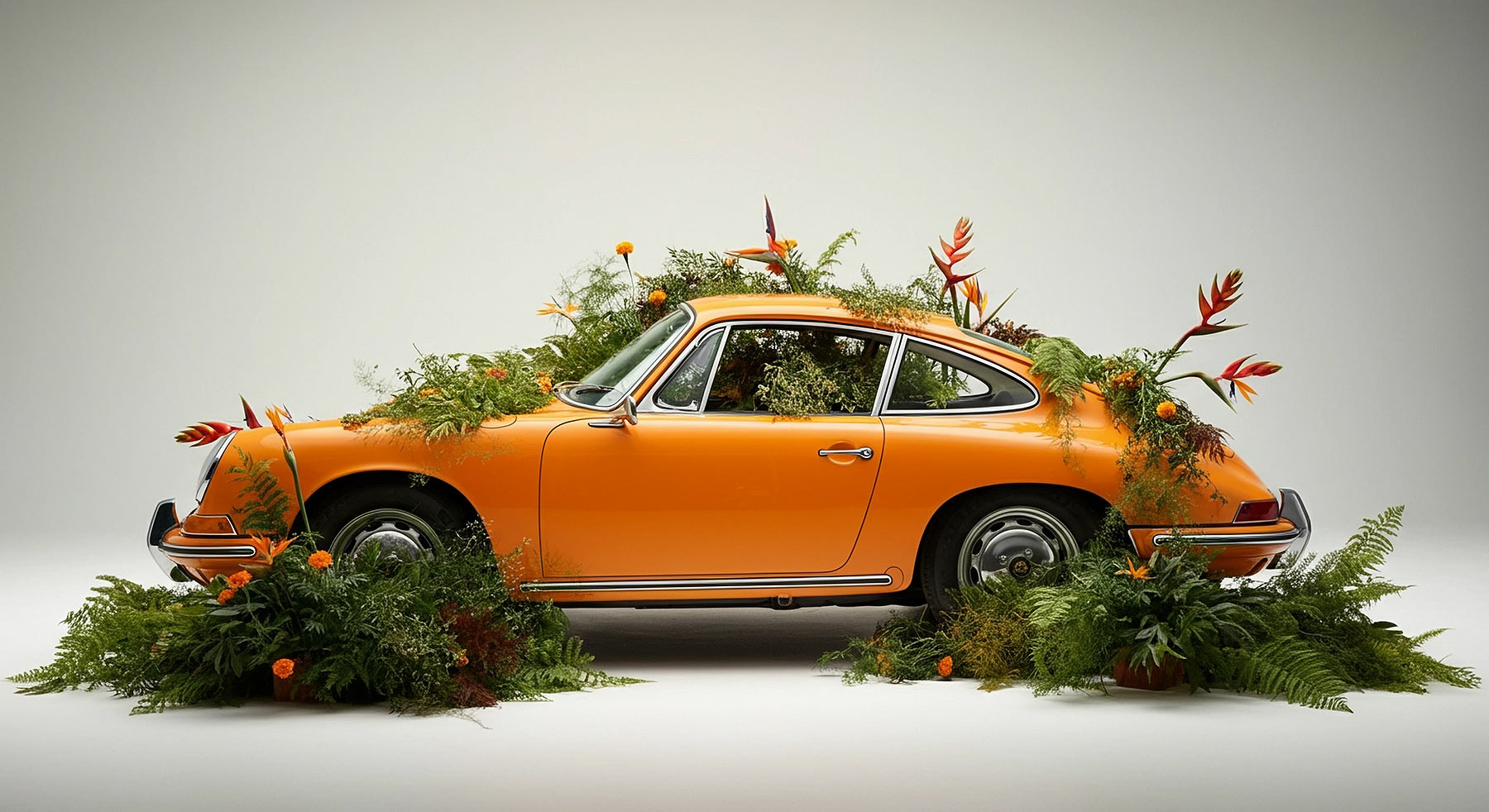
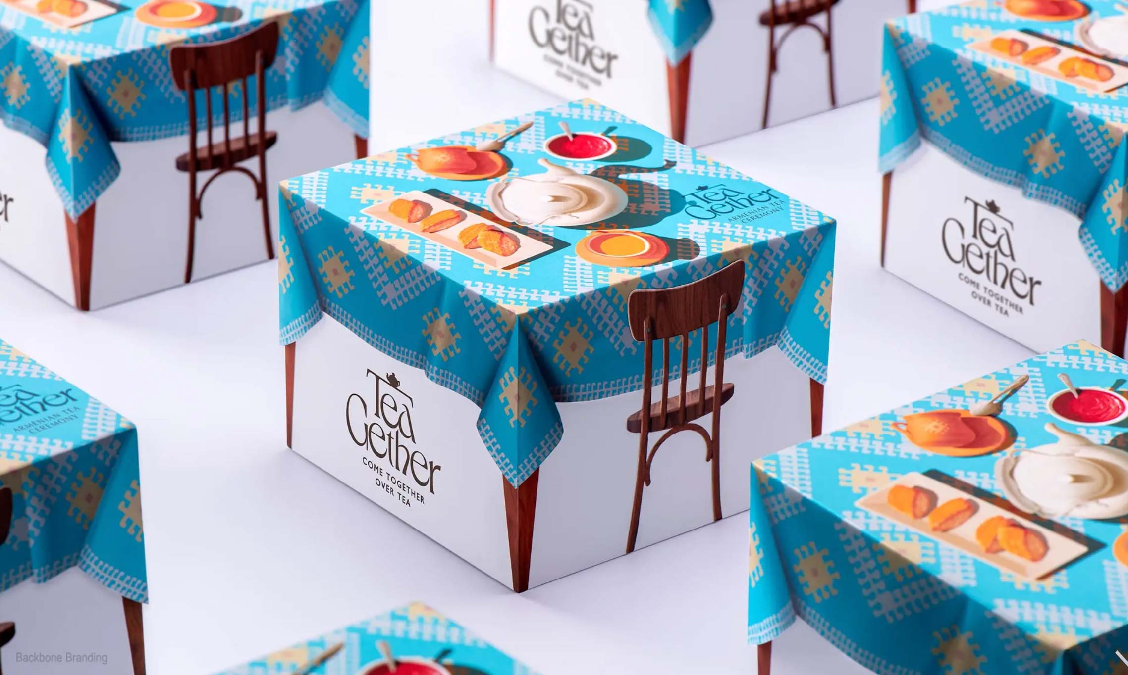
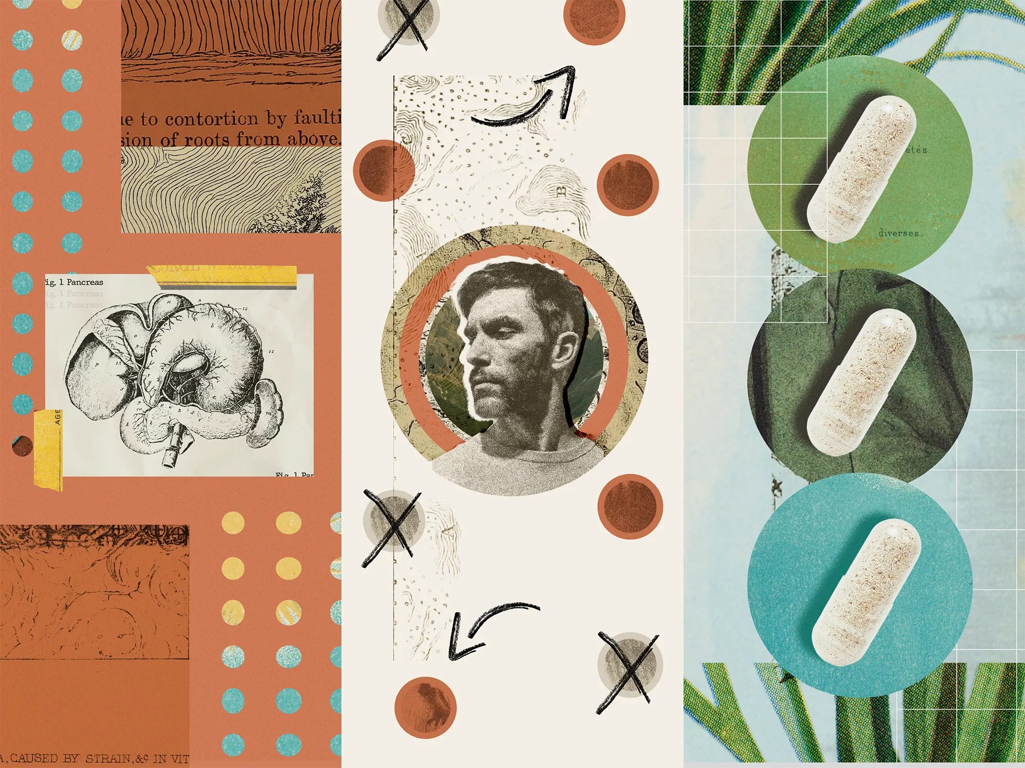
17. Mixed Media
Mixed media design is having a major moment in 2026. Designers are blending photography, illustration, collage, and 3D elements to create layered visuals that feel tactile, unexpected, and full of personality. It’s the art of contrast, digital precision meeting analog grit, clean layouts colliding with messy textures.
Design Credit: Oscar Carreón
Design Credit: Andrew Wiseman
Design Credit: Josh Warren
What’s driving this trend is the hunger for originality. With so many designs starting from the same templates, combining mediums has become a way to stand out. We’re seeing scanned paper textures, hand-drawn doodles, and found imagery woven into sleek digital compositions. It’s not about being perfect; it’s about creating something that feels alive, as if it evolved naturally over time.
Design Credit: Riley Cran
Design Credit: Orbix Studio
Design Credit: Orbix Studio
Design Credit: Suzi
Mixed media works beautifully across branding, editorial, and social campaigns. It gives designers the freedom to mix nostalgia with modernity and chaos with clarity. In the evolving landscape of graphic design trends 2026, it’s proof that the most interesting work often happens when worlds collide.
Design Credit: ILLO
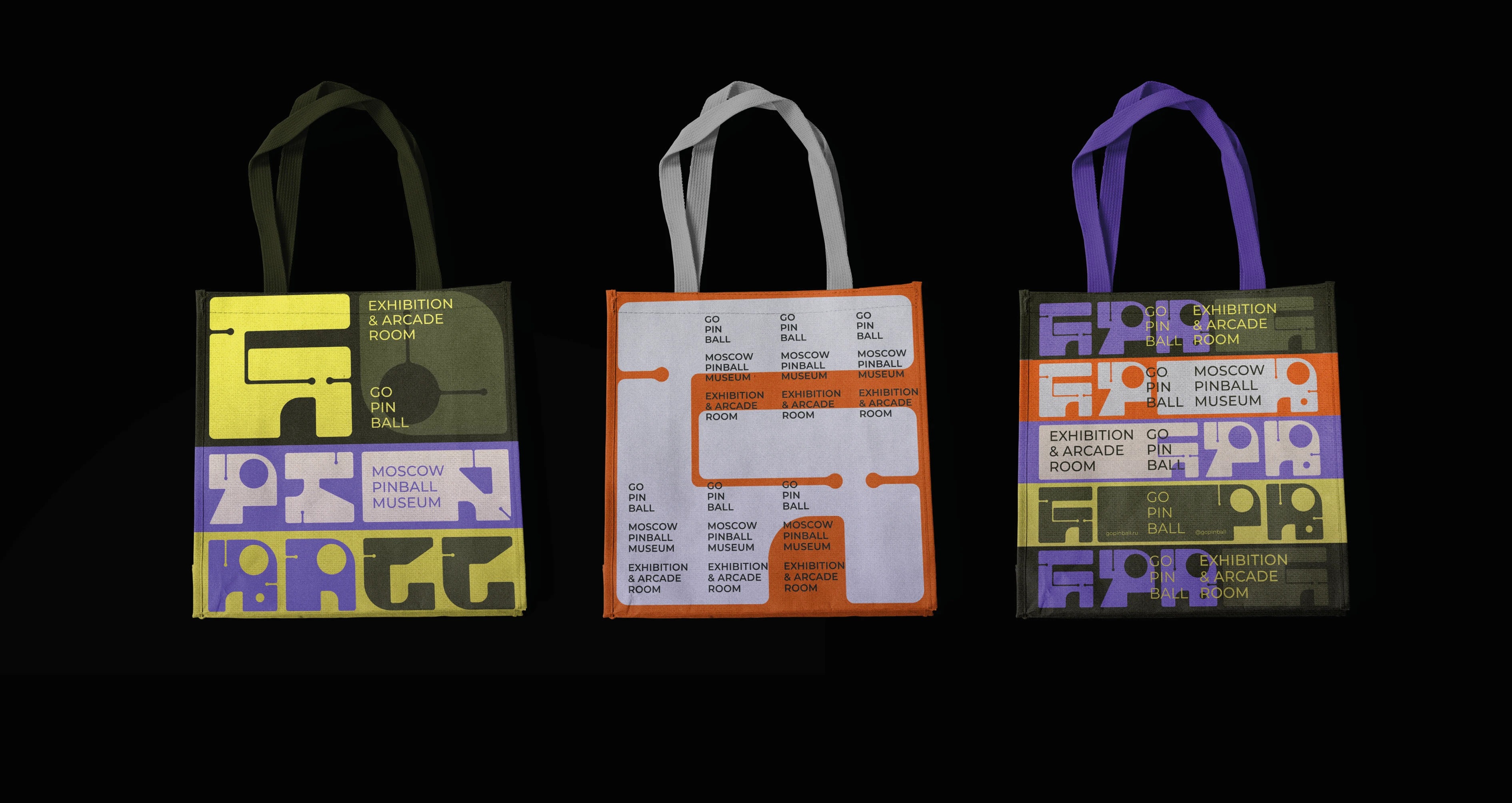
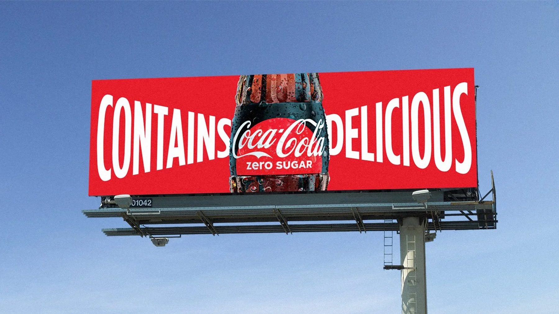
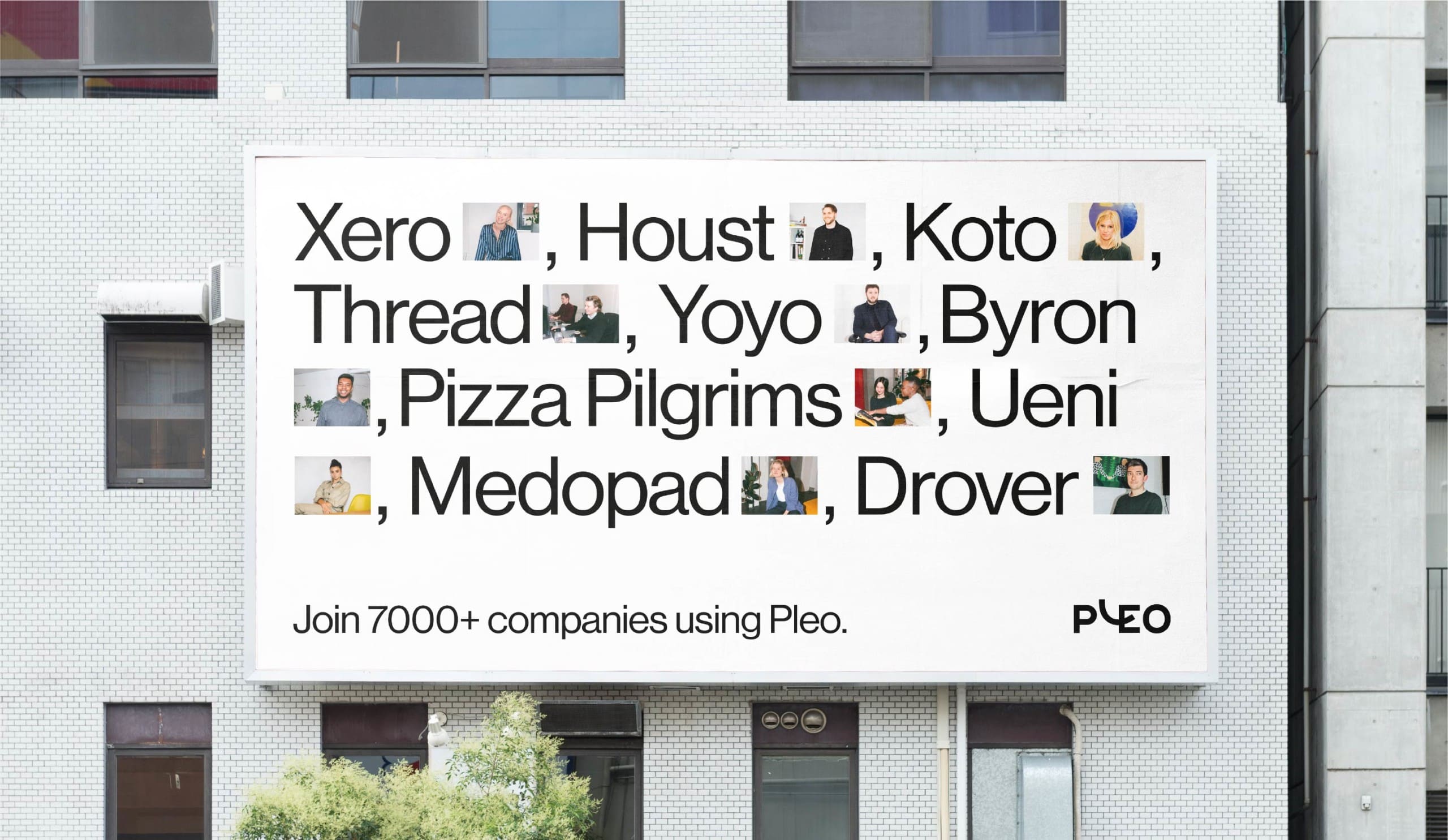
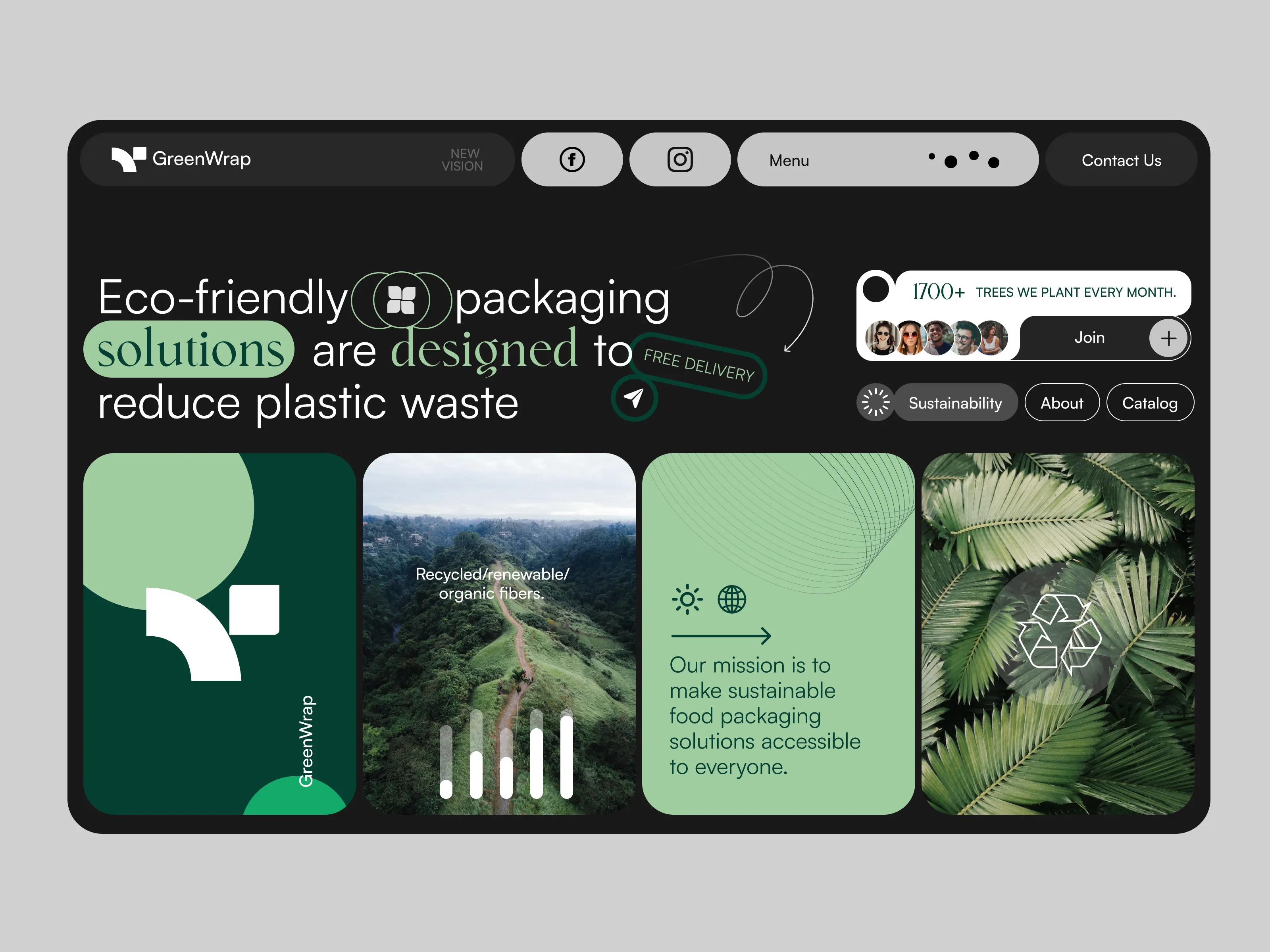
18. Modular Systems
In 2026, modular systems are less about consistency and more about adaptability. Designers are building flexible frameworks that allow brands to shift shape without losing their voice. It’s no longer just about grids or logo variations, it’s about creating living systems that grow, evolve, and respond to context.
Design Credit: Brand Brothers
Design Credit: Halo Lab
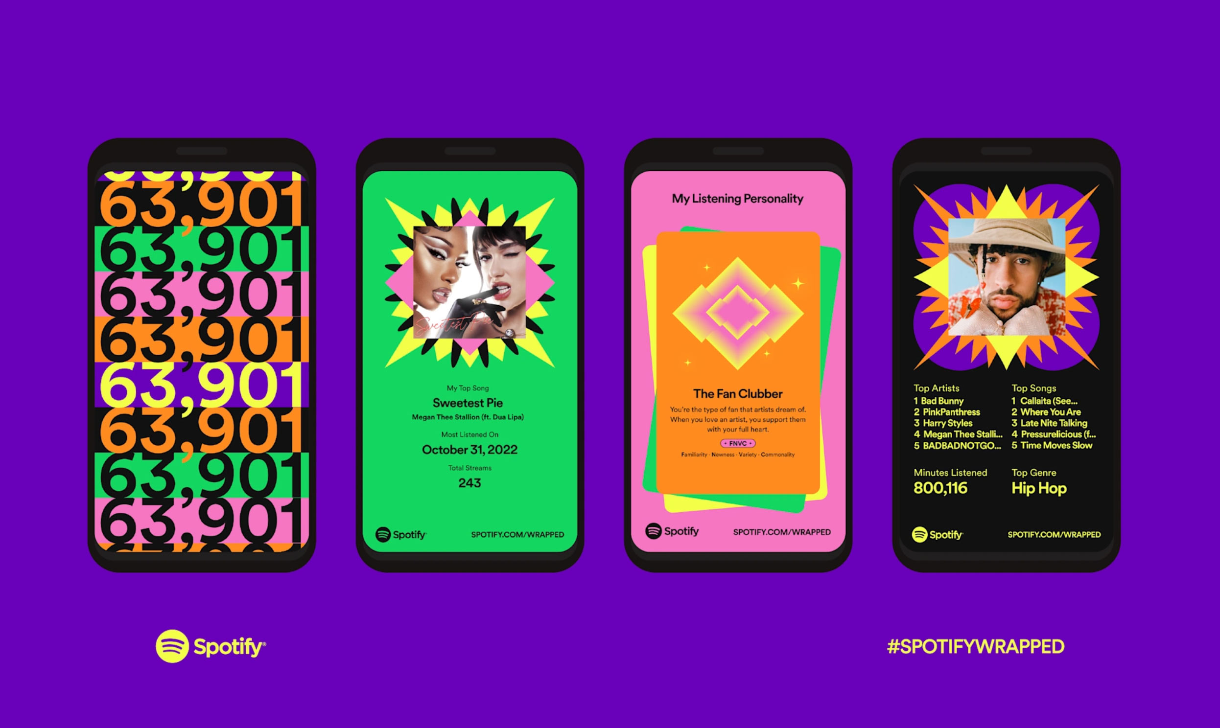
Design Credit: Spotify
This new wave of modularity feels smarter and more human. A brand identity might rearrange itself for different audiences, switch tones across platforms, or scale from a social post to a retail space while still feeling unmistakably cohesive. Every element, from color to typography to motion, becomes part of a responsive toolkit rather than a fixed rulebook.
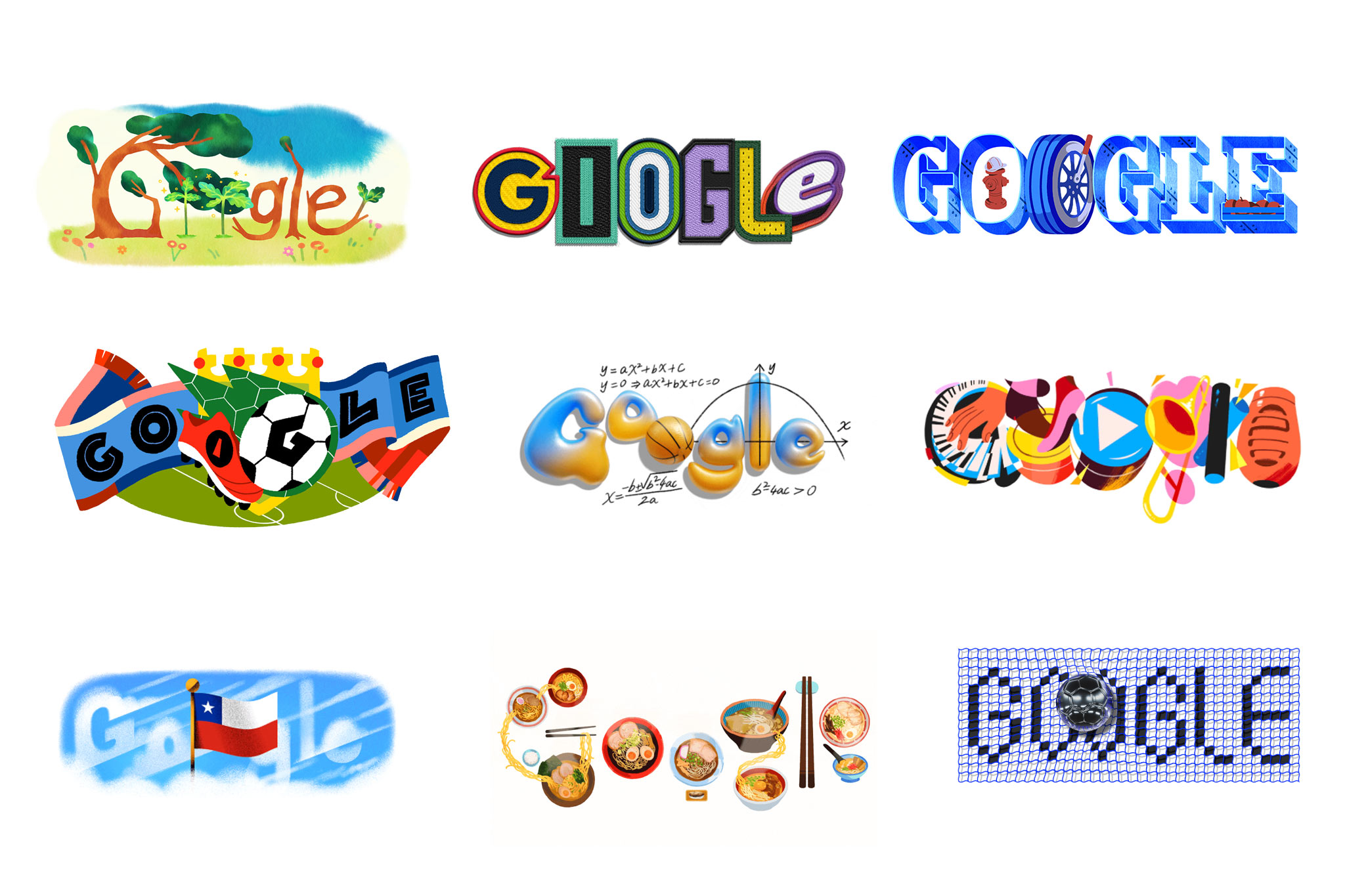
Design Credit: Google Doodles
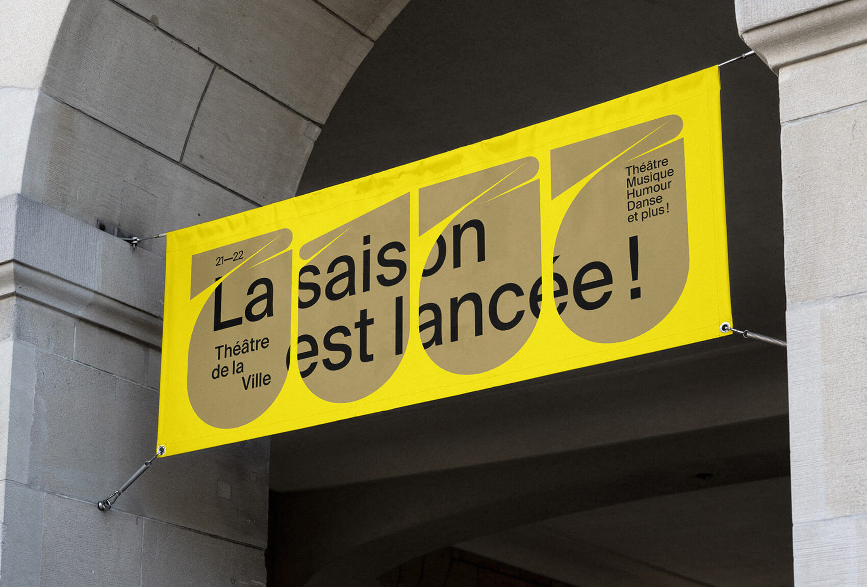
Design Credit: Ragged Edge
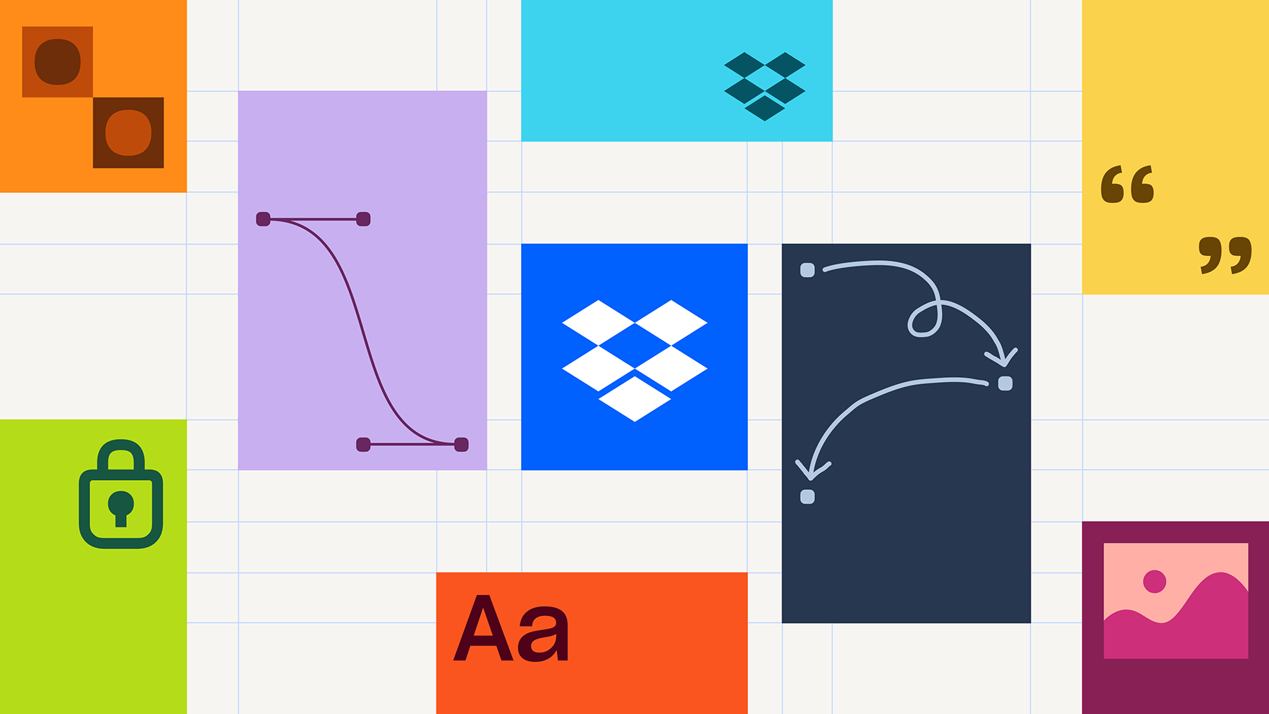
Design Credit: Dropbox
The beauty of modular grids lies in their practicality. In a world where brands need to show up on every screen, surface, and format imaginable, flexibility isn’t optional, it’s strategic. Among the most forward-looking graphic design trends of 2026, modular design stands out as proof that strong identities don’t break under pressure; they bend gracefully.
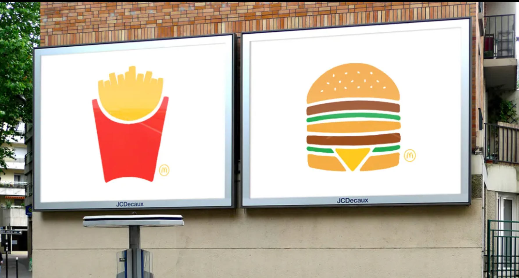
Design Credit: McDonalds
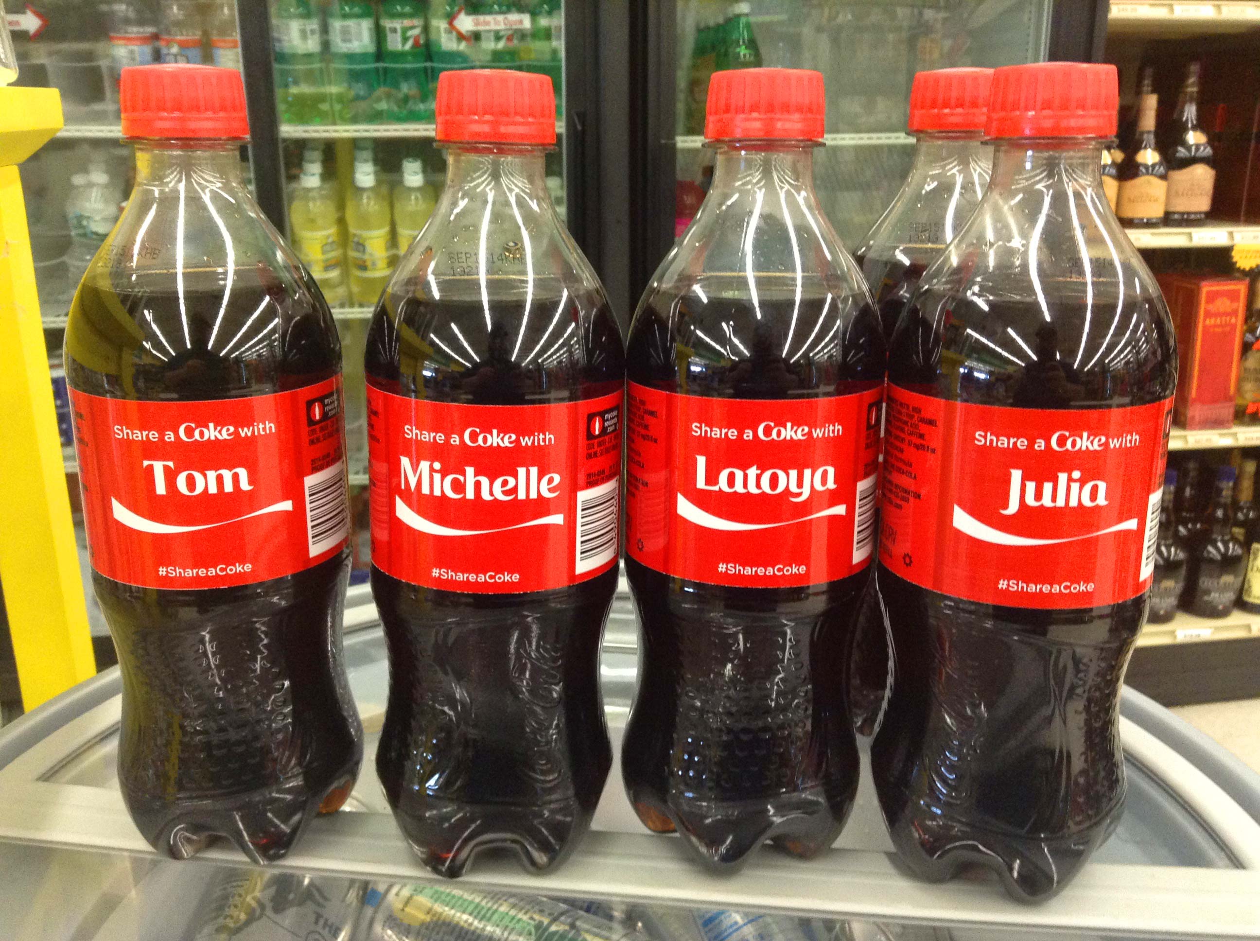
Design Credit: Coke
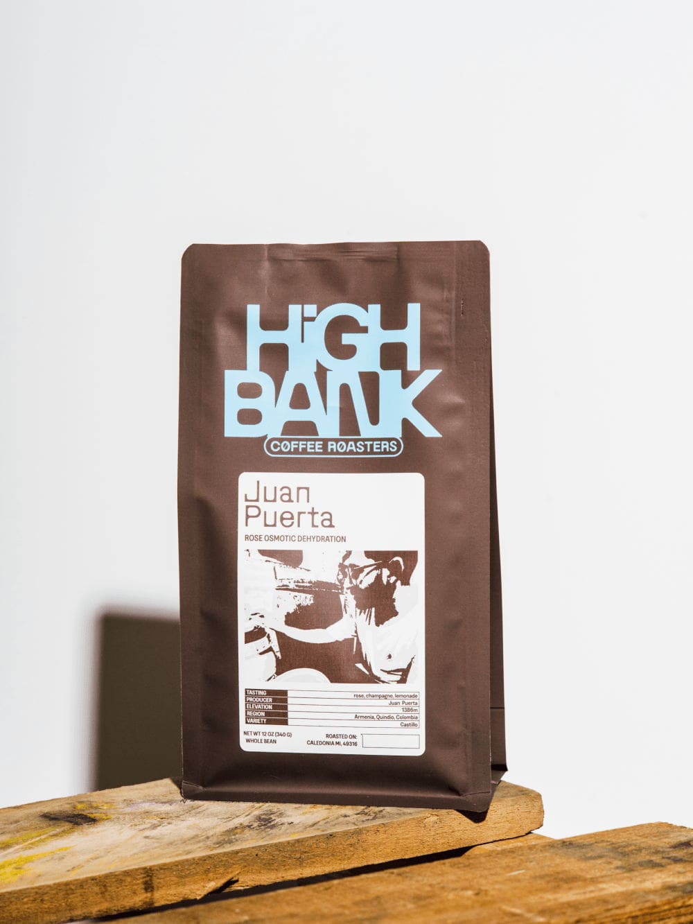
19. Serif Fonts
Serif fonts have been on the rise for a few years now, and in 2026, their momentum shows no sign of slowing down. What started as a quiet comeback has turned into one of the most enduring graphic design trends of the decade. Designers are embracing serifs for their balance of tradition and modernity, they feel trustworthy, expressive, and effortlessly timeless.
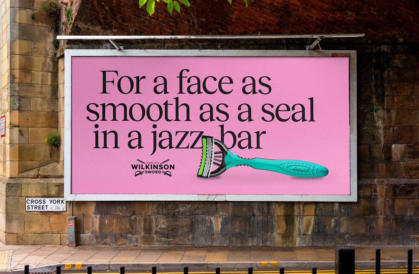
Design Credit: Wilkinson Sword
Design Credit: Working Assembly
Design Credit: The Branding People
The appeal lies in their flexibility. Serifs work beautifully across editorial design, branding, and digital interfaces, bringing warmth and sophistication without feeling old-fashioned. We’re seeing everything from elegant high-contrast serifs to chunky retro-inspired ones, often paired with minimal layouts or bold color palettes for a fresh twist.
Design Credit: Casey Roarty
This ongoing love affair with serif typefaces speaks to a broader shift in design: a desire for depth and personality over pure simplicity. Whether it’s a heritage brand leaning into its roots or a startup looking for character, serifs continue to offer a sense of craft and credibility that feels more relevant than ever.
Design Credit: Gander
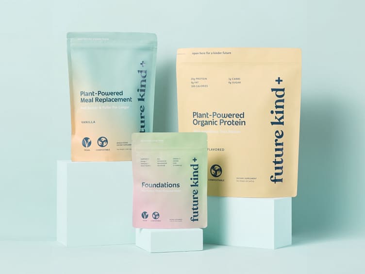
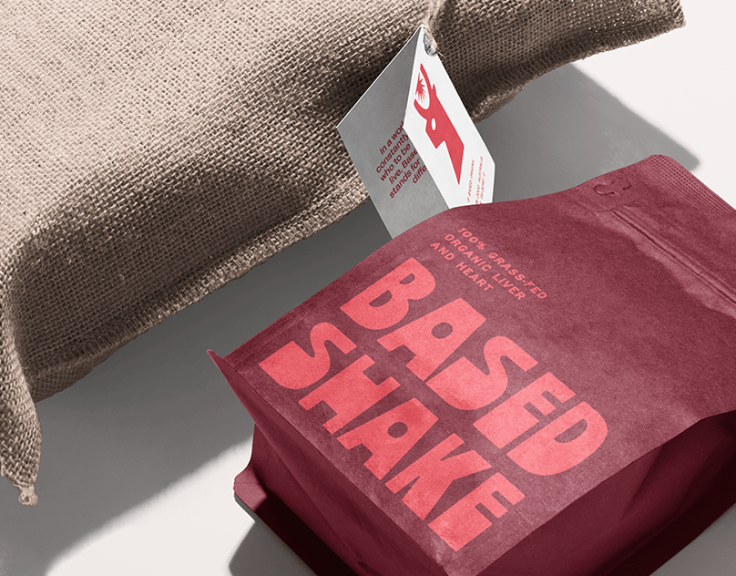
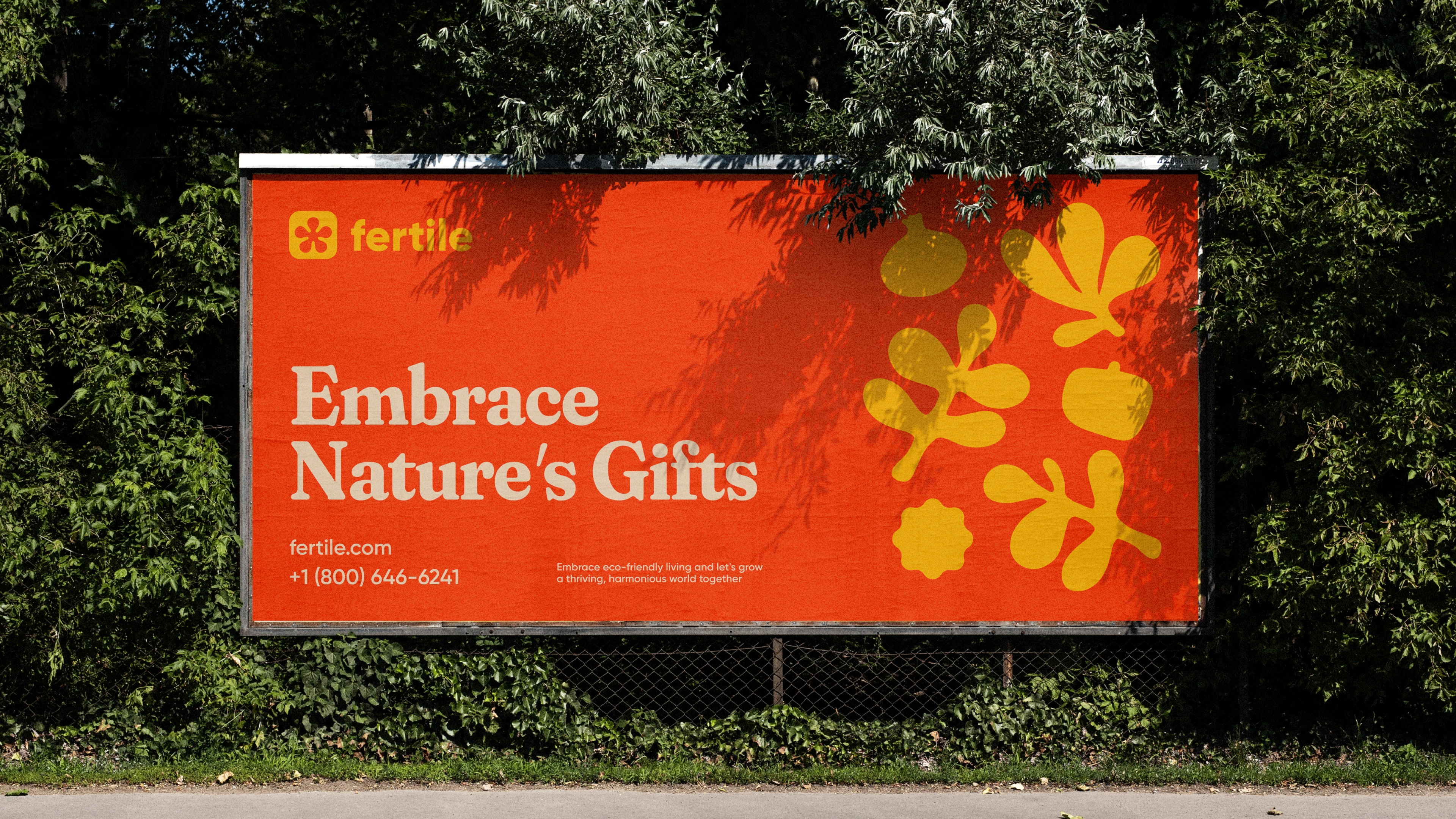
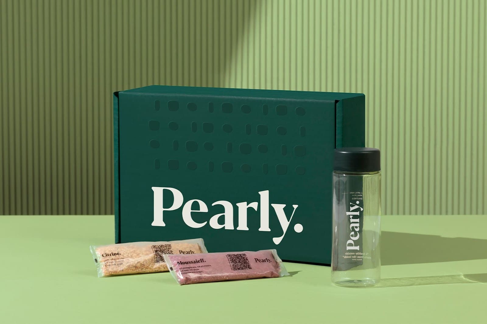
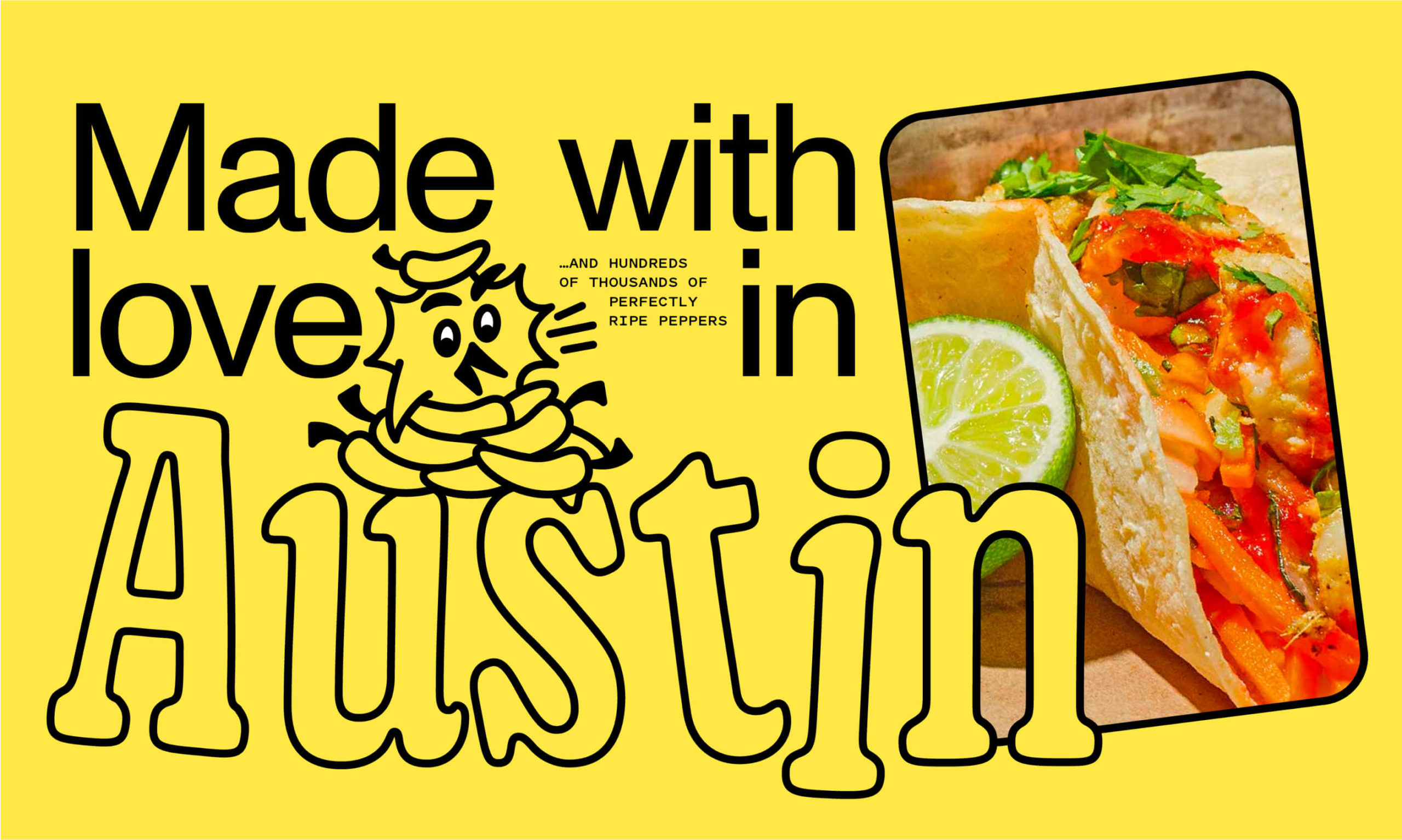
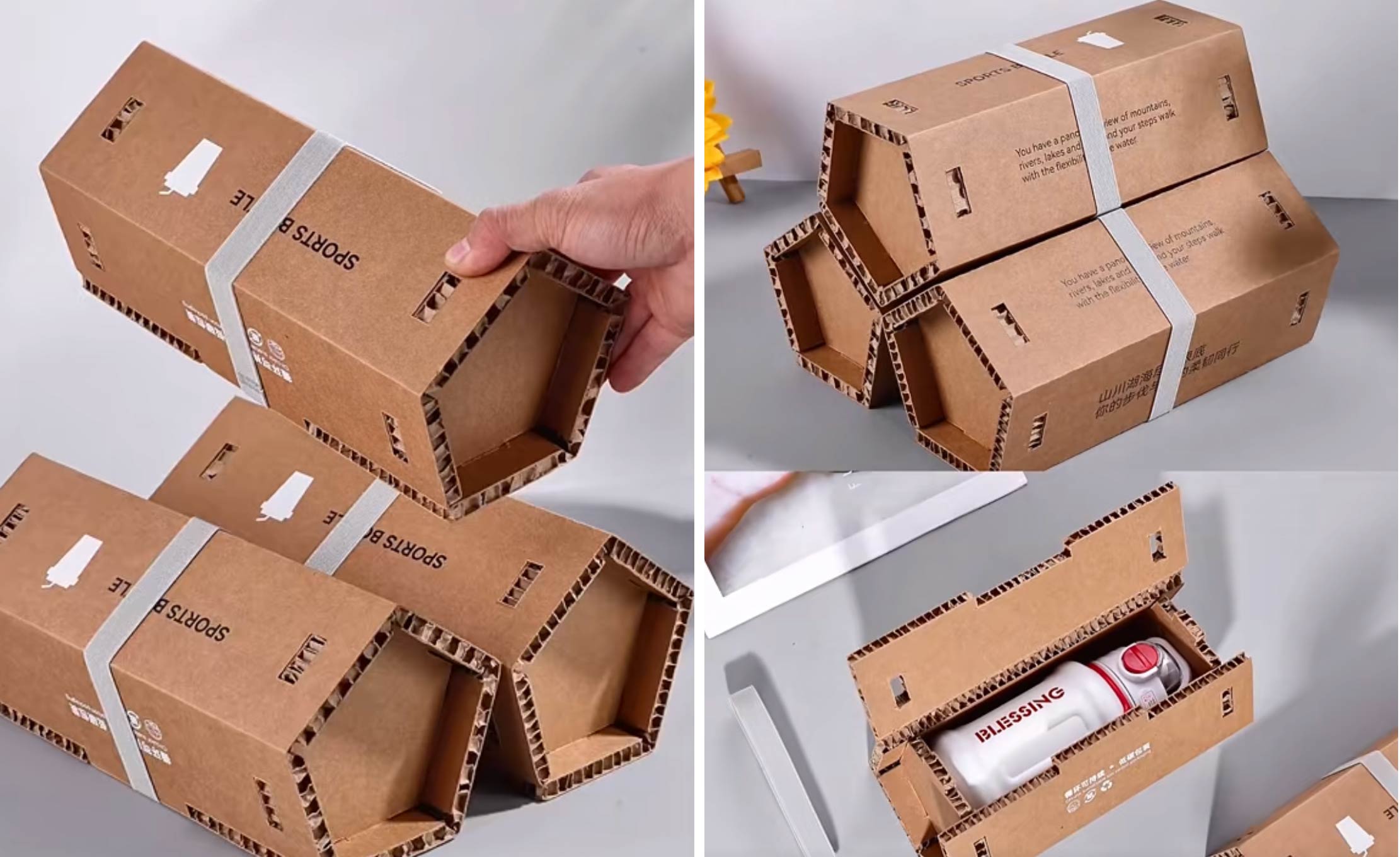
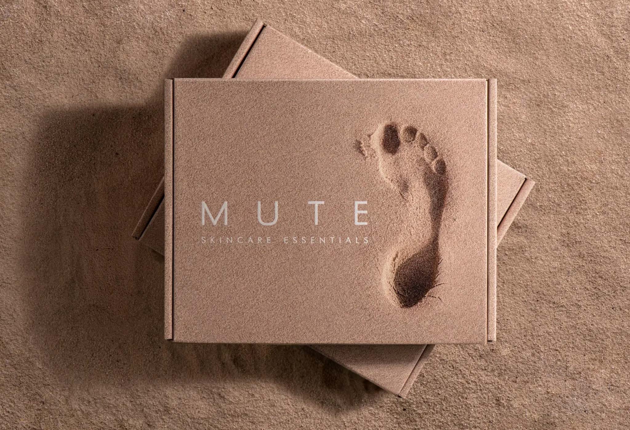
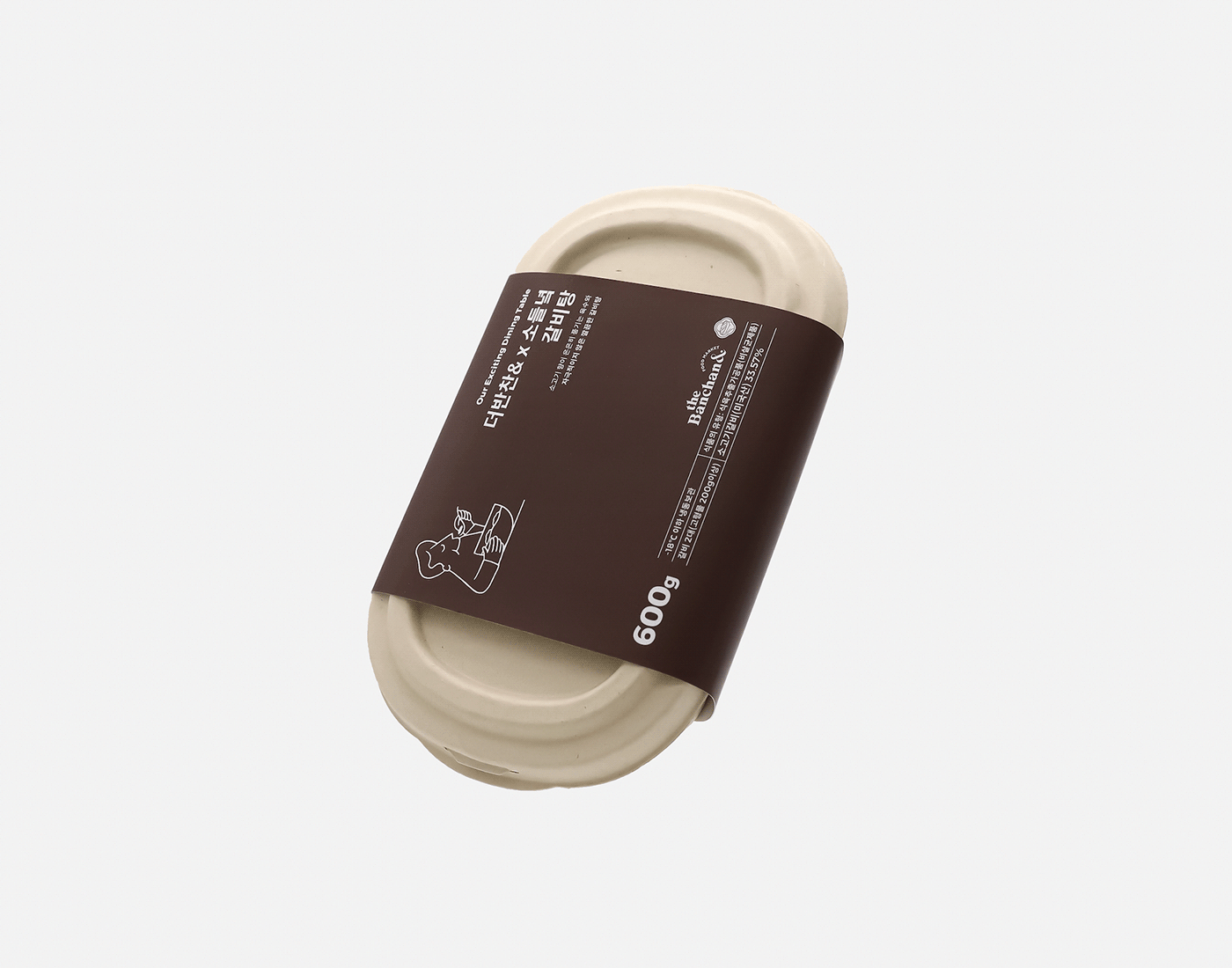
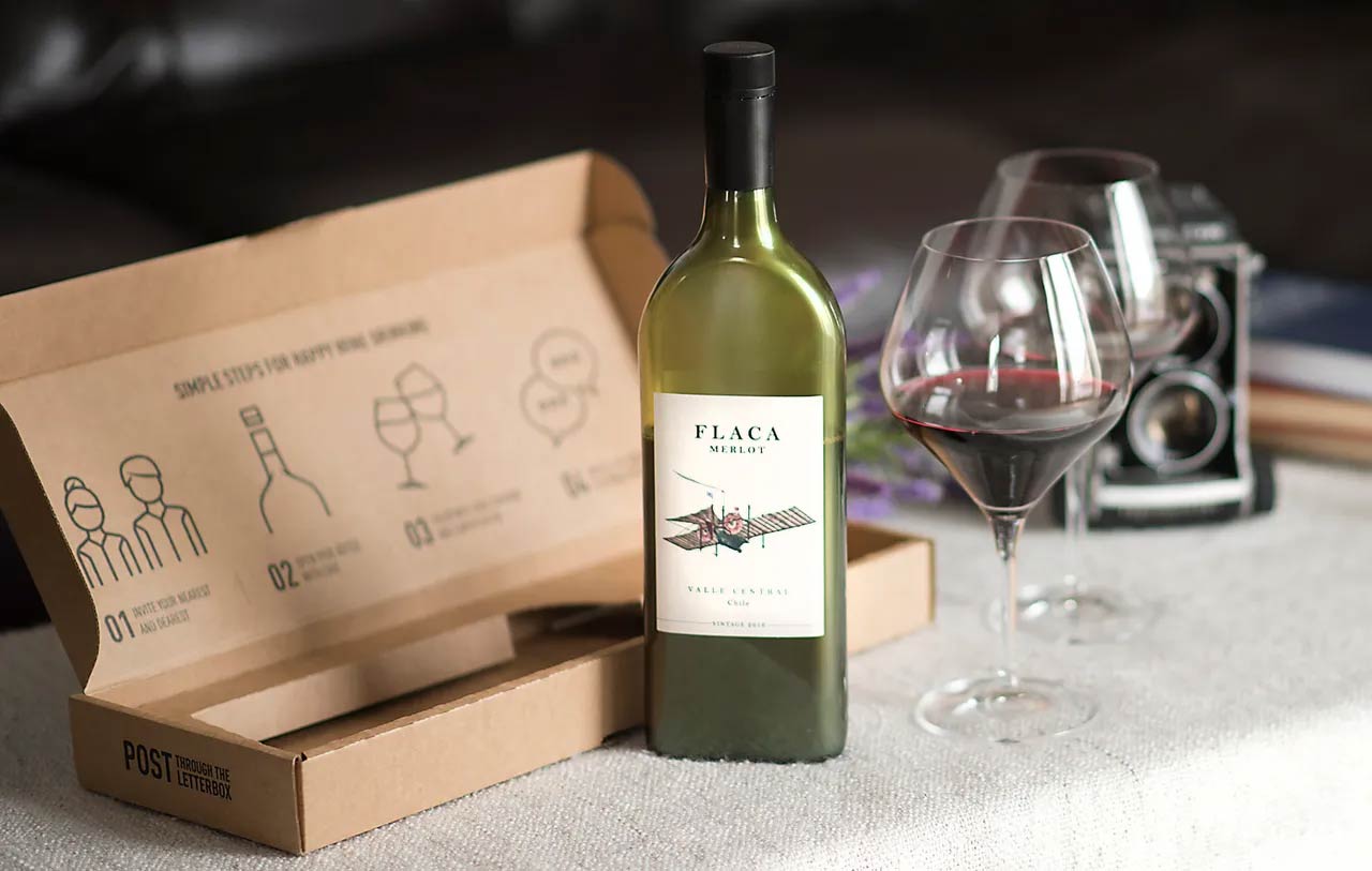
20. Sustainability
Sustainability in 2026 isn’t just about messaging, it’s a visual language. Designers are embracing the look and feel of eco-conscious design through materials, colors, and textures that feel natural and handmade. Think kraft paper tones, muted earth palettes, hand-drawn illustrations, and doodle-style icons that give digital and print pieces a human, grounded touch.
Design Credit: Awsmd
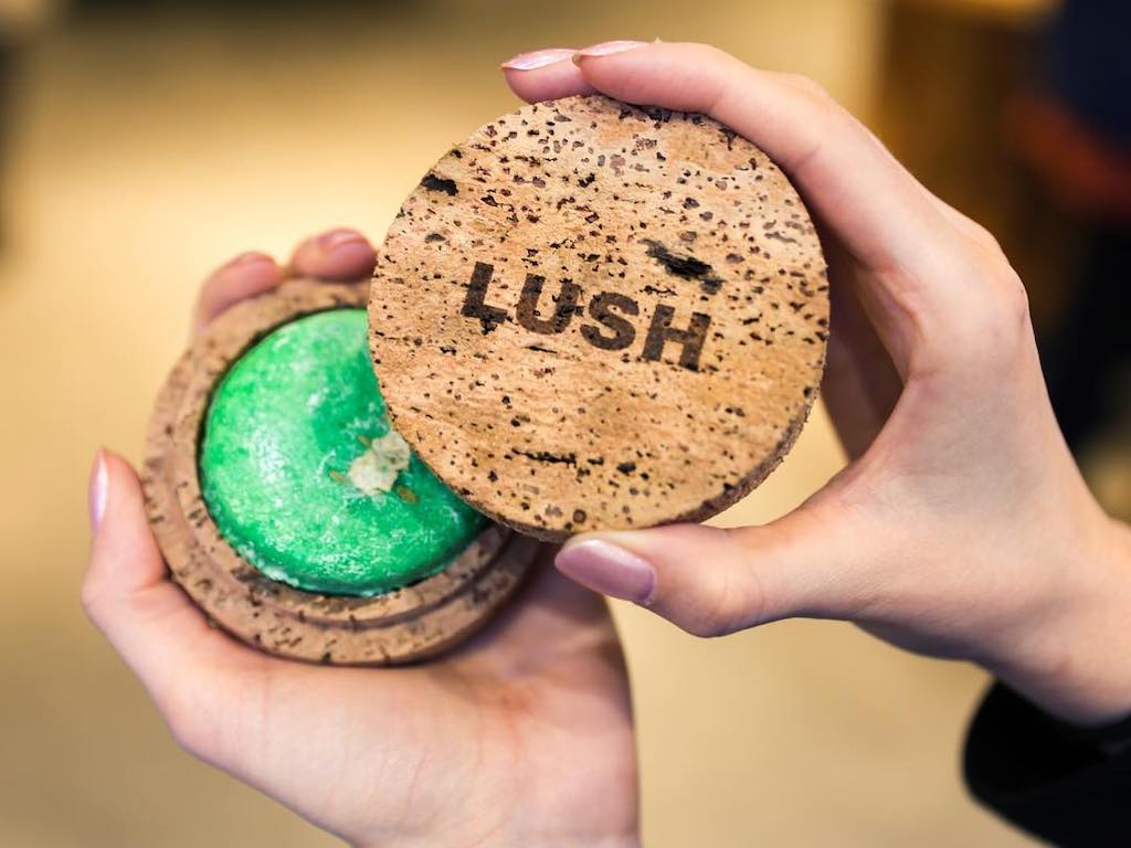
Design Credit: Lush
This trend celebrates imperfection. Rough edges, organic shapes, and tactile textures make brands feel more authentic and relatable. Fonts often mimic brush strokes or ink pens, adding warmth and honesty to layouts. Even in digital spaces, these elements recreate the charm of something printed, sketched, or crafted by hand, a refreshing contrast to slick, hyper-polished visuals.
Design Credit: Backbone Branding
Design Credit: Oilvin Park
Design Credit: Garco Wines
The rise of sustainable design aesthetics reflects more than a style choice; it’s a mindset. Brands are using this organic look to express transparency, care, and connection. It’s soft, approachable, and deeply human. In the landscape of graphic design trends 2026, sustainability reminds us that good design doesn’t just catch the eye, it resonates with the heart.
Design Credit: Boo Repbulic
Wrapping up: 2026’s best design trends
As we move through 2026, these graphic design trends aren’t just about what looks good, they’re about what feels right. They capture the balance between creativity, technology, and the human touch that defines modern design. The future isn’t about chasing every new idea, but about choosing the ones that truly strengthen your brand’s story and connect with people in meaningful ways.
Whether you’re refreshing your visual identity or bringing something entirely new to life, let these trends guide you toward bold, thoughtful design decisions. At Jukebox, we love seeing how designers turn these ideas into something tangible such as business cards or custom stickers. From sustainable materials to inventive finishes that make every piece stand out.
Curious how these 2026 trends could work for your brand? Our print experts are here to help turn your concepts into reality. Here’s to another creative year, and remember, you know where to find us when it’s time to make your next idea happen.
If you want to learn why leading reviewers consistently rank Jukebox at the top, read our full guide: Best Business Card Printing Service.
Find more design inspiration on the Jukebox blog.