

Business cards have evolved into powerful design pieces that express identity and creativity. In 2026, typography is the foundation of every great design. Letterforms, spacing, and structure define how a card feels, while the use of shape and alignment builds balance and visual flow. Designers are moving toward layouts that blend precision with personality, turning even simple cards into memorable design statements.
Equally important is how material and print bring these ideas to life. Stocks such as Colorplan and Duplex add dimension and strength, while specialty finishes like Foil Stamping or debossing create texture and depth. The harmony between design, paper, and print craft is what defines the next generation of business cards modern, refined, and timeless.
To see more about the latest visual styles influencing this year’s print design, explore our companion feature Best Free Fonts for 2026 where we dive into typography trends shaping modern brands.
Let’s explore what’s inspiring designers this year. When a trend sparks an idea, you can put it straight to work in the best online business card maker. Let's explore what's inspiring designers this year.
Lauren Scotti
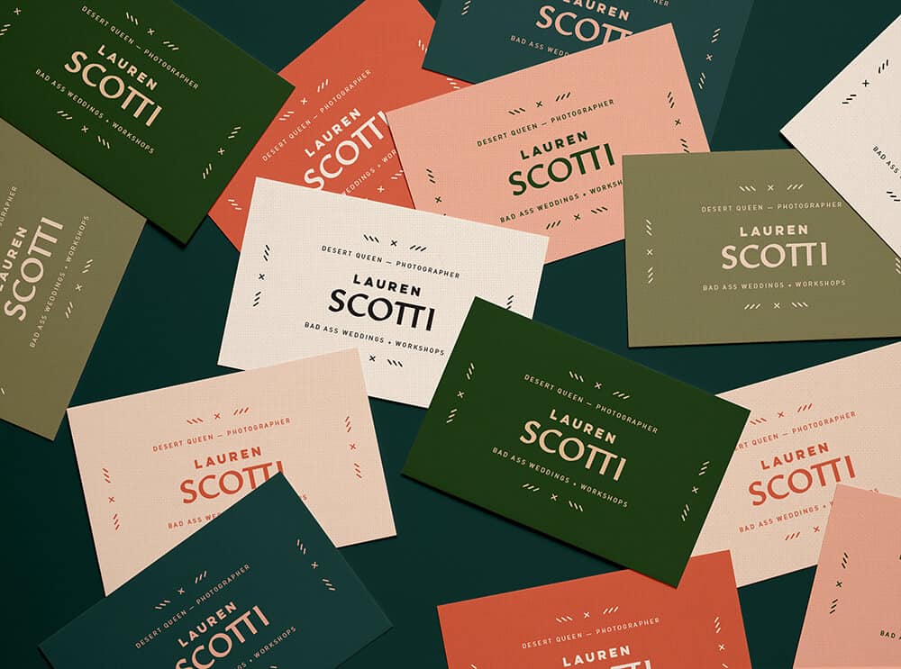
Designed by: Lindsey Pruitt
These business cards are all about pastel harmony, gentle tones that contrast beautifully with bold, modern typography. The balance between soft color and expressive blackletter design creates a visual style that feels both nostalgic and fresh. This combination shows how delicate hues can make a strong statement when paired with confident type.
Champ Hotel
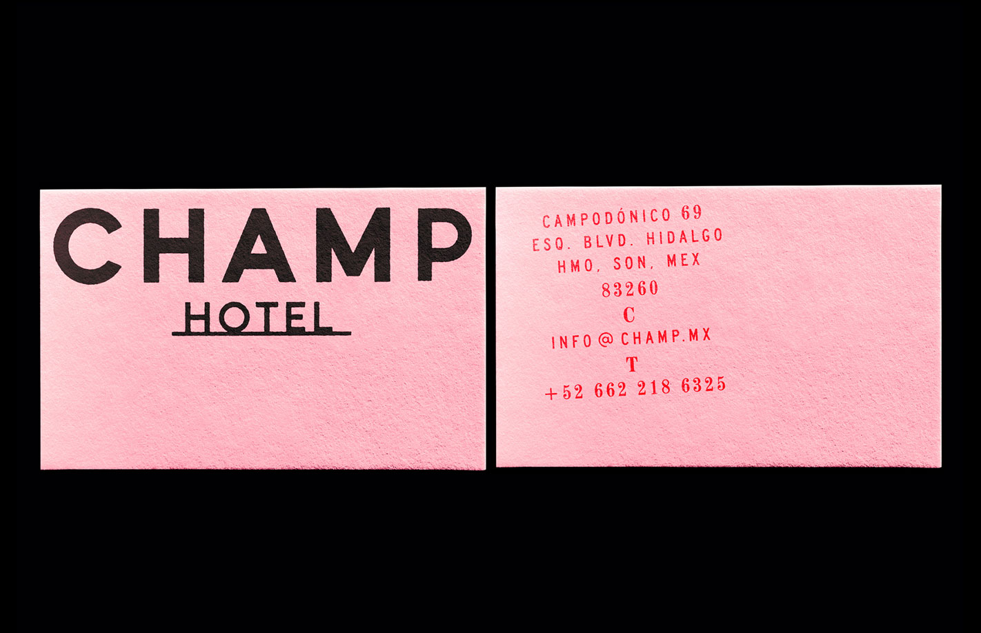
Designed by: Jesus Lopez
Located in Hermosillo, Sonora, Mexico, Champ Hotel’s identity draws on vintage postcards, local culture, and mid-century charm. The retro color palette of sun-faded oranges and neutrals, combined with nostalgic typography, captures the warmth of desert life. Its layout feels editorial, blending modern minimalism with a timeless travel-inspired aesthetic.
Kilo At Boa
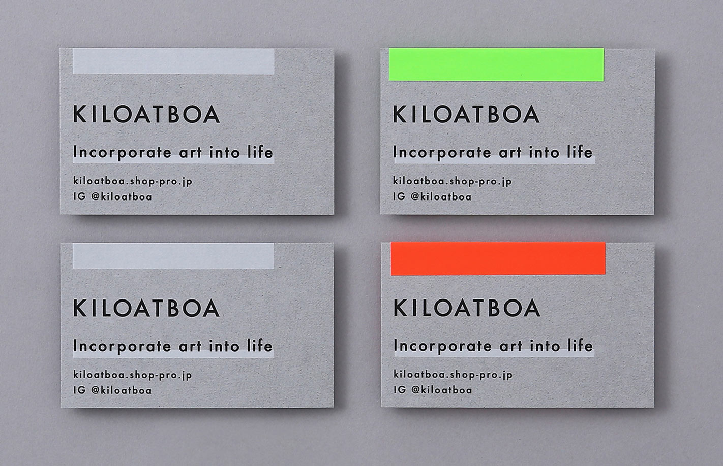
Designed by: Dictom Design Studio
Design meets craftsmanship in this handmade concept. Fluorescent lime and orange accents on cool gray show how a limited palette can still feel vibrant. Layered, glued details build an authentic texture that embodies creativity and care, reflecting 2026’s move toward tactile design experiences.
Gloria Content
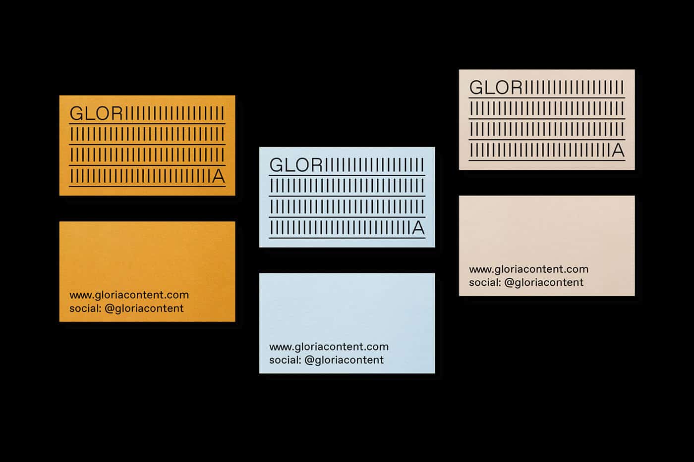
Designed by: Studio Plastac
Repetition and rhythm turn typography into texture. By converting a single letter into a pattern, this design becomes both functional and decorative, redefining minimalist business card design for 2026.
Coure
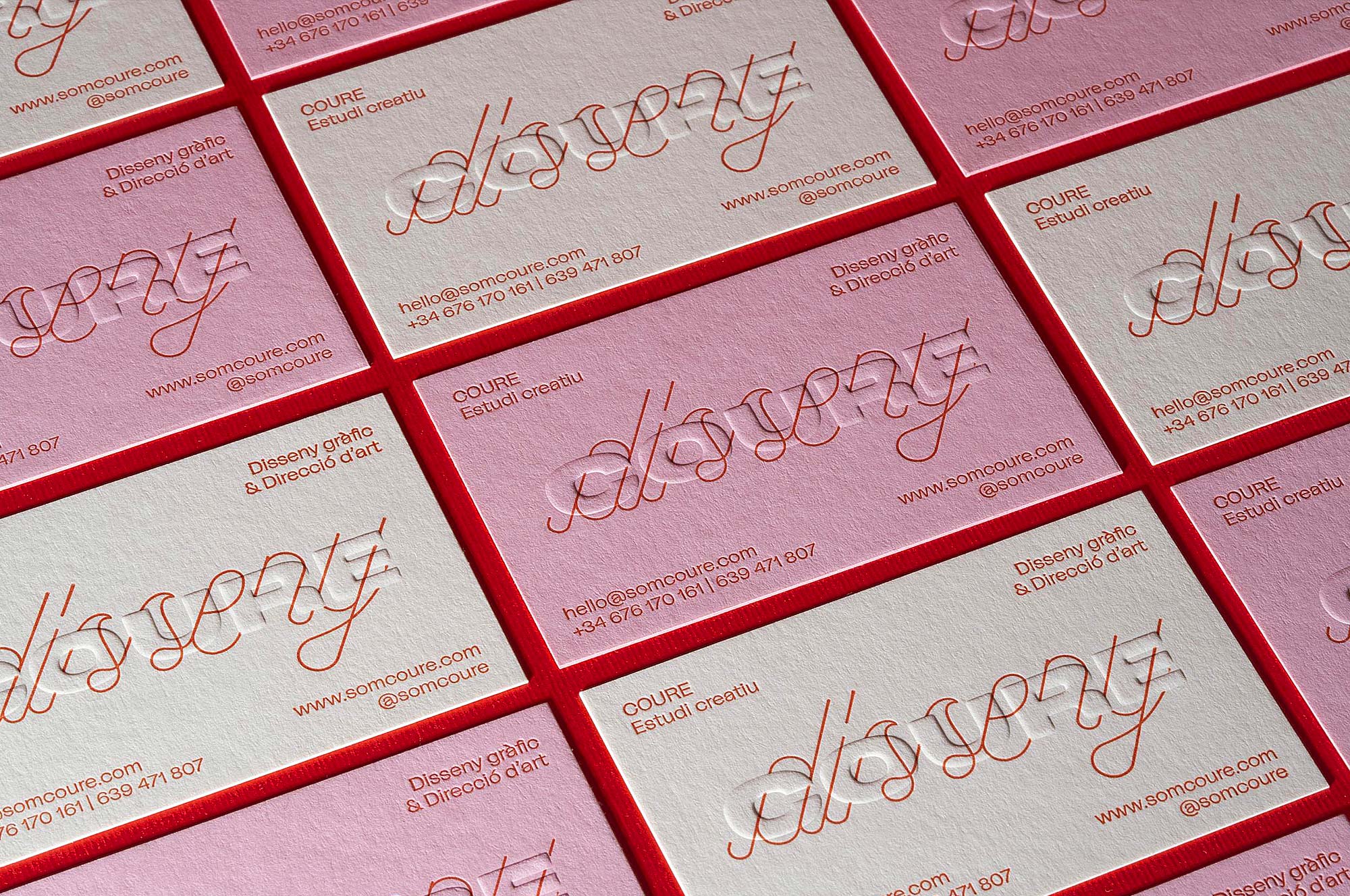
Designed by: COURE Studio
COURE designed these cards to introduce a fresh, contemporary studio voice. A heavy, extended logo pairs with a custom linear script to balance structure and expression. Printed on 18pt Colorplan Candy Pink and China White with letterpress and embossing, the piece feels modern, detailed, and true to the studio’s craft.
WalkerPrints
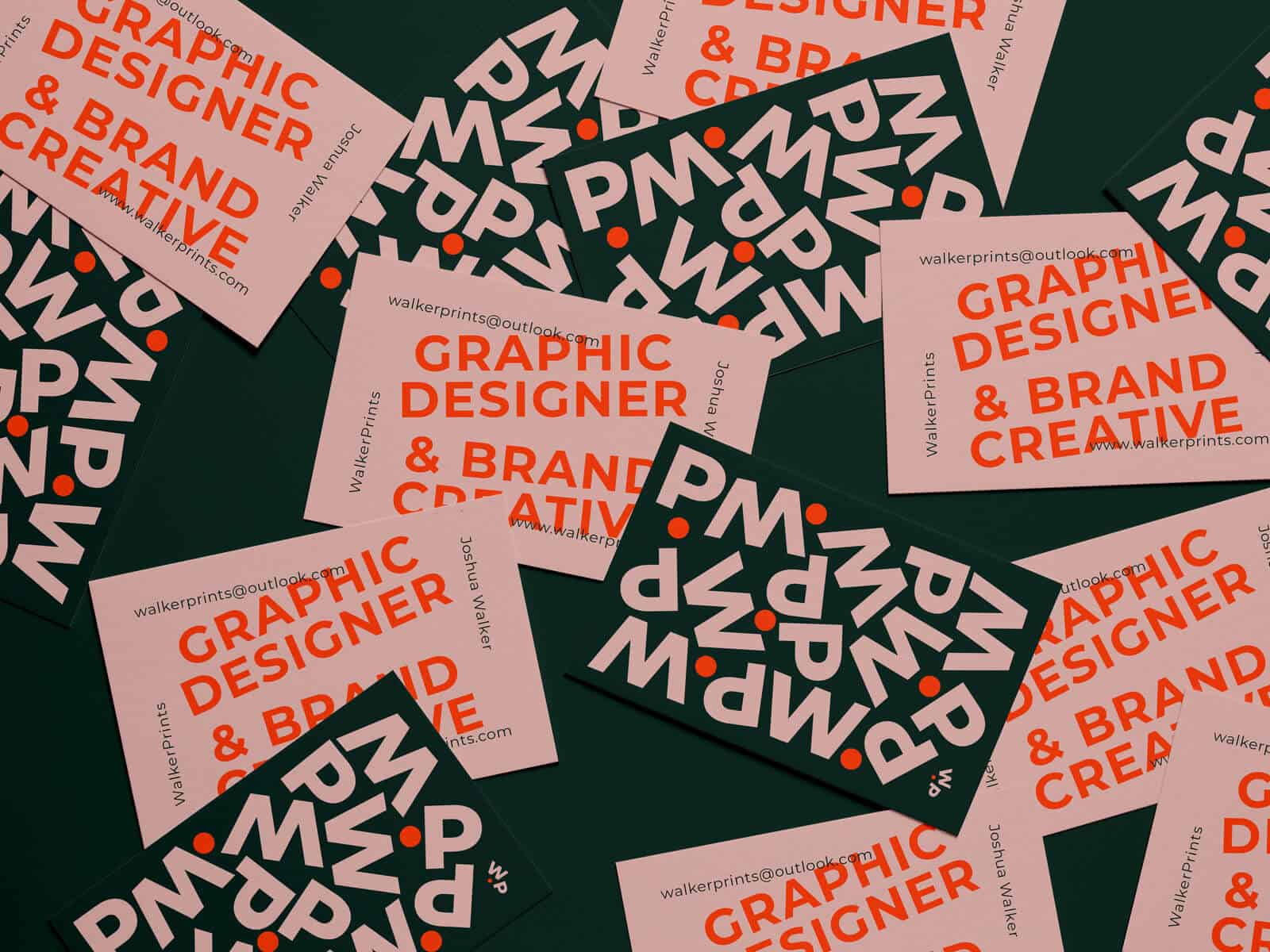
Designed by: WalkerPrints
Letters become graphic shapes. Cropped and enlarged forms create a bold, geometric identity, proving typography alone can drive a complete brand look.
CH LAB
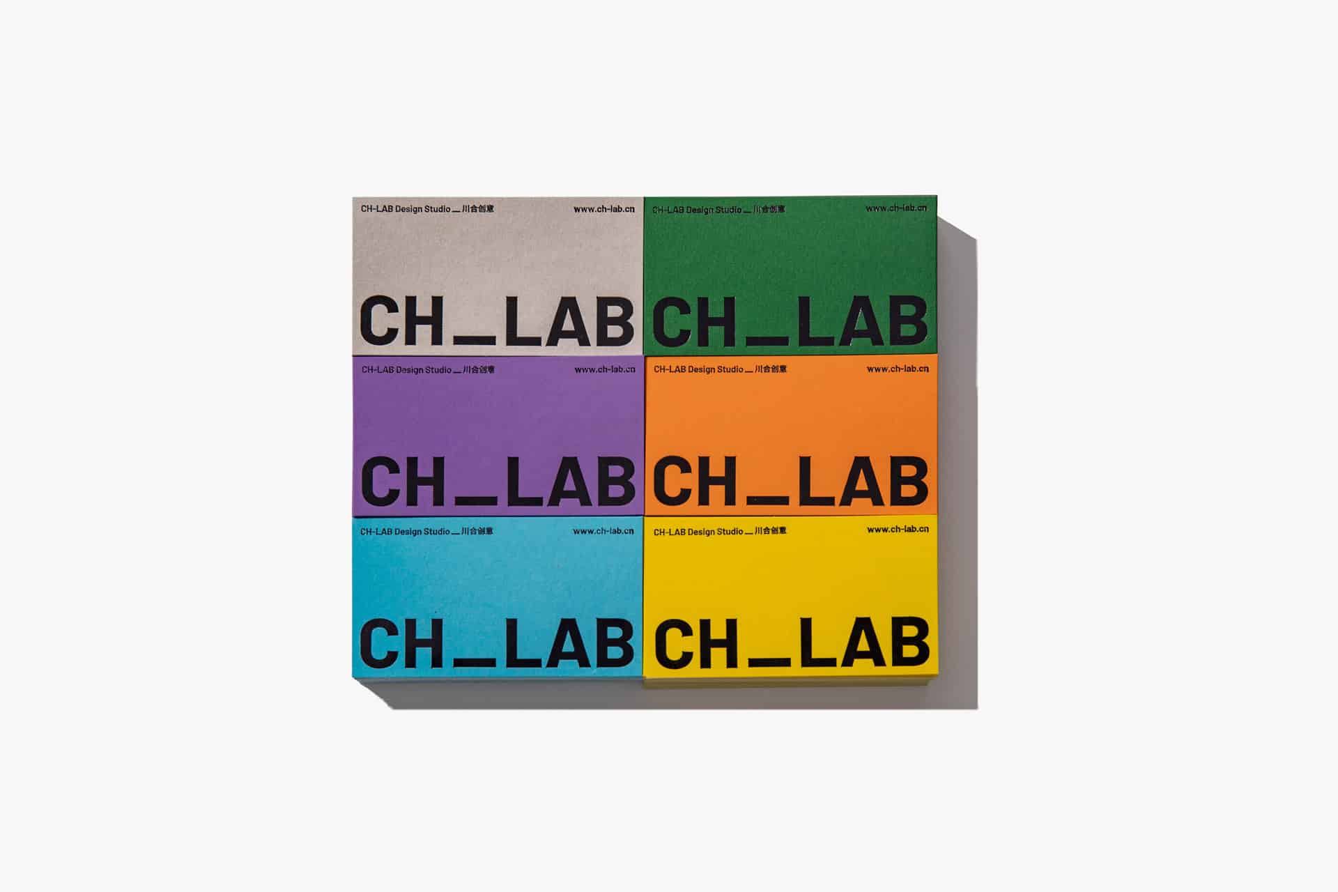
Designed by: CH-LAB Design Studio
Big logo, small data. Oversized branding balanced with precise microtype delivers a clean, confident composition that many modern studios are adopting.
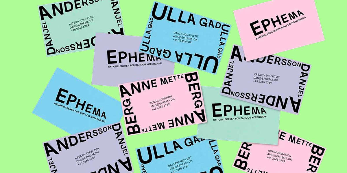
Ephema
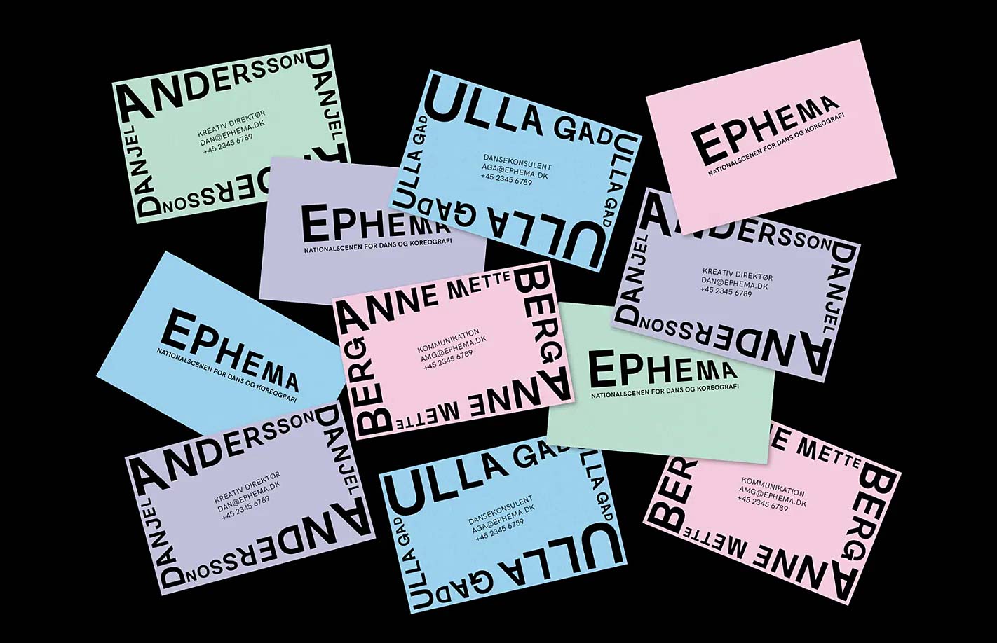
Designed by: Anne Kathrine Nørregaard
Ephema takes a creative approach to bold typography through unique scaling and formation of letterforms. The interplay of weight and proportion gives the card strong visual rhythm, while the use of pastel tones from Colorplan stocks softens the look. The result is a minimalist yet expressive design that feels both daring and understated, a perfect example of how simplicity can command attention.
PetitGrain
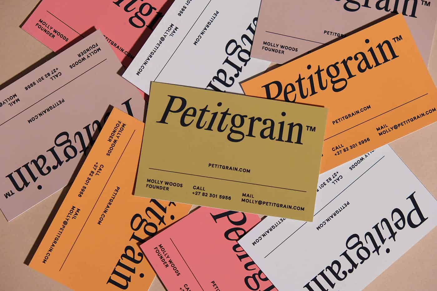
Designed by: Candice Bondi
PetitGrain brings together a timeless serif font and minimalist layout, showing that simplicity never goes out of style. The monochrome palette and symmetrical alignment give this design a refined, professional edge while keeping it visually calm and balanced.
Karuka Niizeki
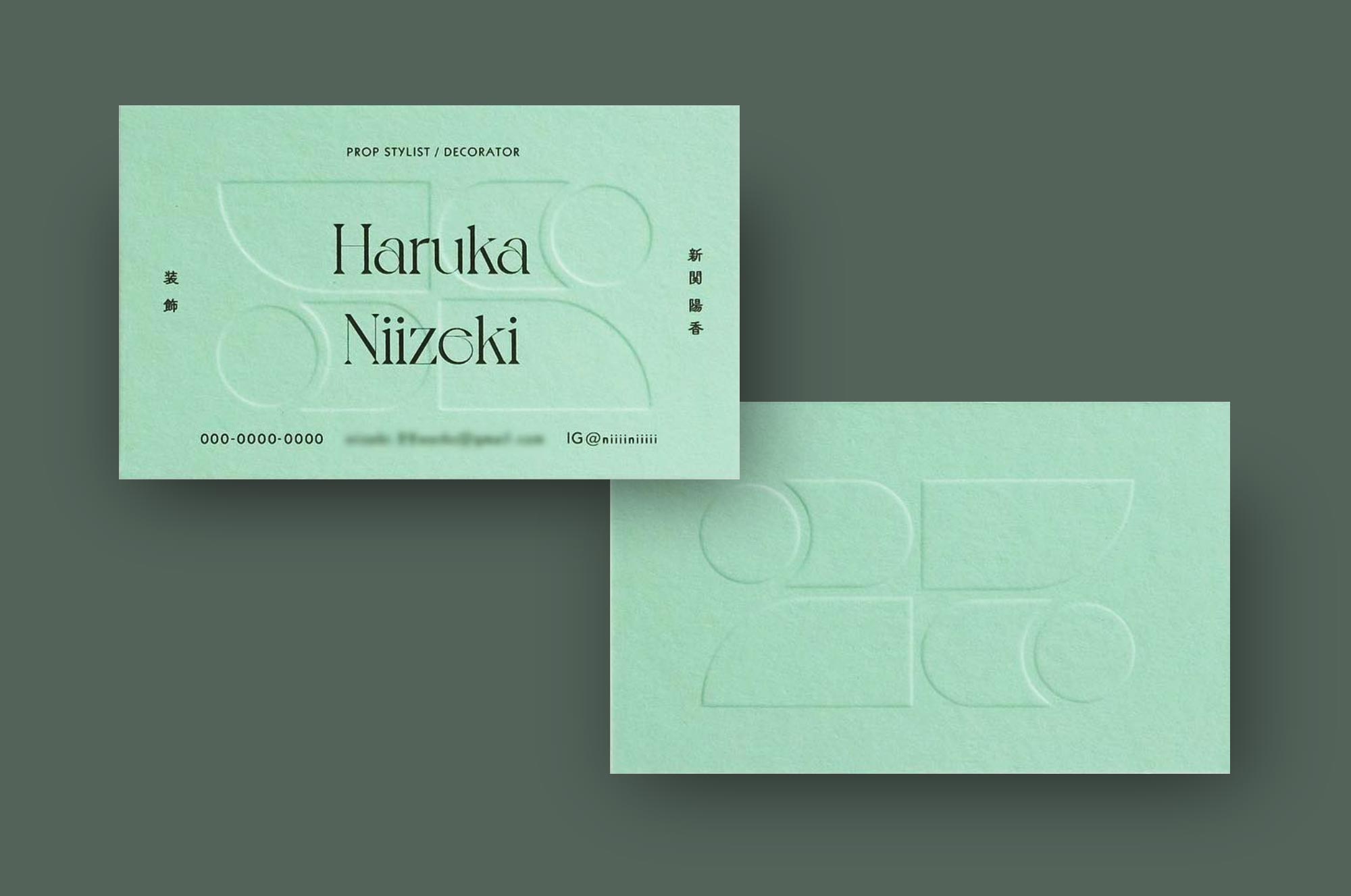
Designed by: Noda Kumi
The simplicity of Park Green Colorplan paired with clean typography from the Paris Type Foundry creates a serene yet impactful aesthetic. What makes this design stand out is the overlapping deboss impression, a daring creative choice that breaks traditional layout rules. The result is a timeless, refined card that will continue to inspire designers for years to come.
Conscious Made
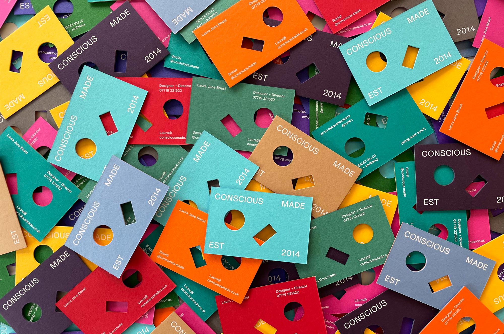
Designed by: Conscious Made
Conscious Made’s cards show how color pairing can become art. Each card features a different Colorplan combination, so no two are identical. The foiled logo and custom die cutting elevate the composition, turning the design into a tactile, collectible experience.
Archier
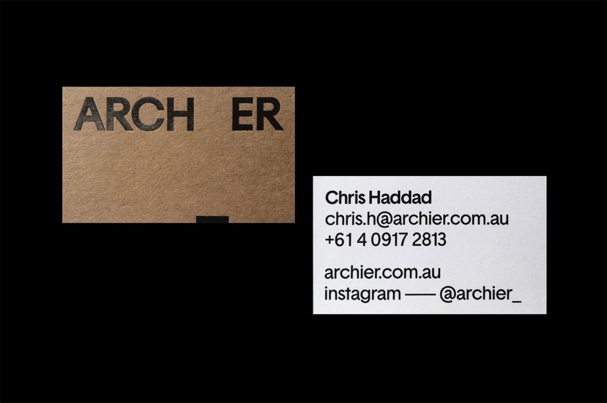
Designed by: Archier · Identity by M.Giesser
Archier’s use of kraft paper and white pairing feels organic and intentional. The minimalist typography layout draws focus to material contrast, a key 2026 trend where natural tones meet modern grid design. The composition feels earthy yet elegant, perfectly matching the brand’s architectural ethos.
IONA
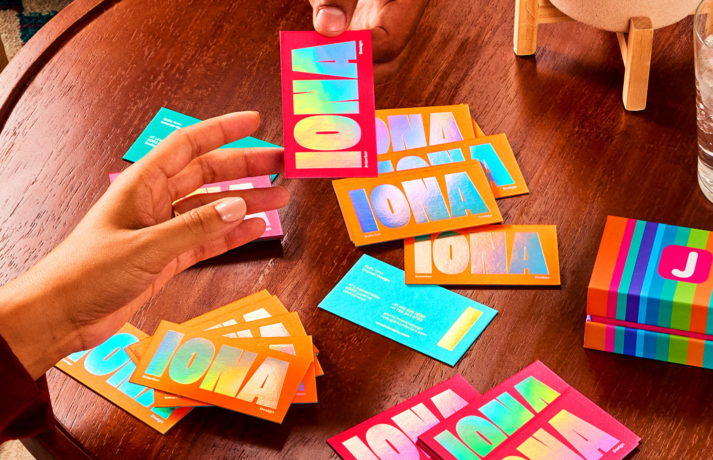
Designed by: Laura Boast
IONA introduces a futuristic look through holographic foil, light and color changing with every angle. The clean typography and negative space let the shimmer take center stage, proving that restraint can make metallic finishes feel elevated and artistic.
Marie Mur
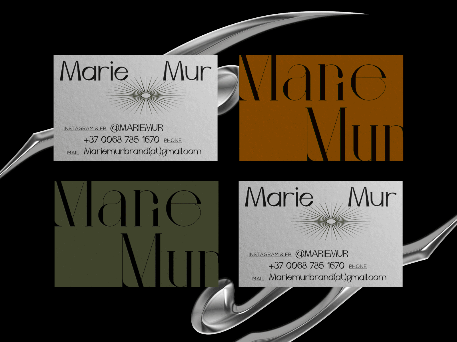
Designed by: Irina Nakonechnaya
Marie Mur’s design blends contrasting font styles to create balance and motion. This approach of mixing serif, sans, and display type is gaining momentum in 2026, giving brands the freedom to express multiple sides of their personality through typography.
Spy Studio
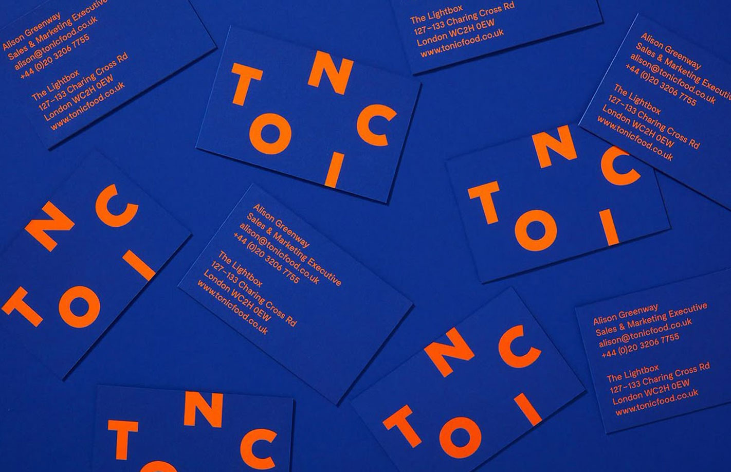
Designed by: Spy Studio
Spy Studio’s cards embrace the power of contrast, vivid fluorescent foil meeting deep reflex blue. The clean sans-serif typography and asymmetrical layout give it a sleek, design-driven edge. It’s bold yet balanced, a perfect closer to 2026’s most visually daring business card trends.
Find Your Perfect 2026 Business Card Design
Ready to create a business card that feels like you? Start with your core idea. Is it all about a stunning font, a dreamy color palette, or a striking layout? You can start designing right away using our free business card maker. Whatever you choose, build contrast to guide the eye – think a bold headline with delicate, fine-print details. Your paper choice is just as important. Feel the vibrant hues of Colorplan, the gentle softness of Cotton, or the sturdy, layered feel of Duplex.
Want to really 'wow' them? Add a special finish. A touch of Foil Stamping, a pop of color with edge painting, or the subtle touch of blind embossing can make all the difference. Remember, the best 2026 designs aren't about being complex; they're about being intentional, balanced, and totally original.
Why a Printed Card Still Wins
In a world full of screens, a physical card is a breath of fresh air. It’s a tangible piece of your brand that someone can hold, feel, and remember. The right paper, texture, and typography tell a story that pixels just can't. A beautifully designed and printed card doesn't just share your contact info – it leaves a real, lasting impression. Print isn't just alive; it's making new connections every day.
And that’s why print continues to shine. It has character. It has presence. It makes people smile. At Jukebox, we love helping creators turn ideas into something real and beautiful and we believe these thoughtful, design-led touches will continue inspiring brands for many years to come.