
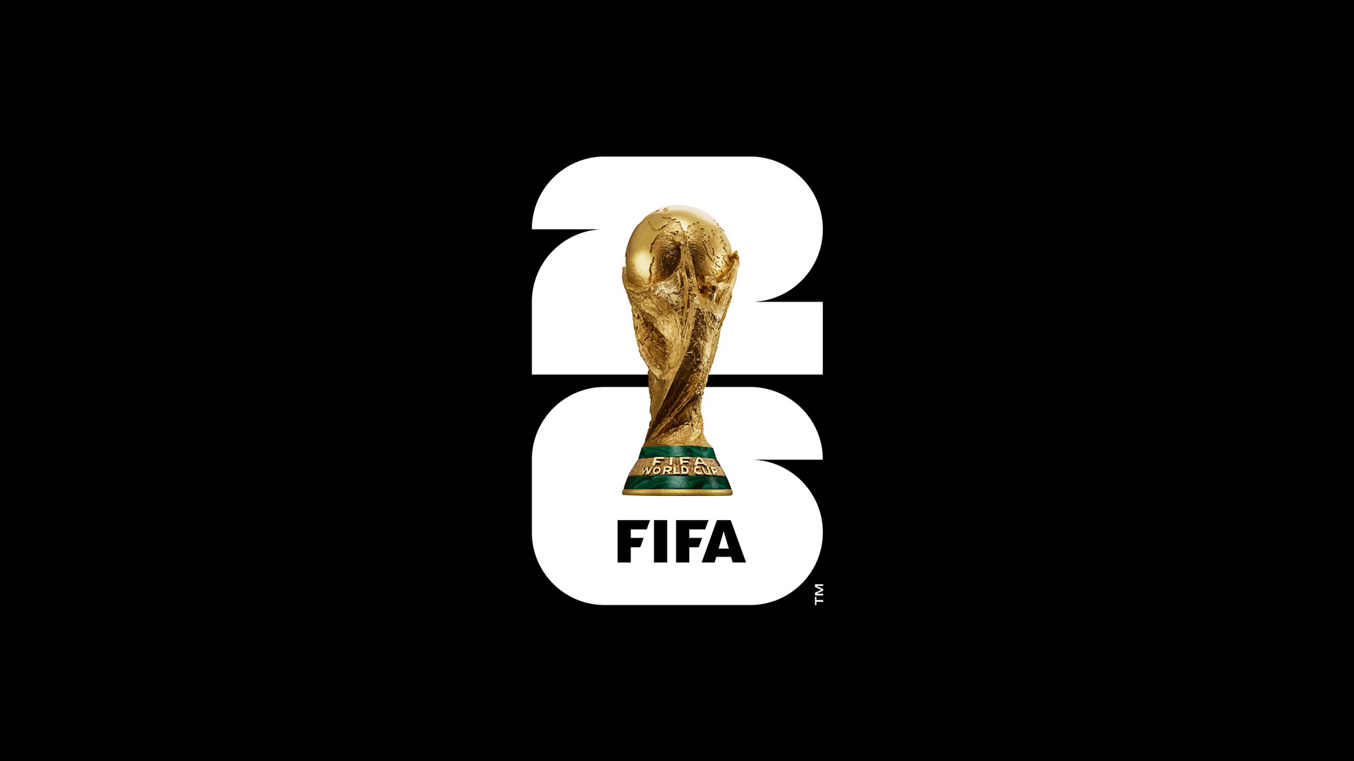
In May 2023, FIFA unveiled the emblem for the 2026 World Cup and, in doing so, did something it had never done before: it put the actual trophy into the tournament's logo. Every previous iteration had used an illustration or a mascot. With this design, the trophy itself became the centerpiece of the identity, which is far more literal than any World Cup logo before it.
And we’ll be seeing a lot of it. Over the next few weeks, that trophy will be inescapable, plastered across stadium billboards, wrapped around city buses, stitched onto merchandise, and stamped on everything from ticket stubs to broadcast graphics.
Here’s why this tournament’s identity is truly iconic.
What makes a World Cup identity different from regular sports branding
Most sports branding is built to last. A club crest evolves gradually but stands the test of time. Real Madrid in 2026 is still recognizably Real Madrid from 1950. A World Cup identity, by contrast, is rebuilt from close to zero every four years.
It also has a job that regular sports branding doesn't: representing a place. Host-nation identities double as a kind of state portrait. How does this country want to present itself to several billion people for one month? That was the brief South Africa and Brazil were working to in 2010 and 2014, and it's a fundamentally different brief from "design a logo for a tournament."
Then there's scale of application. The same mark has to work as a tiny app icon, a stadium-sized banner, a broadcast graphic, a sticker, and a mural across sixteen cities in three countries with different dominant languages. Most identity systems flex across a handful of formats, but a World Cup identity has to flex across an entire spectrum of culture and scale at once.
The 2026 logo: form, concept, and what it's communicating
The FIFA World Cup 2026 logo was unveiled at the Griffith Observatory in Los Angeles, presented by FIFA president Gianni Infantino alongside Ronaldo. It was designed by Public Address, the same studio behind the 2023 Women's World Cup identity and a contributor to the LA28 Olympic logo, so this is an agency with very real, very recent practice.
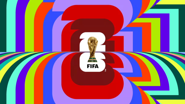
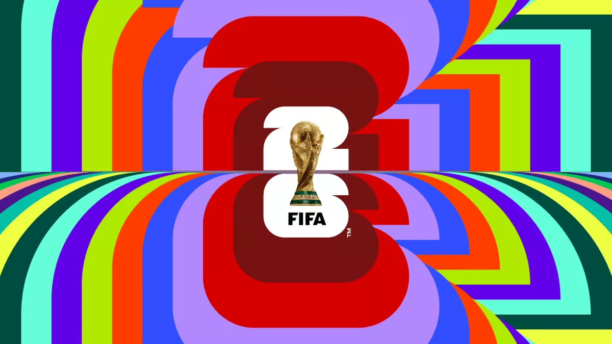
Structurally, the mark stacks two very different design languages on top of each other. The base is a bold, geometric numeral "26," built from 48 individual squares and quarter-circles that FIFA says reference the 48 competing nations (it’s the first time this many countries have competed), the straight edges of a pitch, and the curve of a ball. It's flat, modular, and grid-built.
Sitting on top of it is the World Cup trophy itself, rendered photorealistically with shadow, depth, and a metallic sheen. This is the first time an actual photographic rendering of the trophy has anchored a World Cup emblem.
The palette and swatches
The World Cup 2026 colors actually split into two parts.
The primary color palette (used for the main emblem) is close to monochromatic: black, white, and gold. It's restrained, closer to an institutional or luxury palette than anything you'd associate with football merchandise. That restraint is deliberate. A black-white-gold mark doesn't compete with any single host nation's flag, and it sits cleanly on top of broadcast graphics, signage, and sponsor branding without clashing.
There's also a multicolor version, where the repeated "26" pattern appears across a much wider spread of hues.

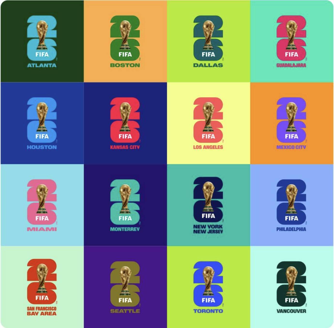
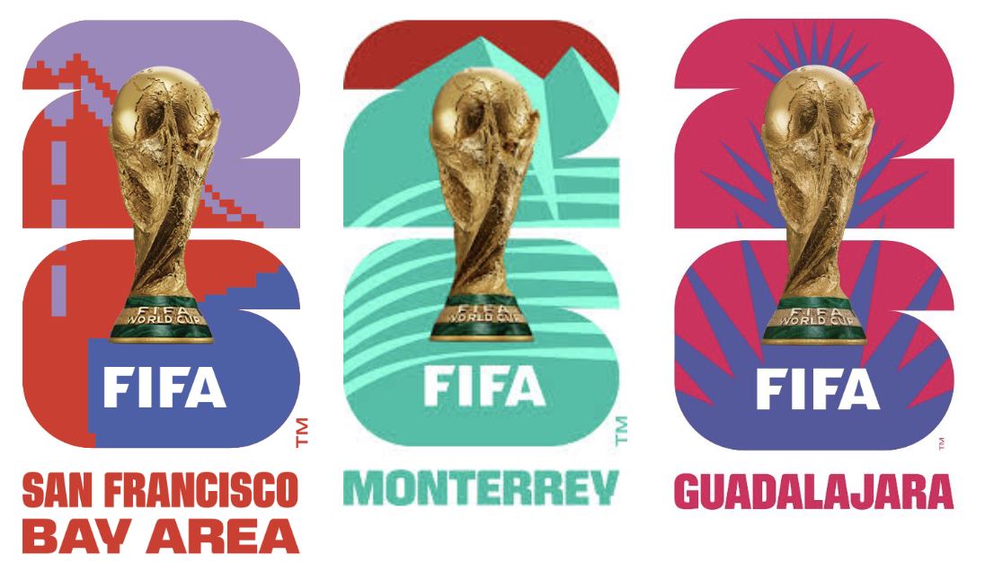
The real color story, though, sits at the host-city level. Each of the 16 host cities has its own logo, built on the same "26" structure but recolored and patterned for local identity. There’s waves for Los Angeles, the Golden Gate Bridge worked into San Francisco's mark, mountains made out of linework for Monterrey.
There's also a country-level layer for sponsors and partners, where Canada's tones run red, Mexico's run green, and the US runs blue. It’s a tidy, if slightly on-the-nose, way of giving three host nations distinct but harmonized palettes within one system.
Typography and how the system extends
FIFA paired a custom display typeface (designed to visually support the "26") with Noto Sans as a secondary, workhorse font. That's a sensible choice for an identity running across three countries in English, French, Spanish, and Indigenous languages.
The FIFA wordmark itself reads more like a slab of branding than a typeface in the traditional sense. It's blunt and confident, which suits its job anchoring the bottom of the lockup at every scale, from stadium banner to broadcast lower-third.
Where the system is least convincing is small-size legibility. Block geometric letterforms read well on a poster or a jumbotron. But on signage, schedules, and smaller print applications, the same forms can quickly become busy. It's a familiar tension in sports branding because the type that photographs best on a big screen isn't always the type that's easiest to read on a printed schedule.
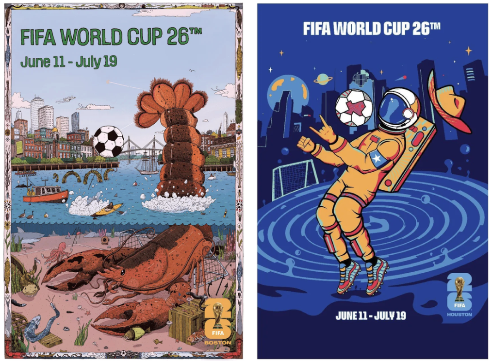
World Cup 2026 posters: the host city system
For the first time in World Cup history, each of the 16 host cities has its own official poster, each commissioned from a different local artist with a loose brief: capture the city's relationship with football and its own visual culture.
Houston's poster leans into an astronaut motif. Vancouver's, by Jamin Zuroski, draws on Indigenous art and nature, with an orca near the Port Mann Bridge and the North Shore Mountains behind it. Los Angeles's was created by Thieb Delaporte-Richard, a 3D artist and former Apple art director, in a rendered, dimensional style. Boston's poster packs in local references, including the Tea Party, lobsters, and regional landmarks.
Alongside the 16 city posters there’s a single official tournament poster, created collaboratively by three artists, one from each host nation, using blue, red, and green to represent the US, Canada, and Mexico.
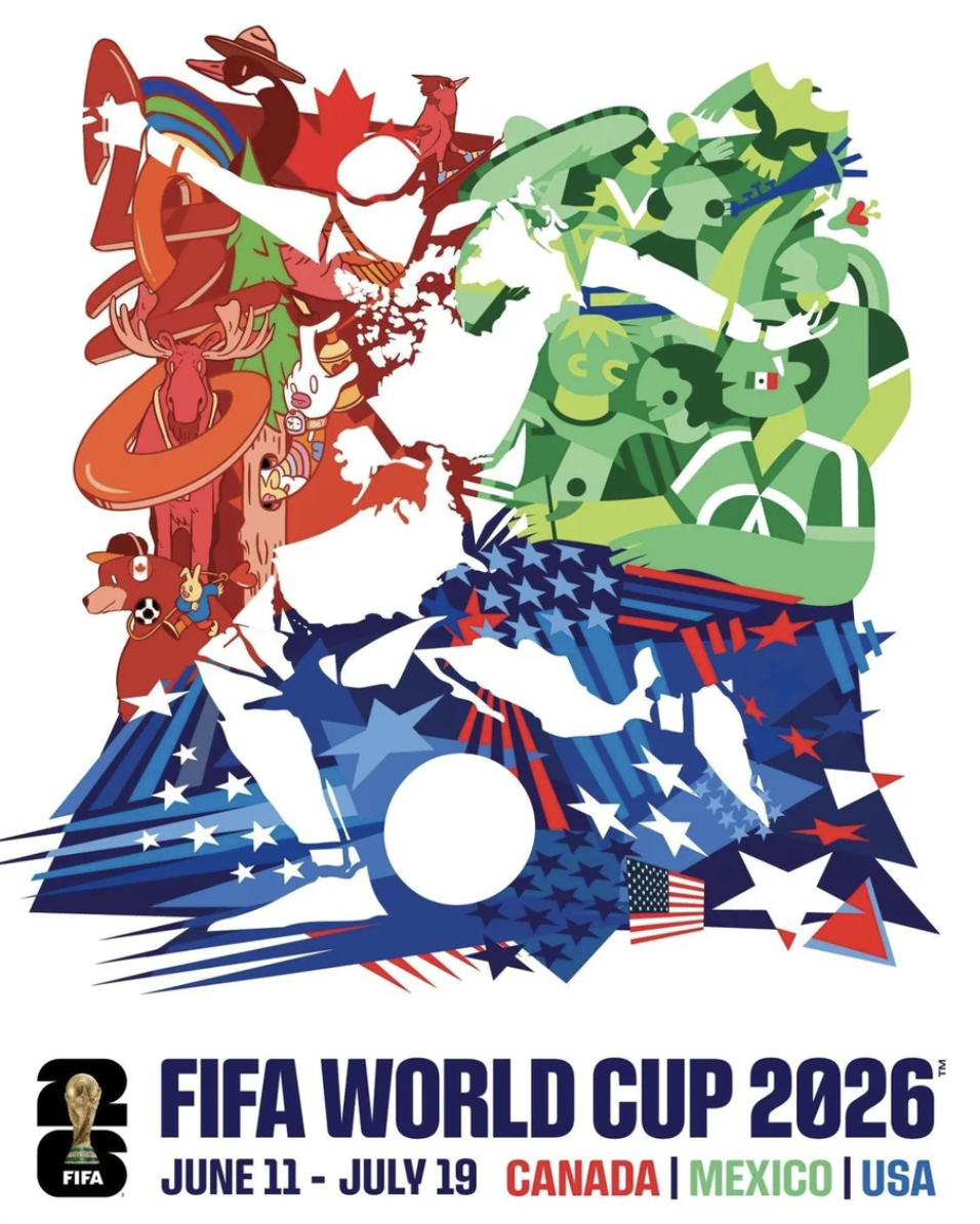
What's notable is the contrast with the core emblem. The logo is tightly controlled, modular, almost corporate. The posters are the opposite. They’re illustrative, expressive, openly inconsistent in style from city to city.
The emblem sends out a consistent global signal, while the posters are where local culture gets to be loud, specific, and a little messy. It's a useful model for anyone designing for a multi-location campaign: a tight core identity paired with a loose, illustration-led layer gives you both consistency and personality, without forcing one mark to do both jobs.
How it compares: Brazil 2014 and South Africa 2010
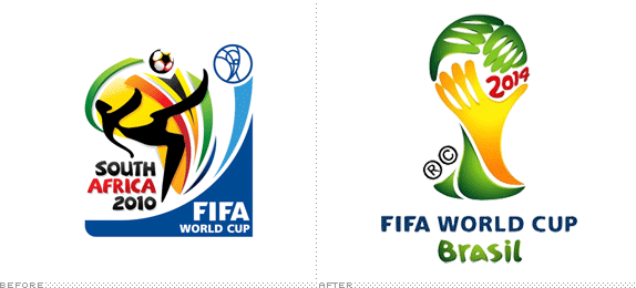
Brazil 2014's emblem, "Inspiration," was built from a photograph of three hands joined together in the shape of the trophy, rendered in the yellow and green of the Brazilian flag, with "2014" set in a loose, hand-drawn red typeface.
It was designed by São Paulo agency Africa, selected from 25 submissions by a panel that included Gisele Bündchen and Paulo Coelho, and was the first World Cup logo designed with animation in mind.
It's warm, human, and unmistakably Brazilian, and it's also the edition most often cited as a cautionary tale for trying too hard to be "friendly." The hand-drawn type in particular has aged into the identity's weakest element. It was charming when it launched, but slightly dated a decade on.
South Africa 2010 took a similarly host-culture-led approach: a dynamic figure mid-kick, built from ribbon-like swooshes in the blue, green, red, and orange of the South African flag and African textile patterns, with the ball itself sitting in negative space. Tied to the slogan "Ke Nako — Celebrate Africa's Humanity," it's arguably the more confident of the two designs, even if some found the abstraction harder to read at a glance.
What both editions share is that the core emblem did the cultural storytelling itself.
Flag colors, national motifs, and a sense of place were baked into the mark from the start. 2026 inverts that completely. The logo is deliberately placeless. The storytelling happens one layer out, in the host-city and poster system.
Which approach "wins" depends on what you're optimizing for. Brazil's and South Africa's marks are more memorable as standalone graphics. You can describe either in a sentence and most people will picture it. The 2026 mark is more forgettable in isolation, but the system around it is more sophisticated, and arguably better suited to a tournament that no longer belongs to one country.
How the tri-nation format shaped the visual system
Past iterations of the World Cup logo could afford to be "about" somewhere, because there was a “somewhere” to be about. 2026 doesn't have that option. A mark built around US imagery would have alienated Canadian and Mexican audiences, and vice versa, so the logo had to be culturally neutral by necessity.
It's not just that minimalist design happens to be fashionable right now (though it is). The bigger issue is structural: this World Cup has three host countries, which rules out the old approach entirely. For the past 20 years, World Cup logos leaned on illustration and imagery tied to the host nation's culture, but you can't do that when there are three hosts instead of one.
The one piece of detail they could safely include was the way the "26" is built. That works because it's about the tournament itself, not about any single country, so it doesn't favor one host over the others.
Everything culturally specific gets pushed outward instead, into the host-city logos, the posters, and the country-level color tones. It's a hub-and-spoke architecture: one neutral, infinitely reproducible hub, and sixteen expressive spokes.
Where the identity actually reaches the most people
There's one place the 2026 visual identity gets handled by more people than any stadium banner or broadcast graphic, and it's a sticker album. The official Panini FIFA World Cup 2026 collection has 980 stickers across 112 pages, the largest World Cup sticker collection Panini has ever produced.
What's worth noticing from a design standpoint is that the album cover uses the same modular "26" grid as the emblem, the stack of squares and quarter-circles, now printed at pocket scale and handed to kids from Toronto to Guadalajara. The player stickers use the "26" as a background frame for each portrait.
The system didn't stop at the poster or the broadcast package. It ran all the way down to a 7cm rectangle someone peels off a backing sheet and sticks next to their bed. That's what a properly built brand framework actually does.
The 2026 World Cup identity is a system, not a symbol
Whether the World Cup 2026 logo itself is "good" is almost the wrong question. On its own, it's a competent, slightly uneasy hybrid of flat graphic design and photographic realism.
The more useful question is whether the system around it holds up, and on that front, it mostly does. Faced with three countries, sixteen cities, and the biggest tournament FIFA has ever staged, Public Address built something closer to a modular brand framework than a traditional sports emblem, and pushed the personality, color, and cultural specificity out to where it can actually do some good: the cities, the posters, the local activations.
It's not the World Cup identity that will make you feel something on sight, the way Brazil's hands or South Africa's kicking figure might. But it might be the one that ages best, simply because it was never trying to be a single, beautiful picture in the first place.