
Typography has had a real moment over the last few years, and it’s changed how we look at design. With better tools and more accessible font software, designers are pushing typography further, treating letterforms as shapes, and using type to build personality across every corner of graphic design.
Business cards are a perfect place for this. Their job is simple: share your contact details clearly, while matching the impression you want to leave.
That’s why typography-first business cards keep winning. Instead of relying on icons, photography, and extra decoration, the type does the work. When hierarchy, spacing, and font choice are dialed in, a clean card can feel more intentional than something packed with elements.
If you’re looking for ideas, or you just want a spark of inspiration for your next layout, here are 54 typographic business cards to scroll through.
Rep Club

This fluorescent accent paired with a black and white palette works perfectly with the condensed sans-serif. The narrow letterforms allow the designer to scale the type up without it feeling heavy, so it grabs attention instantly while staying clean. Leaving out extra elements makes the typography feel even stronger.
Designed by: Estudio Daó
Mamma Chen's

This set uses more supporting elements, but it still feels balanced because the typography leads the way. The mix of type styles gives the design its energy, and it’s a good reminder that the “use as few fonts as possible” rule isn’t a hard rule. When the pairings are intentional, it can look great.
Designed by: Thought & Found
Animis

This display typeface does all the heavy lifting. When you give typography this much space, the letterforms need enough character to hold attention. The layout is simple, but it works because the hierarchy is clear and every line has room to breathe. Three text blocks can be plenty when the spacing is right.
Designed by: Steve Wolf
Wiz Academy

Similar in composition to the previous card, this one is built around the large WIZ mark, set in a geometric display typeface. You can already sense what the overall branding might feel like, which is a lot to achieve with very few elements.
Designed by: Culto Creative
Raktiq

Minimal in the best way. The shape of the card is based on the negative space between the T and I, which makes the typography feel like part of the layout, not just content. This semi-serif typeface gives the design a technical, solid feel, and it holds up well at a bold, oversized scale.
Designed by: Ara Estudio
CH-LAB

A great example of what contrast in type size can do. The small text feels precise, while the large typographic logo adds weight and presence. The palette is strong too, especially with black ink anchoring everything.
Printed Process: Black Ink printed on Colorplan China White, Forest Green, Mandarin Orange, Factory Yellow, Purple, Turquoise
Designed by: CH-LAB Design Studio
WalkerPrints

Who says text has to run in straight lines? Letterforms are visual shapes on their own. This playful composition of separated letters creates movement and grabs attention immediately.
Designed by: WalkerPrints
L'Atelier

Another way to build contrast is mixing type styles. Pairing a clean sans-serif with an elegant serif adds tension in a good way. Studio Velkro did a great job making this feel modern and refined at the same time.
Designed by: Velkro
Aphrem

Through color, typography, and texture, you can tell this brand is all about natural materials and an analogue feel. EPHREM is a manufacturer of wood-fired ovens in France, and the design tells that story well. If you haven’t explored variable fonts yet, this is a great reason to try them. Subtle width and weight adjustments can change the entire tone of a wordmark.
Designed by: Antoine Pilette
Clark

Noticing the trend of using a single ink color and letting the stock do the color work? It can be more economical, but it often ends up feeling more premium because the design has to be intentional.
The expressive text placement on the back is another look we’re seeing more and more. It might feel spontaneous, but it’s carefully composed, and it adds a sense of originality without adding extra clutter.
Designed by: Liam Nguyen
Noise

Another example of what a strong display typeface can do. Paired with a clean sans-serif on the back, the card feels modern and utility-driven. The layout breaks the usual rules just enough to feel fresh, without losing clarity.
Designed by: Monish Khara
Elliot Ulm

If you have a line that captures your brand voice, putting it front and center can work incredibly well. Filling the card with one message makes it memorable, and it tells people who you are before they even flip it over.
Designed by: Elliot Ulm
Play.Full

The foldout is the obvious eye-catcher, but the typography supports the playful sports vibe perfectly. The bold display type paired with the typewriter-style font creates a strong balance.
Designed by: Bond Creative Agency
Fuller

The wedge-serif typeface used for the logo is the first thing you notice, and paired with a modern sans-serif it feels clean, current, and professional. The painted edges add a nice layer of depth without needing extra graphics.
Designed by: Sean Kane
Gloria Content

Typography used in an unconventional way can become a signature brand detail. The repeating “I” is simple, but it’s instantly recognizable and gives the design rhythm. Small choices like this can make a typographic card feel truly custom.
Designed by: Studio Plastac
PetitGrain

Black ink on colored stock keeps showing up and it still doesn’t disappoint. It’s a clean way to reduce ink colors while letting the typography stand out on its own, and it fits that modern-retro look we’re seeing more often.
Serif and sans-serif is still a winning combo too. This balance between solid and elegant is exactly why the pairing works so well.
Designed by: Candice Bondi
De Young Meseum

This bold sans-serif hits immediately and feels disruptive in a way that suits a modern art museum. Color is doing work here too. A strong palette choice can make a typographic card feel instantly current.
Designed by: Karlo Fuertes Francisco
Hugh McCarthy

Minimal typography done right can feel incredibly high-end. The hard part is staying strict with what you include, because it’s tempting to add an icon or illustration. But restraint often creates that exclusive, premium feel.
Designed by: Both Studio
Fuel Bar

This extended typeface is another great example of a trend that’s sticking around. It has presence, and the supporting sans-serif keeps the details readable. That contrast is what makes the card feel balanced.
The most creative part is the matchbox concept. Typography-first doesn’t mean concept-free, and this one has both.
Designed by: Gabriela Hernandez
Kulfi

This modern mix of sans-serif and blackletter is enough to create a strong identity on its own. Hybrid font styles like this keep popping up in branding, and pairing them with a clean, legible body font keeps the design readable and intentional.
Designed by: Badal Patel
BBDO SF

Small adjustments to an existing font can create a strong logo while keeping it fully typographic. The color contrast makes the mark pop, and the bold weight gives the letterforms more to look at.
Designed by: Play Studio
Thomas Coward

This high-contrast sans-serif is interesting enough to hold attention at a large scale, and the small edits in the letters make it feel custom. On the back, the layout breaks a few traditional spacing rules, but the hierarchy still feels clear and confident.
Designed by: Studio SPGD
Hommey

Even without seeing the back, you can tell the brand wants to feel positive and approachable. The rounded corners support the typography nicely. The small “dot” detail turning into a pillow icon is a smart, brand-specific touch.
Designed by: A Friend of Mine
Curri

Based on the font choice alone, you can sense this is a technical brand. Curri is a logistics platform, and the designer communicates that clearly through type. Display faces like this are best used for headlines and nameplates. For small details, a clean sans-serif keeps everything readable.
Designed by: WMB&Co.
EMME

This bold typeface works perfectly for the brand name. Rotating the “M” to create a custom mark is a simple trick, but it’s effective. Pairing the heavy display face with a clean grotesque body font keeps it modern and industrial.
Designed by: Manuela Siviello
Oke

Pushing the boundaries of legibility can work when it’s done with intention. The sharp edges, bold contrast, and unusual forms make this feel like typography as image, not just typography as text.
Designed by: Thought & Found
Chief

The “C” creates the main visual on the front, filling the canvas in a smart, typographic way. On the back, a large name set in a hairline serif grabs attention, while the smaller details stay readable in a modern sans-serif.
Designed by: Mucca Design & Sean O’Connor
Alessandro Pigoni

This personal branding set leans hard into black and white, and it works. The typography feels artistic, with a bit of Y2K edge. It’s also a reminder that you can make type feel graphic without adding any extra illustration.
The Stedelijk Museum rebrand by Mevis & van Deursen (2012) sparked a lot of debate at the time, but you can see echoes of that bold typographic approach showing up more and more now.
Designed by: Alessandro Pigoni
Salesloft

Bracketed serifs have been showing up across modern brand identities for a reason. They feel professional and trustworthy, but still contemporary when the spacing and kerning are handled well. The painted edges add a lot to the overall look and make the set feel finished.
The employer name type on the back has a similar vibe to ABC Arizona by Dinamo, a superfamily that transitions from sans to serif through hybrid styles.
Designed by: Focuslab
Odele

The lowercase display type on the front fills the entire side, and the letterforms are quirky enough that you don’t need anything else. Those “g” and “k” shapes could easily become a whole identity system.
On the back, the uppercase display font stays legible at this size and fits the overall tone of the set.
Designed by: Ira Arturawna
Nguyen Huy Hung (Key)

A different approach to typographic design, where typography becomes the entire layout. Warping, bending, skewing, rotating. It all comes together as a composition that you’ll look at a little longer once it’s in your hand.
Designed by: Hùng Key
Appart Agency

Adjusting the shape of the card based on the content is something worth considering. It keeps the layout tight and makes the design feel more purposeful than leaving empty canvas on both sides.
The bold lowercase sans-serif is set beautifully, and cropping the text is a rare move, but it works here because it stays readable and adds energy.
Designed by: Antonio Calvino
Heba Shaikh

Expanding certain letters can become an identity system on its own. Not every typeface can do this cleanly, so it’s worth experimenting before committing. A condensed sans-serif like this makes it easier, and the analogous palette keeps it fresh without feeling crowded.
Designed by: Antonio Calvino
Ryan Doro

Even without contact details, this shows what’s possible with expressive type. The flare-like serif is unusual, and paired with the color palette it creates a card that feels bold and memorable.
Designed by: Ryan Doro
Flore

Condensed sans-serifs have been popular for years for a reason. Black text in a condensed face on a white background is simple, sharp, and hard to mess up. It looks good now, and it will still look good later.
Designed by: Tobias van Schneider
Rockit

The mix of a geometric, rectangular “R” with a softer display sans-serif is a brave move, and it works. Pairing it with a minimal sans-serif on the back keeps it balanced. Red, black, and white also gives this technical brand a strong, confident feel.
Designed by: Andstudio
Blacktop

Bright yellow type on a black field. That’s all you need sometimes. Designers tend to overcomplicate this because there are so many options to add, but strong typography often comes from what you leave out.
It’s also worth saying out loud: minimalist work is often questioned by non-designers. That pressure can push designs toward “more stuff.” But when typography is strong, simplicity usually wins.
Designed by: Jared Granger
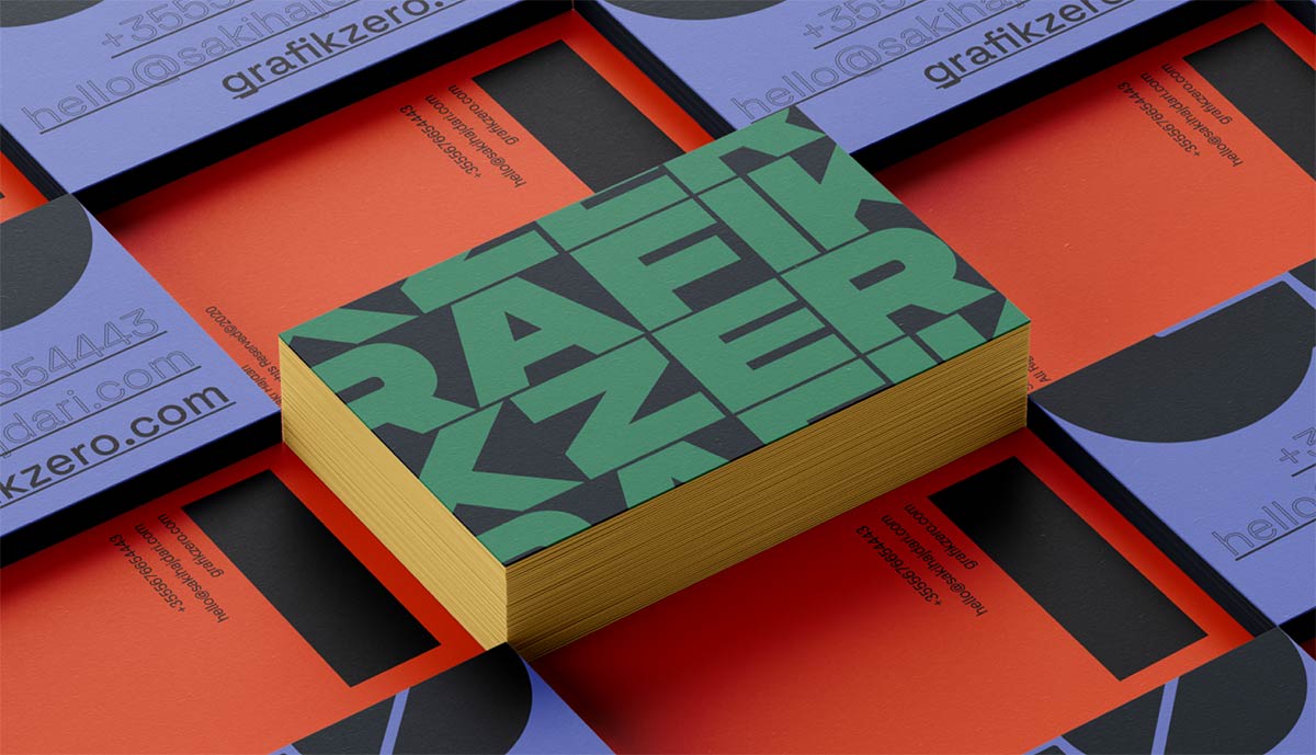
Grafik Zero

The repeated type pattern isn’t fully legible, but it doesn’t always have to be if the brand name and details are communicated clearly elsewhere. The bold display font, clean body type, palette, and painted edges all come together and just work.
Designed by: Saki Hajdari
Shile

Extended typefaces keep gaining popularity, and this is another great example. The oversized wordmark sets the tone immediately, while the smaller supporting lines add depth and make the front feel more layered.
Fixture by Sudtipos is a great example of a font family that gives you plenty of options to explore a similar aesthetic.
Designed by: Outer Studio
Softcity

Could it be this simple? A semi-extended sans-serif centered on a textured white stock, with clean supporting type on the back. It’s minimal, balanced, and feels effortless.
Designed by: Met Studio
Planta

A great example of a portrait business card done well. The logomark, wordmark, and details all feel placed with intention. The floral icon paired with the geometric sans-serif creates a nice mix of organic and modern.
Designed by: Mr. Mockup
Lauren Scotti

These cards look especially good as a set. The color system is cohesive, and the typeface has a modern blackletter feel that gives the whole identity a distinctive voice.
Designed by: Lindsey Pruitt
Eterea

An extended typeface that sets the tone in a bold, confident way. The back is direct and clear with a modern grotesque for the details. Red on white is always a strong attention grabber, and this card is no exception.
Designed by: Cameron Hall
Okay

Dynamic type systems are showing up everywhere in modern identity work. These variations show how different font options can still feel like one cohesive brand when the system is designed well.
Designed by: Mr. Mockup
Marie Mur

An interesting mix of typefaces, balanced by a single non-typographic element. It’s no surprise we keep seeing business cards printed with black ink for the type layer. It’s simple, sharp, and it works.
Designed by: Irina Nakonechnaya
Bolinaria

A great example of a clean, elegant font pairing. The serif choice gives the name an immediate botanical feel, and the minimal approach keeps the message clear and refined.
Designed by: Irina Nakonechnaya
Ikshana

Solid, simple, and confident. The ultra-bold typeface for the brand name is supported by a minimal sans-serif. Black, orange, and white always work well together, and it gives this card a strong mechanical feel.
Designed by: Sazzad Hosen
Thomas Edwards

Experimenting with parts of letterforms can lead to unexpected results. These cards are minimal, but they still feel carefully designed. It’s a good reminder that small typographic decisions can carry an entire layout.
Designed by: Kate Zest Studio
Nova Iskra

The bold sans-serif works well at both large scale and small sizes, which makes it possible to run a single typeface across an identity. If you’re considering this approach, make sure your chosen family has enough weights to create hierarchy.
Designed by: Olga Vajagić
Woven

When you choose your typeface wisely, a wordmark can be interesting enough to carry an entire side of the card. The rounded serif feels friendly and positive, and it creates a strong first impression.
Designed by: Alen Pavlovic
Rond

A lovely identity by Paris-based Brand Brothers, using an ultra-black display typeface they designed themselves. Pairing it with an industrial condensed sans-serif adds contrast and gives it a restaurant feel as well. Worth checking out the full branding project.
Designed by: Brand Brothers
Wildist

This use of a grotesque typeface with tight kerning shows how quickly you can build a strong look when every element supports the same direction. The palette, typography, icon, and border all work together to create a card that stands out.
Designed by: Studio Mast
Petty Well

We’re big fans of expressive fonts, and it’s great to see how well “PW” works when it’s placed full size on the front. If you’re choosing a display font, look for letterform details that feel unique, because they add a lot of value when the type is the main visual.
Just remember to pair heavy display type with a more legible body font for the details. That balance keeps the card readable and intentional.
Designed by: Mr. Mockup
There you have it. 54 typographic business cards in all kinds of styles and directions. If you found a few that made you pause, that’s the point. Typography is one of the fastest ways to shape how a brand feels, before someone even reads a word.
If you’re designing your own, start with hierarchy. Decide what should be noticed first, then support it with smaller, simpler text. Contrast helps too. If your headline is bold and loud, keep the details clean and legible so the card feels balanced.
Looking for a great typeface? Here are a few solid places to start.
Some free font libraries:
- Google Fonts
- Adobe Fonts (included with Creative Cloud)
- Font Squirrel
Some of our favorite type foundries:
When typography is doing most of the work, the physical details matter. Paper color, texture, and weight can subtly change how letterforms feel once they’re printed.
Keeping those choices in mind early on can make a simple typographic layout feel more considered in the final piece.