A visiting card is the same product as a business card. The term visiting card is commonly used in India, Pakistan, Bangladesh, the UAE, and other parts of South Asia and the Middle East. In North America, the United Kingdom, and most of Europe, the same card is called a business card. There is no difference in the product itself. Only the terminology changes by region. For design help, see the visiting card design guide.
Visiting Cards
Design, customize, or print premium visiting cards
Visiting card is the standard term across India, Pakistan, UAE, and South Asia. Business card is the same product. Start from scratch in the visiting card maker, choose a template to customize, or upload your own design for printing.

Choose how to create your visiting card
Not everyone starts the same way. Some users want a blank canvas. Others want a template they can edit quickly. If your design is already finished, you can upload it directly and move into printing.
From scratch
Visiting Card Maker
Start with a blank canvas and build your card exactly how you want. Add text, logos, shapes, and create your layout from scratch.
Start designing ›Premade designs
Visiting Card Templates
Choose from ready-made layouts and customize them with your own name, company details, and brand style.
Browse templates ›Print ready
Upload Your Design
Already have a finished file? Upload your design and print on premium stocks with the same options available across our business card collection.
Upload design ›Start your visiting card in seconds
Most users start with a template for speed or use the visiting card maker for full control. If your design is already complete, you can upload your file and move directly into printing.
What is a Visiting Card
A visiting card is a small printed card that carries your name, contact details, and professional identity. In India, Pakistan, UAE, and across South Asia, visiting card is the standard term. In North America, Europe, and the UK, the same product is usually called a business card.
If you are ready to create one, you can start from scratch in the visiting card maker, choose a template, or upload a finished design for printing.
The visiting card maker lets you create your visiting card online with the correct size, bleed, and layout already set. You can design, adjust, and prepare your card for print without setting up files manually.
| Also called | Business card |
| Standard size (NA) | 3.5″ × 2″ / 88.9 × 50.8 mm |
| Standard size (UK/EU) | 85 × 55 mm |
| Printing sides | Single or double sided |
| Common finishes | Soft Touch, Matte, Gloss, Uncoated, Colorplan |
Visiting Card vs Business Card
Visiting card and business card refer to the same product. There is no difference in size, materials, or printing. The difference is terminology, and it depends on region.
Visiting card is the standard term across India, Pakistan, Bangladesh, the UAE, and South Asia. Business card is used in Canada, the United States, the United Kingdom, and Europe.
Someone searching for visiting card is looking for the same product as someone searching for business card. The only difference is the wording used to find it.
Visiting Card Size
The standard visiting card size in North America is 3.5 inches by 2 inches (88.9 × 50.8 mm). In the UK and Europe the standard is 85 × 55 mm. In South Asia, both 85 × 54 mm and the 3.5 × 2 inch North American standard are widely accepted.
When preparing your file, set bleed to 0.125 inches on all sides and keep text inside the safe zone. Set color mode to CMYK before exporting. Full bleed specs and file setup instructions are in the visiting card size guide.
| Finished size | 3.5″ × 2″ / 88.9 × 50.8 mm |
| With bleed | 3.75″ × 2.25″ / 95.25 × 57.15 mm |
| Bleed on each side | 0.125″ / 3 mm |
| Safe zone | 0.125″ inside the finished edge |
| Resolution | 300 DPI at finished size |
| Color mode | CMYK |
Regional Visiting Card Sizes
Card dimensions vary by region. If you are printing for international markets, it is worth knowing which size is expected where. The differences are small but real. A 3.5 × 2 inch card does not fit neatly into a European cardholder designed for 85 × 55 mm cards.
In practice, the 3.5 × 2 inch North American standard is accepted in most global markets including South Asia and the Middle East, where many suppliers offer both sizes. If you are printing specifically for the domestic Indian or Gulf market, the 85 × 54 mm format is more locally conventional.
| Region | Term used | Standard size | Metric |
|---|---|---|---|
| North America | Business card | 3.5″ × 2″ | 88.9 × 50.8 mm |
| UK / Europe | Business card | 3.35″ × 2.17″ | 85 × 55 mm |
| India / Pakistan / Bangladesh | Visiting card | 3.35″ × 2.13″ | 85 × 54 mm |
| UAE / Gulf markets | Visiting card | 3.35″ × 2.13″ or 3.5″ × 2″ | 85 × 54 mm |
| Australia | Business card | 3.54″ × 2.17″ | 90 × 55 mm |
| Japan | Meishi | 3.58″ × 2.17″ | 91 × 55 mm |
Our standard visiting card size follows the North American 3.5″ × 2″ inch format. If you need a custom format, you can request a custom quote.
Visiting Card Formats
Standard visiting cards are the most common format, but they are not the only option. Square, mini, portrait, and die-cut formats can all work depending on the brand and how distinctive you want the final card to feel.
Square visiting cards (2.5 × 2.5 inches) stand out immediately in a stack of standard cards. They require slightly more design consideration because the square format changes hierarchy, but for creative professionals and brands with strong visual identities, they are effective. They do not fit every cardholder, which is part of the point.
Mini visiting cards (3.5 × 1.5 inches) are the same width as a standard card but half the height. They work well for minimal designs with just a name, title, and contact. Die-cut visiting cards are cut to a custom shape. They cost more and take longer, but they are genuinely memorable.
| Format | Size | Best for |
|---|---|---|
| Standard | 3.5″ × 2″ | Universal fit, any industry, any wallet |
| Square | 2.5″ × 2.5″ | Creative professionals, bold brand identities |
| Mini | 3.5″ × 1.5″ | Minimal designs, packaging inserts |
| Portrait | 2″ × 3.5″ | Strong vertical hierarchy, portrait logos |
| Rounded corners | 3.5″ × 2″ | Refined aesthetic, slightly softer feel |
| Die-cut | Custom shape | Maximum memorability, brand-shaped silhouettes |
Visiting Card Paper and Finishes
The finish of a visiting card is the first thing someone registers when they pick it up, before they read a single word. It communicates quality, intentionality, and something about how the brand operates. Choosing the right finish is not a minor decision.
Soft Touch is the most popular visiting card finish. The velvety matte laminate creates a tactile experience that standard matte and gloss coatings cannot replicate. Once someone holds a Soft Touch card, standard gloss cards feel noticeably thinner in comparison.
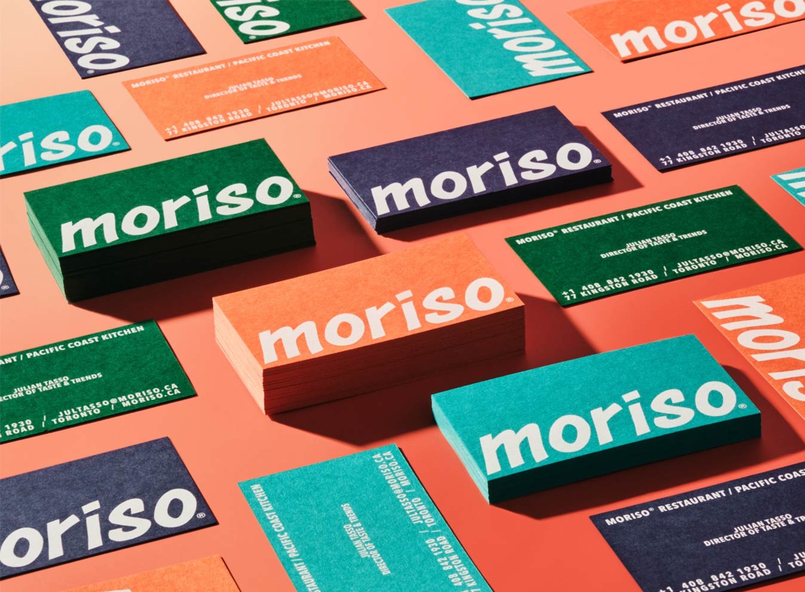
Colorplan is the most requested colored paper stock for visiting cards. GF Smith’s Colorplan paper is dyed all the way through the sheet, so the color runs to the edges. It is available in 55 shades. White ink on Colorplan is one of the most distinctive finishes we offer. The combination of a rich paper color and crisp white ink creates a result that no standard white-stock printing can replicate.
Once your design direction is clear, choose the finish that best supports it, then continue into the visiting card maker, visiting card templates, or direct printing.

Soft Touch
Velvety matte laminate. No shine. The texture is immediately noticeable and unlike any standard coated finish.

Mohawk Superfine
Uncoated UltraWhite. A natural paper surface with a smooth texture. Writable. A designer standard for visiting cards.
| Soft Touch | Velvety matte laminate. Full color print. Most popular premium finish. |
| Matte | Smooth flat surface. Full color print. Clean and professional. |
| Gloss | High-shine laminate. Full color print. Best for photography and bold color. |
| Mohawk Superfine | Uncoated UltraWhite. Full color. Writable. A designer favorite. |
| Colorplan | 55 shades. Dyed through. White ink available. Uncoated texture. |
| Cotton | 100% cotton fiber. Uncoated. Soft tactile feel. Luxury appearance. |
| Kraft | 100% recycled. Natural brown. White ink available. Eco-forward brands. |
Visiting Card Templates
Templates provide a starting layout with the right spacing, hierarchy, and proportions already in place. Choose a design, replace the text, adjust the styling, and move directly into printing when ready.
Visiting card templates and business card templates follow the same production specs. The terminology changes by region, but the layout file is the same. What matters is that the artboard is set correctly and the design is ready for print.
If you want a quicker way to start, browse premade templates. If you want full control, use the visiting card maker and build the card from scratch.
Visiting Card Design Basics
Good visiting card design comes down to four things: layout, spacing, typography, and how the chosen finish supports the design. This page covers the essentials. The dedicated design page goes deeper into each part.
Layout
Most visiting cards use a left-aligned or centered layout. The strongest cards keep information easy to scan and avoid overloading the front with too much detail.
Spacing
Space is what makes a card feel intentional. Give each element room and separate contact details into clear groups rather than running everything together.
Typography
Use one typeface or two at most. Keep the name visually dominant and the contact details easy to read. Avoid over-complicating the hierarchy.
Color and finish
A design should be built with the final stock in mind. Soft Touch, Gloss, Mohawk Superfine, Colorplan, Kraft, and Cotton each change how the card feels and how the design is perceived.
How to Design a Visiting Card
Start by deciding what information actually needs to appear on the card. Most cards only need a name, title, company, phone, email, and website. From there, choose whether you want to begin from scratch in the visiting card maker or use a template as your starting point.
Keep the layout simple, let spacing feel intentional, and choose a stock that supports the design rather than fighting it. Once the design is ready, upload it for printing or continue directly through the maker flow.
Common Visiting Card Layouts
Most visiting card designs fall into a small number of layout patterns. Knowing which pattern fits your content makes the design process faster and the result more considered.
| Left-aligned minimal | Name and title in the upper left, contact details stacked below. Logo top right or back. The most common layout for professional services. Works across every finish and paper type. |
| Centered typographic | Everything centered. Works when the name is the brand, common for creatives, consultants, and personal brands. Requires strong type choices to avoid looking generic. |
| Full-bleed background | A color, texture, or image fills the entire front. White or light text over the top. Needs bleed set correctly. Looks strong on Soft Touch, matte, or Colorplan. Not suited for Gloss if the image has fine detail. |
| Logo-front, info-back | Front is the logo, full-bleed or with generous white space. Back carries all contact details. Forces people to flip the card, which increases how long they look at it. |
| Split layout | A vertical or horizontal rule divides the card into two zones. Brand on one side, contact on the other. Works well for cards with a strong brand color or pattern on one half. |
| Portrait orientation | 2″ × 3.5″. The same information in a vertical format. Feels distinctive in a horizontal card world. Strong for designs with a vertical logo or name treatment. |
Explore the visiting card system
Each page below serves a different role. Use the maker to create from scratch, templates to customize a premade design, or the design page to improve your layout and visual direction.
Visiting Card Stock Comparison
Compare visiting card stocks side by side to see how each finish changes the feel, appearance, and print result.
| Stock | Thickness | Finish | Writable | White ink | Full color |
|---|---|---|---|---|---|
| Soft Touch | 16pt or 20pt | Velvety matte laminate | Ballpoint pen | No | ✓ Yes |
| Standard Matte | 20pt | Smooth matte laminate | No | No | ✓ Yes |
| Standard Gloss | 20pt | High-shine laminate | No | No | ✓ Yes |
| Mohawk Superfine | 18pt | Uncoated UltraWhite | ✓ Yes | No | ✓ Yes |
| Colorplan | 18pt | Uncoated, 55 shades | ✓ Yes | ✓ Yes | Light ink recommended |
| Cotton | 20pt | Uncoated, cotton texture | ✓ Yes | No | ✓ Yes |
| Kraft | 18pt | Uncoated, natural brown | ✓ Yes | ✓ Yes | Light ink recommended |
Which finish fits your visiting card best
Velvety matte laminate. No shine. Works across most design styles. The most commonly chosen premium finish for visiting cards.
Uncoated UltraWhite. Natural, slightly textured surface. Writable. Best for minimal and typographic designs where a natural feel matters.
55 shades. Dyed all the way through. Best when you want the paper color to be part of the design. White ink available.
Matte and Gloss
Standard coated finishes. Matte is flat and easy to read. Gloss makes colors more vivid. Both support full color printing.