


Yes. The visiting card maker is free to use. You can create and customize your visiting card without any cost. You only pay if you decide to print on premium paper.
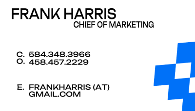
Visiting Card Maker
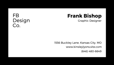
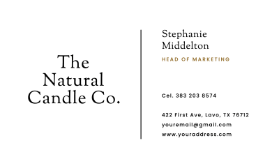
Create your visiting card online in minutes. Start with a blank card or customize a template, then download a print-ready PDF instantly.

No registration
Start designing instantly
Free to design
Export anytime
Print-ready files
High-resolution PDF with bleed
Design both sides
Front and back in one flow
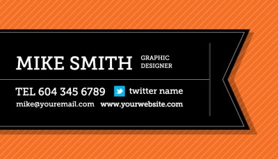
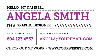
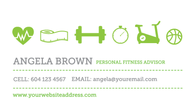
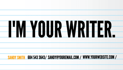
Create your visiting card in three steps
From blank to print-ready in minutes.
1
Start with a blank card or template
Begin with a blank canvas or customize a template.
2
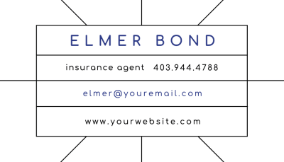
Add your details
Edit your name, title, and contact information. Adjust colors, fonts, and layout directly in the browser.
3
Download or print
Export a print-ready PDF with crop marks, or print on premium paper.
Orientation
Industry
Show:
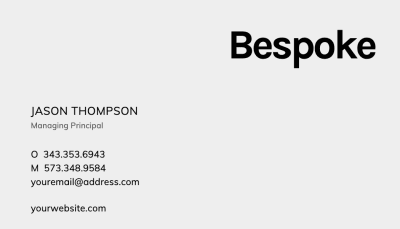
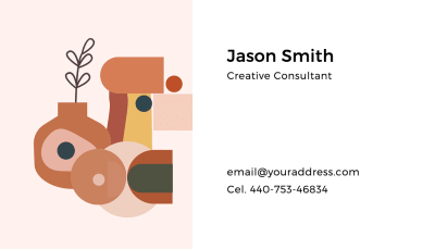
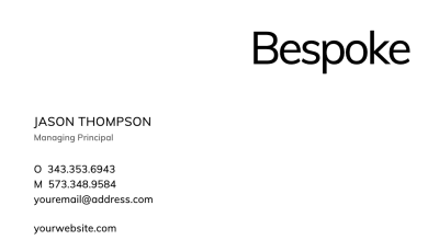
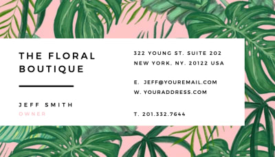
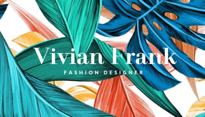
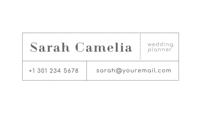
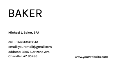
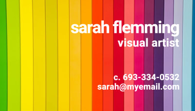
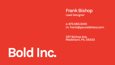
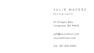
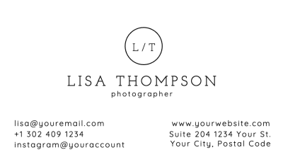
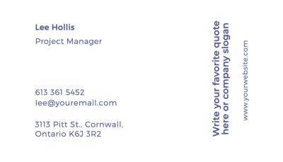
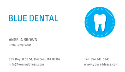
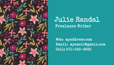
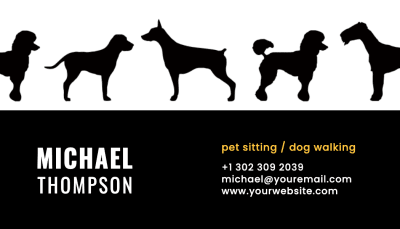
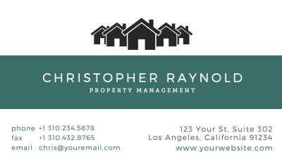
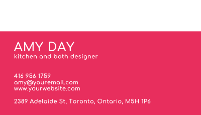
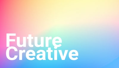
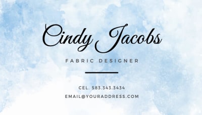
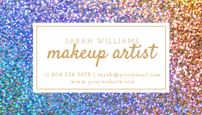
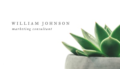
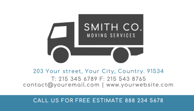
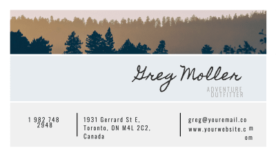
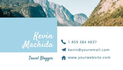
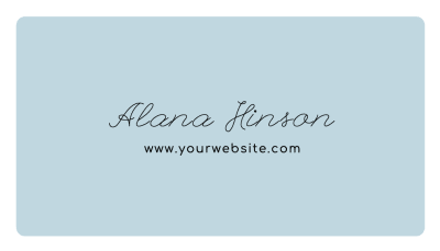
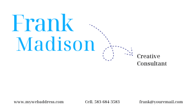
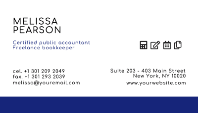
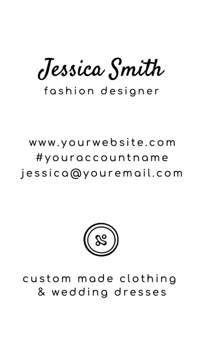
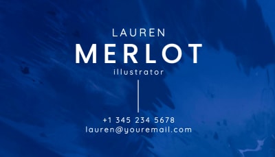
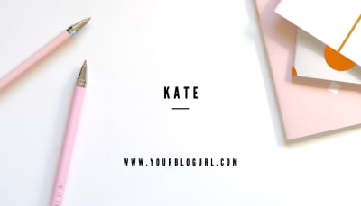
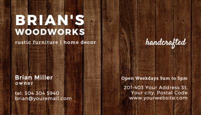
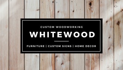
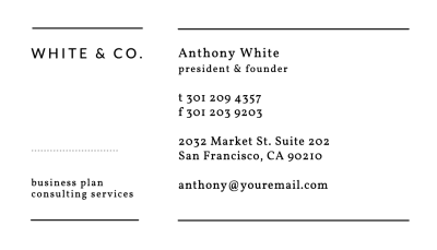
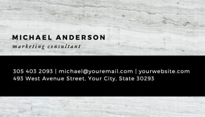
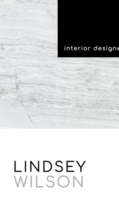
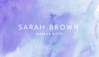
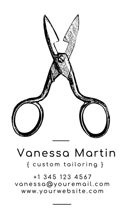
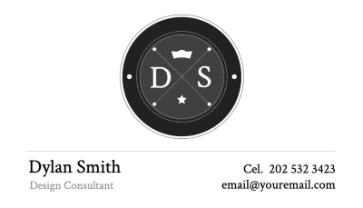
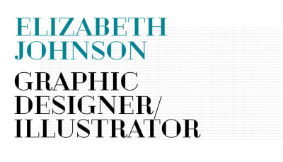
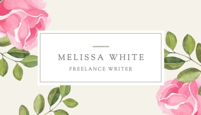
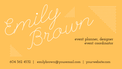
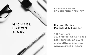
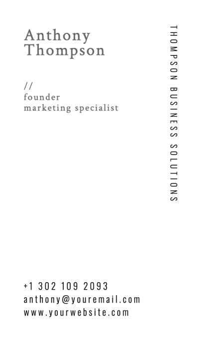
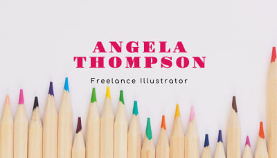
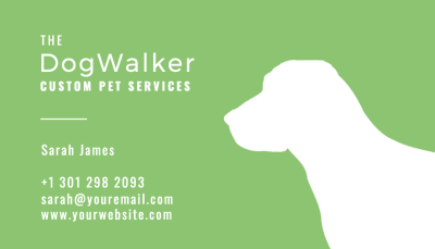
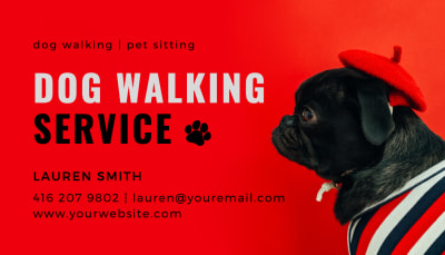
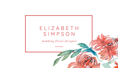
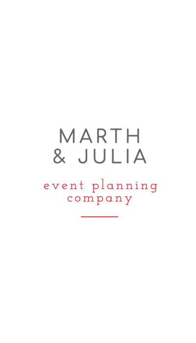
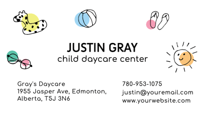
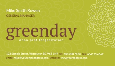
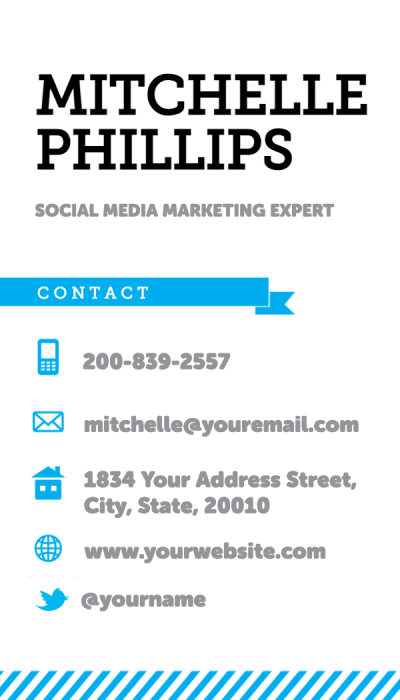
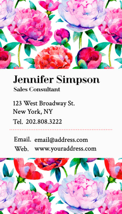
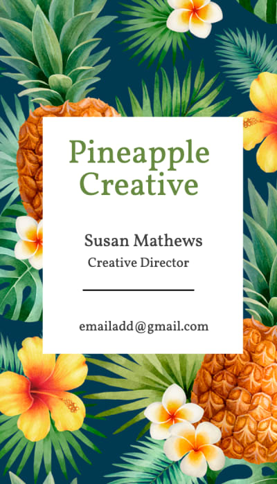
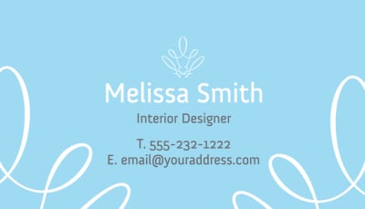
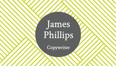
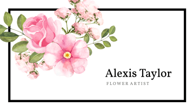
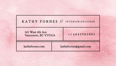
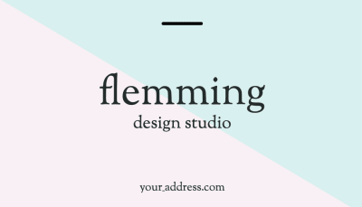
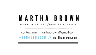
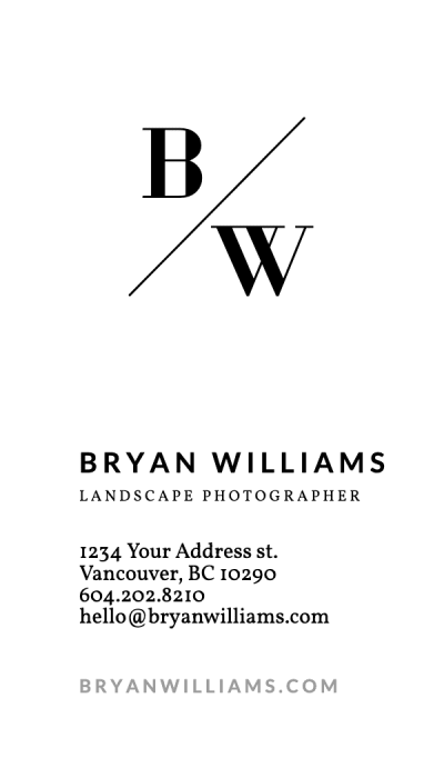
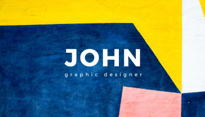
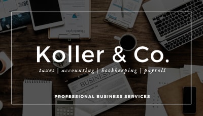
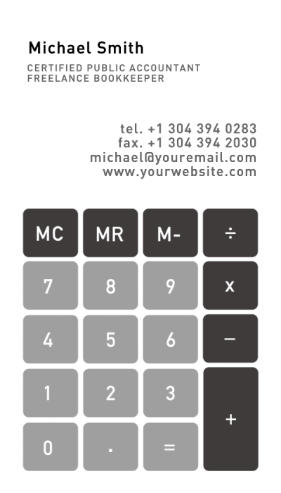
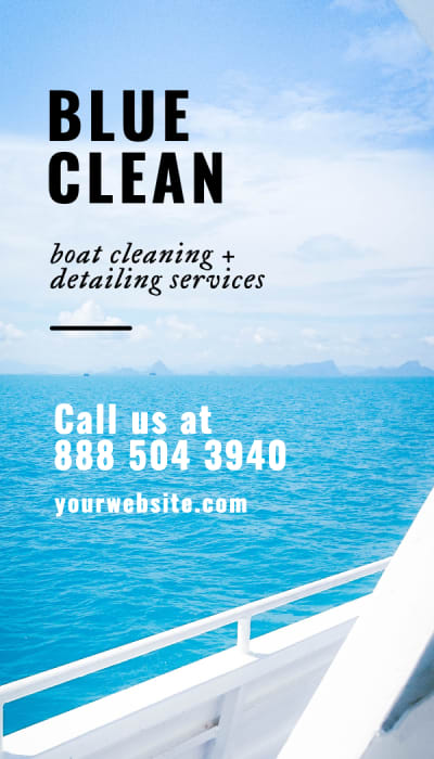
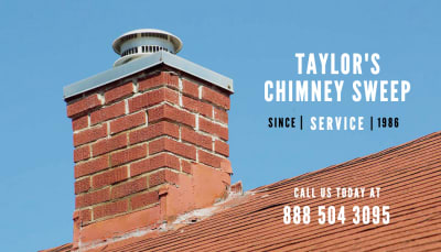
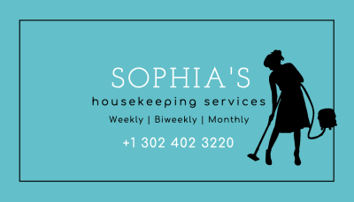
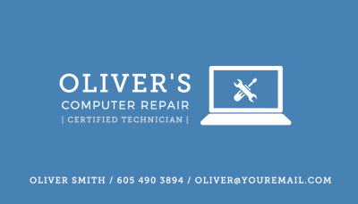
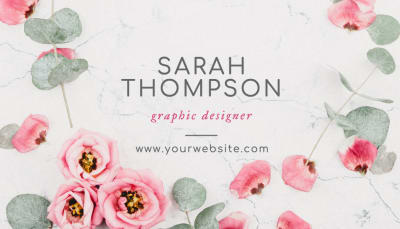
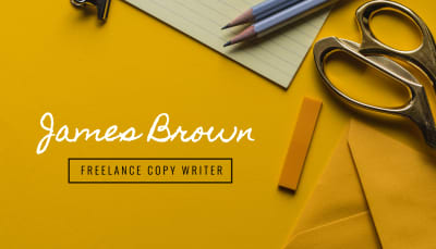
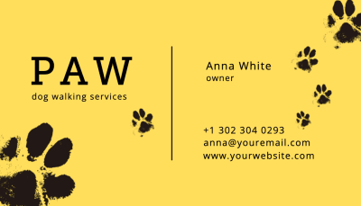
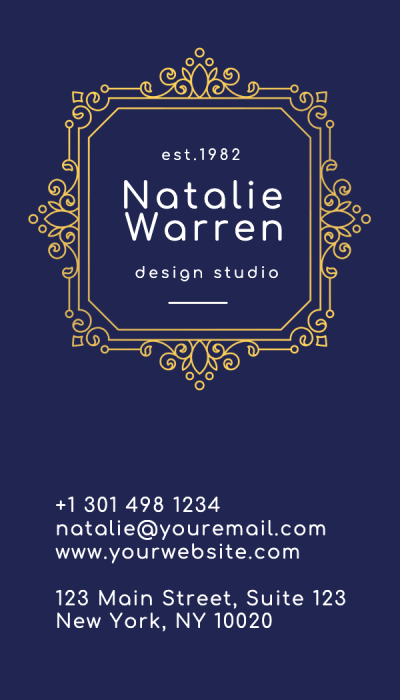
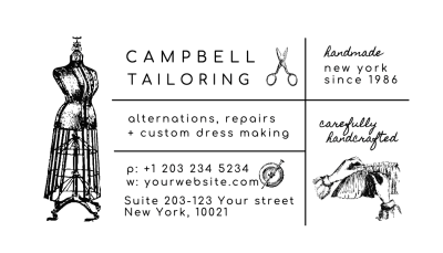
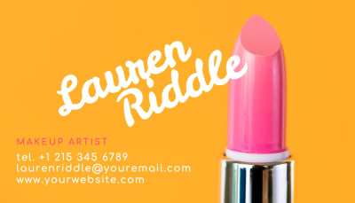
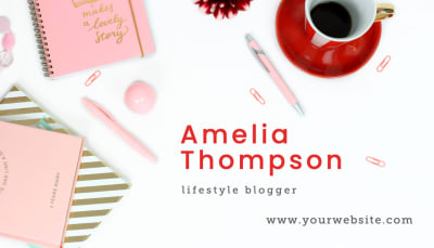
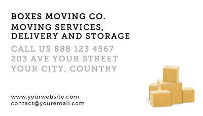
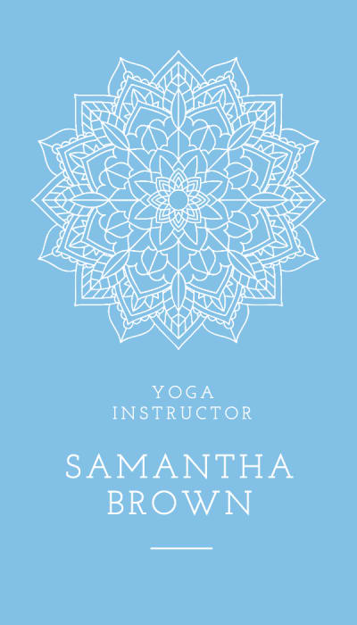
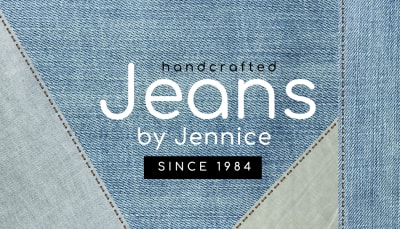
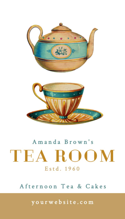
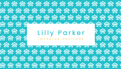
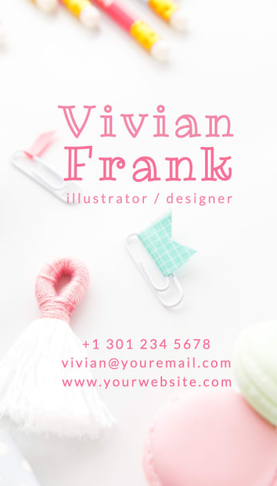
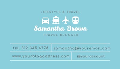
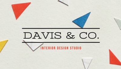
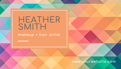
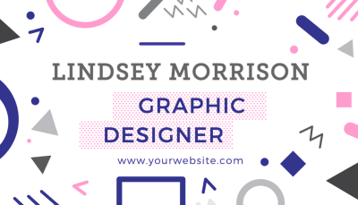
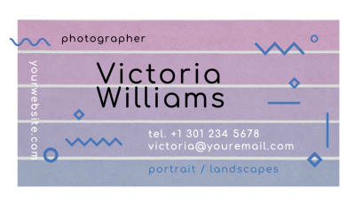
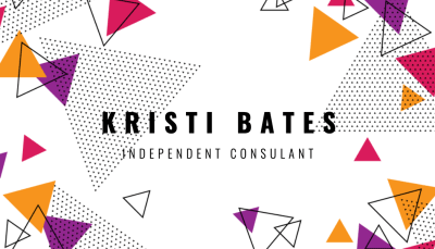
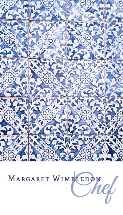
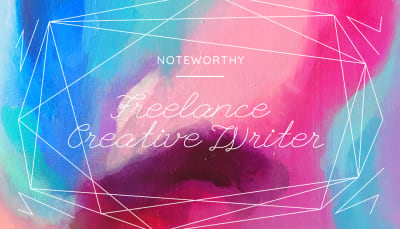
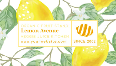
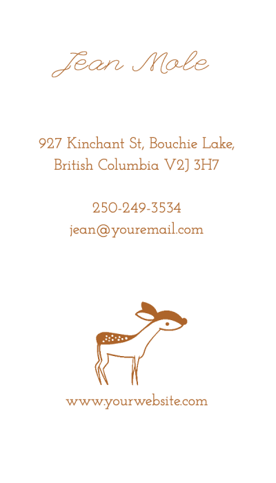
Showing 40 / 299 Templates
Ready to download and print
Your visiting card is set up with the correct size and bleed automatically. Export a print-ready PDF instantly or print when you're ready.
Why People Across India and South Asia Design Here
Recognized internationally. Forbes Advisor named this the Best Overall Business Card Printing Service 2026. The New York Times Wirecutter selected it as a Top Pick. The same quality used by Google, Shopify, and Lululemon.
Premium paper and finishes. Visiting cards are printed on Soft Touch matte, Mohawk Superfine, Cotton, Kraft, Colorplan, and more. The paper choice changes everything about how the design looks and feels.
Design first, print when ready. Start with a layout, refine your design, and print when you're ready.