CAD
CAD
 USD
USD
 EUR
EUR
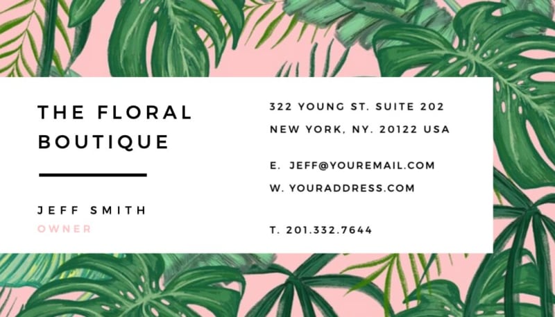
Premium business cards typically run between $0.30 and $0.70 per card at smaller quantities (50 to 100), dropping to $0.15 to $0.25 per card at 500 to 1,000. Stock and finish drive most of the variance. Soft Touch and standard cards start around $34 for 50 cards, while specialty options like foil or painted edges run higher. See full pricing breakdowns by quantity and stock.
Business Cards
Award-winning custom business cards with premium quality and next-day delivery. Trusted by global brands and creators.

Best Overall
Forbes Advisor 2026
Our Pick
NYT Wirecutter 2025
Our most popular business cards.
Our best-sellers, chosen by thousands of customers worldwide.

Soft Touch Business Cards
20pt. Our most popular stock with a luxurious velvety matte feel that makes a lasting first impression.
20% off
Standard Business Cards
20pt. Premium thick stock with your choice of subtle matte or shiny gloss finish. Clean, professional, always reliable.

Mohawk Superfine® Business Cards
18pt. Premium Mohawk Superfine ultrawhite uncoated stock with a luxurious tactile feel. A designer favorite.
Not sure which to choose? Learn the difference between our most popular business card styles
Eco-Friendly Business Cards
Recycled and sustainable stocks. Good for your brand, better for the planet.

Recycled Matte Business Cards
18pt. 100% recycled with a smooth matte finish. Eco-friendly without compromise.

Kraft Business Cards
18pt. 100% recycled natural brown kraft with white ink for bold contrast.

Cotton Business Cards
20pt. 100% cotton with a soft, textured feel and natural cotton fibers.

Cannabis Business Cards
17pt. Hemp-based paper with a rich laid texture you can feel.
Textured & Colored Stocks
Our most unique business cards. Papers with texture, color, and character.

Sandy Matte Business Cards
20pt. Unique sand-like texture for a tactile finish.

Pearl Business Cards
26pt. Pearlescent coating with a subtle shimmer.

Colorplan Business Cards
18pt. Available in 50+ shades. Print with white ink for stunning contrast.

Premium Black Business Cards
16pt–24pt. Deep black stock with a suede-like finish.
Special Finishes
Premium finishes that catch light, turn heads, and start conversations.

Spot Gloss Business Cards
20pt. Highlight key details with raised gloss accents.

Painted Edges Business Cards
18pt–32pt. Choose any color to match your brand. Hand-painted edges that pop.

Rounded Business Cards
Smooth rounded corners for a soft, modern look.

Foil Business Cards
16pt–40pt. Gold, silver, or copper foil stamped on premium stock.
Layered Cards
Ultra-thick cards. Up to 40pt with colored edges that get remembered.

Duplex (2-ply) Business Cards
Two layers of premium paper bonded together. Mix and match colors for a card that stands out from every angle.

Triplex (3-ply) Business Cards
Ultra-thick with a bold colored seam running through the middle. Three layers that demand attention.
Shop Business Cards by Size
From the North American standard to custom die-cut shapes, printed on premium stocks.
Lumière
Paris
Camille Fontaine
camille@lumiere.paris
European Business Cards
85mm × 55mm
From $51 for 50 qty
Shop ›Need help choosing? Explore our complete guide to business card sizes and dimensions.
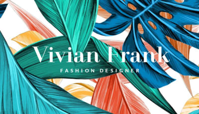
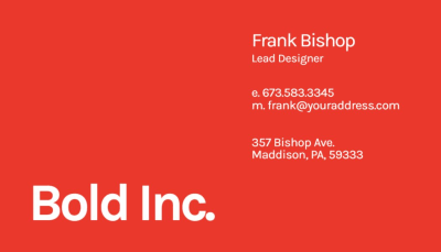
Business Card Design Ideas to Get You Started
Browse layouts, fonts, and styles to get started. Design your own business card using our business card maker.









Only the Finest Papers
A premium card starts with the paper. We source from legendary paper mills to bring you a collection of unique stocks that are as memorable as your brand.




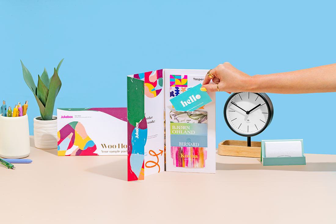
Feel Our Business Card Quality Firsthand
Not sure which paper to choose? Our sample pack lets you experience our most popular stocks and finishes, so you can choose the perfect card with confidence.
What Makes Jukebox the Best for Business Cards?
Every order goes through a detailed quality process where real people review your design, inspect your print, and make sure it's perfect before it leaves our shop. Expert eyes, premium papers, and fast production for every single card.

Real Experts,
Ready to Help.
Our Prepress and Customer Success teams make sure your business card project runs smoothly from upload to delivery. You can reach out anytime for real guidance from print experts who understand design, materials, and detail.
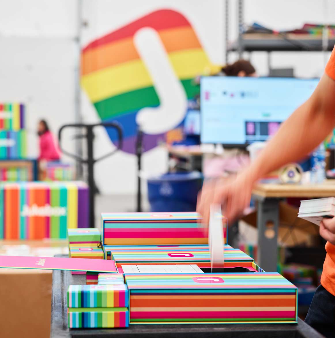
Every Card
Carefully Reviewed
Nothing leaves our production floor without a full inspection. Every file, color, and finish is reviewed by real people who check your business cards against our quality standards. We only ship when it looks right.
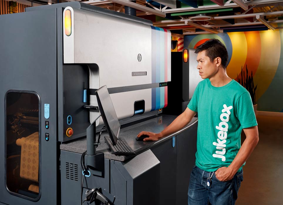
Made Fast.
Made Right.
Most business card orders are ready in one day, with next-day delivery available. For tighter timelines, explore our same day business cards with next-day delivery. Fast turnaround with no shortcuts on quality.
Trusted by global brands


Why Jukebox?
Premium papers, expert quality control, and the fastest turnaround in the industry.
1M+
Cards Printed Monthly
Shipped worldwide
50+
Fortune 500 Clients
Google, Amazon, Lululemon & more
Premium papers from around the world. Mohawk Superfine, Colorplan, Gmund. Stocks used by top design studios.
7-day support. Real humans review every file before it prints. Questions? Our team is here to help, any day of the week.
No minimums, no compromises. Order 50 cards or 50,000. Same premium quality, same attention to detail on every run. Here's how our online printing services work.

Every order gets the same attention to detail, backed by our love it or we reprint it guarantee.
Compare Our Business Cards
See the difference side-by-side and choose the perfect stock for your brand.
Soft Touch
Luxury brands seeking a tactile experience
Our most popular stock. A velvety, soft-touch lamination creates a luxurious feel that begs to be touched, adding dimension and refinement to any design.
Key Specs:
Thickness: 20pt
Soft-Touch Lamination
Scratch & Water Resistant
Starting Price:
$34 / 50 cards
Cotton
Elegant, timeless, and sophisticated designs
Made from 100% cotton fibers, not wood pulp, this paper has an unmistakable, luxurious softness. It has a gentle, pliable feel that other papers simply cannot match.
Key Specs:
Thickness: 20pt
100% Cotton Fibers
Soft & Pliable Feel
Starting Price:
$43 / 100 cards
Which One is Right for You?
For a different feel, Soft Touch is all about the feel. The velvety lamination is irresistible and creates a memorable first impression, making it ideal for luxury brands and premium services. On the other hand, Cotton delivers elegance through texture. Made from cotton fibers, its uniquely soft and pliable feel creates a distinct impression of quality for luxury and timeless brands.
Build and Price Business Cards Instantly
| Quantity | Price per Card | Total Price |
|---|---|---|
50 | $0.54 | $27$34 |
100 | $0.36 | $36$45 |
250Most Popular | $0.25 | $62$78 |
500 | $0.17 | $84$105 |
1,000 | $0.13 | $132$165 |
Custom Quantity |
Your selection:
250 Soft Touch Cards for $62
Have a large or complex project? Get a custom quote