CAD
 USD
 EUR


Explore the graphic design trends shaping 2027, from expressive typography and experimental digital layouts to tactile textures, playful branding, and creative print.
Graphic design is getting interesting in two very different directions. On one side, we have beautifully polished digital visuals, dimensional graphics, and compositions that seem to float effortlessly across the screen. On the other, there's a growing affection for rough edges, handwritten details, paper textures, and designs that feel like someone actually made them. Both approaches have something exciting to offer.
Designers are finding new ways to work with familiar techniques, giving classic typography unexpected proportions, turning simple patterns into recognizable brand assets, and bringing print-inspired effects into digital spaces. Even the smallest details are getting attention, from tiny annotations tucked into a layout to the particular shape of an icon.
Physical creativity also has an important place in the conversation. A beautifully designed postcard, an unusual business card, or a collectible sticker can offer an experience that a passing image on a screen simply can't replicate. That relationship between digital and physical design is becoming an especially interesting area to explore.
Of course, trends are never a complete change of direction. The best ideas usually evolve, borrow from different influences, and become something new in the hands of creative people.
Curious how graphic design has changed over the years? Take a look back at our previous Trendbook editions:
- Graphic Design Trends 2022
- Graphic Design Trends 2023
- Graphic Design Trends 2024
- Graphic Design Trends 2025
- Graphic Design Trends 2026
Now, let's explore the graphic design trends worth keeping an eye on in 2027.
Micrographics
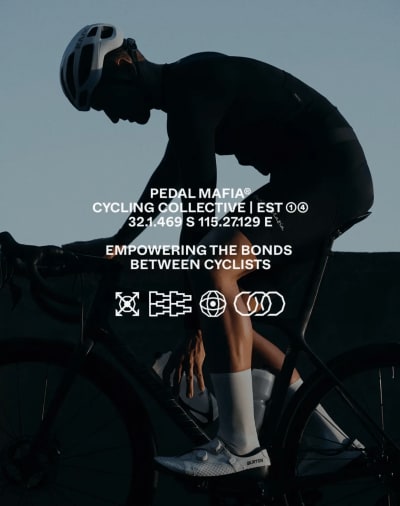
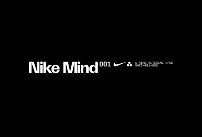
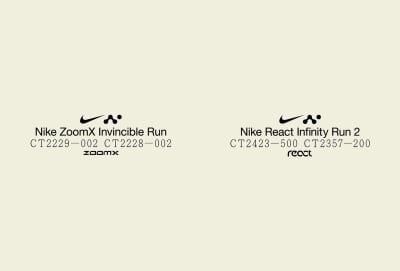
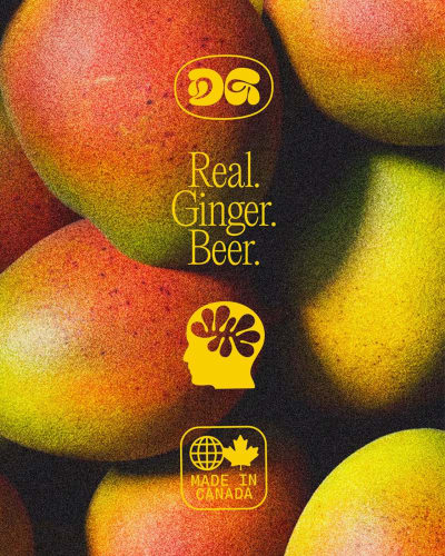
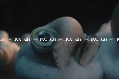
Sometimes the most interesting part of a design is the detail you notice last. Micrographics celebrate those tiny visual elements that might seem insignificant on their own but give a composition its character. Think miniature symbols, fine rules, tiny numbers, technical labels, coordinates, and small annotations placed around a larger design.
Design Credit: STUDIO HERRSTRÖM
Design Credit: Gesture Systems
There's something particularly satisfying about a poster with a huge headline surrounded by delicate information, or packaging that uses little diagrams and identification numbers to create a more considered look. These details can borrow from scientific publications, technical drawings, product manuals, and digital interfaces without making the final design feel overly technical.
Design Credit: M35

Design Credit: Concrete
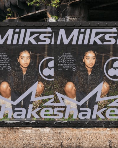
Micrographics are especially effective when they create a second layer of discovery. From a distance, the design has a clear structure. Move closer, and suddenly there's more to explore. That sense of depth makes them a natural fit for editorial layouts, visual identities, packaging, promotional graphics, and anything else visual for that matter. It just works.
Design Credit: M35
Design Credit: Pendo
Design Credit: STUDIO HERRSTRÖM
As designers continue experimenting with scale and information, micrographics could become an increasingly useful way to add visual richness without filling every available space. A few carefully placed details can make an otherwise simple composition feel surprisingly complete.
Design Credit: Standard Projects

Design Credit: Onmi Design
Floating Layouts
Forget the idea that every element needs to sit neatly in its own rectangular space. Floating layouts give images, typography, graphic shapes, and interface-inspired components room to move around a composition, creating designs that feel open, layered, and slightly unpredictable.

Design Credit: GrandArmy
Design Credit: Hoodzpah
A photograph might hover above a block of text, while a small label overlaps its corner. Rounded cards sit at different heights, shadows suggest distance, and generous whitespace keeps everything from becoming overwhelming. There's usually an underlying sense of order, even when the arrangement looks wonderfully spontaneous.

Design Credit: AREA 17

Design Credit: Slope
This approach feels particularly natural in a world where digital interfaces have become part of our everyday visual language. Designers can borrow familiar elements such as floating windows, interactive cards, and overlapping panels, then reinterpret them for brand identities, websites, editorial graphics, and advertising campaigns.
Design Credit: Company Policy
The interesting challenge is finding the right balance between freedom and control. Too much structure removes the fun, while too little makes the design difficult to follow. Floating layouts work best when every element has a reason to occupy its particular position.

Design Credit: Field

Design Credit: The New Company
For 2027, that combination of movement, depth, and breathing room offers plenty of creative potential.

Design Credit: Christopher & Doyle
Brand Illustrations
A good illustration can tell you something about a brand before you've read a single word. Maybe it's the unusual way people are drawn, a particular color palette, or the charming little characters that keep appearing across different materials. Over time, these visual choices can become quite recognizable in their own right.

Design Credit: Studio Koto

Design Credit: Faena Studio
Design Credit: Polar
Brand illustrations are moving beyond occasional decorative graphics toward complete visual languages. A business might develop its own collection of characters, illustrated environments, expressive objects, or narrative scenes. The style can then appear across websites, packaging, social posts, printed materials, and campaigns without losing its identity.

Design Credit: Studio Roses
Design Credit: Studio Blackburn
What makes this approach interesting is the freedom it offers. Illustrations can explain complicated ideas, introduce humor, create imaginary worlds, or communicate emotions that would be difficult to capture with photography alone. They also give brands the opportunity to create something that feels distinctly theirs. Sure, AI can generate photographic images very easily, but people are still recognizing this as AI, which isn’t always appreciated. With illustrations, you can win over the hearts from your potential customers.

Design Credit: Estudio Cariño

Design Credit: Studio Chong
Looking toward 2027, we may see more illustration systems designed to grow and change alongside a brand. The strongest examples will have recognizable artistic rules while leaving space for individual stories, seasonal collections, and unexpected creative moments. Consistency doesn't have to mean drawing the same thing forever.

Design Credit: Together

Design Credit: The Collected Works

Design Credit: Koto
Tactile Textures
You can almost feel some designs just by looking at them. A soft paper grain, the subtle weave of fabric, a raised-looking letter, or a rough surface catching the light can make a flat graphic seem surprisingly physical.


Design Credit: Base Design
Tactile textures bring that sensory quality into visual design. Instead of relying entirely on smooth colors and perfectly clean shapes, designers introduce material characteristics that add warmth and depth. A simple background might resemble uncoated paper, while a digital illustration could feature a velvety finish, translucent layers, or an embossed appearance.
Design Credit: Gesture Systems

Design Credit: An Audience of One
These effects are particularly appealing because they change the atmosphere of a composition. Fine grain can soften a bright gradient. A linen texture can make elegant typography feel more intimate. Rough edges and uneven surfaces can introduce contrast into otherwise polished branding.

Design Credit: Landscape
The distinction between real and simulated materials is also becoming a creative opportunity. Designers might photograph physical surfaces, build textures digitally, or combine both approaches in the same project.

Design Credit: ssnn

Design Credit: Motto
For 2027, tactile textures offer a way to make graphics feel richer without necessarily making them busier. Sometimes the surface itself provides all the visual interest a design needs.

Design Credit: Meat
Patterns
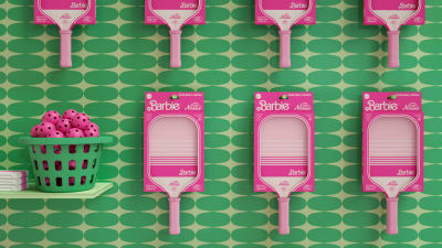
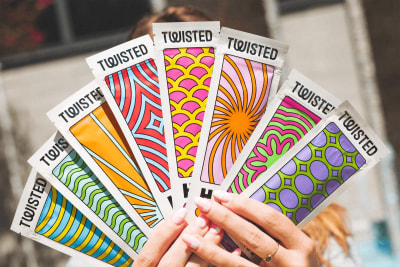
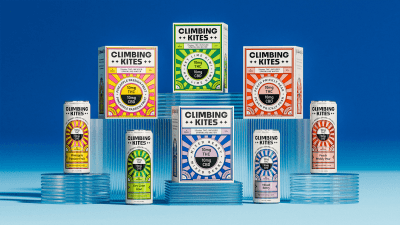
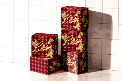
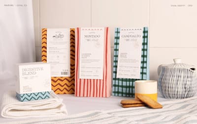
Patterns have been part of graphic design for generations, but their modern applications are wonderfully flexible. A repeating motif can be a subtle background, the most recognizable part of a brand identity, or the entire artwork covering a piece of packaging.

Design Credit: Studio Chong
Design Credit: Hoodzpah
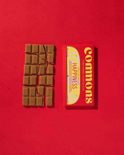
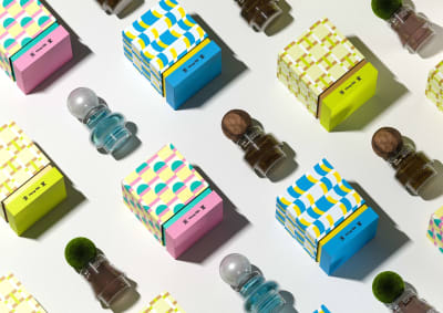
Contemporary patterns aren't always perfectly measured or predictable. Oversized shapes extend beyond the edges of a layout, hand-illustrated motifs repeat at irregular intervals, and unusual color combinations give familiar geometric arrangements a different energy. Some designs use tightly organized grids, while others feel closer to scattered collections of objects.
Design Credit: Faena Studio
Design Credit: AAOO Studio
One particularly interesting direction is the use of patterns as adaptable brand assets. A single collection of shapes or illustrations can produce dozens of compositions while maintaining a consistent visual identity. The same elements might appear on wrapping paper, fabric, labels, merchandise, and digital backgrounds, changing scale and arrangement depending on the format.
Design Credit: Twice Shy
Design Credit: Dinger Creative
As branding becomes increasingly flexible, patterns provide a useful balance between recognition and variation. For 2027, the opportunity lies in treating repetition as a creative tool rather than a fixed formula.
Design Credit: Jonah Terry
Design Credit: Oleksandr Lukovskyi
A great pattern can make even the simplest object feel like part of something bigger.
Design Credit: Elisa Tapia de Andrés
Tangible Design
There's something special about holding a design in your hands. You notice its weight, texture, size, and finish. You turn it over, look closer, and perhaps keep it long after the original interaction is over. Physical design creates experiences that exist beyond the moment someone sees them.

Design Credit: The Collected Works

Design Credit: Pentagram
Design Credit: Studio Chong

Design Credit: The Collected Works
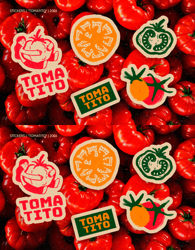
Tangible design reflects a renewed appreciation for objects that people can collect, share, display, and remember. Brands are finding creative opportunities in everything from beautifully considered packaging and event invitations to custom stickers, collectible prints, and thoughtfully designed business cards.

Design Credit: Jean-Michel Mercier

Design Credit: The Collected Works
The appeal isn't simply nostalgia for print. Physical objects can become meaningful parts of a brand experience. An unusual postcard tucked into an order, a sticker with artwork worth keeping, or a distinctive business card can encourage a different kind of interaction. Something small might end up on a laptop, pinned above a desk, or saved in a drawer for years.

Design Credit: Studio Chong

Design Credit: Ofform
In 2027, the relationship between digital identities and physical experiences could become even more interesting. The strongest projects will consider how a visual idea changes when it becomes something real, from the material it's printed on to the moment someone opens, touches, or shares it.

Design Credit: Standard Projects
Bold Photography
Imagine a perfume campaign photographed like a scene from a mysterious film. There's a deep blue shadow across the wall, one carefully placed beam of light, and a subject who seems to have a story you're arriving halfway through. Suddenly, an ordinary advertisement feels much more intriguing.

Design Credit: Misami

Design Credit: Young Jerks
Photography can bring the atmosphere of storytelling into graphic design through dramatic lighting, expressive framing, color grading, and carefully considered compositions. Images might feel quiet and intimate, richly saturated, or deliberately theatrical. The purpose isn't necessarily to imitate a movie, but to give a visual a stronger sense of mood.

Design Credit: Lung-Hao Chiang

Design Credit: The New Company
Typography has an important role here. An oversized title can make a photograph feel like a film poster, while small editorial lettering might introduce a more subtle, sophisticated character. Cropping, negative space, and graphic overlays help establish the relationship between image and message.

Design Credit: Polar

Design Credit: Young Jerks
For branding and campaigns in 2027, cinematic photography offers an alternative to overly straightforward product imagery. It invites designers to build a world around what they're communicating.

Design Credit: Koto

Design Credit: St.Jules
A photograph doesn't always need to explain everything immediately. Leaving a little room for imagination can be part of its appeal.

Design Credit: Concrete
Gradients
Gradients have come a long way from the familiar transition between two colors. Today's versions can look like glowing light, drifting clouds, colored glass, or soft fields of pigment spreading across a surface. Their appeal lies in how much atmosphere they can create with color alone.
Design Credit: Studio Dumbar

Design Credit: Pentagram
Some gradients are smooth and barely noticeable, with pale tones dissolving gently into one another. Others combine electric oranges, saturated purples, acid greens, and unexpected flashes of light. Adding grain, blurred edges, or translucent layers can give them a completely different character.

Design Credit: Saint-Urbain

Design Credit: Studio Dumbar
These variations make gradients useful across many kinds of graphic design. A soft atmospheric blend can introduce calm to a wellness identity, while a vivid multicolored gradient might provide the visual energy for music packaging or an experimental poster. Even simple typography can feel dramatically different when placed against a carefully constructed color transition.

Design Credit: The Phoney Club

Design Credit: Twice Shy
Design Credit: Office of Overview
As digital and printed graphics continue influencing one another, gradients are likely to become even more expressive in 2027. There's plenty of room to experiment with unusual color relationships, depth, and the appearance of light.

Design Credit: Ofform

Design Credit: Tiare Payano
The trick is giving the colors a purpose beyond simply making the background look pretty.

Design Credit: Goods

Design Credit: Pentagram
Bold Minimalism
Minimalism doesn't have to whisper. Sometimes it works best when it walks into the room wearing an enormous red headline.

Design Credit: Studio Koto

Design Credit: Studio Roses
Bold minimalism takes the clarity of simple design and gives it a more confident visual presence. Instead of relying on quiet neutral palettes and delicate typography, this approach uses dramatic scale, saturated colors, sharp contrast, and a small number of carefully selected elements.
Design Credit: Holographic
Picture a poster featuring one gigantic word, a vivid yellow background, and a tiny line of supporting information. Or packaging with a single oversized symbol and almost nothing else. There's very little to look at, yet every decision feels important.

Design Credit: Ashfall Studio
This kind of simplicity can be especially effective for brands that want a recognizable visual identity without relying on complicated graphics. Strong typographic choices and distinctive colors can carry an entire system across packaging, campaigns, and digital applications.

Design Credit: Studio Koto

Design Credit: Base Design
For 2027, Bold Minimalism offers an appealing response to increasingly detailed visual styles. It proves that visual impact doesn't always require additional layers or decoration.

Design Credit: Pentagram
Of course, simplicity leaves nowhere for weak decisions to hide. When a design contains only a handful of elements, their proportions, placement, and relationship become everything.
Design Credit: Recent
Monospaced Fonts
There's an unmistakable rhythm to monospace typography. Every character occupies exactly the same horizontal space, giving words a measured, mechanical quality that feels quite different from conventional proportional type.

Design Credit: Together

Design Credit: Phantasia

Design Credit: Wunder Werkz
Originally associated with typewriters, programming, and technical documents, monospace fonts now appear in a much wider range of creative work. Their evenly spaced letters can make an editorial headline feel deliberately unconventional, bring structure to product packaging, or give a contemporary identity a subtle reference to older technology.

Design Credit: Studio Avenir
What makes monospace particularly interesting is its ability to feel both functional and expressive. A small line of uppercase monospace text can resemble a technical label, while the same typeface used at an enormous scale becomes a distinctive graphic element. Pairing it with elegant photography, organic illustrations, or soft colors introduces an appealing contrast.
Design Credit: Skogen
Its predictable spacing also creates opportunities for unusual compositions, including stacked words, aligned text blocks, and typographic patterns. If you're looking for typefaces to experiment with, our guide to the best free Google Fonts for web design and print is a good place to start.

Design Credit: STUDIO HERRSTRÖM
As designers explore typefaces with stronger individual characteristics, monospace fonts could play an important role in 2027 branding and editorial design. Their personality comes from their proportions, making even ordinary information feel considered.

Design Credit: Gesture Systems
And yes, they can look great outside a coding window.

Design Credit: STUDIO HERRSTRÖM

Design Credit: Monumento
Modern Heritage
Old packaging, historic signage, traditional lettering, and archival illustrations are full of beautiful design ideas. Modern heritage takes inspiration from these references and gives them a contemporary purpose, combining a sense of history with the clarity and flexibility expected from modern branding.

Design Credit: Tavern

Design Credit: Studio Roses
The visual language might include carefully drawn emblems, ornamental borders, classic serif lettering, engraved-style illustrations, and familiar color combinations. A traditional-looking crest could sit alongside clean typography, while vintage-inspired packaging might use generous whitespace and an unexpectedly modern palette.

Design Credit: Ey Studio

Design Credit: Studio Freight

Design Credit: Strange Family
This approach is particularly interesting for brands that want to communicate craftsmanship, tradition, or a connection to place. Food packaging, hospitality identities, independent shops, and specialty products can all benefit from visual storytelling that feels established without appearing outdated.

Design Credit: Anchovies

Design Credit: Estúdio 017
The important part is interpretation. Simply recreating an old label rarely produces something especially memorable. Modern Heritage works when designers understand what makes a historical reference appealing, then adapt its proportions, details, or character for a new audience.

Design Credit: HAL

Design Credit: Lotta Nieminen

Design Credit: Flama Design House
Looking toward 2027, expect interesting combinations of decorative and contemporary elements, particularly in physical branding. A beautifully printed label or carefully designed piece of stationery can make those historical influences feel especially convincing.

Design Credit: Young Jerks
Utilitarian Design
Who knew a product label could look so good? This design style takes inspiration from everyday functional graphics, turning practical information, straightforward typography, and industrial details into a distinctive visual style. Think shipping labels, instruction manuals, technical diagrams, and packaging where every element looks like it has a specific job to do.

Design Credit: Smörgåsbord


Design Credit: Baudouin Willemart
The aesthetic is direct and refreshingly uncomplicated. Heavy sans-serif fonts, compact text, barcodes, numbered details, and structured layouts create compositions that feel practical yet full of character. Bright colors often appear alongside black typography, while information that would normally be hidden away becomes part of the design itself. An oversized product code or a neatly arranged ingredients list can suddenly become the most interesting thing on the packaging.

Design Credit: Marx Design

Design Credit: POLAR® DSGN

Design Credit: Oddity Studio
For 2027, this functional approach offers an exciting direction for branding, packaging, editorial design, and printed materials. Rather than relying on decorative graphics, designers are finding personality in the way information is organized and presented. The result feels confident, recognizable, and surprisingly playful, proving that practical design doesn't have to look ordinary.

Design Credit: Lotipa

Design Credit: Studio South

Design Credit: Studio Don
Expressive Typography
What if the letters themselves could do all the talking? Expressive typography treats words as visual material, stretching, bending, stacking, rearranging, and transforming them until the typography becomes the main artwork.
Design Credit: Studio Dumbar

Design Credit: Estudio Cariño
Letters might curve around an image, squeeze into an unusual shape, overlap one another, or expand until they barely fit inside the composition. Some designs exaggerate the proportions of familiar typefaces, while others use custom lettering that feels closer to illustration than traditional typesetting.

Design Credit: Ey Studio
The emotional effect can be immediate. Soft, rounded letters might feel friendly and playful. Sharp, distorted forms introduce tension. A dramatically stretched headline can give a fashion campaign an experimental edge, while irregular lettering might bring energy to an event poster.

Design Credit: Estudio Cariño
This approach is especially exciting because typography can communicate both the message and its mood without relying on additional imagery. The arrangement of a few words becomes the entire visual concept.

Design Credit: Tavern
For 2027, expressive type offers creative opportunities across branding, editorial work, music graphics, and advertising. Designers can experiment with unusual letterforms while keeping the essential message understandable.

Design Credit: Twice Shy
After all, the most impressive typographic experiment still needs to communicate something, even if it makes you look twice.

Design Credit: Praktika
Design Credit: Jean-Michel Mercier
Halftones & Dithering
Look closely at an old printed photograph and you'll often find a fascinating collection of tiny dots doing the work of creating shade and depth. Halftones bring that recognizable printing technique into contemporary graphic design, where it can be exaggerated, recolored, layered, or combined with completely different visual styles.

Design Credit: Studio Chong
Design Credit: Studio Freight
The effect ranges from delicate dotted shading to enormous circular patterns that turn photographs into almost abstract compositions. A black-and-white portrait might become a high-contrast image built from coarse dots, while colorful halftone layers can introduce the playful misregistration associated with traditional printing.

Design Credit: Studio Freight
Halftones work particularly well when paired with clean typography and simple layouts. The contrast between precise digital elements and visible print-inspired dots creates a distinctive visual rhythm.

Design Credit: Lika Fadeeva
Posters, editorial illustrations, packaging, and music graphics all provide opportunities to explore this technique. Designers can control dot size, spacing, density, and color to create effects that feel nostalgic, graphic, or surprisingly modern.

Design Credit: Sylvan Hillebrand

Design Credit: All True
As interest in print aesthetics continues, halftones offer plenty of room for experimentation in 2027. Their appeal comes from revealing the visual structure of an image rather than hiding it.
Design Credit: Studio Freight
Sometimes seeing how an image is constructed makes it more interesting.

Design Credit: All True
Custom Iconography
A tiny shopping basket, a location marker, or a simple arrow might seem like a minor design decision. But put dozens of generic icons together and it's easy to notice how much visual personality is missing.
Design Credit: Cash App

Design Credit: Koto
Custom iconography gives brands the opportunity to create symbols with a recognizable style of their own. Rather than selecting unrelated icons from a standard library, designers build coordinated sets with consistent proportions, line weights, corners, shapes, and decorative details.
Design Credit: Sylvain
These systems can be beautifully simple or wonderfully playful. A food brand might use rounded icons inspired by its illustrated ingredients, while a cultural venue could develop geometric symbols based on elements of its architecture. Even the smallest choices, such as whether a corner is sharp or curved, can contribute to the overall identity.

Design Credit: Twice Shy
The practical value is considerable. Custom icons can help people navigate websites, understand packaging information, recognize categories, and interact with digital products while maintaining a consistent visual language.

Design Credit: Diorama
For 2027, bespoke icon systems could become an increasingly thoughtful part of brand development. Good iconography combines clarity with character, giving functional information a visual identity that belongs naturally alongside the rest of a brand's design.

Design Credit: Office of Overview
Hand-Drawn Elements
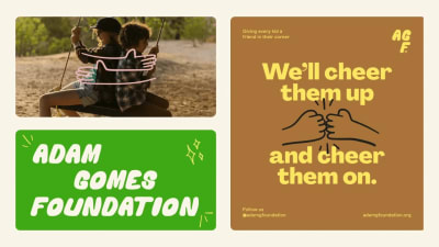
Not every line needs to be perfectly straight. A quick sketch, uneven underline, handwritten note, or imperfect little star can bring a welcome sense of spontaneity to a carefully constructed design.
Design Credit: Studio Chong

Design Credit: Gaptooth
Hand-drawn elements celebrate the marks that feel personal and informal. They might appear as doodles around a headline, rough illustrations tucked into a layout, handwritten annotations beside photographs, or loose shapes that break up a precise composition.

Design Credit: Base Design

Design Credit: Pentagram
One of the most appealing applications is the contrast between polished graphic design and casual drawing. Imagine an elegant editorial layout with a playful handwritten arrow pointing toward a photograph. Or a clean product label featuring a small, expressive sketch. Those details can change the tone without requiring an entirely illustrated identity.

Design Credit: Wunder Werkz
Design Credit: Oleksandr Lukovskyi
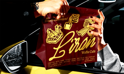
This style is also wonderfully adaptable. Marks can be created with pencils, markers, brushes, digital drawing tools, or a combination of techniques. What matters is the gesture and the feeling it communicates, rather than whether it was physically drawn on paper.
Design Credit: Yuliia Hrabynska

Design Credit: Pentagram
In 2027, hand-drawn details may become an especially useful way to introduce warmth, humor, and individuality into contemporary branding. A little imperfection, used thoughtfully, can make a composition feel more relaxed and inviting.

Design Credit: Helms Workshop
Condensed Fonts
Tall, narrow letters have a special kind of visual confidence. They can stretch across a poster like architectural columns, squeeze an impressive amount of text into limited space, and give even a short headline a dramatic presence.

Design Credit: GrandArmy
Condensed fonts are characterized by their narrow proportions, allowing designers to create large typographic compositions without requiring enormous amounts of horizontal space. This makes them particularly useful for posters, packaging, magazine covers, advertising, and bold brand identities.

Design Credit: Studio Freight
Design Credit: Six
There's plenty of variation within the category. Some condensed typefaces feel industrial and practical, with sturdy strokes and compact proportions. Others are elegant, extremely thin, or dramatically tall, creating a more fashion-oriented editorial appearance.

Design Credit: Saint-Urbain
One compelling application is oversized lettering that nearly touches the edges of a composition. Words become towering graphic structures, with photography or smaller typography arranged around them. Strong vertical forms can also create an interesting contrast with wide images and horizontal layouts.


For 2027, condensed fonts offer designers a way to explore scale and typographic impact while working within real spatial constraints. Their narrow silhouettes make them instantly recognizable, particularly when used with careful spacing.

Design Credit: Pendo
The result can feel powerful without needing much decoration.

Design Credit: Area Studio
3D Design
Some graphic elements seem determined to escape the page. Letters inflate into glossy sculptures, metallic shapes twist through the air, and illustrated objects cast convincing shadows across colorful backgrounds.
Design Credit: Office of Overview

Design Credit: Studio Gruhl
3D Design allows graphic designers to introduce volume, lighting, and material qualities into otherwise flat compositions. The results can range from realistic product-inspired imagery to playful, impossible objects that could only exist in a digital environment.

Design Credit: Slope
Materials are a particularly interesting part of this visual direction. Soft translucent forms create a very different mood from polished chrome, matte clay, or brightly colored plastic. Lighting and shadows can turn a simple shape into something atmospheric, luxurious, or almost cartoon-like.

Design Credit: Output
These visuals are useful for campaigns, editorial graphics, packaging concepts, and brand identities that benefit from an imaginative visual world. Sculptural typography can become a recognizable campaign asset, while recurring dimensional characters or objects can give a brand a distinctive visual vocabulary.

Design Credit: HalloBasis
As 3D imagery continues influencing graphic design, 2027 could bring more imaginative combinations of dimensional and flat elements. A carefully rendered object placed against simple typography can be just as effective as an elaborate scene.
Design Credit: Make Studio
Depth is exciting, but the strongest designs know when to keep things simple.
Serifs
Serif typography has never really disappeared, and that's part of what makes its current creative possibilities so interesting. Those small strokes at the ends of letterforms carry centuries of typographic history, yet contemporary designers continue finding unexpected ways to use them.

Design Credit: Studio Dumbar

Design Credit: GrandArmy
Modern serif fonts can be elegant and sharply contrasted, soft and organic, or wonderfully eccentric. Some feature dramatic curves and exaggerated details that turn individual letters into memorable shapes. Others draw on classic book typography, bringing an editorial quality to contemporary identities.

Design Credit: Faena Studio
One appealing direction is the pairing of expressive serifs with clean sans-serif typography. The contrast can create a sense of balance, combining character and clarity without relying on additional decorative elements. Large serif headlines also work beautifully with atmospheric photography, restrained color palettes, and spacious layouts.

Design Credit: Company Policy

Design Credit: Studio Chong
Serifs are particularly versatile in branding because their character can shift dramatically between typefaces. A delicate high-contrast serif might suggest refinement, while a sturdy, rounded version feels much warmer and more approachable.

Design Credit: This®
For 2027, the opportunity is less about rediscovering serif typography and more about choosing distinctive forms that support a particular visual story.
Design Credit: Studio Freight

Design Credit: Studio Chong

Design Credit: Saint-Urbain
A beautifully shaped letter can be a brand asset in its own right.

Design Credit: Slope
Lo-Fi Design
Perfect alignment, flawless photography, spotless surfaces. Graphic design has plenty of tools for making everything look immaculate. Lo-Fi Design is interested in what happens when you deliberately loosen those standards.
Design Credit: Saint-Urbain

Design Credit: Polar
Design Credit: Holographic
This aesthetic draws on the visual language of photocopies, underground publications, old scanners, homemade flyers, rough typography, and imperfect reproduction. Images might appear faded or heavily contrasted, text can sit slightly off-center, and distressed graphics introduce the feeling of something repeatedly copied, handled, or altered.

Design Credit: Alright Studio

Design Credit: Ey Studio
Unlike a single texture or printing effect, Lo-Fi Design is an overall creative approach. It embraces roughness as part of the composition, often creating visuals that feel immediate, personal, and full of energy. Music posters, independent publications, fashion graphics, and experimental brand campaigns are natural places for this attitude.

Design Credit: Strange Family
The most effective examples still involve careful editing. A deliberately imperfect layout needs visual hierarchy just as much as a polished one. Randomly adding scratches or distortion rarely produces the same effect as understanding the character of the references.

Design Credit: Six
For 2027, Lo-Fi Design offers a refreshing opportunity to explore more expressive visual languages. Not everything needs to look finished to feel complete.

Design Credit: Sylvan Hillebrand
Digital Realms
The digital world has its own visual language, and designers are having plenty of fun borrowing from it. Digital Realms takes inspiration from the interfaces, graphics, and little details we interact with every day, turning them into something much more playful. Think colorful cursor labels, floating windows, technical diagrams, digital grids, and oversized typography that feels right at home in a browser.

Design Credit: OHMY
Design Credit: Office of Overview
What makes this trend interesting is how these familiar elements are being used in unexpected ways. A simple cursor becomes a decorative detail, interface-inspired cards turn into an editorial layout, and technical illustrations sit alongside elegant serif typography. Add animated transitions, bright colors, and a few experimental effects, and suddenly something that feels functional becomes full of character. The mix of precise digital details and more expressive design choices is part of the appeal.

Design Credit: Slope
For 2027, Digital Realms opens up plenty of possibilities for branding, websites, posters, and creative campaigns. It's less about making everything look futuristic and more about finding inspiration in the technology around us. Who knew a little browser window could have so much personality?

Design Credit: HEX
Design Credit: Office of Overview
Finding your own direction in 2027
There's a lot to get excited about in graphic design this year. From futuristic digital worlds and playful typography to beautiful textures and traditional print techniques, the trends for 2027 are full of ideas worth exploring. And with so many different styles to choose from, there's plenty of room to try something new.
Of course, you don't need to follow every trend to create great design. Pick the ideas that speak to you, experiment a little, and see where they take you. Sometimes it's an unexpected color combination, a small typographic detail, or a completely different approach to something familiar that makes a design feel special.
Why not try one of these ideas in your next project? Play with an unusual layout, experiment with a new typeface, or see how your favorite trend looks on custom stickers or business cards. Even a small experiment can lead to something you hadn't considered before.
And if you're looking for more ideas, there's always something new to discover on our blog.
Here's to trying new things, trusting your creative instincts, and making some lovely design projects in 2027.