CAD
CAD
 USD
USD
 EUR
EUR


Instagram changed its wordmark on August 13, 2026, for the first time in ten years, and within an hour the internet had decided the app is now called Instagzam.
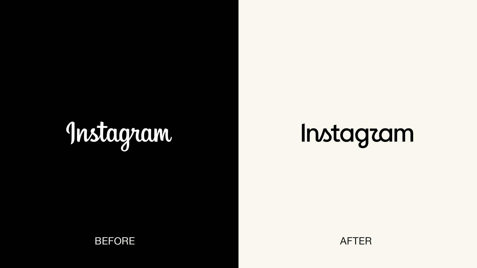
The 2016 wordmark and its 2026 replacement.
That is not a small thing to get wrong. A wordmark has one job a symbol doesn't, which is to spell the name. So when thousands of people look at a brand new piece of type and read a different word than the one written there, something has happened. The question is whether it was an accident.
Here's what changed, why one letter is doing all the damage, and what we found when we produced the mark in print.
What Instagram actually changed
It's the text-only mark that sits across the top of the app, and it hadn't been touched since 2016.
The new one is a hybrid. The old wordmark was fully cursive; this one mixes print and script in the same word, keeping cursive gestures on the s, r, and g while everything else sits closer to a geometric sans. Strokes are heavier, connections looser, the whole thing more compact. Adam Mosseri, who runs Instagram, called it "cleaner and more modern" with nods back to the original.
According to Meta's own account of the project, the team went through hundreds of directions, everything from all-caps to camera concepts to literal handwriting, before landing back on script. Camera concepts being on the table at all is worth pausing on, since that would have meant dropping the wordmark for a symbol.
“Script reflects individuality, so referencing that felt right. The new wordmark is bolder and simpler, with touches of unexpectedness.
Jasmine Probst, Director of Product Design, Instagram
That last phrase is going to follow this project around for a while.
The mark rolls out globally over the rest of the year and beyond, which is normal at this size. Wordmarks live inside app builds, splash screens, marketing templates, and legal filings, and none of those update on the same schedule.
Every Instagram wordmark, 2010 to now
Four marks in sixteen years, and the through-line barely moves. Every version has been a script. What changes is how much of one.
2010 to 2013
2013 to 2016
2016 to 2026
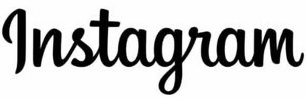
2026 to present
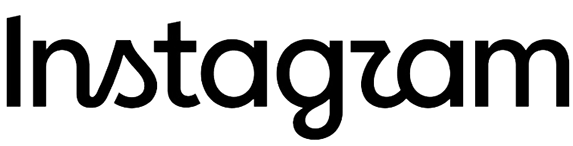
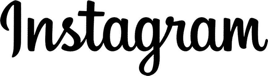
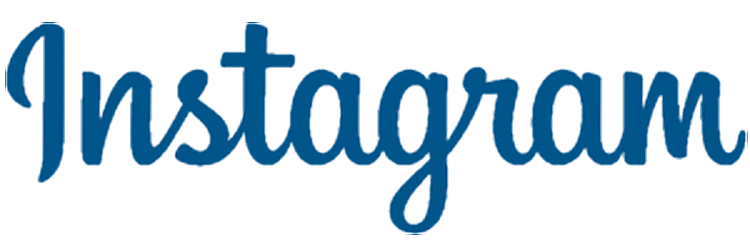
The 2010 mark was Billabong, a typeface anyone could buy. The 2013 version was the first drawn specifically for Instagram, and 2016 refined it further without changing its character. All three are fully cursive. The 2026 mark is the first to break that, and breaking it is where the trouble starts.
The gaps are also getting shorter in a way the timeline hides. Instagram ran a full brand identity refresh in 2024, covered on Meta's own design blog, and the 2016 wordmark came through that untouched. Two years later it is gone. A mark that survived a complete overhaul has been replaced in the gap between overhauls, which suggests the wordmark itself was the specific problem rather than the identity around it.
What font is the new Instagram logo?
It isn't a font. The wordmark is custom lettering, drawn for Instagram rather than set in an existing typeface, which is why nobody has been able to name one. You can't download it or license it.
That's normal at this scale. A mark seen billions of times a day is something a company wants to own outright, with no licensing terms attached and no way for anyone else to reproduce it exactly.
It wasn't always true here, as the 2010 mark above shows. Billabong was available to anyone, and it took until the redraw for the lettering to become Instagram's own. The 2026 refresh picks up from that drawing rather than starting over.
Some font suggestions to start from
Most of the advice circulating for the Instagram font is now out of date. It points at Pacifico, Yellowtail, and Grand Hotel, which were reasonable stand-ins for the old cursive and are the wrong shape entirely for what shipped in August.
Nothing off the shelf matches the new mark, and we are not going to pretend otherwise. What follows is a starting point rather than a match, and we will update it as better options surface.
Split the wordmark into its two halves and it gets easier to approach. The base is a heavy geometric sans with rounded terminals and almost no stroke contrast. Sitting inside that base are three cursive-inflected letters, the s, r, and g, which were drawn by hand and have no equivalent anywhere. So get the base close and decide separately whether you need the quirks at all.
For the base, these are worth setting your own name in and looking at.
Comfortaa. Rounded geometric forms, low contrast, and letterforms with a bit of oddness to them. The closest in overall character, though distinctive enough that it reads as itself.
Quicksand. Cleaner and more neutral, same rounded terminals and geometric skeleton. In Bold it gets close to the weight and compactness of the new wordmark.
Nunito. Rounded terminals on a more conventional humanist frame. A looser match, but it holds up better at small sizes.
Poppins. Purely geometric with flat terminals. Wrong on the rounding, right on the circular forms and monolinear stroke, and the most widely supported of the group.
None of these will give you the s, r, and g. Those letters are the entire reason the mark is being discussed, and the honest route is to set the word in one of the bases above and redraw the accents yourself, which is roughly what Instagram's team did.
If you are chasing the old cursive instead, since plenty of brand assets will keep running it for years, Pacifico and Grand Hotel remain the usual approximations.
You can preview any of these at real body size in our font library, and the font generator will run your own brand name through a large set of options at once.
Instagram Sans, Instagram Pen, and Instagram Mono
The wordmark took the attention, but Meta shipped a whole type system with it. Instagram Sans, the interface face, got an update. Instagram Pen is new and hand-drawn. Instagram Mono is a new monospace. All three are proprietary and none of them leave Meta's products.
This is the half that matters more. A wordmark shows up in a handful of places. A type system shows up in every caption, button, error message, and ad the brand makes for the next decade. Meta is also easing off the gradient, and the stated reasoning is to leave more room to breathe so that what the community posts carries the energy rather than the interface around it.
“It's designed to spark courageous action and give people the confidence to create and show up as themselves, freely and fully.
May Hartono, Director of Brand Design, Meta
If you can only fund one of the two, fund the system.
Why everyone is reading it as "Instagzam"
It's the r.
In the new wordmark, the r carries a cursive swoosh where you'd expect a plain stem and shoulder, and it sits right next to a g with a curve of its own. Reading doesn't happen letter by letter. Your eye takes in clusters and silhouettes, then checks the guess against context. Two neighbouring letters carrying the same sweeping diagonal collapse into a single shape, and the nearest match most people have on file is a z.
The hybrid build is probably making it harder rather than easier. In a fully cursive wordmark every letter is unfamiliar in the same way, so your eye adjusts once and reads the rest in that mode. Here the script letters sit among print ones, so there's no single mode to settle into, and it starts at the s, which is the worst possible position. That's where readers commit hardest to a first guess.
Ars Technica's creative director, Aurich Lawson, wrote the sharpest version of the critique, saying the mark reads like the almost-real lettering image generators produce, all odd spacing and letters that stop just short of being letters. He wasn't claiming AI made it. He was saying it landed in the same uncanny register, which in 2026 is a rough place for a brand to land.
CNET found the reception genuinely split, with plenty of people liking it. USA TODAY counted more than 2,000 comments on Mosseri's post within the first hour, running from praise for the energy of it to complaints that it's hard to read and might not clear accessibility checks.
Then ChatGPT joined in, which is where a logo joke stops being criticism and turns into distribution. They posted their own wordmark redrawn as "chatjipiti," captioned "no notes."
Their India account went further and made the letterform itself the punchline, posting "different ways of writing r" with the r drawn several different wrong ways, captioned with the observation that this is a post about Meta, on a Meta app, which makes the whole thing quite meta.
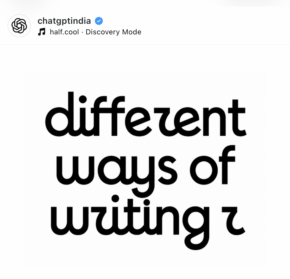
Via @chatgptindia on Instagram.
428,000 likes on the first one in a day, for a joke that only works if you already know what Instagram's new r looks like. The mark had existed for 24 hours and it was already a running bit across two of ChatGPT's accounts.
So the criticism is real. It might also be the plan.
The case that the flaw is the feature
Start with what Meta didn't say.
Their announcement runs to a five-minute read and makes the full case for the new mark. It talks about warmth, individuality, personal voice, craft, confidence, and expression. The words legible, readable, and clarity do not appear anywhere in it. Every criticism this wordmark has attracted is about legibility, and the company's own argument for it never engages with the question at all.
That is either an oversight or a set of priorities. Given that they explored hundreds of directions and landed on one with three redrawn letters, priorities seems more likely.
Which makes sense once you think about what a wordmark is for after the first week.
Nobody really reads a familiar wordmark. You recognize it. After a few exposures the mark stops being text and becomes a shape you clock at a glance, from across a room, upside down on someone else's phone, at thumbnail size in a browser tab. Legibility matters enormously during the introduction and much less after it.
Which means the thing that makes a mark irritating in week one, a letter you have to slow down for, can be the same thing that makes it identifiable later. A wordmark nobody stumbles over is also a wordmark nobody looks at twice.
Then there's the math nobody at Meta will say out loud. A rebrand everyone shrugs at gets one news cycle. A rebrand with one argument-starting letter gets a week of coverage, thousands of comments, designers publishing their own corrections, ChatGPT making a joke in your visual language, and a nickname that travels further than the announcement did. Instagzam is now attached to Instagram in a way no press release could buy.
The catch is that ambiguity is only affordable when you're already famous enough to absorb it. Instagram can carry a letter people argue about. A company nobody can name yet cannot.
Wordmark or logo, what's the difference
Worth sorting out, since most of the coverage used the terms interchangeably. Meta didn't. Their announcement says wordmark and brand identity throughout and never once says logo.
A wordmark is text only. It's the brand name itself, drawn or set a specific way, with no symbol attached. Coca-Cola, Google, and Instagram's app header are all wordmarks.
A logo is the broad category, covering any visual identifier a brand uses: symbols, icons, emblems, or type and image combined. A logomark is the symbol on its own, like Instagram's gradient camera glyph, which didn't change here.
Most brands run both, a symbol for tight spaces and a wordmark for anywhere the name needs saying outright.
What happens when the logo goes to print
Everything about the reaction so far has happened on backlit displays, where type is pixel-dense, sharp at any size, and can animate its way out of confusion on the way in. It is the most forgiving environment a letterform will ever sit in, which made it worth finding out what the mark does somewhere less generous. We produced it on business cards in foil.
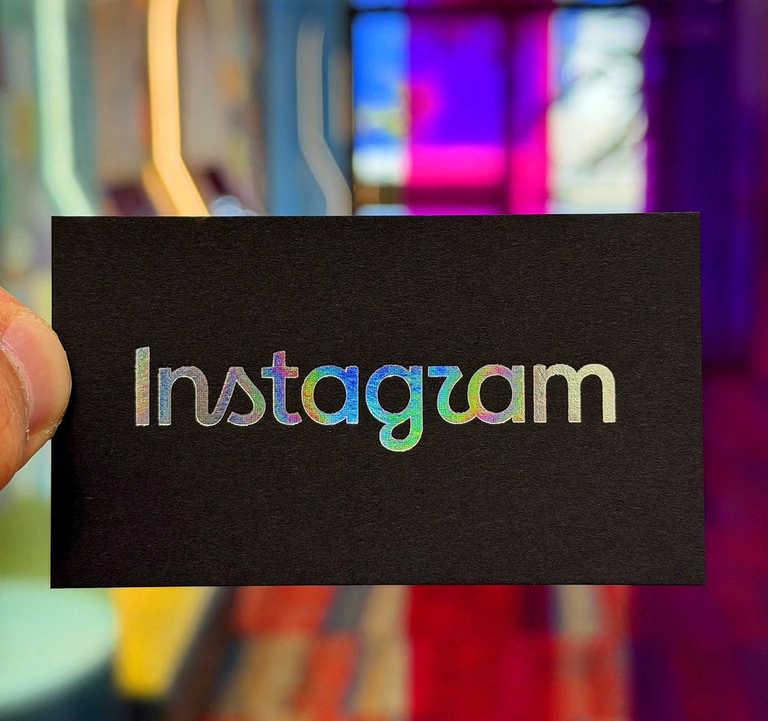
Vissarutt Pilachai, our Head of Special Projects, spends most of his time on work that pushes what these processes can do, and he found the mark genuinely interesting to run.
The first half of the verdict is a compliment, and the card above makes the case better than any description. The wordmark is well built for specialty printing. The strokes carry enough weight to take an impression without collapsing, the curves hold a clean foil edge, and the whole thing sits comfortably on a die. It behaves the way you want type to behave when there is real pressure involved. It would work on stickers, on packaging, on anything where the finish is doing part of the talking.
The second half is the trade-off. Under relief, the z gets louder. Foil reads by light and shadow rather than by outline, so every stroke picks up a highlight on one edge and a shadow on the other, and the small distinctions between letterforms start to flatten. The r's tail and the g's curve stop looking like two decisions and start looking like one shape.
So the mark is both things at once. It produces beautifully and it reads worse doing it, and which of those you care about depends on what the piece is for. On packaging where the finish is the point, this is a gift. On a card someone has to read across a table, less so.
Which is the argument for taking type off the monitor before signing it off. The mark did not change between the screen and the card. The light did, and that was enough.
What to take from this for your own mark
A short checklist, drawn from the failure modes visible in this launch.
Test the ambiguity before you commit. Show the mark to ten people who've never seen it and ask them to read it out loud. Don't explain it first. If two of them trip on the same letter, you've found your r.
Print it before you approve it. Get it on the actual stock, at the smallest size you'll ever use, in the finish you plan to run. As above, a mark can behave differently under relief than it does on a screen, and you only find that out by producing it.
One unexpected letter, not five. Distinctiveness comes from a single deliberate departure people notice. Several departures read as inconsistency.
Check it in one colour and reversed out. Marks end up engraved, stamped, and printed in a single ink more often than most people plan for. If it only works in full colour with a gradient, it doesn't work.
Decide whether legibility is on your list. Meta's case for this wordmark never mentions it. That is a defensible choice at their scale and a dangerous one at almost any other. Write down which criteria you are actually judging against before you start reviewing options.
Build the system, not just the mark. Typeface choices, spacing rules, and a defined minimum size will do more for how coherent a brand looks than the logo will. Our guide to building a brand identity covers the order to do it in.
Frequently asked questions
Meta announced the new wordmark on August 13, 2026, replacing one that had been in place since 2016. It rolls out worldwide across the rest of the year and into next.
Four wordmarks since 2010. The original ran from 2010 to 2013, a redrawn version from 2013 to 2016, the long-serving cursive mark from 2016 to 2026, and the current hybrid from August 2026. The camera icon has changed separately on its own timeline.
There isn't one. The wordmark is custom lettering drawn for Instagram rather than an existing typeface, so there's no font name to look up and nothing to download. The typefaces announced alongside it, Instagram Sans, Instagram Pen, and Instagram Mono, are proprietary to Meta.
Nothing matches it, since the letterforms were drawn by hand. As a starting point, Comfortaa and Quicksand Bold are the nearest rounded geometric sans faces available free through Google Fonts, with Nunito and Poppins as looser alternatives. None of them include the cursive s, r, and g.
No. Neither the wordmark lettering nor the three Instagram typefaces are available to license.
The r carries a cursive swoosh and sits right beside a g with a curve of its own. Reading happens by cluster rather than letter by letter, so the two merge into one shape that resolves as a z.
We produced it on business cards in holographic foil. The type holds up well, with enough stroke weight to take a clean impression and curves that hold a clean foil edge. The trade-off is that relief printing makes the r read as a z more strongly than it does on screen, because light and shadow flatten the distinction between the letterforms.
No, the gradient camera icon stays. This change covers the wordmark and the typefaces around it, though Meta says the gradient will be used more sparingly across the wider identity from here.
A wordmark spells out the brand name in text only. A logo is the general term for any visual brand identifier, including symbols, icons, and combined type and image marks.
Open question. Users raised legibility and accessibility concerns within hours of launch, and Meta's own announcement of the wordmark does not mention legibility at any point. Accessibility guidance covers contrast and text size directly but says much less about custom letterform ambiguity, which gets judged by testing rather than by ratio.