When thinking of business cards on the big screen, there’s one instance that takes the cake: the American Psycho business card scene. You probably know it. Patrick Bateman’s carefully crafted civility begins to crack as his coworkers one-up his business card with even better designs.
In real life, your business card probably won’t bring people to the verge of a mental breakdown. But it can still be a solid showcase of your skills and professionalism. Let’s break down the rest of the American Psycho card scene to understand why it hits so hard and how you can create a business card that also makes an impact.
Why the American Psycho business card scene stands out
The American Psycho business card scene is only around three minutes long. The business cards in question? Only on screen for a few seconds. Even so, this scene packs a punch that has us still talking about it over 25 years later.
Not familiar with how things play out? Let me set the scene for you.
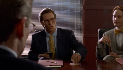
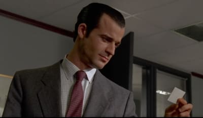
Patrick Bateman and the rest of his fellow Pierce & Pierce VPs crowd into a conference room and start comparing their seemingly identical cards. Card after card is revealed with a dramatic whooshing sound, as though the heavens are parting.
Source: American Psycho
At first, Bateman thinks his card is supreme. He’s smug as he slides his 3.5" × 2" piece of cardstock across the table. But then, as David Van Patten reveals his on the table, the rest of the group congratulates him, and Bateman’s voice falters. He realizes he might be in over his head.
Next goes Timothy Bryce, who slaps his down to an equally impressed room. Bateman can only mutter in agreement.
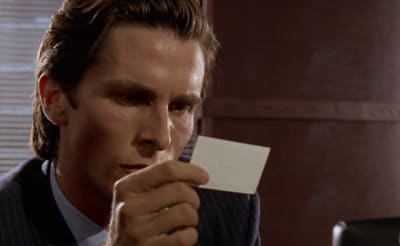
The final nail in the coffin is Paul Allen’s card. Bryce holds it in the air like a shining beacon, and Bateman completely unravels as he pulls it closer, his face glistening in a cold sheen of sweat and fingers shaking as he struggles to pull himself together.
Source: American Psycho
Part of the scene’s memorability stems from Christian Bale’s excellent acting. We can feel him desperately trying to keep from screaming and letting his inner monster out. During this scene, Bale said that he actually stopped breathing, taking a cue from the original novel by Bret Easton Ellis.
The other reason the scene sticks in is the absurdity of it all. To the untrained eye, all of the business cards look nearly identical: white background, black text, same format. The fact that grown men are salivating over them is comical.
But it also has a deeper meaning. Director Mary Harron uses this moment as a satire of the conformity and materialism of Wall Street in the 1980s. All the men even have the same Vice President title in the same department, showcasing the fact that they’re pretty much interchangeable.
Bateman’s desire for superiority finally unleashes itself later in the film with morbid results, but it’s this business card scene that helps get us there.
American Psycho business card analysis
Each of the business cards presented in this scene bears some striking similarities. First things first, they’re all made using letterpress. In this method, a raised plate is pressed into the cardstock, leaving a debossed impression.
Having cards printed this way gives off an air of sophistication and luxury. Not only does it look impressive, but it will also feel impressive as you run your fingers over the letters.
Source: American Psycho
They also use a mix of small caps, meaning that lowercase letters are often replaced with smaller versions of capital letters. This is especially apparent for the first name of each individual.
Designers don’t use this technique as much today, as it can be hard to get right online, leading to brand inconsistency. Instead, a better design would be to use lowercase letters.
Finally, the layout of each card is identical. The name and title are centered in the middle, so the eye spots this information first. In the top left is the phone number, and in the top right is the company and department.
The information is laid out in a Z-pattern to accommodate the left-to-right scanning that’s common for English readers. Less important information, like the office address, goes at the bottom of the card, where the eye goes last. There’s a good amount of space between each element, making the cards easy to read so they don’t feel cluttered.
Even though all of the VPs’ business cards share these same features, they do have some differences. Are they different enough to have a panic attack over? Not quite, but there are enough subtleties for us to analyze.
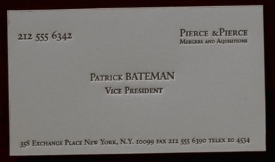
Patrick Bateman's business card
Source: American Psycho
Bateman proudly announces that the color of his card is Bone, and the lettering is Silian Rail. You can instantly notice that the off-white color adds a bit of warmth to the card. While Silian Rail isn’t a real font, the font here does resemble Garamond, an old-style serif font that’s highly readable and perfect for traditional business cards like this.
As for the stock, it looks as though Bateman is using high-quality, matte cotton, though I can’t tell for sure. Finishes like this without a sheen immediately feel premium. The card also looks smooth, which is slightly more modern and clean than some of the textured choices his colleagues have made.
Unfortunately, Bateman’s cards have a few big problems. First, there’s a missing space after the ampersand in “Pierce & Pierce.” Second is the misspelling of “Aquisitions.” In fact, all the cards in this scene spell “acquisitions” incorrectly. Let that serve as a reminder that proofreading your business cards before sending them to print is essential.
Overall, the Patrick Bateman business card isn’t the worst card in the world, but it lacks all personality. The homogeneous use of font, lack of color or logo, white background, and smooth stock all combine for a lackluster effort that I’d probably toss in the trash as soon as I walked away.
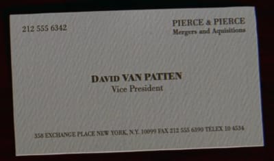
David Van Patten's business card
Source: American Psycho
David Van Patten’s card is in the color Eggshell with Romalian Type. Like Silian Rail, Romalian Type isn’t a real font. Instead, this uses a version of Bodoni, which is a modern serif. This style has a high stroke contrast, meaning there’s a good variety of thick and thin lines within each letter.
Typically, fonts like this are used in fashion, specifically for the logos of Harper’s Bazaar and Vogue, so it’s a bit odd to see it being used here for an investment banker. It does make this card look more visually interesting than Bateman’s card, however.
What really sets Van Patten’s card apart is the textured stock. This card looks like it would feel tactile to the touch. Not only does this make the card easier to grab, but it also makes it a little more durable for being carried around.
It’s hard to tell for sure, but it looks like Van Patten’s card is also less debossed than the other cards here. If so, it’s a good thing he opted for textured stock to compensate.
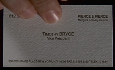
Timothy Bryce's business card
Source: American Psycho
Bryce explains his card uses raised lettering and the color Pale Nimbus White. However, I’m doubtful. The letters don’t appear to be raised—in fact, it seems as if they’re slightly debossed, meaning they’re punched into the paper.
He doesn’t mention the font, but it’s clearly a form of Helvetica. This is a common contemporary font that would feel at home on a business card today. In this case, it’s an appropriate font for an investment banker who doesn’t want extra flourishes.
Bryce also has a textured stock that’s slightly different than Van Patten’s. It’s hard to tell for sure, but it looks a little bit softer, as though it’s made from a textured cotton. If so, the card will feel soft under the fingers, but may have trouble holding up in a wallet without getting dinged up corners.
Paul Allen's business card
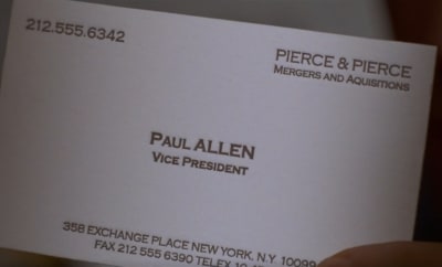
Source: American Psycho
Bateman explains that this card has subtle off-white coloring, tasteful thickness, and a watermark. But I think he’s worked himself up over nothing, because it’s clear this card doesn’t have any sort of watermark. We’d see some faint indicator of an underlying image or text, but the background is solid white.
The font used in this card is called Copperplate Gothic, a typeface that has no lowercase letters and has tiny serifs on each letter. This font actually makes the most sense on a banking business card, as it was heavily used in the industry during the 20th century. And fun fact—it’s the same font used for the opening and closing credits of the film.
Allen’s card does appear to be the thickest of all the cards featured in the scene, which means it will definitely hold up the best when networking. The stock is also smooth like Bateman’s, but you can see the visible difference in quality. Allen’s card uses a brighter white without fibers or textures, making it feel the most modern of them all.
How to recreate the American Psycho business card
If you like the looks of these cards, I have good news—they’re easy enough to recreate. Here are my recommendations on how to use Jukebox to print your very own version of the American Psycho business card.
- Patrick Bateman’s business card: Use Colorplan China White stock, which comes in the same uncoated texture. Opt for the Garamond font.
- David Van Patten's business card: Use Cannabis stock for the textured finish that’s more durable. Opt for the Bodoni font.
- Timothy Bryce’s business card: Use Cotton for that sophisticated texture that’s soft and light. Opt for the Helvetica font.
- Paul Allen’s business card: Use Mohawk Superfine UltraWhite to get that smooth, uncoated finish with a thicker base. Opt for the Copperplate Gothic font.
While you can use these ideas to get you started, I have full confidence you can create something more exciting than the VPs at Pierce & Pierce did. These business cards get the job done, but on the whole, they’re lifeless. Adding a splash of color, metallic lettering, or even the company logo could make them far more memorable.
How business cards are showing up again in pop culture
The American Psycho business card scene isn’t the only time business cards have popped up in pop culture. In fact, they’ve been making quite a splash recently in shows like Squid Game.
In the Korean thriller, a mysterious man presents the main character, Seong Gi-Hun, with a symbol-covered business card. The brown kraft business card becomes central to the plot as Gi-Hun works to learn more about what he’s getting himself into.
That’s just one small example. Truth is, business cards have never been more popular, and now’s the time to jump in and create your own design.
Take business card design inspiration
While you may not want to channel Bateman’s homicidal tendencies, you can use his business card as an inspiration for your own. Leaning into the clean, minimalist aesthetic of the Pierce & Pierce VP crew helps you look professional and sophisticated.
When you’re ready to make a splash in the business world (hopefully not as drastically as Bateman did), use Jukebox to design and print your own premium custom business cards.