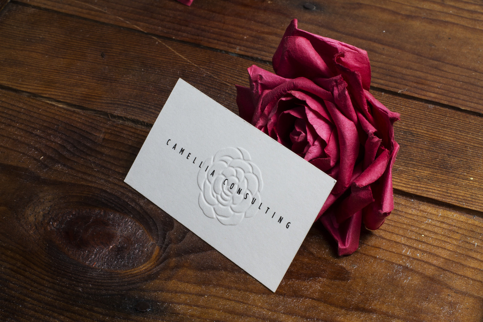
Embossed Business Cards in Vancouver
Stand out from the crowd
Take your business cards to the next level with custom embossing! The raised impression of embossing adds class and finesse to your design. Not only is it a truly eye-catching effect, but will make an impact through the raised texture of the business card itself.
Embossing makes elements of your business card literally stand out, raising areas of one side of the card as specified in your design. The opposite effect, having an impression on one side of the card is called Debossing.
A unique aspect of this printing technique is that you cannot have one effect without the other also being applied to the card. An embossed design will create a reverse impression, deboss, on the back side, while a debossed design will create a reverse raised effect, emboss, on the other side.
Embossed Business Card Inspiration

Embossed Business Card Pricing
Visit us at our Vancouver Location!

165 West 4th AveVancouver, BC V5Y1G4(604) 683-0097View MapLocation Hours:Weekdays: 9:00 AM - 5:30 PM PST
- Popular FAQ
- Download Template
- Design Guidelines
Most Popular Questions
We can emboss a wide range of stocks and materials. The best stocks for embossing are soft uncoated stocks (such as our 20pt Cotton) or for fine detail embossing, uncoated stocks 16pt or less.
If there is a specific stock you are interested in embossing, please request a Print Quote and one of our Estimators will get in touch with you.
Below are examples of materials we have embossed:
![]() | Pearl 16pt Pearl Silver |
![]() | Premium Black 16pt Jet Black |
![]() | Wood Natural Birch |
![]() | Spot UV 16pt Smooth Matte Laminate with Spot UV |
![]() | Foil 16pt Smooth Matte Laminate |
What is the best stock for embossing & debossing?
Thinner and softer stocks show the detail of an emboss and deboss much better than thicker, rigid stocks. Uncoated stocks also generally hold these details better.
That being said, greater depth of the raised area or impression can be produced with thicker soft stocks, like our 40pt Cotton. Since the thickness will make fine details less visible, designs for emboss and deboss should be more simple, bold and have no fine detail.
Thicker coated stocks will not be as suitable for fine detail or deep impressions, therefore the design for these stocks should be created with this in mind.
The impression of an emboss and deboss will show through on the reverse side. This means that any printed content that is directly behind the emboss or deboss will be affected. To avoid this, we recommend a duplex product where two stocks are mounted together. The side to be embossed or debossed will be produced first and then mounted to the second sheet to hide the impression. Note that a duplex product with emboss will reduce the quality of the impression due to the mounting process, so it is best to work around the emboss and go with a single ply product.
Please note that there are strict design considerations for these projects that one of our Print Specialists or Prepress agents will need to review with you first. You can speak to one by contacting 1.888.667.0067 - selection 4 or 5.
See: What are your paper options for duplex (2-ply) business cards?
Setting up press-ready files for Embossing
Emboss print-ready files should be supplied as separations. Before you create a press-ready file for your design, be sure to carefully read through Design Considerations for Embossing.
This means the emboss layer is supplied in a separate file (or separate page) of your press-ready PDF file.
See: Setting up press-ready separations file.
Finest Detail for Embossing
Fine detail refers to the line weight used in your artwork, and includes the small dots and serifs on fonts.
Fine Detail According to Stock
The finest detail for embossing is largely dependent on the paper stock – thinner uncoated stocks hold fine detail when embossed the best, while thicker rigid or coated stocks do not hold fine detail as well.
The thickness of the paper as well as the rigidity will affect how fine of detail is suitable in your design. We offer a very wide range of stocks, each of which may affect the way your embossed detail turns out. As such we do not recommend to place an embossed order "run-as-is" unless it is a repeat order. Choosing the "online PDF proof" option before production will give you the benefit of our Prepress Team's review of your files - they may make recommendations to change your design to better suit your chosen stock. If you are ordering a custom job please make sure you upload files with your quote request so an Estimator can let you know if they think the chosen paper stock will not be suitable.
Fine detail can be as small as 1pt on soft uncoated stocks 16pt or thinner. Coated stocks and thicker uncoated stocks can be more rigid and will have lower tolerances for embossing, meaning details in the design will need to be larger.
Line Weight and Embossing
Although increasing your line weight may make the design look thicker than desired, it is important to keep in mind that the embossed effect is visually thinning due to the curved surface of the emboss. Embossed artwork appears thinner than it does when viewed as a flat design. We recommend to choose sans-serif fonts as the font size will not need to be increased as much to meet the minimum line weight as it would with serif fonts.
1pt is our minimum recommended line weight, with a few points to consider:
- if your design is to be blind embossed (not registered to ink printing) it is highly recommended to use a thicker line weight, since the effect of a blind emboss is much more subtle. Small embossed text registered to ink printing can still be readable while this same text created in a blind emboss may not be legible.
- Spacing between printed elements should also be kept at a minimum 1pt.
- If you're using negative space for your artwork, the minimum recommended line weight is increased to 2pt.
- The finer the detail in your artwork, the less precise the registration of ink printing to embossing will be. 2pt line weight or higher generally has better results for registered embossed designs.
The larger you can make details in the artwork for embossing, the more impact it will have, so we do not recommend a large amount of fine detail.
What is the depth of an Emboss?
The depth of an emboss largely depends on the type of stock (its elasticity and structure) and typically ranges between 0.5 – 2 millimetres. Note that due to many factors and variations in production, the depth of an emboss cannot be guaranteed.
What is the difference between Blind and Registered Embossing?
Embossing refers to the impression of a design, decoration, lettering or pattern that can be done blind (with no printed image) or registered (aligned with a printed image). It's a process that can really enhance the look and feel of a business card or promotional design.
At its core, debossing is the polar opposite of embossing, and as such, it's possible to categorise in the same way: Blind Debossing and Registered Debossing.
To differentiate between these two established printing techniques (both of which are effective for a wide variety of card stocks), let’s explore two clearcut definitions for your reference:
Blind Embossing
Fundamentally, blind embossing is the method of creating raised logos or characters without the use of ink. Typically, two metal dies are used for this process: one with a raised logo or detail, and another with matching but recessed logo or detail. When a sheet of paper is pressed between these dies, often using metal plates, the act of blind embossing takes place.
A blind emboss or deboss will produce a far more subtle effect than registered emboss, therefore it is not as suitable for finer details, especially small text. A registered emboss leans itself toward more intricate, busy or miniature designs.
Registered Embossing
The main difference between blind and registered embossing is that with the latter, the embossed design, image or graphic is printed with ink before it is raised. Images may also be foiled or printed with spot UV, before it is registered embossed.
Both of these emboss techniques are branches of heat and while the results are different for each, both leave a deep impression that serve to enhance the aesthetics of a business card, letterhead, or any other form of promotional material, significantly.
Embossing Process Essentials
For quick reference, here are some essential attributes of blind, registered and foil embossing explained with supporting graphics:
Blind Embossing
![]() | The embossed element is not printed with ink. The emboss is not aligned to any particular graphic. |
Registered Embossing
First, the image is printed with ink and then embossed in alignment to the printed element. |
Spot UV with Registered Embossing
![]() | Here, the image is printed in Spot UV first, and then embossed in alignment to the Spot UV. |
Have a question? Ask Away!
Select Business Card Template:
Select File Format:
- Bleed Area
- Trim Area
- Safe Area
Bleed Area refers to images that extend to the very edges of a design. To prevent an unwanted white border from showing at the edge of your design, or for the design to appear slightly off-center, be sure to extend any background colors or design elements all the way to the edge of bleed (.125” past the trim on all four sides).
Trim Area refers to the amount of the image that will appear on your finished product. These areas will also be marked with ‘cut lines’ on your proof and are where we aim to cut your card.
Safety Area in most cases refers to 1/8 of an inch inside of the Trim Area. For thicker papers 20pt and up or wooden papers the Safety Area increases ¼ of an inch inside the Trim Area. we strongly recommend you keep important aspects of your design such as text and logos well inside of the Safety Area, otherwise, they may be cut off.