
 CAD
CAD
 USD
USD
 EUR
EUR


Glossy vs matte business cards is the foundational finish decision in the category. They look and feel completely different in hand. The right one depends on what your design is doing, what your brand is signaling, and how the card will be handled. But the choice usually decides itself once you see the design printed on each. The choice sits inside the broader stock-and-finish system covered in our complete business card materials guide.
The quick version
Glossy is shiny, vivid, color-forward. Matte is flat, soft, refined. Both print color well. The difference is what the finish does to the design after printing.
Then there's a third option, Soft Touch, which is matte's premium cousin. We'll cover that too. For the head-to-head, Soft Touch vs matte business cards compares the two finishes that get confused most. For the full three-way premium comparison against Standard and Mohawk Superfine, see Soft Touch vs Standard vs Mohawk Superfine. For the broader stock-tier decision, premium vs standard business cards covers when each tier earns its place.
Glossy
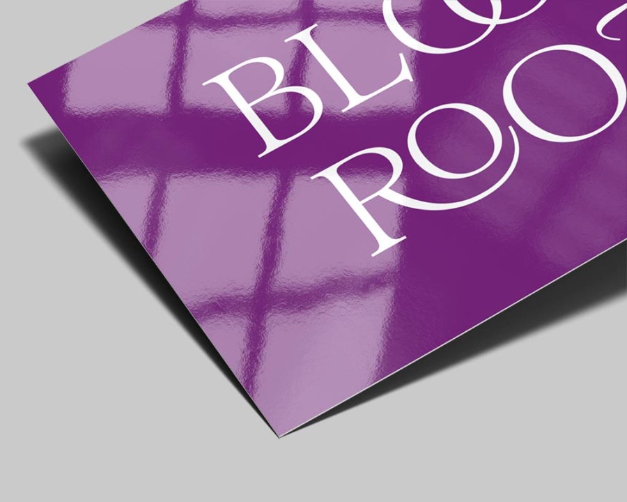
How it looks
Reflective surface. Light bounces back to the eye, which makes colors look brighter, deeper, and more saturated. Whites are bright. Blacks are deep. Photos and color-rich designs look their best on gloss.
How it feels
Smooth, slightly slick. The coating creates a hard surface that feels durable.
What it's good for
- Photo-heavy designs (portfolios, real estate, food)
- Brands with bright, saturated color palettes
- Cards that need to feel polished and finished
- High-handling environments (passes through hands often without showing wear)
What it's not great for
- Glare in photos (fingerprints and reflections show)
- Subtle, refined brand voices (gloss can feel commercial)
- Anywhere recipients need to write on the card (most pens slip on glossy)
Matte
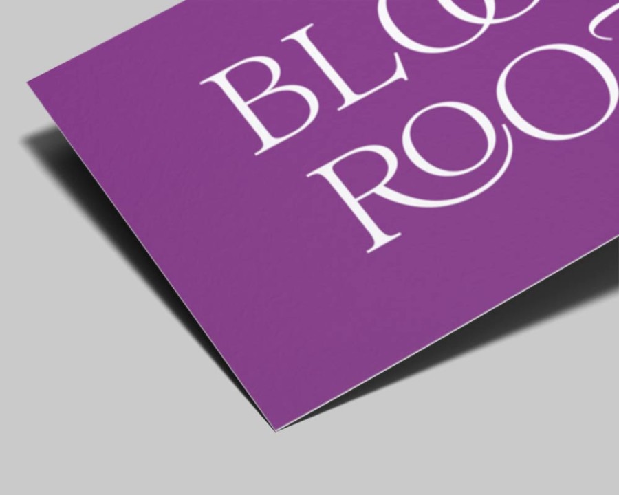
How it looks
Non-reflective. Color sits flat on the surface without bouncing light. Reads as understated, refined, professional. Premium brands lean matte heavily because it doesn't compete with the design.
How it feels
Smooth and dry. Different from gloss but not dramatically so unless you're feeling them side by side. The premium upgrade is Soft Touch.
What it's good for
- Type-driven designs (the type doesn't compete with shine)
- Premium and luxury brands (gloss can read as cheap on premium positioning)
- Photography in galleries (no glare in photos of the card itself)
- Anywhere recipients might write on the card (pens work)
What it's not great for
- Photo-heavy designs (matte slightly mutes color depth)
- High-impact, vivid color brands
- Cards in very high-handling environments (matte shows wear sooner than gloss)
Soft Touch (the premium matte)
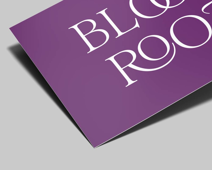
Soft Touch is matte's upgraded cousin. A velvety lamination over a matte print surface. Feels distinctly different from standard matte. Reads as premium without the brashness of gloss.
It's our most-ordered finish. Soft Touch vs matte explained in detail.
How it looks
Same flat color reproduction as standard matte. The lamination doesn't change how the print looks, only how it feels.
How it feels
Velvety. Almost like suede. The defining tactile experience in premium business card printing right now.
What it's good for
- Premium positioning across any brand category
- Tactile-first experiences (the card communicates before the recipient reads it)
- Modern brand voices that lean refined
What it's not great for
- Designs that depend on extreme color saturation (gloss is better for that)
- Tight budgets where standard matte gets the job done
Side by side comparison
Glossy is the visual loudest of the three. The look is vivid and reflective, the feel is slick and hard, and color depth is the highest of any finish. Pens slip off glossy, fingerprints show clearly, and the best use case is photo-heavy or color-rich designs where the shine helps the imagery do its job.
Matte and Soft Touch share a flat, refined look but feel completely different in the hand. Matte is smooth and dry, holds color at medium depth, and accepts most pens for handwritten notes. Soft Touch carries the same flat look as matte but adds a velvety, almost suede-like coating that resists fingerprints, signals premium more strongly, and accepts only fine-tip permanent markers for writing.
For photo-driven brands, glossy is the right call. For type-driven and restrained design, matte serves the design without competing with it. For premium positioning that whispers rather than shouts, Soft Touch is the most-ordered finish in the category for a reason.
Which to pick
Three quick rules.
Photo-heavy and color-rich design: Glossy. The shine helps the design do its job.
Type-driven and premium-feeling design: Matte or Soft Touch. Glossy can feel commercial in this context.
Brand wants to feel premium without being loud: Soft Touch. The velvety feel signals premium without the visual flash.
If unsure, order a sample pack with all three finishes. The differences are tactile and visual at the same time. Holding them side by side makes the right call obvious.
The bottom line on glossy vs matte business cards
The glossy vs matte business cards decision comes down to the design. Photo-heavy and color-rich brands win on glossy. Type-driven and premium-positioned brands win on matte or Soft Touch. The full business card materials guide covers every premium stock side by side, and our best business cards roundup covers the specific finish recommendations by brand archetype. Matte, gloss, and Soft Touch all sit on the business cards page - the prices and per-card math are live as you compare.



