Brand identity is the set of visual and verbal choices a brand uses to present itself to the world. It’s how a brand looks, sounds, and shows up across everything from a website to a business card.
This article breaks that down in a simple way. You’ll learn what brand identity actually means, what goes into it, and how it works outside of a screen. We’ll also look at real examples and talk about how to build something that holds up in print, packaging, and everyday use.
If you’ve ever thought a logo was the whole story, this will help connect the dots.
What is brand identity?
Brand identity is a system. Not just a logo, not just colors, and definitely not something you decide once and forget.
It includes everything a brand uses to present itself. That means visuals like logos, colors, and typography. It also includes how a brand speaks, writes, and interacts.
The key thing to understand is this. Brand identity is what you control. Brand perception is what people think. They are connected, but not the same.
You can design a clean, minimal identity, but if your packaging feels cheap, people notice. If your tone sounds friendly online but stiff in print, people notice that too.
A strong brand identity keeps things consistent. It helps people recognize you quickly and understand what you stand for without needing an explanation.
Think of it less like a single design and more like a toolkit. Every piece works together, and every piece shows up in real situations.
The core parts of a brand identity
A brand identity works because multiple parts come together. Each one plays a role, and none of them should feel random.
Logo
The logo is often the first thing people see. It should be simple enough to work small and strong enough to stand on its own. A good logo still works when printed tiny on a card or large on packaging.
Typography
Fonts shape how a brand feels. Clean sans-serif fonts feel modern. Serif fonts can feel more classic or editorial. If you’re exploring options, this list of best free fonts is a solid place to start.
Color
Color builds recognition fast. The key is consistency. Colors should look right on screens and in print. Bright colors can shift when printed, so testing matters more than most people expect.
Imagery
Photos, illustrations, and graphics all fall under this. Some brands use clean product shots. Others use bold, playful visuals. The important part is that it feels intentional and consistent.
Voice
Voice is how a brand sounds when it writes or speaks. Friendly, direct, playful, serious. It should match the visuals. A fun brand with stiff copy feels off immediately.
Physical applications
This is where things get real. Business cards, packaging, stickers, and printed materials. A strong identity holds up here. Something like premium business cards or well-made custom stickers can quickly show whether a brand has thought things through.
30 brand identity examples
Minimalist
Minimalist brand identities focus on clarity and control, using fewer elements but applying them consistently across every touchpoint. When done well, they work just as effectively on packaging and printed materials as they do on screen.

Apple uses very little, but applies it with precision. Simple typography, clean layouts, and minimal color carry across product, packaging, and retail. It shows how restraint and consistency can build a strong, global identity.

IKEA builds its identity through clarity and structure. Bold color, simple type, and consistent layouts run through packaging, signage, and instructions. It shows how a clear system can feel simple, even at a very large scale.

Aesop keeps everything calm and consistent, using simple typography, muted colors, and label-first packaging across every product. When everything is reduced, consistency becomes the most important design decision.

.jpg")
Humanrace uses soft colors, clean type, and simple forms across packaging and digital, with nothing feeling overdesigned. It shows how minimalism works best when it still feels human and not too cold.

Module uses a precise, system-driven approach across its coffee packaging, where every detail feels intentional, from layout to typography. This level of control shows how strong brand identity comes from deliberate decisions at every level.

Uniqlo uses a simple red and white color system with clean typography and structured layouts. It stays consistent across stores and packaging worldwide, showing how a minimal system can scale without becoming confusing.

Gush builds its identity around a system of circular forms that represent air particles, carried across typography, imagery, and packaging. It proves how a strong concept can drive every part of a brand system.

Muji removes branding almost entirely. Neutral colors, simple type, and material-focused packaging create a calm and consistent look. It shows how minimalism can come from what a brand chooses not to include.
Bold and expressive
Bold and expressive brand identities are built to stand out, using strong color, typography, and personality to grab attention. The key is consistency, so that the identity still feels intentional across packaging, print, and real-world use.

Liquid Death uses heavy metal-inspired typography and aggressive visuals to brand something as simple as water. The contrast is intentional and consistent across every touchpoint, showing how a bold idea works when it is fully committed.

Ben & Jerry’s uses bold illustration, bright colors, and playful typography across its packaging, turning each product into its own small visual story. The identity feels expressive but consistent, showing how personality can drive a complete brand system.
Kreatures of Habit uses bold, text-heavy packaging and bright colors, replacing typical food imagery with a wall of typography that highlights ingredients and benefits. It shows how typography alone can carry an entire brand identity.

Maeve uses bright colors, bold illustration, and character-driven packaging to turn each product into its own small story. The identity feels playful but consistent across the range, showing how storytelling can shape a strong visual system.

Burger King uses bold typography, warm retro colors, and simple graphic shapes across packaging and signage. The system feels confident and consistent, showing how strong visual direction can refresh a global brand.

Oatly uses bold typography, handwritten-style fonts, and conversational copy directly on its packaging, turning every carton into a communication space. The identity feels disruptive but consistent, showing how a strong voice can carry an entire brand system.

Tony’s Chocolonely uses bright, unconventional colors and uneven chocolate pieces to reflect its mission around inequality in the cocoa industry. The design goes beyond packaging, showing how a brand identity can live directly in the product itself.

Olipop combines retro-inspired typography, soft color palettes, and consistent layouts to create a system that feels both nostalgic and modern across every flavor. It shows how a strong visual system can scale while still letting individual products stand out.
Luxury and tactile
Luxury brand identities are defined as much by how they feel as how they look. Materials, finishes, and physical details play a central role, with print and production quality often carrying the identity more than graphics alone.

Hermès builds its identity through material, color, and craft, most clearly seen in its iconic orange packaging and refined finishes. The consistency across every touchpoint shows how physical experience can define a brand just as much as visuals.

Rimowa builds its identity through material and construction, most notably its grooved aluminum cases and refined finishes. The consistency across product and retail shows how physical design can define a brand just as much as graphics.

Bottega Veneta defines its identity through material and craftsmanship, using its signature woven leather instead of visible logos. The approach shows how texture and construction can become the most recognizable part of a brand.

Teora uses soft, surreal illustrations and layered color to turn its packaging into a visual expression of atmosphere, with minimal typography letting the artwork lead. It shows how packaging can capture a mood, not just describe a product.

Maison Margiela strips branding back to almost nothing, using stitched labels, numbered codes, and material details instead of a visible logo. The identity lives in construction and texture, showing how a brand can be defined by what it chooses to leave out.

Aimé Leon Dore builds its identity beyond clothing, extending it into immersive retail spaces with wood paneling, vintage furniture, and café elements that reflect its retro-inspired aesthetic. The experience feels cohesive and intentional, showing how brand identity can live through environment and atmosphere as much as design.

Café Ephemera builds its identity through a story-driven world, where illustrated characters, typography, and packaging all extend a narrative across the space. From labels to signage, every detail feels connected, showing how storytelling can shape a complete brand system.

Le Labo uses lab-style labels, raw typography, and simple bottle forms to create a tactile, almost utilitarian identity. Each label is freshly printed and applied, showing how material choices and process can define a brand just as much as design.
Packaging-first
Some brands build their entire identity through packaging, using structure, color, and layout to stand out on the shelf. In these cases, print and production are not just part of the brand. they are the brand.

Graza rethinks olive oil packaging with a squeeze bottle and bold color-coded system that breaks away from traditional glass formats. The design is simple but distinctive, showing how challenging category norms can define an entire brand.

Pringles builds its entire identity around its iconic tube packaging, bold color coding, and playful mascot. The format is instantly recognizable, showing how packaging structure itself can define a brand.

Lolo combines bold typography, warm two-tone color palettes, and a die-cut window to create packaging that feels both nostalgic and modern. The system is designed to stand out while staying structured, showing how packaging can balance tradition with accessibility.

Innocent uses simple packaging, friendly typography, and conversational copy to create a distinct and approachable identity. The consistency across bottles and labels shows how tone and design can work together as a complete system.

Heinz builds its identity through instantly recognizable packaging, using its keystone label shape, bold typography, and consistent color across products. The system has stayed strong over time, showing how repetition can build lasting recognition.

Fishwife uses bold illustration, bright colors, and playful iconography to turn tinned seafood into something joyful and highly desirable. The packaging feels expressive but consistent across the range, showing how design can completely reframe a product category.

MAG uses oversized typography and bold color blocking to create packaging that feels more like editorial design than traditional food branding. By removing ingredient imagery, it shows how a strong graphic system can carry the entire identity.

San Pellegrino uses a consistent green color, red star, and detailed label design across its bottles and cans. The packaging feels refined but recognizable, showing how a strong visual system can carry across formats while maintaining a premium feel.
Digital-first
Digital-first brand identities are designed to move and adapt across screens, using flexible systems rather than fixed layouts. Even so, the strongest ones still translate clearly into physical formats when needed.

Notion uses a simple black and white foundation with a slightly hand-drawn feel in its logo, icons, and illustrations. The system stays minimal but flexible, showing how a human touch can make even the simplest identity feel approachable and scalable.

Duolingo builds its identity around a playful mascot, using bold color, expressive illustration, and a distinct tone across product and marketing. The personality is consistent everywhere, showing how character can carry an entire brand system.

Cash App A signature bright green runs through the product, cards, and marketing, supported by bold layouts and simple graphics. The system is minimal but unmistakable, showing how one clear visual choice can carry an entire brand.

Spotify Bright gradients, bold color shifts, and strong typography define this visual identity across campaigns and product. The system constantly adapts to different artists and moods, showing how a flexible identity can stay recognizable while always evolving.

Figma identity is built from simple shapes and a flexible color system that extends across product, marketing, and community. It feels open and adaptable, showing how a modular system can grow with its users.
Patreon stays simple and adaptable, using clean layouts and a flexible visual system that lets creators’ content take the lead. Rather than dominating visually, it shows how a brand can support others while still staying recognizable.

Airbnb uses a flexible visual system built around photography, simple layouts, and consistent typography across product and marketing. The identity adapts to different places and experiences, showing how a digital-first brand can stay cohesive while remaining flexible.

Twitch builds its identity around bold color, distinctive typography, and a highly recognizable interface across product and community spaces. The system feels dynamic and interactive, showing how digital-first brands can grow through culture and participation.
How to build a brand identity that works in the real world
This is where many brand identities fall apart. They look great on a screen, then feel completely different when printed.
Colors are a big one. A bright blue on a monitor might look dull in print if it is not set up correctly. The same goes for fine details in logos that disappear when scaled down.
Materials matter too. A design that looks clean digitally can feel cheap on thin paper or low-quality packaging. That is why testing matters. Print your designs early. Try them on actual products.
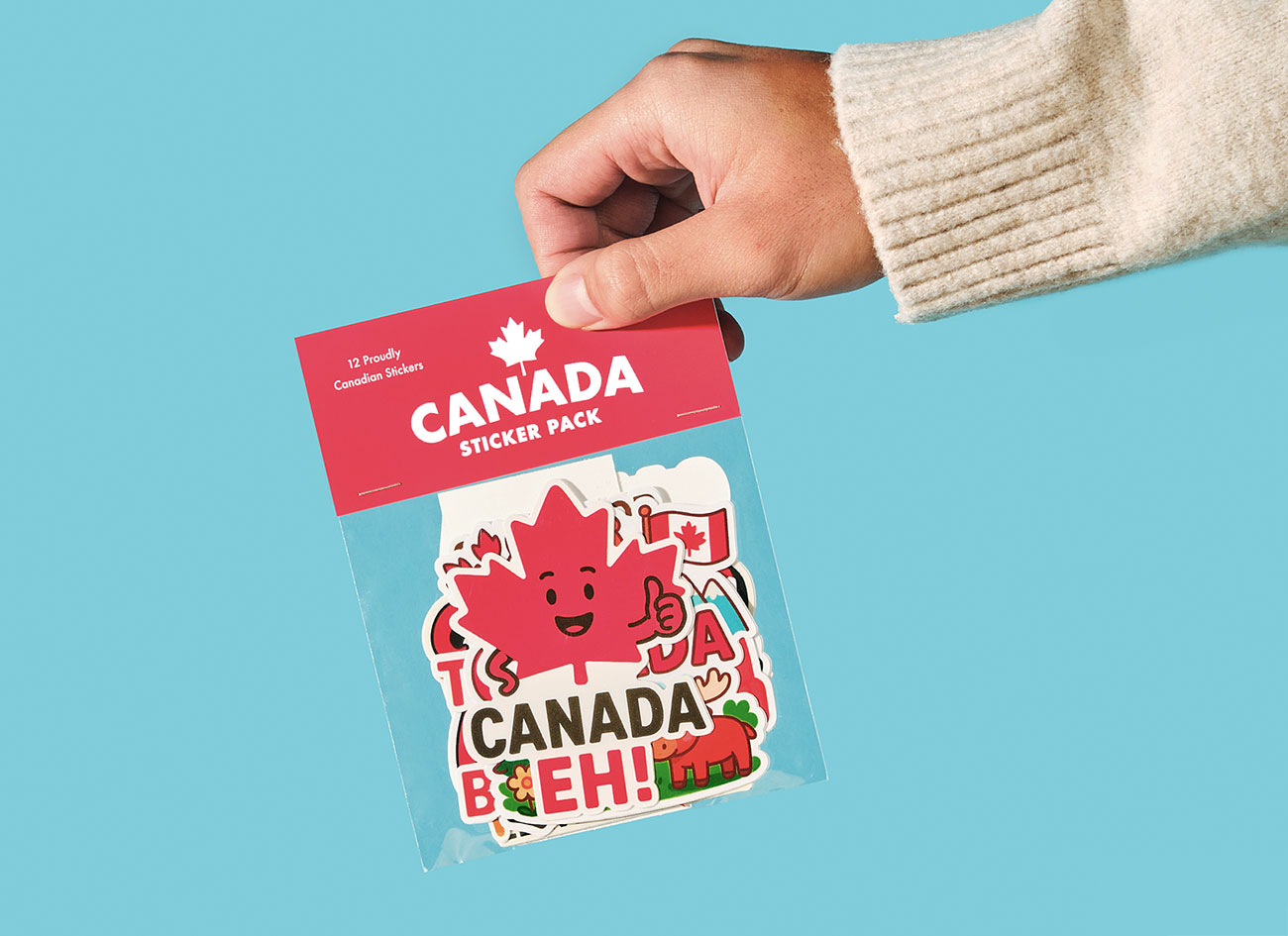
Things like sticker sheets or using a sticker maker can help you see how your identity holds up in real use. Even something simple like cutting out an image with a free online remove background tool can improve how polished your visuals feel.
A strong brand identity is flexible. It works on a website, on packaging, and in someone’s hand. If it only works in one place, it is not really working.
Conclusion
Brand identity is not just a logo or a color palette. It is a system that shows up everywhere your brand exists.
When it works, it feels consistent, clear, and easy to recognize. When it doesn’t, things feel disconnected fast.
The goal is simple. Build something that looks good, works in real life, and holds together across every touchpoint. That is what makes a brand identity actually useful.