Free fonts are everywhere, but truly good ones still take time to find. In 2026, it feels less about chasing whatever is new and more about finding type that actually holds up once you start designing with it.
This article is a curated look at free fonts that stood out to us while working, experimenting, and collecting type over the past year. These are fonts we would realistically use in real projects, not just ones that look nice in a preview image. Every pick is free for commercial use, so you can drop them straight into client work, side projects, or personal experiments without second guessing the license. When preparing your designs, you can also remove background from image to create clean, transparent assets for print and layout work. And before you settle on a font, it helps to know what colors it will live alongside, so build a color palette first and choose type that fits the mood.
What connects all of these fonts is usefulness. Some are expressive and make a strong first impression. Others are quiet and flexible and end up doing the heavy lifting across layouts, brands, and interfaces. Together, they reflect the kind of typography that feels relevant right now while still being dependable.
If you're building a type library for the year ahead, this is meant to be a place to explore, compare, and discover a few new go to options. Take your time with it. A good font choice rarely comes from rushing. Once you've found a few favorites, experiment with different font combinations using our best Font Pairing Collection and browse our growing library of Free Google Fonts for Commercial Use to find typefaces that fit your next project.
We also put together a free font roundup last year. If you want to keep exploring, the 2025 collection is still worth a look and pairs nicely with what is here.
CoFo Kabeltouw
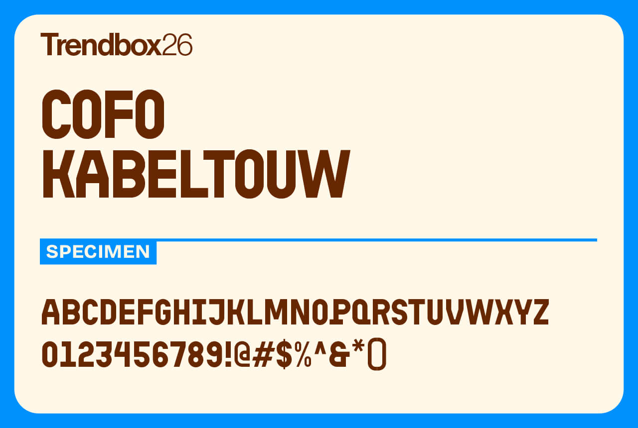
CoFo Kabeltouw feels like it was built in a shipyard and polished by hand. It’s a bold, modular display font inspired by the mechanics of modern sea transport, cranes, cargo containers, metal tubing, and the bright signals that guide them. Its shapes follow a strict grid but still manage to feel human, with hints of brush-painted lettering in every curve.
Named after an old Dutch measure of rope used at sea, Kabeltouw captures that mix of utility and craft perfectly. All caps, full of character, and ready to anchor your next design, it easily earns a spot among the best free fonts for 2026 for anyone who loves strong, distinctive type with real presence.
Number of styles: 4
License: Free for commercial use
Bricolage Grotesque
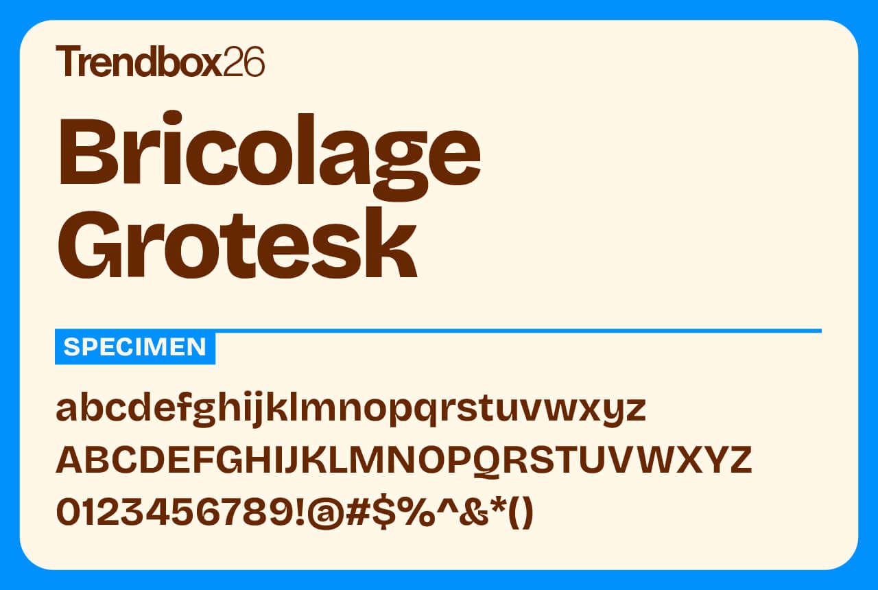
Bricolage Grotesque has that rare mix of charm and utility that designers are always chasing. Created by Mathieu Triay, it takes the clean structure of a geometric sans-serif and adds just enough quirk to make it memorable. Subtle curves and unexpected shapes give it personality without pushing too far.
With seven weights and matching italics, it’s a flexible choice that fits almost anywhere, from digital branding and editorial layouts to interface design. Confident, clear, and a little playful, Bricolage Grotesque is a typeface that knows how to stand out without shouting.
Number of styles: 105
License: Free for commercial use
Sausage
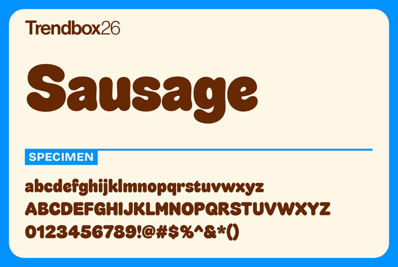
Sausage is all about curves and confidence. It takes cues from fridge magnets, 70s type catalogs, and perfectly grilled hot dogs. Every letter is plump, rounded, and full of personality. There are no corners or straight lines anywhere in sight, just pure softness.
Even with its playful look, it’s thoughtfully made with a wide range of ligatures, alternates, and arrows for refined typography. It’s the kind of font that instantly adds warmth to food packaging, event branding, entertainment projects, and more. Bold, friendly, and impossible to ignore.
Number of styles: 1
License: Free for commercial use
CoFo Glassier
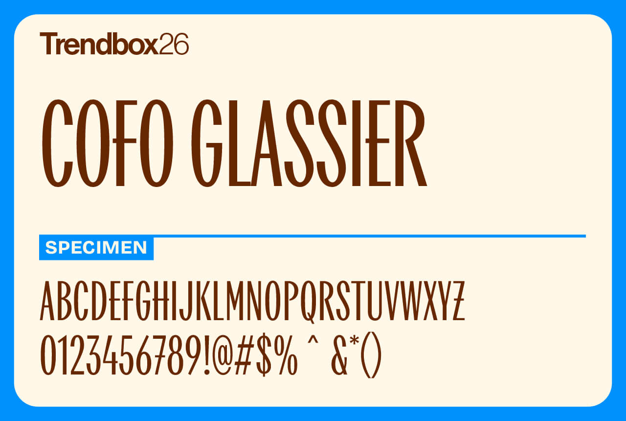
CoFo Glassier is a sleek display typeface with roots in modernist design. It bridges two worlds, blending mid-century Soviet typography with the architectural lettering styles that defined the United States in the 1950s and 60s.
Its tall proportions and gentle contrast give it an elegant rhythm that works beautifully in headlines and medium-length text. With its refined tone and confident presence, CoFo Glassier adds a touch of sophistication to any project.
Number of styles: 1
License: Free for commercial use
Willard Sniffin Script
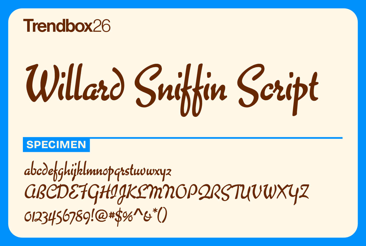
Willard Sniffin Script brings classic charm to modern design. Originally inspired by Willard T. Sniffin’s 1933 typeface Keynote, it was reimagined by Steve Jackaman in 2005 as a clean, legible brush script with a touch of calligraphic grace.
It strikes a balance between informal and refined, making it just as comfortable in personal projects as it is in professional ones. With its smooth flow and easy readability, Willard Sniffin Script adds warmth and polish wherever it’s used, securing its place among the best free fonts for 2026 for anyone who values timeless elegance and versatility.
Number of styles: 1
License: Free for commercial use
Download Willard Sniffin Script
Alphabet Soup
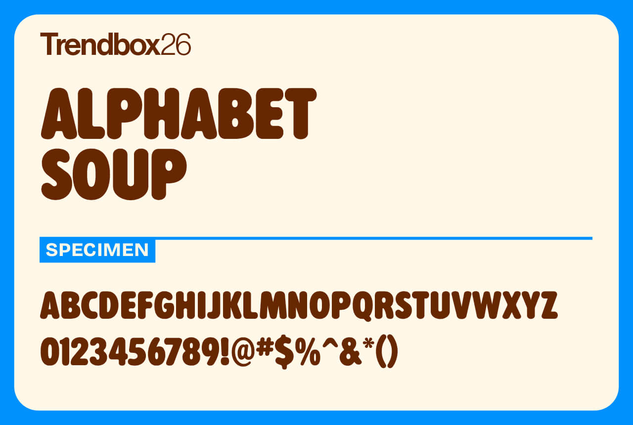
Alphabet Soup is a cheerful rounded sans serif with a story behind it. Designed by Steve Jackaman in 2010, it traces its roots back to his early days at Typographic House in Boston during the 1980s. The original version, TH Alphabet Soup, quickly became a local favorite and was later released commercially through Visual Graphics Corporation.
This updated take keeps the friendly, approachable character of the original while giving it a polished modern edge. Alphabet Soup is ideal for anything that needs warmth, clarity, and a touch of nostalgia.
Number of styles: 1
License: Free for commercial use
Mingler
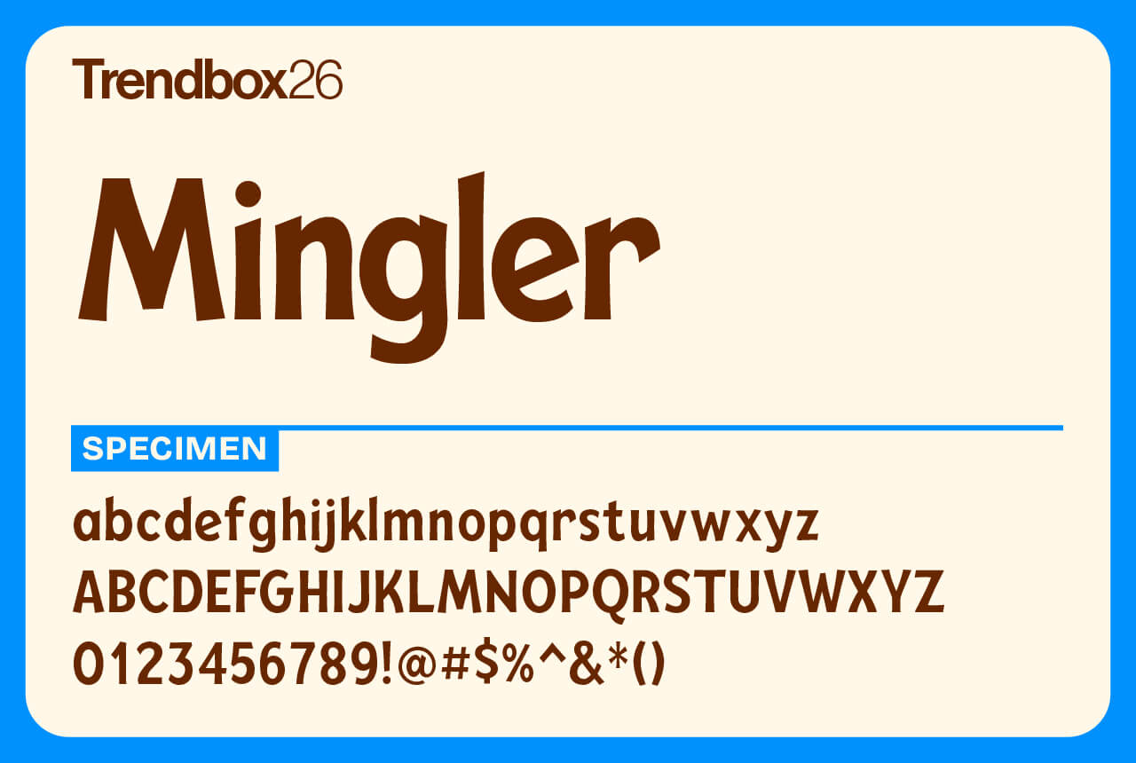
Mingler is the kind of typeface that greets you with a grin. Designed by Chank Diesel, it’s a hand-painted sans that mixes playfulness with clarity. The rounded shapes and confident rhythm give it a warm, approachable feel that still reads clean and professional.
True to Chank’s style, Mingler is full of life and character, echoing the charm of vintage sign lettering and mid-century optimism. It’s perfect for headlines, packaging, or anything that calls for a friendly human touch.
Number of styles: 8
License: Free for commercial use
Venice Blvd
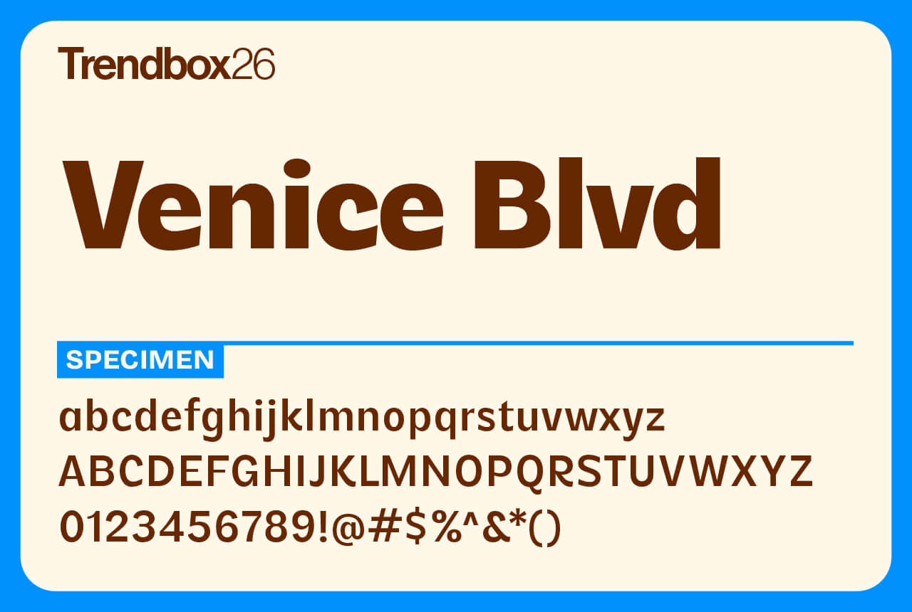
Venice Blvd is made for moments when your design needs a little spark and a lot of personality. It’s as eccentric as a drum circle on Venice Beach, as twisty as the skatepark loops, and as carefree as the souvenir stand selling seashell necklaces.
This display family comes in four weights with matching italics and even includes a playful set of emojis and symbols. Venice Blvd. doesn’t take itself too seriously, it just wants to make your work smile.
Number of styles: 8
License: Free for commercial use
IvyPresto Headline
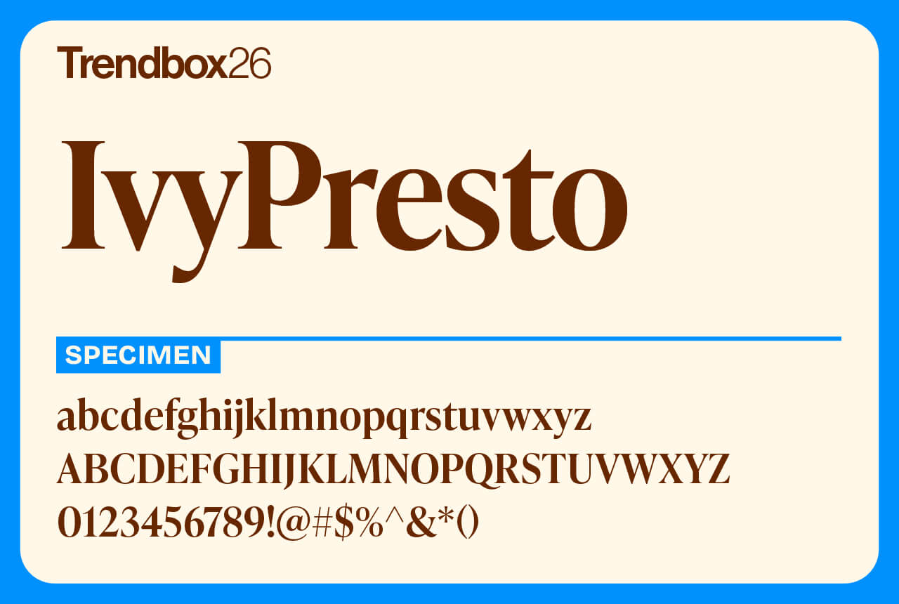
IvyPresto brings classic elegance into the modern era. Inspired by the work of 16th-century punchcutter Hendrik van den Keere, this Old Style display family pairs fine hairlines and tall proportions with a generous x-height that makes it both graceful and readable.
Designed by The Ivy Foundry in 2020, it comes in a wide range of weights and two optical sizes, giving you plenty of flexibility for everything from refined headlines to expressive editorial layouts. IvyPresto is timeless typecraft made for today’s designers.
Number of styles: 10
License: Free for commercial use
Halyard
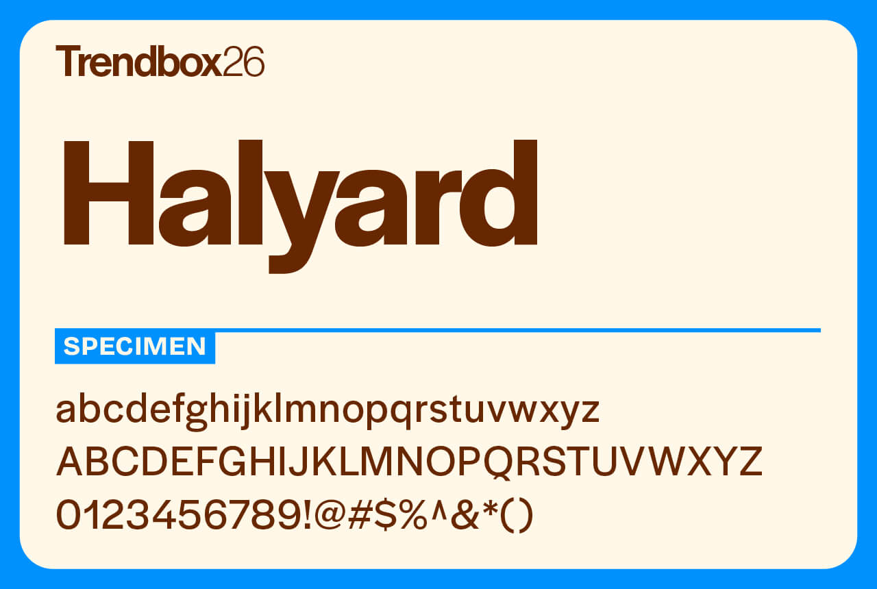
Halyard rethinks what a grotesque sans can be. It takes a familiar category and pushes it further, offering a type family that feels both classic and refreshingly distinct. Its design strikes a balance between warmth and precision, making it work beautifully at any size.
The Halyard superfamily is built for consistency. Each optical subfamily has its own personality, yet they all come together with a unified rhythm that feels like one seamless typeface. Versatile, confident, and full of quiet character, Halyard stands among the best free fonts for 2026 for designers who want clarity with a touch of individuality.
Number of styles: 48
License: Free for commercial use
DM Serif
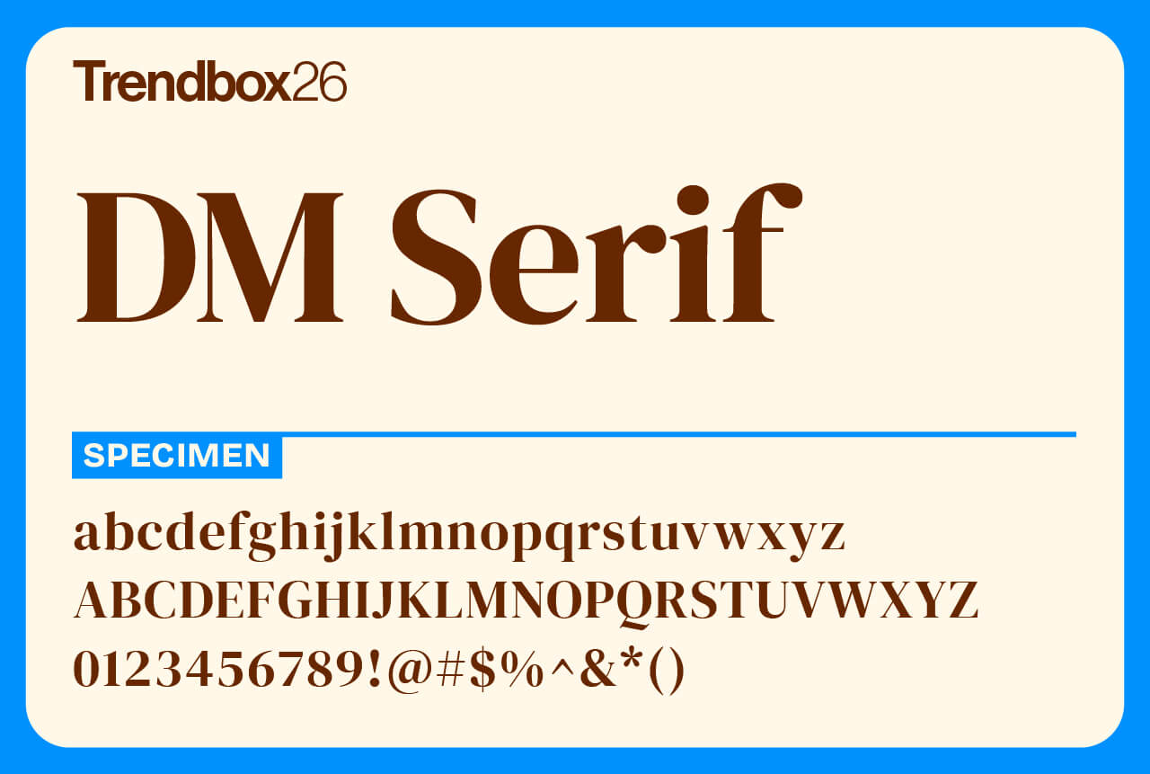
DM Serif is the more grounded sibling of DM Serif Display. Designed by Colophon Foundry, it softens the dramatic contrast of the Display version to stay clear and sturdy at smaller sizes. The result is a serif family that keeps its elegance without losing readability.
Originally built from the Latin portion of Adobe’s Source Serif Pro by Frank Grießhammer, DM Serif combines classic form with a modern touch. With full Latin support, it’s well-suited for editorial design, branding, and everyday text that needs a little sophistication.
Number of styles: 4
License: Free for commercial use
Eckmannpsych
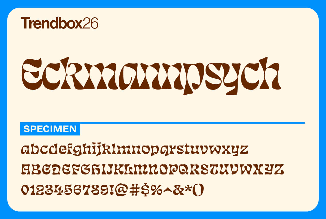
Eckmannpsych is what happens when Otto Eckmann’s classic Eckmannschrift takes a psychedelic trip. While it carries the spirit of the late 60s and early 70s, its roots go back much further, blending art nouveau influences with retro counterculture flair.
Originally drawn for a single poster, the design grew over time into a full family on Future Fonts. Now polished and ready for the spotlight, Eckmannpsych comes in three optical sizes, making it perfect for everything from bold headlines to trippy packaging.
Number of styles: 3
License: Free for commercial use
Comma Base
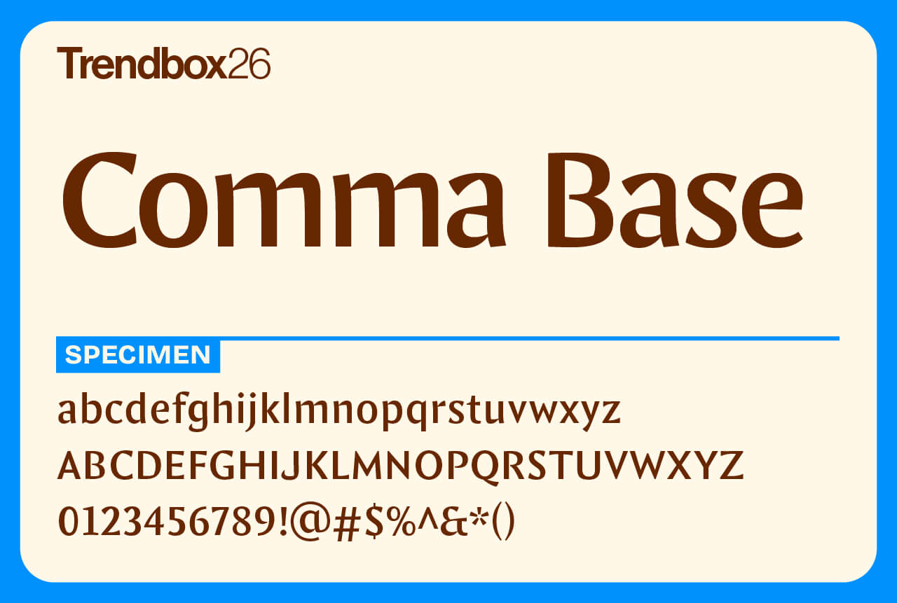
Comma Base explores the purest forms of the letter. Designed by Martin Majoor, known for classics like Scala and Seria, this typeface blends the calm precision of a sans with the structure of a serif. The result is something that feels familiar yet surprisingly fresh, a design that bridges two traditions instead of choosing between them.
Released in 2021 as the first typeface from Majoor’s own foundry, Comma Base shows the confidence of a seasoned designer still eager to experiment. It’s versatile, modern, and built on the timeless craft of good typography.
Number of styles: 16
License: Free for commercial use
Geist Mono
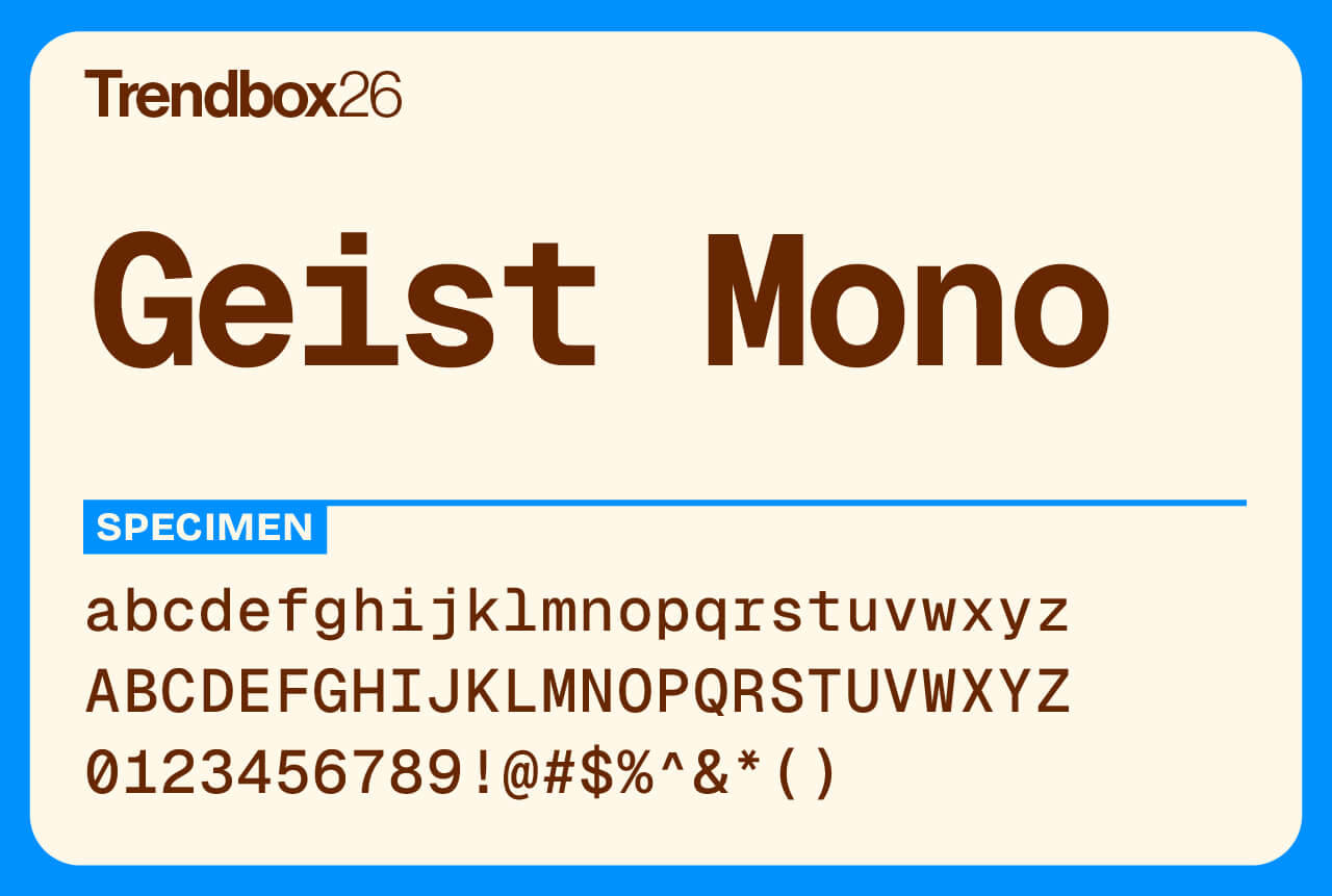
Geist Mono brings clarity and calm to code. Designed by Vercel in collaboration with Basement Studio, it pairs precision with simplicity, following the clean lines of Swiss design. Every character feels balanced and deliberate, built to stay readable even through long stretches of text.
Created as the monospaced companion to Geist Sans, it carries the same minimal spirit while adding the rhythm and structure developers need. Geist Mono is more than a coding font, it’s a workspace for ideas, designed to keep your focus sharp.
Number of styles: 9
License: Free for commercial use
CoFo Glassier
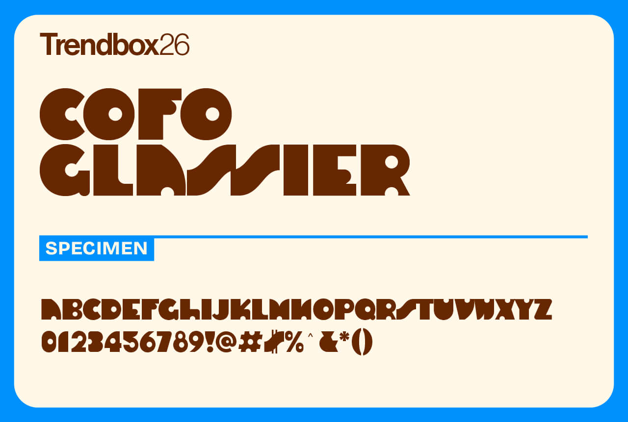
CoFo Glassier captures the elegance of modernist design through a distinctly international lens. It draws from mid-century Soviet typography and the architectural lettering traditions of 1950s and 60s America, merging both into a sleek, contemporary display typeface.
Its narrow proportions and subtle contrast give it a graceful rhythm that stands out without shouting. Sophisticated yet approachable, CoFo Glassier brings a polished edge to titles, branding, and editorial work alike, earning its place among the best free fonts for 2026 for designers seeking refined modernism with a timeless feel.
Number of styles: 1
License: Free for commercial use
Puffin
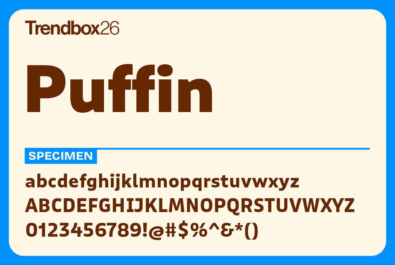
Puffin started as a single, friendly typeface by Pieter van Rosmalen, first released through Bold Monday over a decade ago. What began as something simple and informal has since grown into a full family of fonts: Puffin, Puffin Display, Puffin Display Soft, and the playful Puffin Arcade.
The main Puffin family is a warm, humanist sans with generous spacing and a lively 15° italic, perfect for screens and interfaces. The Display versions bring more flair, with rounder shapes, tighter spacing, and a touch of softness in Puffin Display Soft. Together, they strike a perfect balance between fun and functionality, especially when you throw Puffin Arcade into the mix.
Number of styles: 14
License: Free for commercial use
TT Globs
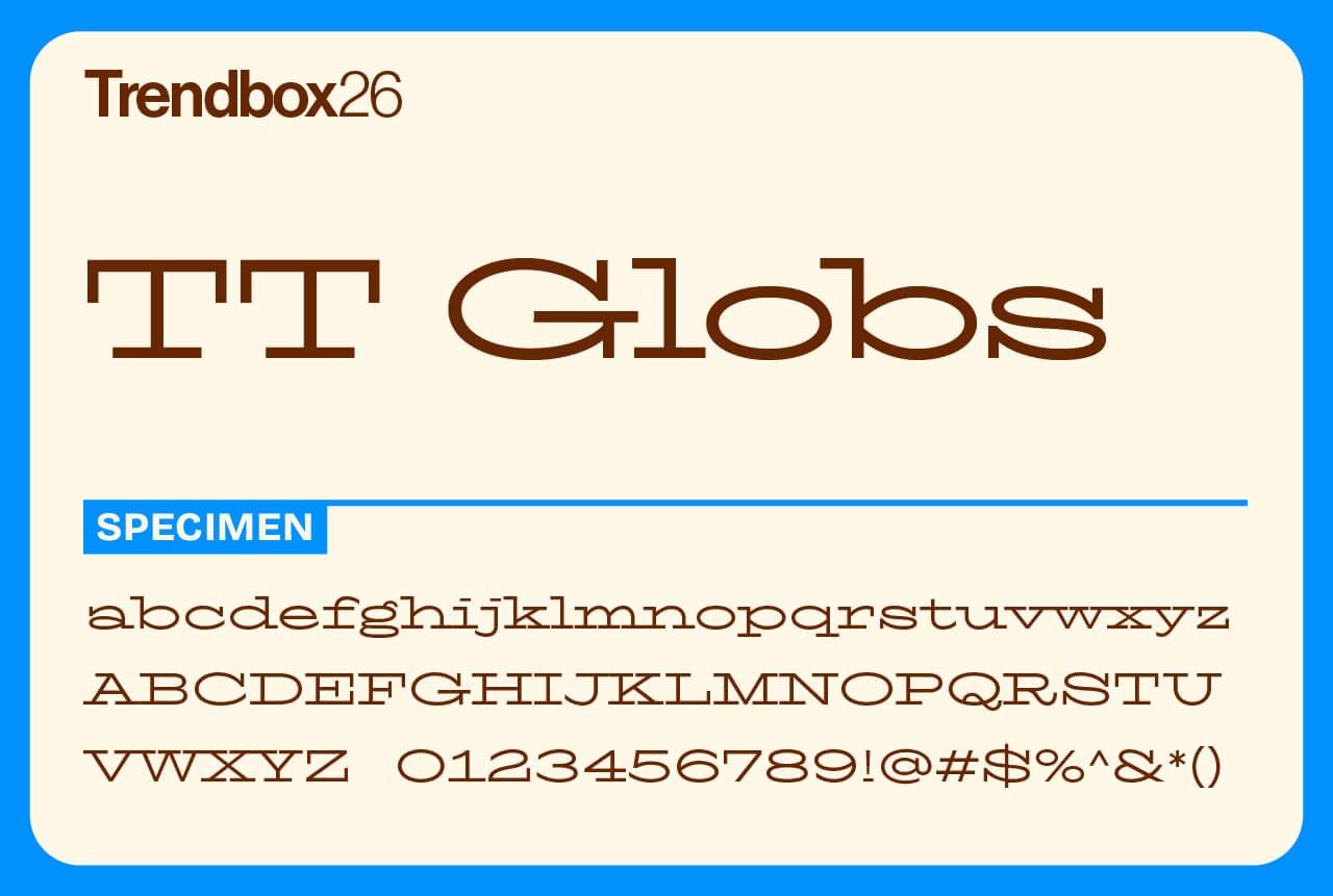
TT Globs blends the charm of old-style slab serifs with a modern, modular approach. Its designers set out to reimagine the sturdy geometry of classic typefaces through a contemporary lens, making the curves more mechanical while preserving a sense of rhythm and energy.
Its defining feature is the long, extended serifs that link characters together, creating a steady flow of movement across the line. The result is a typeface that feels both industrial and expressive, perfect for bold headlines or projects that call for a strong, unified texture.
Number of styles: 3
License: Free for commercial use
Hagrid
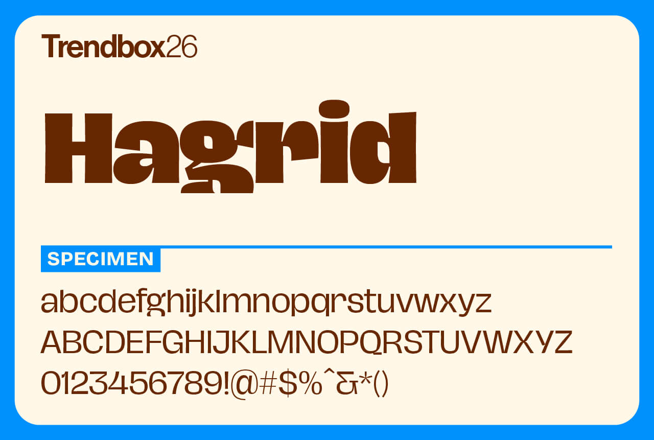
Hagrid, designed by Cosimo Lorenzo Pancini, celebrates the expressive side of grotesque letterforms. It mixes strong geometric foundations with calligraphic rhythm, reversed contrast, and brutalist shapes to create a voice that’s bold, unconventional, and full of attitude.
Originally released as a display family, Hagrid was redesigned and expanded in 2025 to improve readability and versatility. The new text styles refine proportions and spacing for longer reading, while the updated display weights add subtle contrast and a dramatic Black cut for maximum impact. t’s a type family built for projects that thrive on originality and strong visual personality.
Number of styles: 13
License: Free for commercial use
Redondo Ave
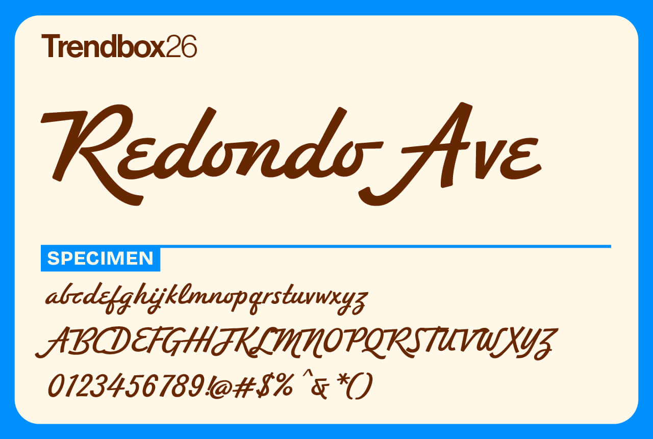
Redondo Ave is a lively script that feels both extravagant and down-to-earth. Designed by the Southern California studio Hoodzpah, founded by twin sisters Amy and Jennifer Hood, it captures the duo’s signature love for bold, personality-filled design.
The typeface has a natural, hand-drawn rhythm that brings instant retro charm to any layout. Available in two weights and packed with over 500 glyphs, it gives you plenty of room to experiment. Much like Jennifer Coolidge, it balances confidence with effortless glamour, making Redondo Ave perfect for projects that need personality and a wink of fun.
Number of styles: 2
License: Free for commercial use
Mercato Variable
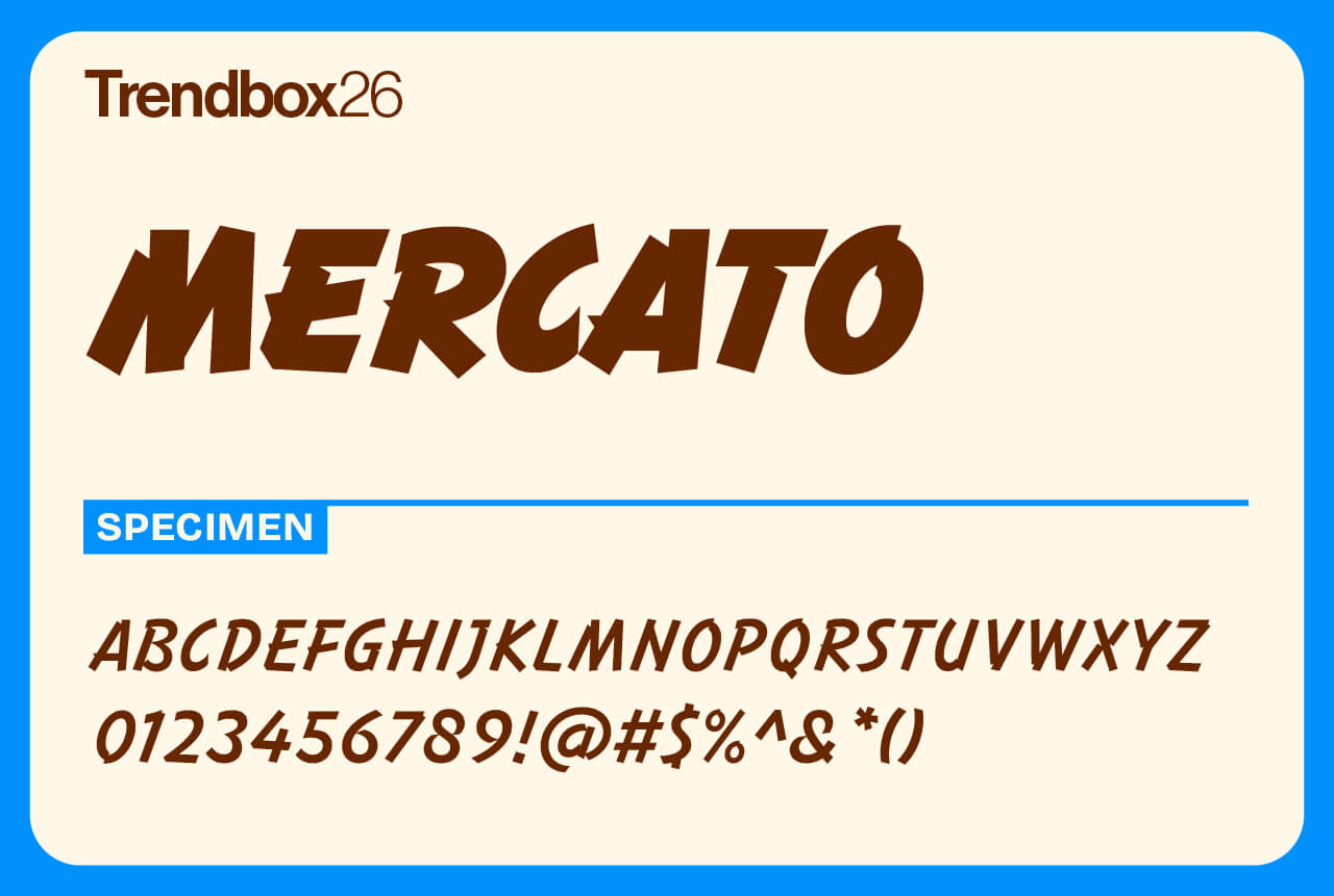
Mercato is a display type family inspired by the hand-painted price signs found in local markets. The idea was born in South America, where designer Mateusz Machalski set out to capture the expressive, handwritten energy of those signs within a structured, geometric framework. The result is a lively typeface full of rhythm and warmth. Its strokes dance with slight irregularities, giving it a handmade charm that still feels precise and intentional.
Developed over three years with Michał Gorczyca and Małgorzata Bartosik, Mercato bridges the space between brush lettering and classic geometric forms. Available in five styles and as a variable font, Mercato shines in logos, posters, and headlines, anywhere you want that mix of craft, energy, and modern refinement.
Number of styles: Variable
License: Free for commercial use
Degular
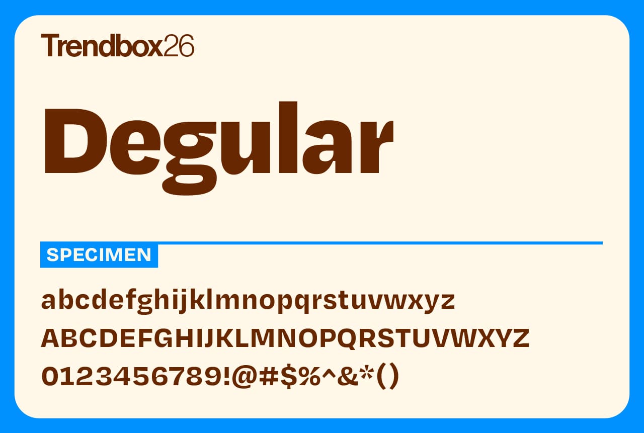
Degular strikes the perfect balance between precision and personality. Designed by Ohno Type Co., it’s built with the care of a technical typeface yet shaped by confident, characterful forms that give it real charm. The result is a font that feels modern, fresh, and ready for any bold brand identity.
With its wide range of weights and styles, Degular can carry most of a project on its own, from clean headlines to polished layouts. For longer reading, though, it’s best paired with a simpler body font for easier legibility at small sizes. Ohno Type Co. continues to impress with thoughtful, expressive designs, and Degular shows exactly why their work keeps turning heads.
Number of styles: 42
License: Free for commercial use
Adhesive Nr. Seven
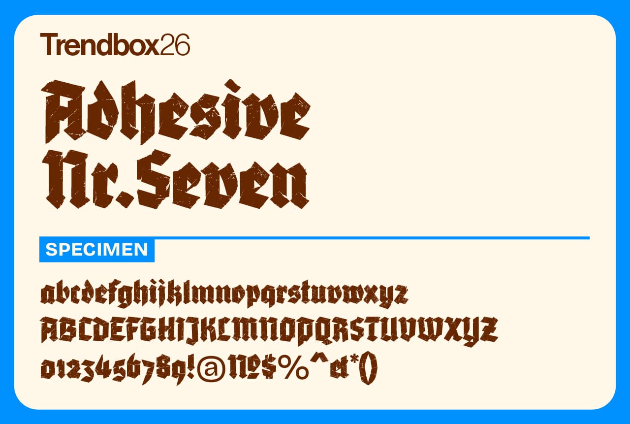
Adhesive Nr. Seven is a modern blackletter typeface built from the texture and structure of torn tape. Its overlapping layers and rough edges create a distinctive handmade look that shines at large sizes, making it perfect for bold posters, album art, and statement headlines.
It was designed by Roland Hörmann, who runs phospho, a Vienna-based studio dedicated to type design and lettering. Hörmann’s love for letterforms began in the early 1990s on a Commodore 64, where he created experimental pixel fonts long before studying design. Beyond his studio work, he leads Stadtschrift, a project devoted to preserving and showcasing historic shop signs across Vienna. That passion for urban lettering and visual heritage gives Adhesive Nr. Seven its raw, authentic spirit, a perfect fit among the best free fonts for 2026 for anyone drawn to typefaces with real texture and story.
Number of styles: 1
License: Free for commercial use
Salford Sans
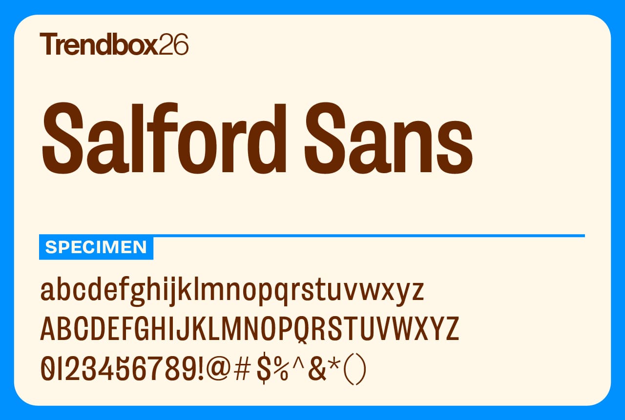
Salford Sans is a refined sans serif that combines classic British style with global reach. Designed for serious, communicative design work, it balances function and personality in equal measure. With eight weights plus slanted and semi-slanted styles, it offers flexibility for headlines, editorials, and display settings alike.
Supporting Latin, Greek, Cyrillic, and Arabic scripts, Salford Sans is built to perform across languages and cultures. Its narrow proportions and crafted details give it a timeless elegance, while a range of symbols, language features, and a variable slant axis make it as practical as it is polished. A true modern update of a traditional idea, Salford Sans easily ranks among the best free fonts for 2026 for designers seeking versatility with a refined edge.
Number of styles: Variable
License: Free for commercial use
Gitan Latin
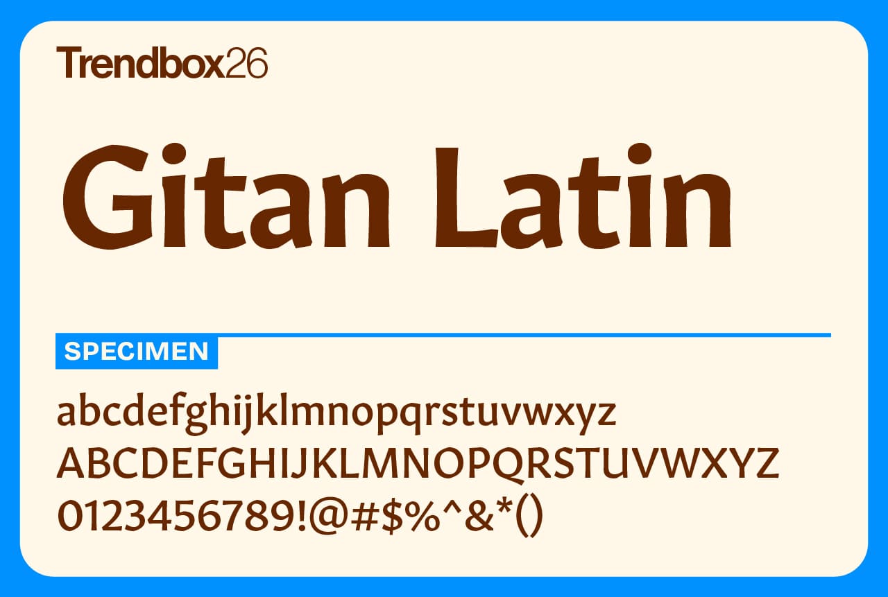
Gitan is a slightly flared sans serif with the calm confidence of an engraved inscription. Its sturdy shapes and subtle contrast make it feel grounded yet approachable, ideal for long-form reading or refined editorial work. The design carries a quiet strength, steady, timeless, and distinctly human.
Created by Rosetta Type Foundry, a studio dedicated to multilingual typography, Gitan reflects the foundry’s mission to make reading better for everyone, everywhere. Rosetta’s award-winning team has designed typefaces for more than 360 languages across scripts ranging from Latin and Cyrillic to Arabic, Tamil, and Thai. Gitan continues that spirit of inclusivity with a design that speaks clearly across borders.
Number of styles: 10
License: Free for commercial use
Program
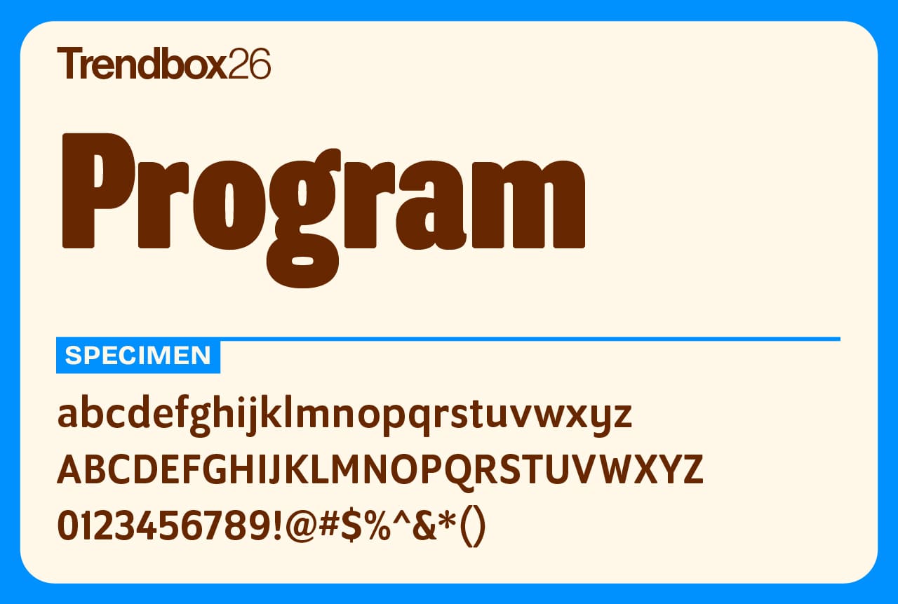
Program is a typeface made for type designers. It explores the quirks, tensions, and subtle decisions that go into shaping letterforms, the kind of details only those who obsess over typography truly appreciate.
Blending mixed structures, unexpected stroke endings, and varied weight distribution, Program intentionally breaks the usual rules of family consistency while still feeling cohesive. Rounded corners echo the look of ink on paper, while ink traps balance those soft edges with sharp precision. The result is a distinctive, experimental design that celebrates the craft of making letters itself, earning Program a spot among the best free fonts for 2026 for creatives who love type with a mind of its own.
Number of styles: 14
License: Free for commercial use
Birra
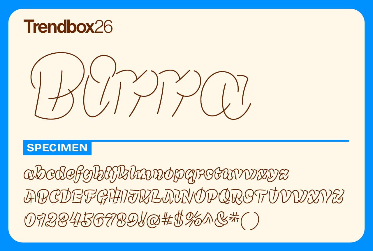
Birra takes its cue from the tasting flights served at North American craft breweries, where each sample has its own character and flavor. Every style in the Birra family was created by a guest designer, each drawing inspiration from a different beer.
The connection runs deeper than the theme: the color of each beer corresponds to the weight of the type, while the upright styles reflect the dry, crisp finish of lighter brews. Birra is a playful, collaborative project that celebrates creativity and craft, the perfect pairing of design and good taste.
Number of styles: 5
License: Free for commercial use
IBM Plex Sans
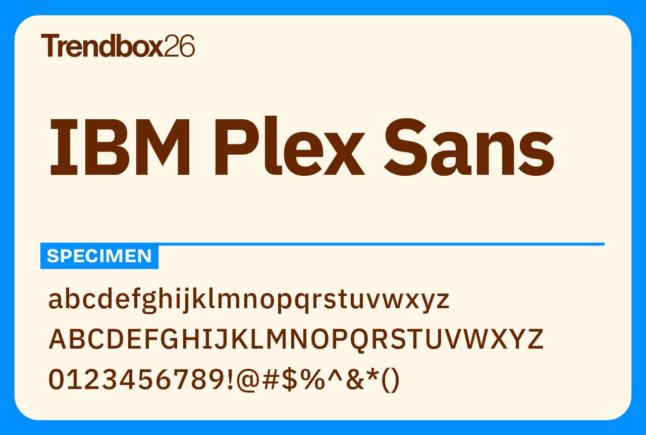
Set to maintain its position as one of the most reliable free sans-serif fonts in 2026, IBM Plex Sans masterfully balances technological precision with human touch. Designed by Mike Abbink and published by Bold Monday for IBM, this comprehensive typeface family represents the sweet spot between corporate functionality and contemporary design sensibility.
What makes this font particularly valuable for 2026's design landscape is its incredible versatility. From sleek user interfaces to sophisticated editorial layouts, it maintains crystal-clear legibility across all platforms. The extensive character support for multiple languages and writing systems makes it a powerhouse for global design projects.
Number of styles: 32
License: Free for commercial use
Dilemma
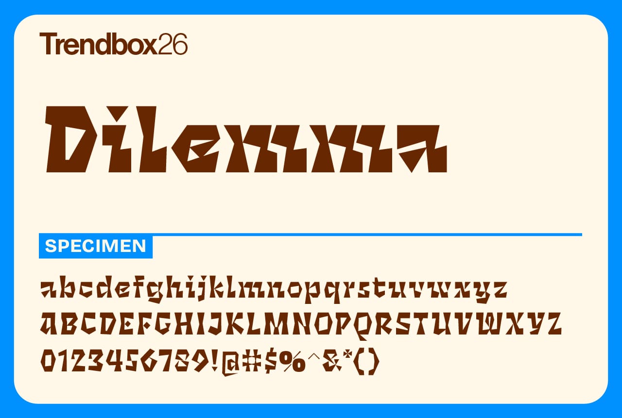
Dilemma is a bold, double-axis variable font that thrives on contrast and experimentation. Its sharp, angular shapes and playful energy give it a rebellious personality that’s hard to ignore. Each style shifts in tone and texture, making Dilemma as flexible as it is expressive, perfect for projects that want to feel loud, alive, and hand-crafted.
Created by ps.type.lab, Dilemma reflects designer Mark Caneso’s passion for exploring the extremes of letterform design. His foundry serves as both a playground for experimentation and a platform for releasing original, character-driven typefaces to the world.
Number of styles: Variable
License: Free for commercial use
Kensington
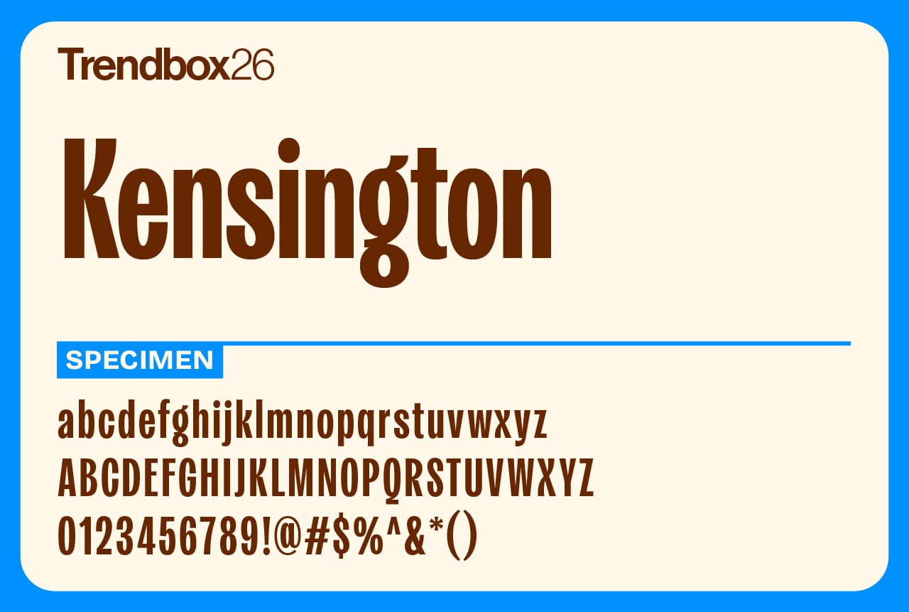
Kensington, designed by Jen Hood for Fort Foundry, offers a masterful fusion of classic elegance and contemporary adaptability. Its timeless design ensures both clarity and readability, making it a versatile option for projects that need character and refinement.
This typeface strikes the perfect balance between tradition and modernity, effortlessly adapting to a variety of styles. With multiple weights and styles alongside OpenType features, Kensington equips designers with the tools to craft designs that evoke nostalgia while embracing modern trends. From editorial layouts to sophisticated branding, it’s a stellar choice for those seeking typographic excellence and a touch of sophistication.
Number of styles: 10
License: Free for commercial use
Beastly
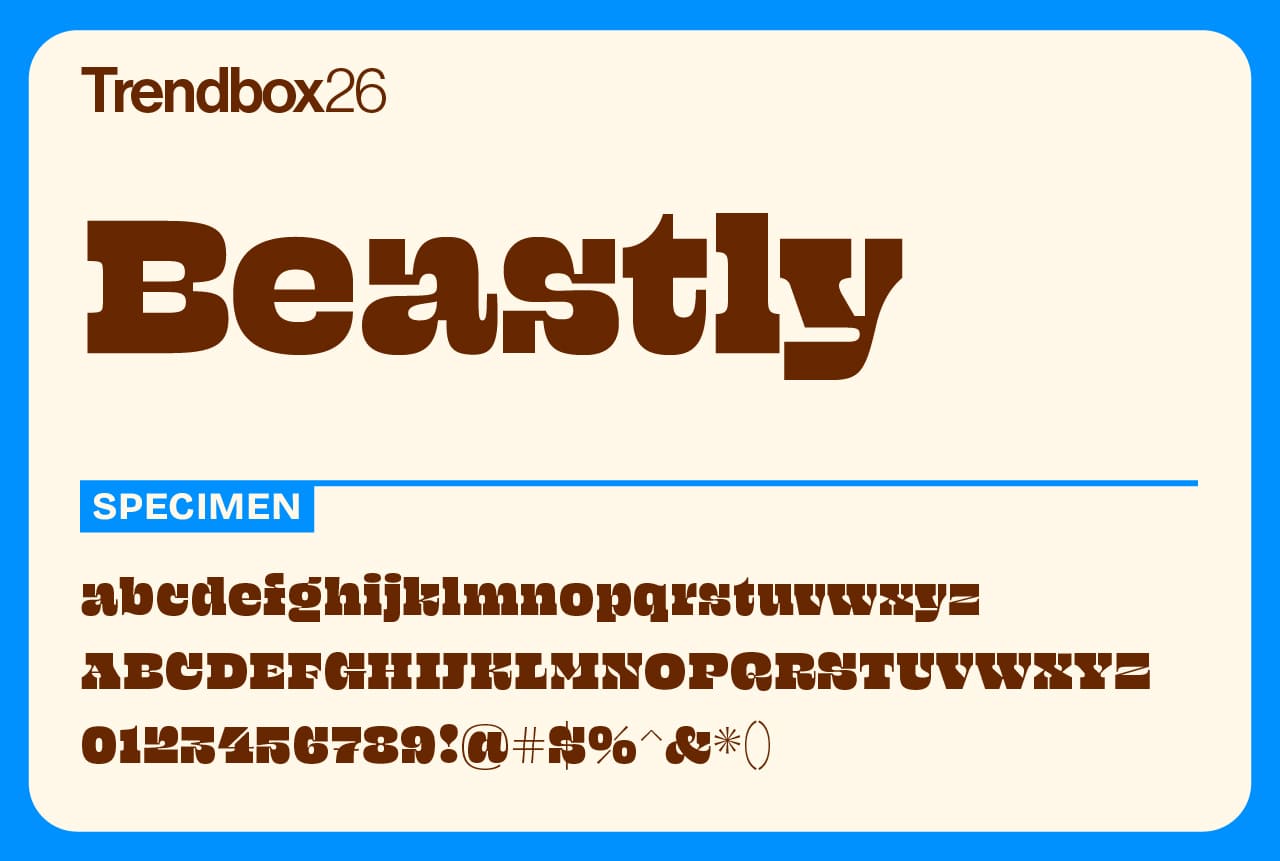
Beastly is a custom typeface originally created for the Lubalin 100 project, celebrating the legacy of Herb Lubalin and his team of lettering artists. While it nods to their iconic mid-century style, Beastly is entirely new, a fresh design that channels the same bold energy and precision.
With nine optical styles, Beastly adapts beautifully to any scale, from expressive headlines to fine print details. It’s a fitting tribute to Lubalin’s spirit of experimentation and craftsmanship, and it firmly belongs among the best free fonts for 2026 for designers who appreciate bold ideas grounded in timeless design.
Number of styles: 9
License: Free for commercial use
Alfabet
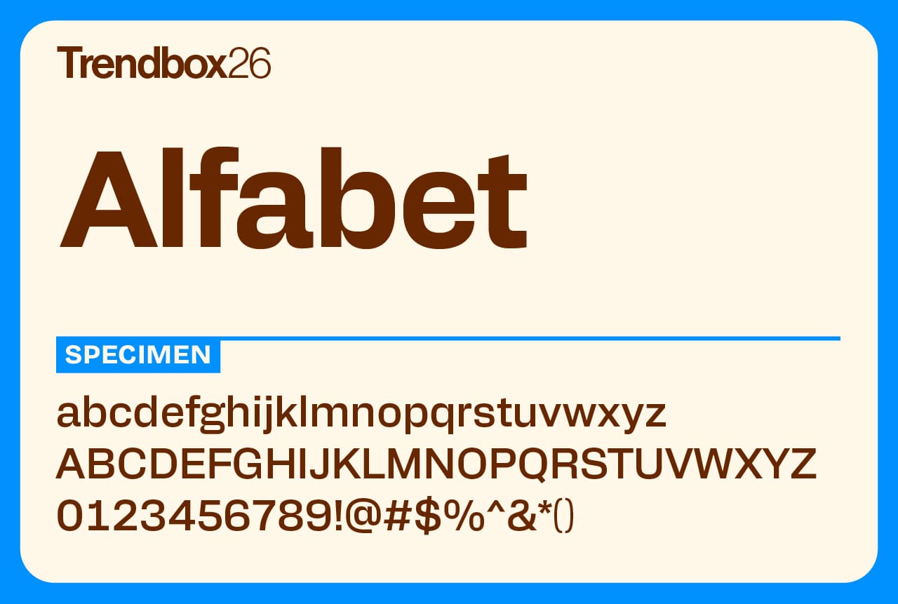
Alfabet was shaped through years of careful exploration into form and function. Inspired by the precision of Swiss and German design, it brings geometric structure together with a calm, modern voice. Each letter feels measured and confident, built for designers who value clarity and control.
The family includes 20 styles across 10 weights with matching italics and supports multiple scripts such as Latin, Greek, and Cyrillic. With its range of alternates, symbols, and numeral styles, Alfabet is made for brands that work across borders and care about visual consistency.
Number of styles: 18
License: Free for commercial use
Hanken Grotesk
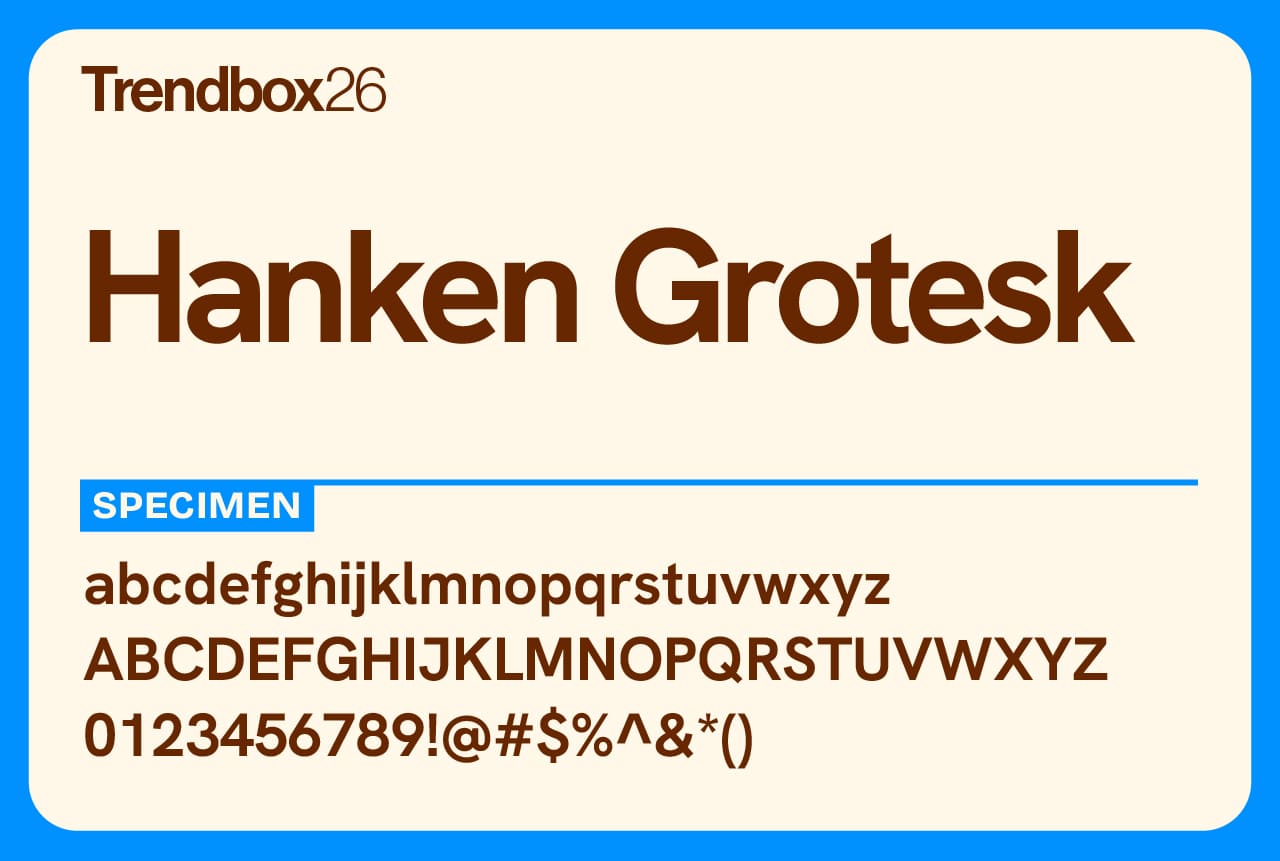
Hanken Grotesk reimagines the classic grotesque style with a modern sense of balance and precision. Designed by Alfredo Marco Pradil, it pairs clean geometry with refined spacing and contemporary proportions, making it adaptable to nearly any design context.
From signage and editorial layouts to apps and websites, Hanken Grotesk performs with quiet confidence. Its updated metrics, punctuation, and OpenType features give it the flexibility to move easily between print and digital, all while maintaining a clear, human feel.
Number of styles: 18
License: Free for commercial use
Kepler
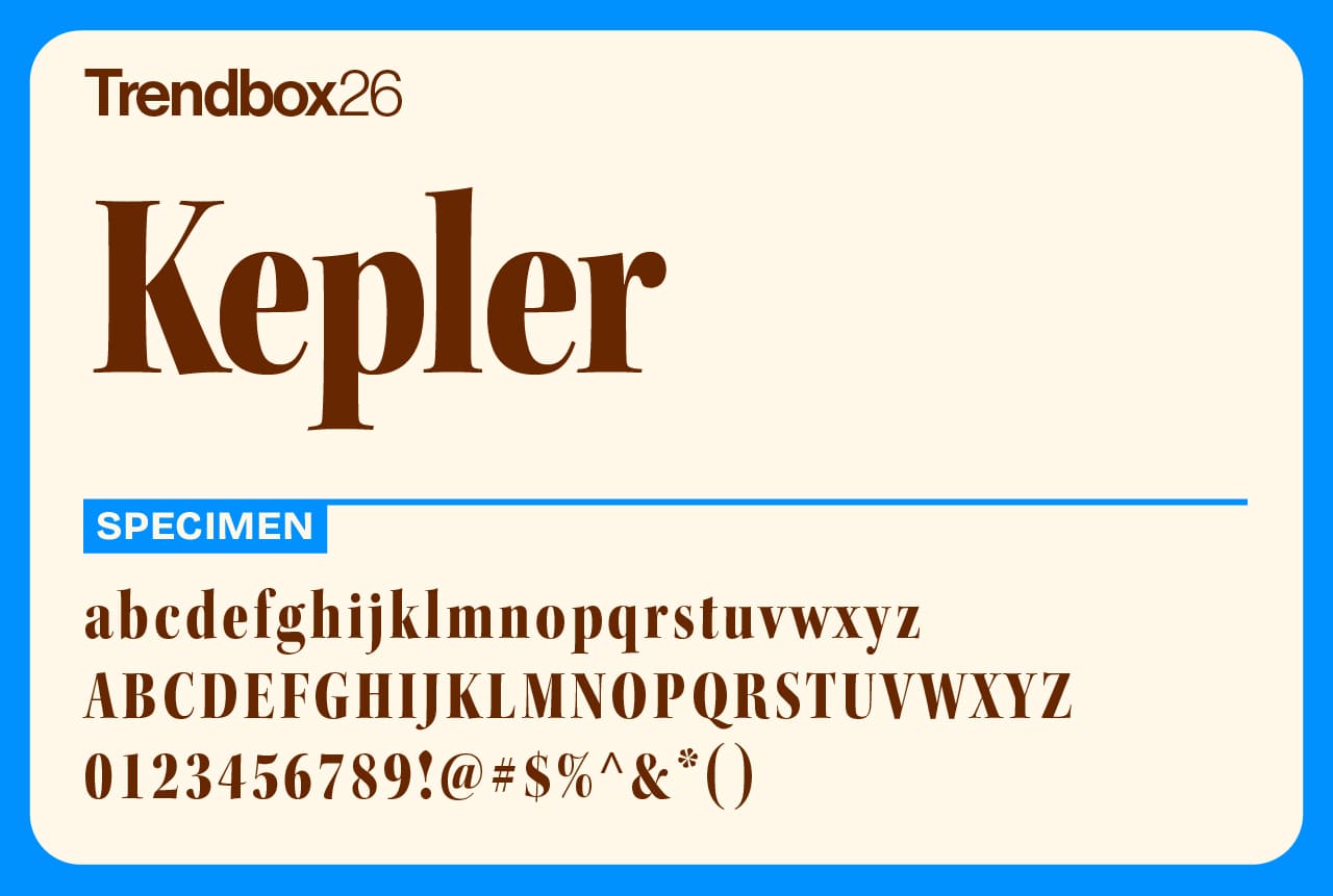
Named after the German Renaissance astronomer, Kepler is a contemporary serif family designed by Robert Slimbach for Adobe. It draws inspiration from the refined elegance of 18th-century typefaces while adding a human touch that softens their usual formality.
Slimbach’s design balances intellect with warmth, pairing crisp structure with subtle calligraphic details and old-style proportions. The result is a typeface that feels both classical and alive, perfect for long reading, refined branding, or editorial work that calls for sophistication without coldness.
Number of styles: 168
License: Free for commercial use
Alkaline
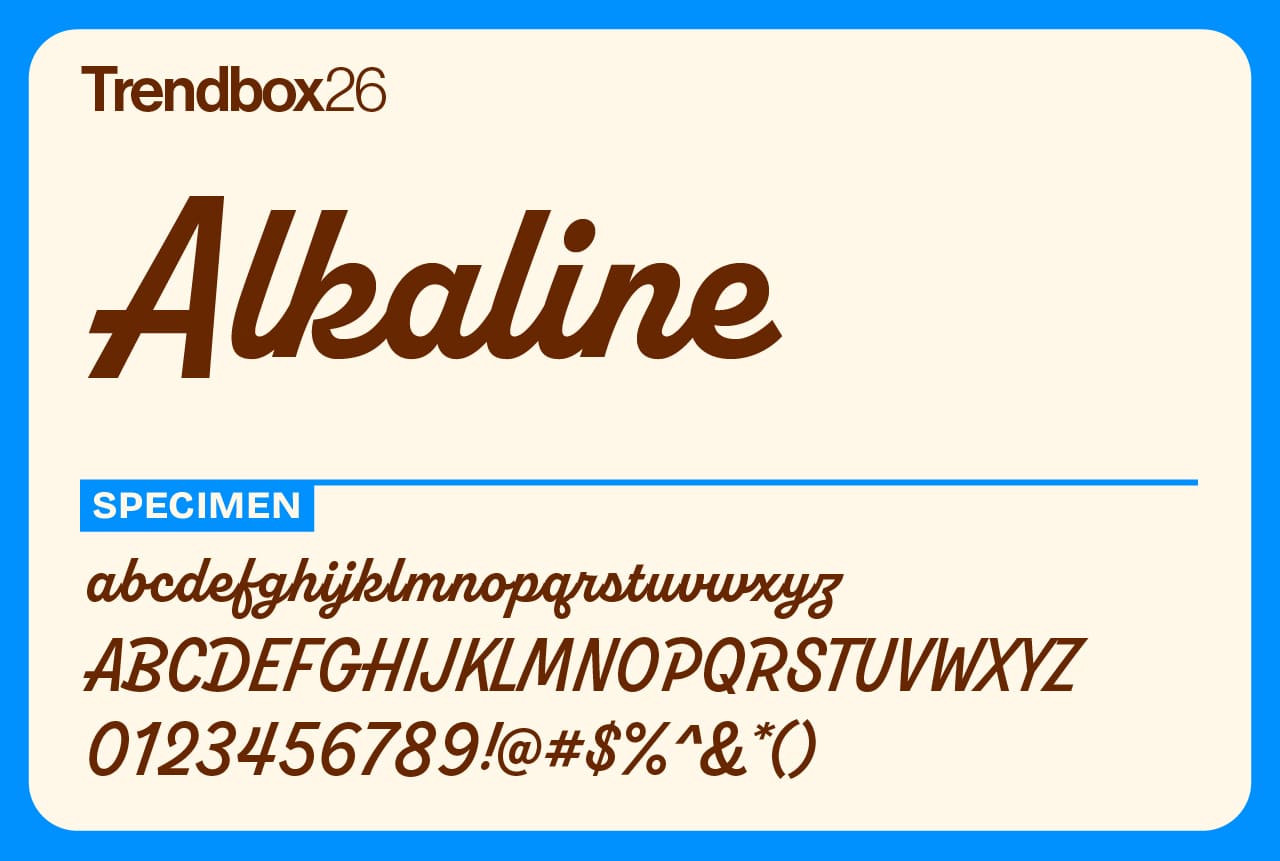
Alkaline, designed by Jonathan Ball, brings a burst of retro character to modern design. It’s bold, angular, and full of personality, the kind of display typeface that instantly pulls focus. Its sharp geometry and offbeat rhythm give it a rebellious energy that feels both nostalgic and fresh.
Ideal for posters, branding, or statement headlines, Alkaline adds attitude without losing clarity. It’s a font made for creative risk-takers, injecting a playful edge into any project that dares to stand out.
Number of styles: 10
License: Free for commercial use
Cheee
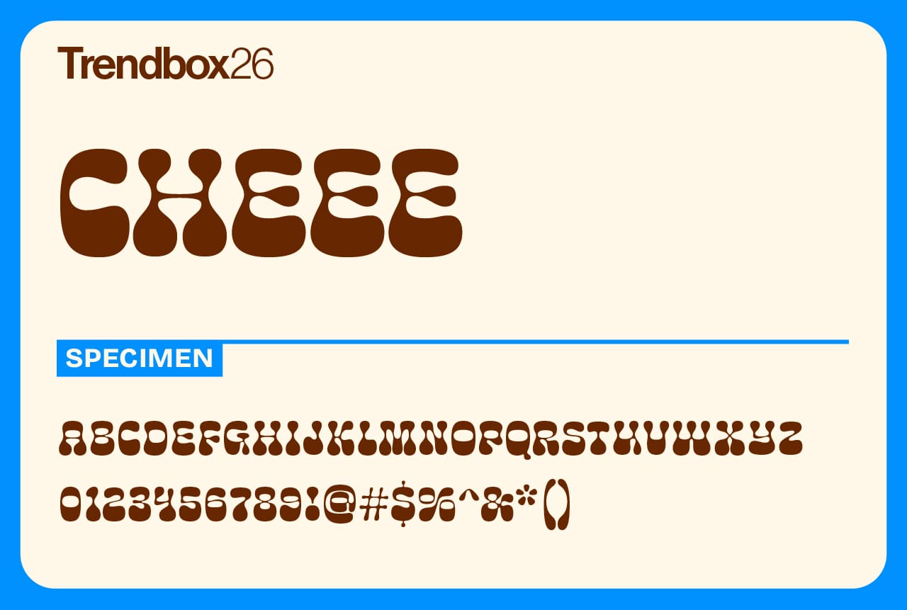
Cheee, from Ohno Type Co., is a big, joyful sans serif with curves that refuse to sit still. Its oversized shapes and soft edges make it feel approachable and full of charm, perfect for designs that want to grab attention without feeling too serious.
Even with its bold personality, Cheee stays clear and readable, performing beautifully in both print and digital spaces. Whether it’s a playful brand, packaging design, or an eye-catching headline, this typeface brings an instant spark of fun to any project.
Number of styles: 8
License: Free for commercial use
Pennypacker
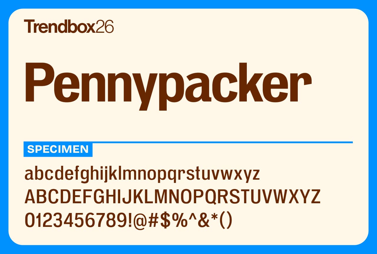
Designed by CJ Dunn from CJ Type, this modern take on classic grotesque styles brings a perfect balance of personality and professionalism to any project. What makes this font particularly valuable is its impressive range.
With 5 widths and 9 weights packed into a single variable font, it offers remarkable flexibility for diverse design needs. From modern mobile apps and packaging designs to comprehensive brand identity systems, Pennypacker delivers consistent quality across all applications. The variable font technology allows designers to fine-tune weight and width with precision, making it an invaluable tool for both digital and print projects.
Number of styles: 90
License: Free for commercial use
Gardez
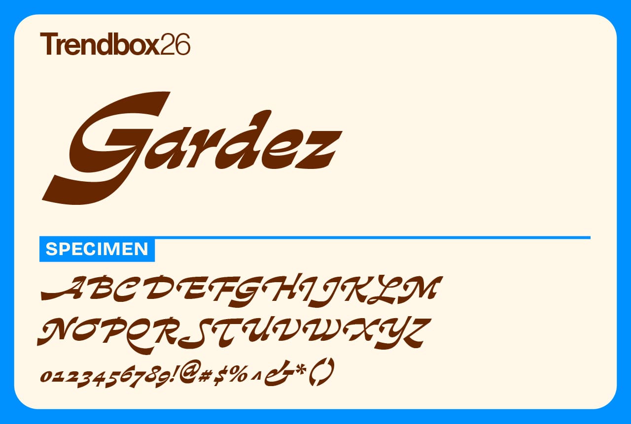
Gardez, designed by Dalton Maag, is a bold and expressive serif display font that redefines elegance with a twist. Its standout feature is the inverted contrast applied to a Garalde-style italic, creating a striking and unconventional aesthetic.
This unique approach makes Gardez a versatile choice for projects requiring high visual impact, such as packaging, logos, posters, and editorial designs. Its bold personality ensures it commands attention while maintaining a sense of sophistication and flair.
For designers seeking an innovative serif font that balances tradition with a modern edge, Gardez is an inspired pick.
Number of styles: 1
License: Free for commercial use
Faculty Glyphic
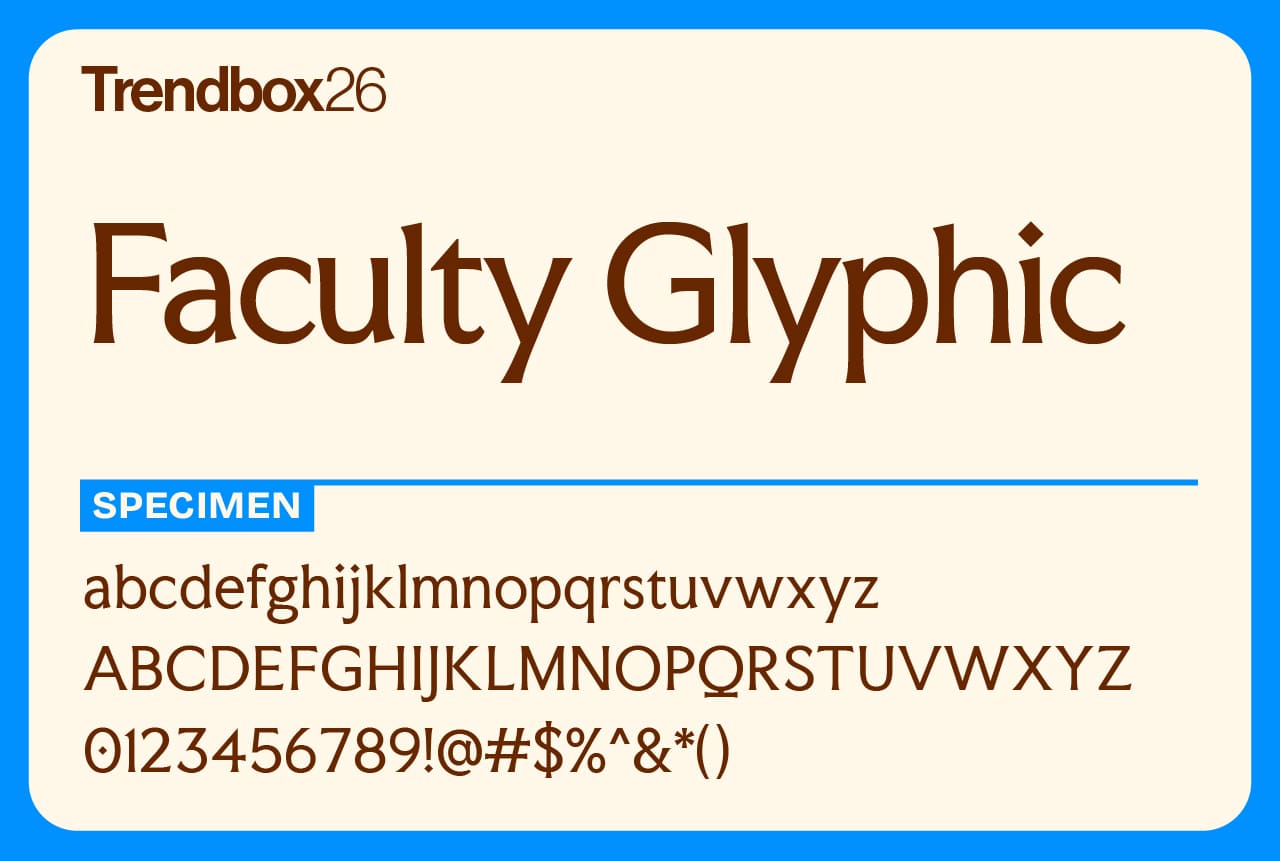
Faculty Glyphic captures the spirit of Faculty, a global leader in applied AI, through timeless design. Created in 2024 by Koto London, the typeface draws inspiration from London’s deep connection to technology and typographic craft. Its forms echo the carved lettering traditions of Berthold Wolpe and Edward Johnston, two figures whose work shaped the city’s visual identity.
As a modern tribute to Wolpe’s Albertus, famously seen on the street signs of the City of London, Faculty Glyphic blends heritage with innovation. It’s a typeface that feels both grounded in history and finely tuned for the digital age, bridging past and present with quiet confidence.
Number of styles: 1
License: Free for commercial use
JAF Herb
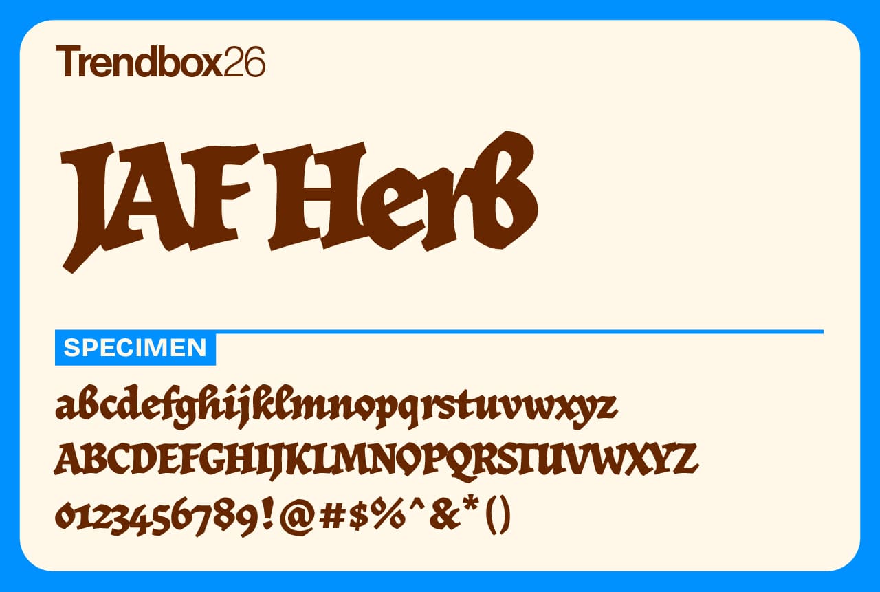
JAF Herb brings the spirit of sixteenth-century calligraphy into a modern context. Designed by Tim Ahrens during his MA studies at the University of Reading and expanded in 2010, it draws from early cursive blackletter and printing traditions while introducing a softer, more approachable tone.
Its connected letterforms and tight rhythm create a sense of movement that feels handcrafted yet deliberate. The goal behind JAF Herb was to preserve the texture and humanity of blackletter without the heavy historical weight often associated with it. The result is a typeface that feels rich, expressive, and unmistakably contemporary, making it one of the best free fonts for 2026 for designers who appreciate history reimagined with warmth and clarity.
Number of styles: 4
License: Free for commercial use
Atrament
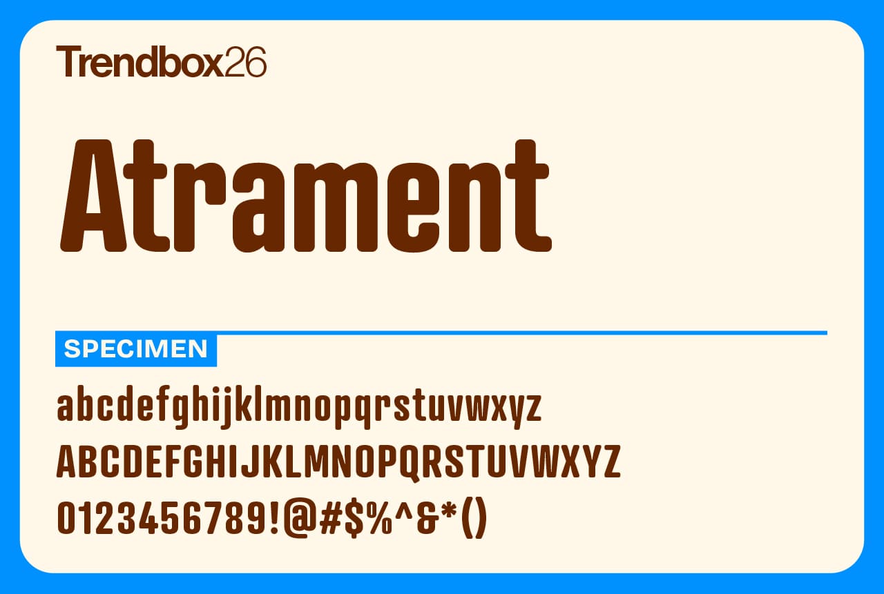
Atrament was first developed in 2003 as the corporate display typeface for Suitcase Type Foundry. Its roots trace back to Karel Teige’s 1922 cover design for Devětsil, Revoluční slovník almanac, a piece of Czech avant-garde history featuring condensed sans serif lettering with soft, rounded ends.
While inspired by that early model, Atrament takes the idea further. Its proportions are broader, its rhythm more balanced, reflecting how semi-condensed sans serifs evolved through the 1960s. The result is a typeface that feels both historical and contemporary, carrying the quiet strength of modernist craft.
Number of styles: 8
License: Free for commercial use
DM Sans
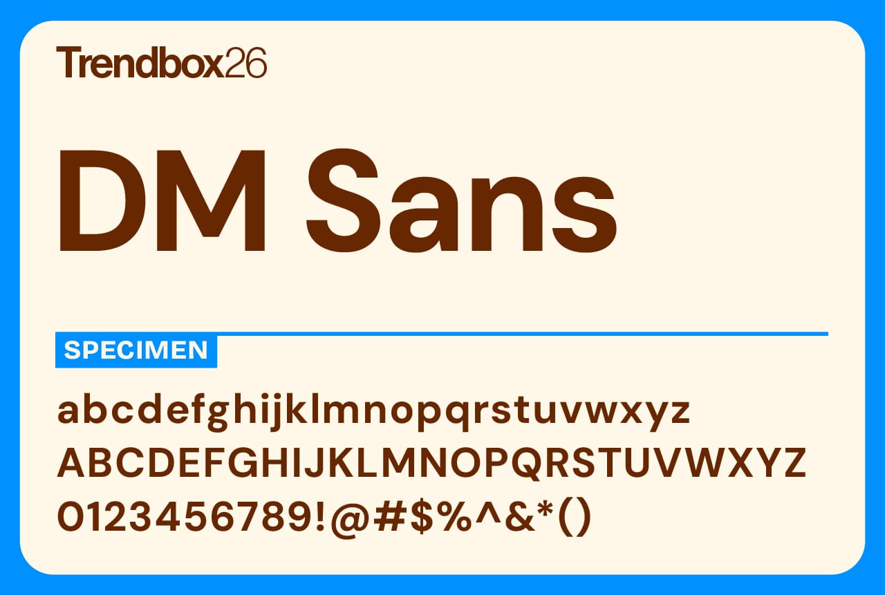
DM Sans is a geometric sans serif that keeps things simple and readable. Originally developed by Colophon Foundry in collaboration with the Indian Type Foundry, it builds on the foundation of Poppins to create a softer, more versatile design suited for smaller text sizes.
The 2023 update expanded the family dramatically, adding new Thin and Extra Black weights and introducing an optical size axis for better performance across scales. With broad Latin language support and a clean, approachable tone, DM Sans remains a go-to choice for digital design, interfaces, and everyday typography.
Number of styles: 72
License: Free for commercial use
Urbanist
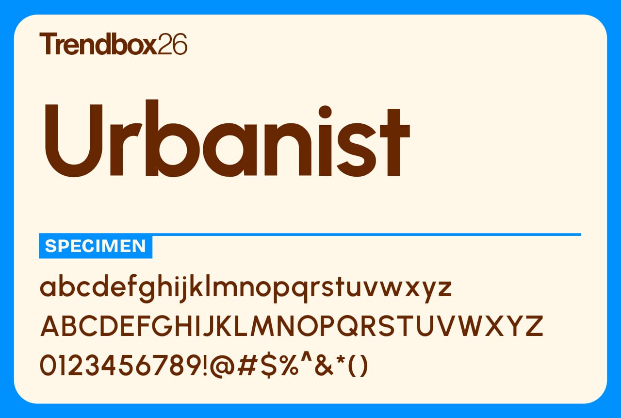
Urbanist is a clean, geometric sans serif inspired by the clarity and balance of Modernist design. Created by Corey Hu in 2020, it began as a nine-weight family with italics and has since evolved into a flexible variable font with a full weight axis.
Built from simple geometric forms, Urbanist feels neutral yet confident, making it an ideal choice for everything from digital interfaces to print layouts. Its even rhythm and minimal contrast give it a timeless quality that fits seamlessly into both branding and everyday design, earning it a well-deserved spot among the best free fonts for 2026 for creators who value precision and modern simplicity.
Number of styles: 18
License: Free for commercial use
Mono45 Headline
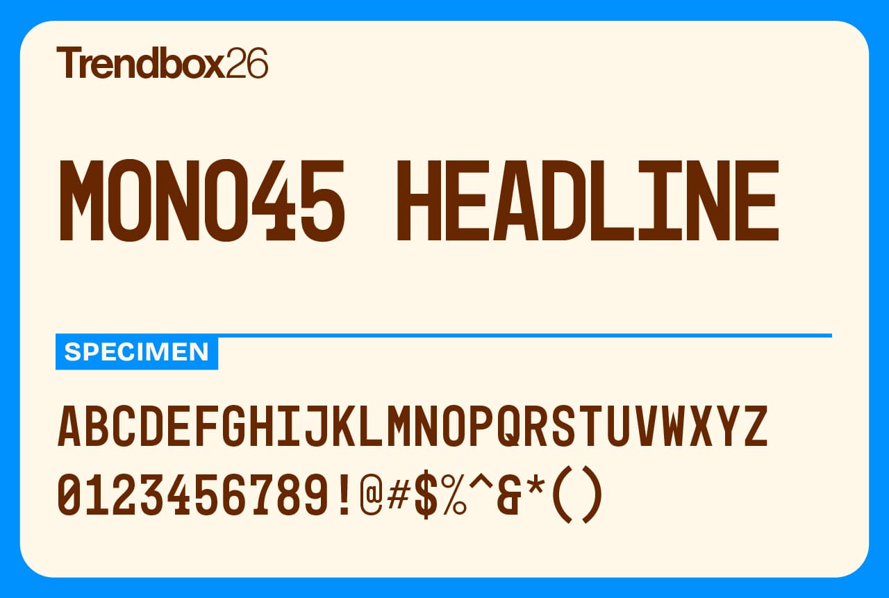
Mono45 Headline has an unexpected origin story. It began with the stamped ticket numbers handed out at the University Hospital in Zurich for vaccination queues. From that modest source came a bold, all-caps display typeface with the rough charm of industrial lettering and vintage posters.
Its condensed proportions and sturdy forms give it a distinctly utilitarian feel, while its imperfections add warmth and authenticity. Mono45 Headline carries the character of something made by hand, practical, honest, and full of presence.
Number of styles: 5
License: Free for commercial use
Tektur
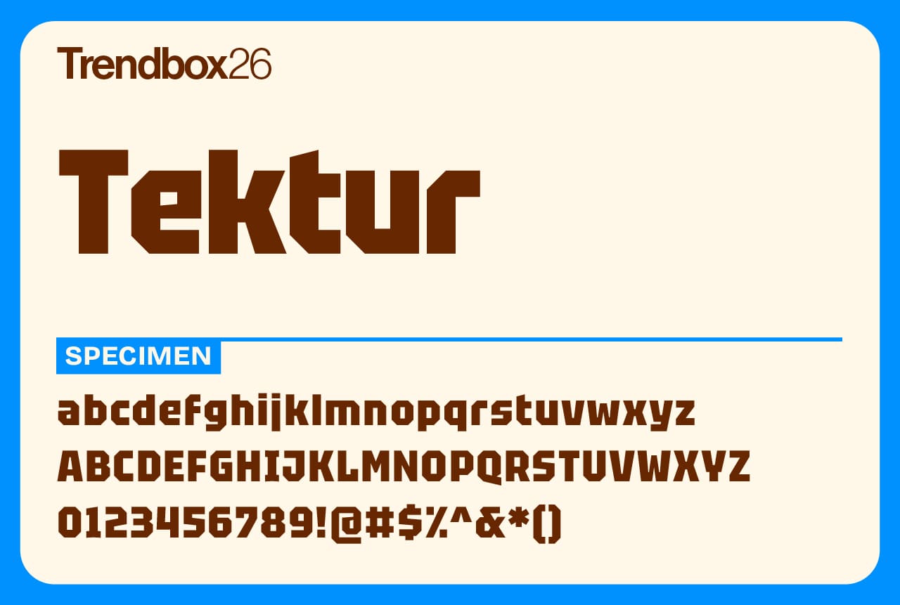
Tektur is a geometric typeface built from sharp edges and angular rhythm. Its octagonal forms and rectangular counters give it a distinctly constructed look, while carefully preserved diagonals maintain clarity and flow.
With a high x-height and ascenders that align with the capitals, Tektur allows for tight, compact typesetting. It’s precise, modern, and confident. A typeface that bridges technical design with solid readability.
Number of styles: 6
License: Free for commercial use
Whomp
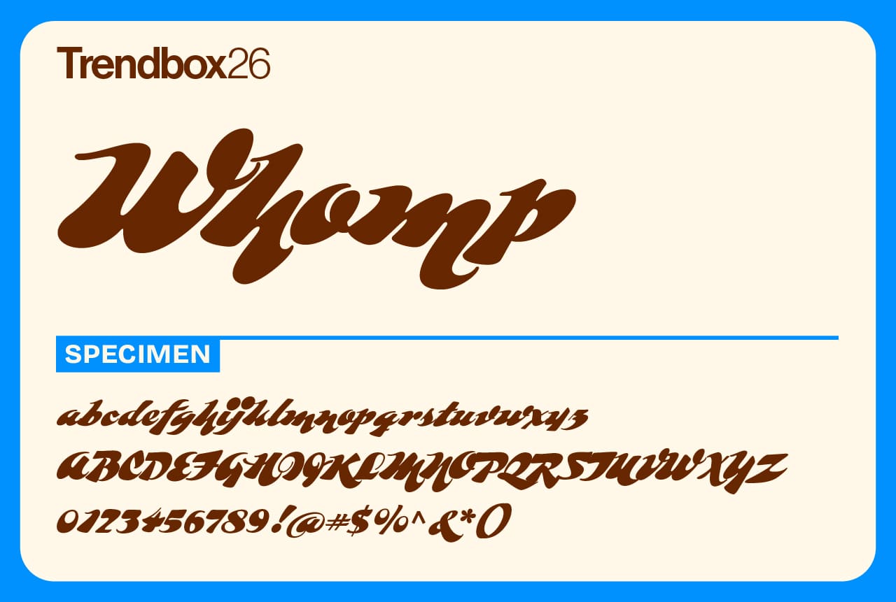
Whomp takes its inspiration from the bold, expressive lettering of American sign painter and alphabet craftsman Alf Becker. It captures the same sense of rhythm and personality that makes hand-painted typography so timeless, a perfect addition to any designer’s list of the best free fonts for 2026.
The typeface was created by Sudtipos, an Argentine design collective founded in 2002 by a group of designers with a shared passion for lettering. Over the years, Sudtipos has become a global name in expressive type design, with fonts appearing in campaigns for Coca-Cola, Levi’s, and The New York Times. Whomp embodies the studio’s signature blend of craftsmanship, playfulness, and bold visual storytelling.
Number of styles: 1
License: Free for commercial use
Beverly Drive Right
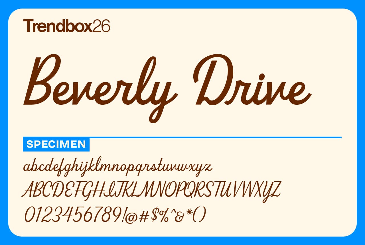
Beverly Drive Right is a charming retro script with a low x-height, tall capitals, and plenty of personality. It comes with two unique stylistic sets that let you shift the mood depending on your project. The default style feels relaxed and casual, perfect for restaurant menus, beer labels, or vintage-inspired branding, while the alternate set adds an elegant touch ideal for wedding invitations or seasonal designs.
Packed with extras like smileys, superscript ligatures, and tons of contextual alternates, Beverly Drive Right is one of the best free fonts for 2026 if you’re looking for something playful yet refined. It’s a reminder that nostalgia and craftsmanship can still go hand in hand.
Number of styles: 4
License: Free for commercial use
Dunbar
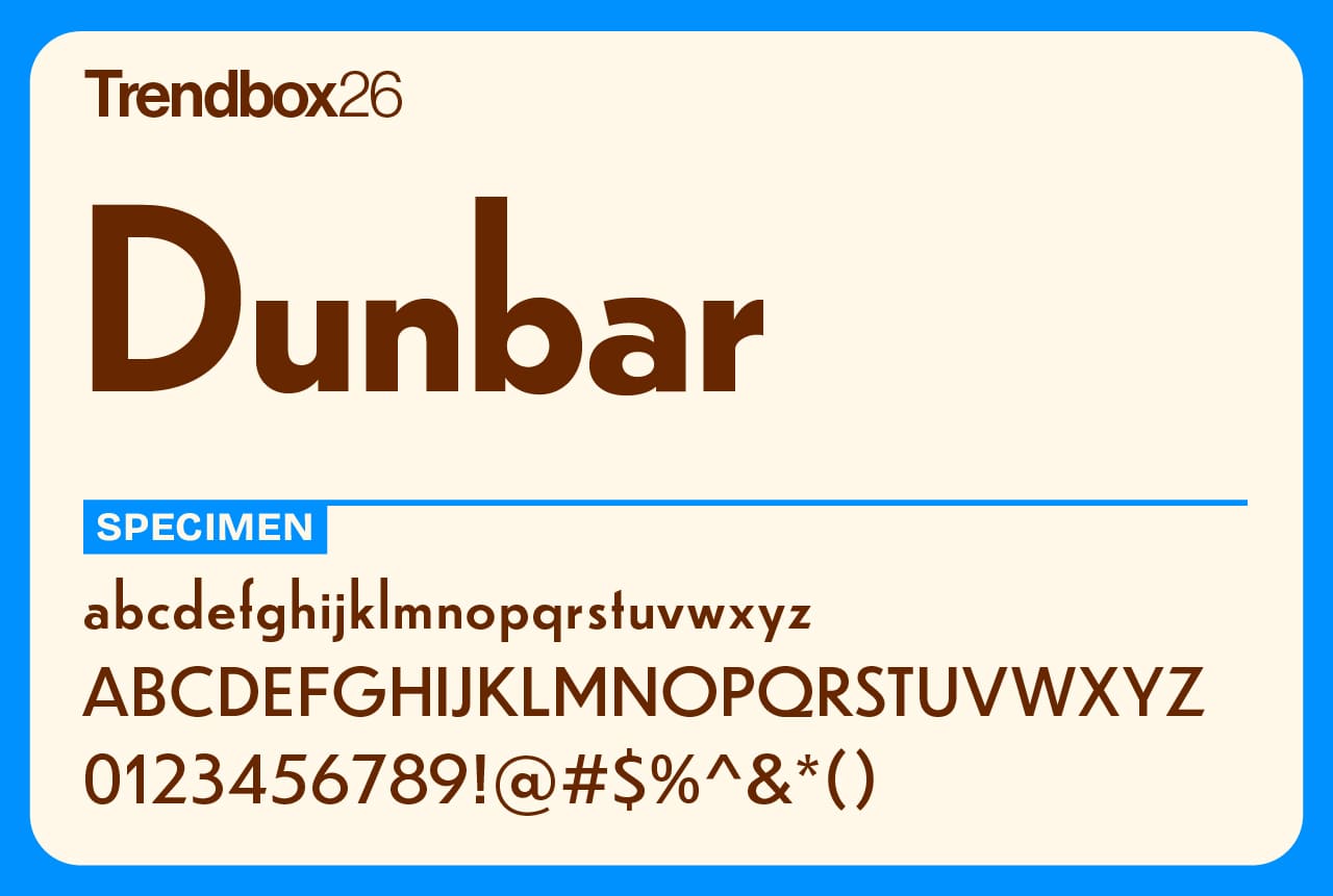
Dunbar is a lively geometric sans that reimagines Jakob Erbar’s early modern classic Erbar-Grotesk for today’s designers. Rather than a strict revival, it builds on Erbar’s ideas with contemporary proportions and alternate letterforms that bring energy and balance to every layout.
The family includes three variations designed for different purposes. Dunbar Tall uses an expansive x-height to create dense, impactful text blocks, perfect for bold headlines or limited space. Dunbar Low has a more open vertical rhythm that shines in editorial spreads or exhibition signage, while Dunbar Text softens the extremes for comfortable reading at smaller sizes.
Number of styles: 4
License: Free for commercial use
Cooper Black
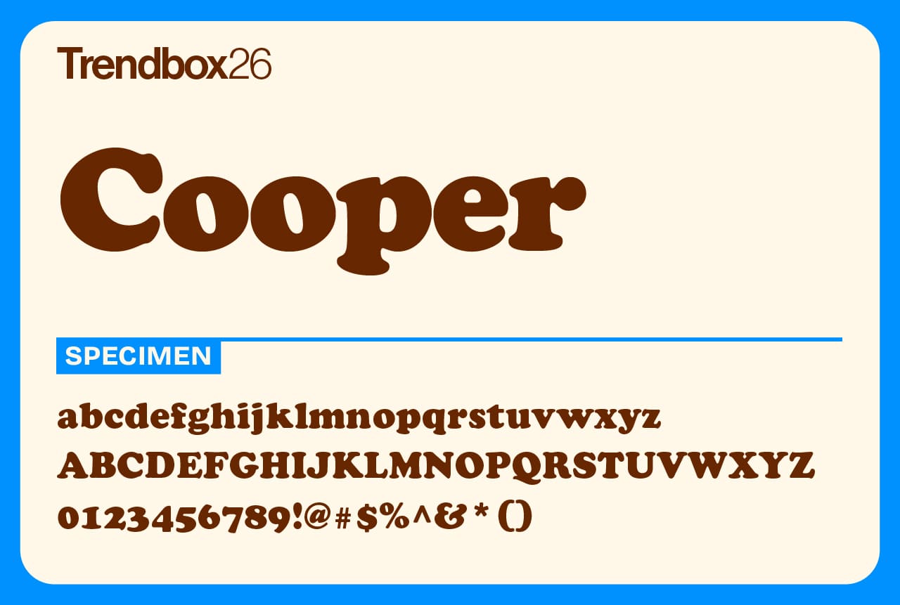
Cooper Black is one of the most iconic display typefaces of the 20th century. Originally designed in 1919 by Oswald Bruce Cooper as a heavy extension of his Cooper Oldstyle, it was released in 1922 by Barnhart Brothers & Spindler in Chicago. With its rounded serifs, long strokes, and unmistakable warmth, it quickly became a favorite for advertisers and printers looking to make a bold statement.
Cooper once joked that his Black version was made for “progressive printers with shortsighted clients”, a line that perfectly captures the font’s mix of humor and practicality. A true classic of American typography, Cooper Black remains as influential today as ever and easily holds its place among the best free fonts for 2026 for anyone seeking vintage charm with serious impact.
Number of styles: 2
License: Free for commercial use
Bilo
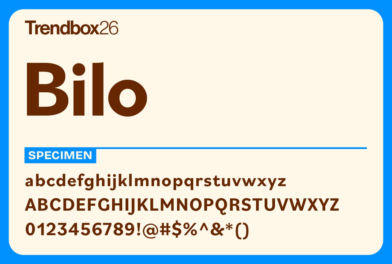
Bilo is a grotesque in the truest sense of the word, unconventional, expressive, and full of personality. Designed by Pieter van Rosmalen, it breaks from the polished norms of modern sans-serifs, favoring distinctive, irregular shapes that feel surprisingly human. In the heavier weights, letters like o and e take on stretched, egg-like forms, while the lighter styles reveal sharper curves that give the typeface a quirky rhythm.
The idea first took shape back in 2014, when Van Rosmalen set out to design a low-contrast sans inspired by Bodoni. Though that project never fully materialized, one detail stayed with him: the bold, sculptural o from Bodoni’s black weight. That shape became the seed for Bilo ExtraBold, and eventually, for one of the best free fonts for 2026, a typeface that proves imperfect forms can be the most expressive of all.
Number of styles: 18
License: Free for commercial use
FatFrank
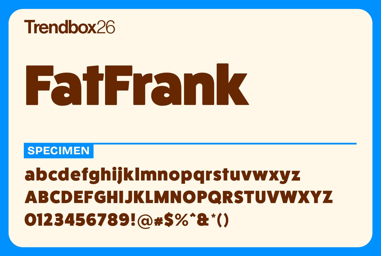
FatFrank is a heavy, friendly sans serif with rounded corners and a soft geometric charm. Inspired by early 20th-century sans serifs, it’s built for big, confident headlines that still feel approachable. The design combines weight with warmth, making it ideal for posters, packaging, and branding that need to make a strong impression.
Created by Regular Bold Italic, a Dutch type studio founded in 2013 by designers Timo Kuilder and Jeff Schreiber, FatFrank reflects their shared passion for clear, character-driven typography. With support for Cyrillic and a solid sense of craftsmanship, it easily earns its place among the best free fonts for 2026, perfect for projects that want boldness without losing friendliness.
Number of styles: 1
License: Free for commercial use
Barlow Semi Condensed
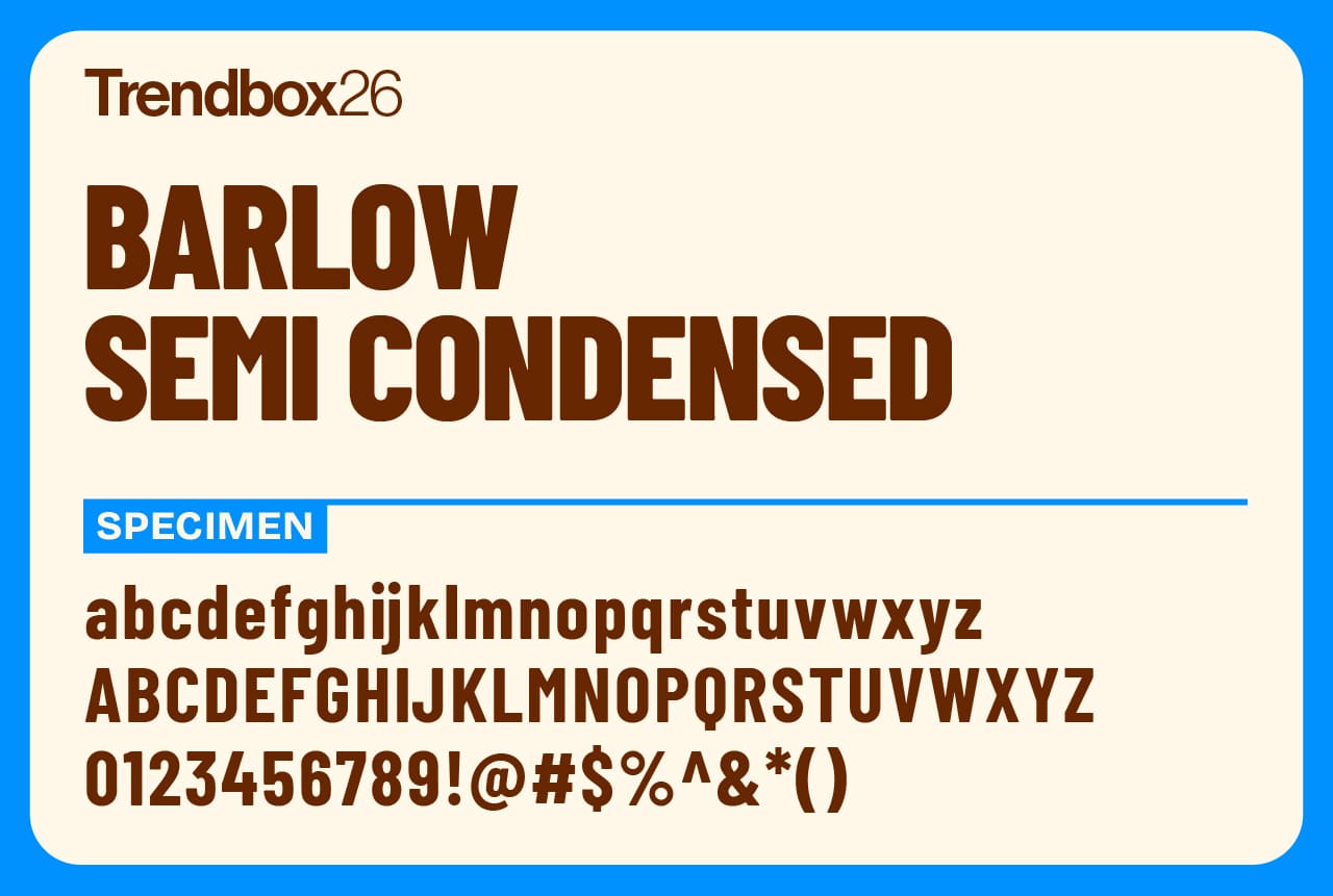
Barlow Semi Condensed is a low-contrast grotesk with softly rounded shapes and a distinctly utilitarian feel. Designed by Jeremy Tribby, the typeface takes cues from the everyday typography of California, drawing inspiration from license plates, highway signage, buses, and transit systems. The result is a font that feels familiar and functional, with just enough warmth to keep it from feeling cold or mechanical.
This Semi Condensed cut is part of the wider Barlow superfamily, which also includes Condensed and Normal widths. Each family offers nine weights with matching italics, making it a flexible option for everything from editorial layouts to interface design. Clean, dependable, and easy to work with, Barlow Semi Condensed is the kind of font that quietly does its job and does it well.
Number of styles: 18
License: Free for commercial use
Download Barlow Semi Condensed
Satisfy
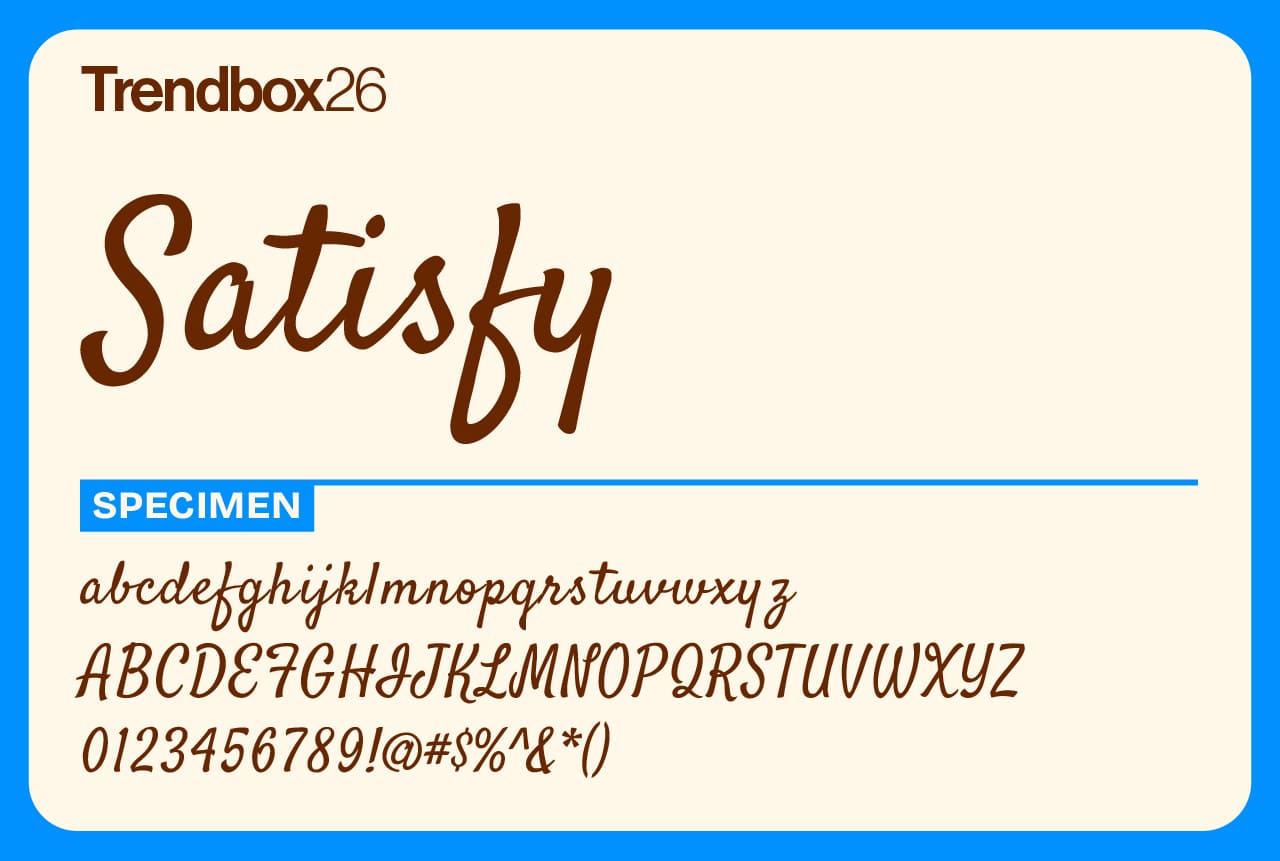
Satisfy is a flowing brush script that balances classic charm with a relaxed, modern attitude. Designed by Stuart Sandler, it captures the feel of hand-drawn lettering with smooth connections and an easy rhythm that keeps it readable even at smaller sizes. It has personality without feeling overworked, making it a great choice for headlines, logos, and casual branding.
Sandler is the founder of Font Diner, a foundry known for its deep roots in retro-inspired display type. With decades of experience and hundreds of released typefaces, his influence is clear in Satisfy’s confident strokes and timeless appeal. It feels nostalgic without leaning too hard on the past, offering a script option that still feels relevant in contemporary design.
Number of styles: 1
License: Free for commercial use
Rethink Sans
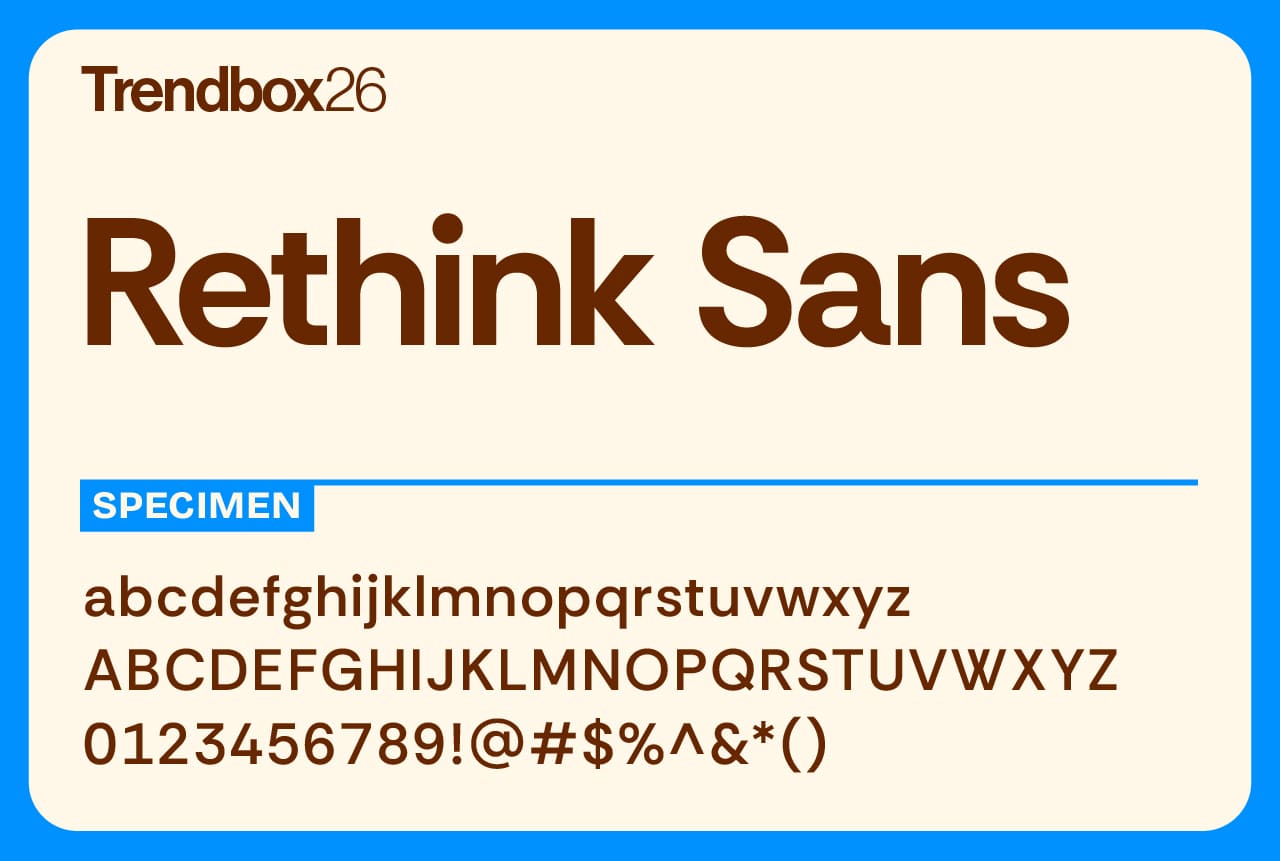
Rethink Sans is a deceptively simple sans serif built with everyday usability in mind. Created by Hans Thiessen, the ECD of Design at Rethink, the typeface was developed to help designers work with more confidence and precision inside Google Workspace. At first glance it feels clean and neutral, but a closer look reveals a font carefully tuned for real-world use.
Based on DM Sans by Colophon Foundry, which itself traces back to Poppins by Indian Type Foundry, Rethink Sans expands on its roots with thoughtful refinements. Weight-specific tracking, tabular lining figures, and multiple styles of circled numbers are all included out of the box. These details make it especially well suited for documents, presentations, and digital environments where clarity and consistency matter most.
Number of styles: 12
License: Free for commercial use
Wrapping up: notable free fonts for 2026
That wraps up our current selection of notable free fonts worth checking out in 2026. Some of these will likely find their way into active projects right away. Others might sit quietly in your library until the right moment comes along. Both outcomes are part of the process.
What stands out to us is the range and quality of type that is freely available right now. From expressive display fonts to reliable workhorses, these picks show that good typography is less about price and more about choosing tools that support the work you are doing.
If one or two fonts from this collection end up becoming part of your regular rotation, then it has done its job. And if you are in the mood to keep exploring, our design trends for 2026 offer more context on where things are heading and how type fits into the bigger picture.
Take what you need, experiment a little, and let the fonts do the rest.