CAD
CAD
 USD
USD
 EUR
EUR


Almost every business has a logo, but there are far fewer that have a brand identity. The two get conflated all the time, and it's an easy mistake to make. A logo is visible, tangible, and satisfying to tick off a list. Brand identity is harder to point to, which is probably why so many businesses stop at the logo and consider the job done.
But there’s much more to an identity than that. It’s the complete system of decisions that determines how your brand looks, sounds, and feels across every touchpoint,from your website to your packaging to the business card someone tucks into their wallet.
Done well, it builds recognition, earns trust, and gives customers a reason to choose you over someone cheaper.
This guide covers everything you need to know to do it well, including:
- What brand identity actually is (and how it differs from branding and brand image)
- The core elements that make up a strong identity
- How to build one from scratch, step by step
- The most common mistakes brands make with their identity
What is brand identity?
Brand identity is how your brand shows up, including the colors, the words, the logo, the feel of your packaging, and the thinking behind why it all looks that way.
It's not a checklist of individual elements. It's a system that includes your color palette, your typography, the way your copywriter writes a product description, the weight of the paper your business cards are printed on, all working together as one cohesive whole. In a strong brand, none of that happens by accident. Every choice is intentional, and every choice reinforces the same idea.
Brand identity vs. branding vs. brand image: what's the difference?
The word “brand” comes before several other words in marketing speak. Brand identity. Brand image. Brand strategy. Branding. Plenty of people use them as if they mean the same thing. They don’t, but it’s an easy mistake to make because they’re all describing different parts of the same thing.
- Brand identity is the system of elements you build to present your brand to the world, including your logo, colors, typography, tone of voice, packaging, and everything else that makes your brand look and sound the way it does.
- Branding is the process of creating and maintaining that identity over time. It's the work, including the strategy sessions, the design decisions, the brand guidelines, the briefing of every designer or copywriter.
- Brand image is how your audience actually perceives you. It’s the one thing on this list you can't directly control. You can design a logo that feels premium, write copy that feels warm, and choose packaging that feels sustainable, but brand image is what people walk away thinking and feeling.
- Brand strategy is the thinking that should underpin everything else. It’s your audience, your positioning, your mission, your reason for existing. This is something you should figure out and put in place before you do any design work.
| Term | What it is | Who controls it | Example |
|---|---|---|---|
| Brand identity | The system of visual, verbal, and physical elements you use to present your brand | You | Your logo, color palette, packaging, tone of voice |
| Branding | The active process of building, managing, and evolving that identity over time | You | Running a rebrand, creating brand guidelines, briefing a designer |
| Brand image | How your audience actually perceives and feels about your brand | Your audience | “They feel premium” or “they seem approachable” |
| Brand strategy | The business thinking that informs your identity decisions | You | Deciding to position as the sustainable option in your category |
Why brand identity matters
Think about the last time you bought something from a brand you'd never heard of. Chances are, before you handed over your money, you looked for reassurance: Does this feel legitimate? Does it look like a real business? Does it feel like something I can trust?
According to Edelman's 2025 Brand Trust Report, 80% of people trust the brands they use, which is more than they trust government, media, or NGOs. That's a striking finding, but it makes sense when you think about it. Brands show up in our lives constantly, consistently, and (when they're doing it right) reliably. Trust builds over time through thousands of small signals, like a repetitive color or a familiar tone of voice.
There’s commercial value in having a recognizable brand identity too. Edelman found that trust now sits alongside price and quality as a deciding factor in purchase decisions. That means how your brand looks and feels directly influences whether people buy from you.
The numbers back this up. Kantar BrandZ has tracked the world’s strongest brands for nearly two decades, and their portfolio has outperformed the S&P 500 by 83% over 18 years. Strong brands thrive in good times and bad. When markets dip, they fall less far and bounce back more than twice as fast as weaker brands.
A big part of why is pricing power. Customers are happy to pay a premium for brands that are distinctive enough. This protects margins even when times are tough.
What does a strong brand identity actually look like?
There's no shortage of opinions on this, but Kantar's research across millions of consumers and thousands of brands over nearly two decades gives us a framework.
According to Kantar, the brands that consistently grow faster, charge more, and recover better from downturns share three qualities.
They are:
- Meaningful
- Different
- Salient
Meaningful: people feel it's made for them
A meaningful brand meets people where they are, both functionally (it does what they need) and emotionally (it makes them feel something). Your brand needs to be the right thing for the right people all of the time.
Different: it stands out without trying to explain why
In Kantar's framework, difference is about being distinctive in a way that consumers can actually feel (it goes beyond simply “claiming” you’re different). A brand that looks and sounds like everyone else in its category forces people to make decisions on price alone, whereas a brand with a strong, ownable identity gives people something else to go on.
Salient: it comes to mind first
Kantar's research found that brands people feel a strong emotional connection to command 1.5x more pricing power. When your identity matches across every touchpoint, it compounds because people don't have to think about whether they recognize you.
Takeaway: strong brand identity looks good and feels relevant to the right people, looks like nobody else, and shows up in the same way every time on your website, your packaging, your business cards, and everywhere in between.
The core elements of brand identity
Brand identity is made up of several interconnected elements. Individually, each one does a job, but together, they create something bigger than the sum of their parts.
These elements can be put in three categories:
- Visual identity
- Verbal identity
- Physical identity
Visual identity
Visual identity is the collection of design elements that make your brand look like you.
Logo
Your logo is usually a quickly recognizable symbol or design. A well-built logo has multiple versions: a primary mark, a secondary version, an icon or symbol that works alone, and rules about spacing, sizing, and color usage.
Apple's logo is one of the most studied examples of logo design. It’s a single bitten apple, rendered in one colour, with no wordmark, no tagline, and no explanation. It works at any size, on any surface, in any color, whether that’s embossed on a laptop lid or printed on packaging.
Research shows that your logo can influence your brand positioning, with angular logos offering a more premium feel than circular logos.
Test it at thumbnail size, in one colour, on a dark background, and on a physical material.
Color palette
Your color palette is the set of colors you use across all your brand materials. Adobe’s 2025 consumer research found that one in two consumers have chosen one brand over another based on color alone.
A “good” palette has three tiers:
- Primary colors (your dominant, most used and most recognizable colors).
- Secondary colors (supporting shades that add range).
- Accent colors (used sparingly, usually for highlights or calls to action).
Research published in the Journal of Marketing & Social Research found that certain colors have certain associations (blue with trust, red with excitement), but there are differences depending on product category, target audience, and cultural context
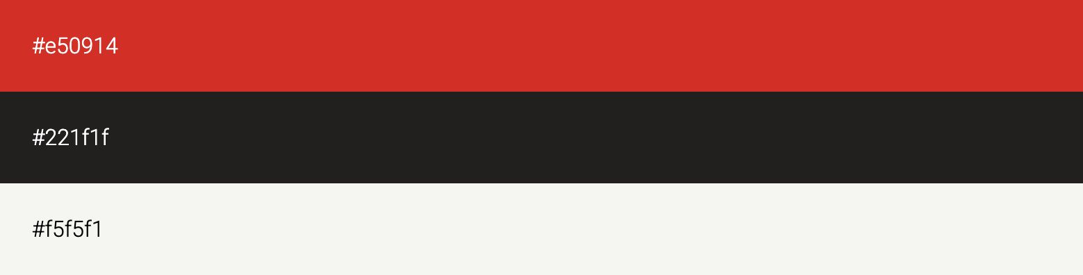
Netflix’s black, red, and gray color scheme is a simple choice, but it works well when paired with the multi-colored icons of TV shows and movies.
Run your color combinations through a contrast checker to make sure they’re accessible. Or use the Jukebox Color Palette Generator
Typography
Typography is the typefaces and text styles you use. It includes fonts, sizes, weights, and spacing, and does two important things:
- Organizes information
- Showcases your personality
A heavy slab serif has a different vibe to a refined geometric sans-serif. For example, Uber's typography is clean and modern, while The New York Times uses a classic serif font that feels authoritative and timeless.

Whatever typography you choose, keep it consistent. Research confirms that consistent and distinctive typography helps brands stand out from competitors and directly contributes to brand recognition.
A functional type system has three layers:
- A display or headline typeface
- A body typeface (should be legible at smaller sizes)
- A utility or accent typeface (for labels, captions etc)
Typography also needs to be compatible with your color palette. A delicate, high-contrast serif needs breathing room rather than a competing bold palette. The two should feel like they come from the same world.
If you’re on a tight budget, Google Fonts has some good options.
Imagery
Imagery refers to any photos, illustrations, iconography, or graphics that make up your brand’s visual identity. It’s not necessarily a single image, but more like a consistent color temperature in any photos, a specific illustration style, or a set of icons in your brand colors.
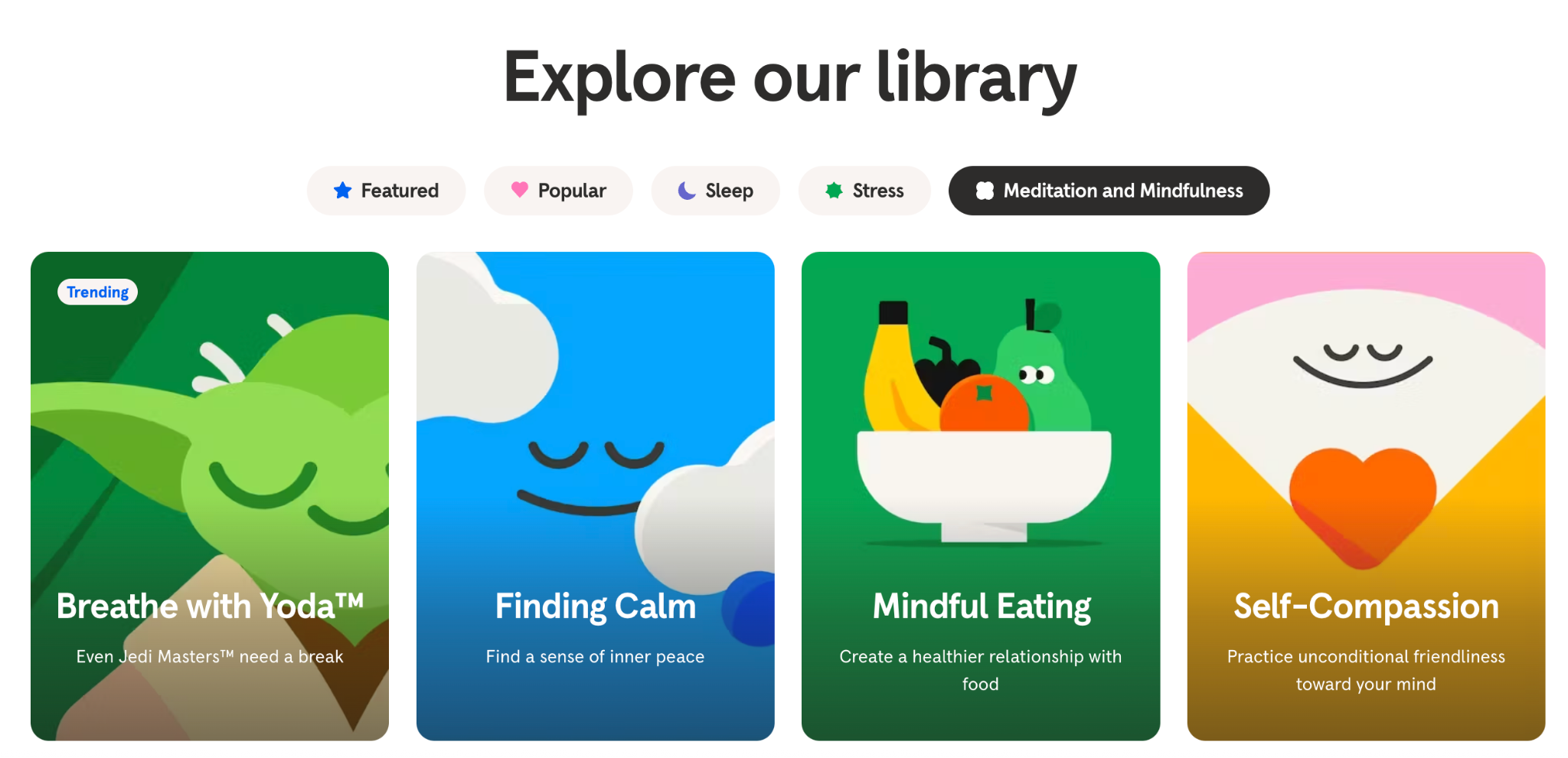
Meditation app Headspace is known for its bright, bold illustrations of blob-like people.
Create a simple one-page mood board that defines your imagery style with three columns: what we shoot, how we shoot it, and what we never do.
Verbal identity
Verbal identity is how your brand sounds. It’s the words you say and the way you say them.
Brand voice and tone
Brand voice is how your brand talks and sounds. It infuses your written content with brand personality, whether that’s playful or professional.
Your brand tone is how that voice adapts to context. That might be warmer in a welcome email, more direct in an error message, and lighter on social media.
The most important thing is that your verbal identity and your visual identity align. It’s confusing if a brand has a warm, playful visual identity and a formal, corporate-sounding voice.
Dove made a deliberate choice to sound different from every other brand in the beauty industry. At a time when most beauty advertising was built on insecurity, Dove's voice was warm, direct, and celebrated real people.
Write a simple "we are / we're not" list for your brand voice, for example, "we are direct, not blunt; warm, not gushing; expert, not jargon-heavy."
Mission, values, and brand personality
Your mission defines why your business exists beyond making money. Your values define what it will and won’t compromise on. Your personality defines what your brand would be like if it were a person.
This work should happen before any design decisions are made.
A useful practical tool here is brand archetypes. The idea, rooted in Jungian psychology and widely used in brand strategy, that brands (like people) tend to express a recognizable character type: the Rebel, the Caregiver, the Creator, the Jester. Choosing a primary archetype gives designers and writers a shared creative anchor that's faster and more useful than a list of adjectives.
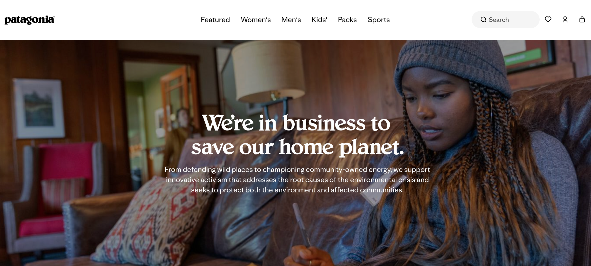
Patagonia's mission ( "we're in business to save our home planet") is one of the most direct and unambiguous purpose statements of any major brand, and everything about the company flows from it.
Physical identity
Physical identity is the way your brand shows up in real life, through its packaging and printed materials.
Print, packaging, and product
Your physical identity (a.k.a. packaging and product) is often the first tangible encounter a customer has with your brand. As soon as you print a business card, a label, a leaflet, or a piece of packaging, your brand identity needs to work in the physical world as well as online.
address print guidelines in your overall brand guidelines, including CMYK color values, approved paper stocks, and guidance on finishes.
Brand identity as a system
Most guides treat brand identity as a checklist. Tick off the logo, the colors, the fonts, the voice, and you're done. But that's not how identity actually works. The elements aren't independent, they're in constant conversation with each other.
Think about how the elements constrain each other:
- Your color palette influences which typefaces feel right. A bold, saturated palette pairs naturally with strong, confident type, while a muted, earthy palette calls for something more considered.
- Your imagery style either reinforces or undermines your logo. A hand-drawn wordmark sitting next to cold, corporate stock photography is jarring.
- Your brand voice should reflect your visual assets. A brand that looks playful and irreverent but writes like a terms and conditions document is sending two completely different messages at once.
If you described every element of your brand as a personality trait, would they all describe the same person?
The brands that do this best make it look effortless. Take Liquid Death. On paper, it's canned water, one of the most unremarkable product categories imaginable. But every single element of its identity reinforces the same idea: water for people who hate wellness culture. The skull logo, the matte black cans, the metal-influenced typography, the "Murder Your Thirst" tagline, the aggressive social media voice, nothing breaks character.
Oatly is equally deliberate, but in a different way. The design looks intentionally chaotic. It’s verbose, hand-scrawled, and self-aware to the point of parody. But remove the copy and the design no longer makes sense. Remove the design and the copy loses its context. The two are so tightly interlocked that neither element would survive without the other.
The bottom line is that, when every element is aligned, each one amplifies the others. Your voice makes your visuals feel more intentional, and your visuals make your voice feel more credible.
How to build a brand identity: a practical framework
Building a brand identity is a process. And, like most processes, there’s a specific order to it. You have to do the foundational, thinking work before moving on to the more exciting, design part.
Step 1: Define your mission, vision, and values
Before you make a single design decision, you need to know why your business exists, where it’s going, and what it stands for.
To reiterate:
- Your mission is why you exist beyond making money.
- Your vision is what you’re building toward.
- Your values are the principles you won’t compromise on.
Research consistently shows that purpose-driven brands (i.e. those that successfully integrate core values with business objectives) create more meaningful connections with customers and show stronger long-term performance.
Try this: Complete these three sentences in plain language:
- "We exist to..." (mission).
- "In five years, we want to be the brand that..." (vision).
- "We will never compromise on..." (values).
Step 2: Know your audience
Build at least one customer persona, a.k.a. a detailed picture of who you’re actually talking to. Go beyond age, gender, and location here and dive into how they think. What makes them trust a brand? What would make them roll their eyes?
Adobe’s 2025 consumer research found that Gen Z and millennials lead the trend on choosing brands based on color alone, which is a reminder that your audience will influence your visual identity.
Try this: Interview three to five of your best existing customers. Ask them why they chose you, how they'd describe you to a friend, and which other brands they love and why. The language they use (their actual words, not your marketing copy) is the raw material for your brand voice and visual direction.
Step 3: Check out what your competitors are doing
Running a competitive analysis will show you what other, similar brands are doing with their brand identity, giving you inspiration andrevealing any gaps in the market.
Pull together the logos, color palettes, and websites of your five or six closest competitors and lay them out side by side. Most industries have a dominant visual language that everyone defaults to (e.g. wellness brands with sage green, fintech brands with navy and white).
You don’t want to be different for the sake of it. Instead, identify where there’s a gap between what your competitors are communicating and what your audience actually needs.
Try this: Create a simple two-axis map. Plot your competitors on axes that are important in your category, for example, "traditional vs modern" and "premium vs accessible." Where does everyone cluster? Where is there space?
Step 4: Define your brand personality and archetype
Pick three to five traits that describe how the brand should feel, such as direct, warm, irreverent, authoritative, or playful.
Pair this with a Jungian brand archetype. Common archetypes include the Creator (original, imaginative, driven to make things), the Rebel (unconventional, provocative, anti-establishment), and the Caregiver (warm, nurturing, service-oriented).
Try this: Describe your brand as if it were a person, including their age, how they dress, how they speak at a dinner party, what they'd never say. It sounds odd, but it's one of the fastest ways to build a shared creative understanding between founders, designers, and writers working on the same brand.
Step 5: Develop your visual identity
Use your previous research to start designing your visual identity. You can use an agency or a freelance designer to do this if you don’t have an in-house design team.
This part includes designing all your visual elements, including:
- Logo
- Color palette
- Typography
- Imagery
Each element should consider your audience, mission, values, and where your brand sits in the current market. Instead of briefing designers with an aesthetic reference (“We want a green background but we don’t want nature imagery”), go for a more strategic approach (“We need to feel warm and welcoming but credible in a market that skews cold and corporate”).
It’s a good idea to start with a mood board that documents your initial research and bring in some visual ideas based on those. You can then share this with designers and team members to make sure everyone’s on the same page.
Try this: Before signing off any visual identity work, test every element in context. Put the logo on a mock business card. Drop the color palette into a real email template. See the typography at body copy size.
Step 6: Define your verbal identity
Your verbal and visual identity need to go hand-in-hand, so develop your brand tone and voice alongside the visuals.
At a minimum, document your voice principles, tone guidance for different contexts, and any key messages that define how you talk about what you do. Refer back to your brand personality and archetype for this part of the process and draw on the “persona” you gave your brand during that stage.
Try this: Rewrite the same piece of copy three times, in three different voices. Then choose the one that feels most like the brand you've defined. Use those three versions as examples in your guidelines to show the difference between on-brand and off-brand writing in practice.
Step 7: Build your brand guidelines
Your brand guidelines are a working document that outlines both your visual and verbal brand identity. The purpose is that you have something to give new designers, copywriters, packaging suppliers, and printers that tells them what they can and can’t do with your brand elements.
This can be a simple Notion page or Google Doc, or it could be a full brand deck that covers:
- Logo usage (including what not to do)
- Color values in both RGB and CMYK
- Typography hierarchy
- Imagery direction
- Voice principles
It helps to include real examples and common mistakes so people can see what your brand should look like in action.
Try this: The acid test for any brand guidelines document is whether a freelancer you've never spoken to could produce on-brand work from it alone. If the answer is no, it needs more worked examples, clearer do's and don'ts, or both.
How brand identity works in print
At some point you’ll need to consider how your brand translates into the physical world, especially if you sell a product or plan to create materials like business cards, stickers, leaflets, etc.
While you might have a rock-solid brand on screen, that might not translate as well into a physical identity, plus there’s more to consider. Colors often look different when printed out and you’ll also need to think about the material, stock, and finish on any printed products.
- CMYK vs. RGB: Screens display color using RGB. Print uses CMYK. The two don’t always map onto each other perfectly, so a color that looks sharp and saturated on screen can come out flat and muddy in real life.
- Paper stock: The paper you print on communicates something about your brand. Soft-touch has a velvety, almost skin-like texture that’s often used for high-end skincare packaging and luxury business cards. Uncoated and kraft stocks are a more tactile, natural choice. None of these is inherently better than the others. The question is whether the stock you choose reinforces what your brand is trying to say.
- Finish: Similar to paper stock, the finish you use on printed materials can say a lot about your brand. Finishes like spot gloss, foil stamped, and embossing and debossing all convey different messages and are extensions of your brand personality in physical form.
Brand identity examples
Here are some real life examples of big-name brands with recognizable identities.
Apple: consistency across every touchpoint
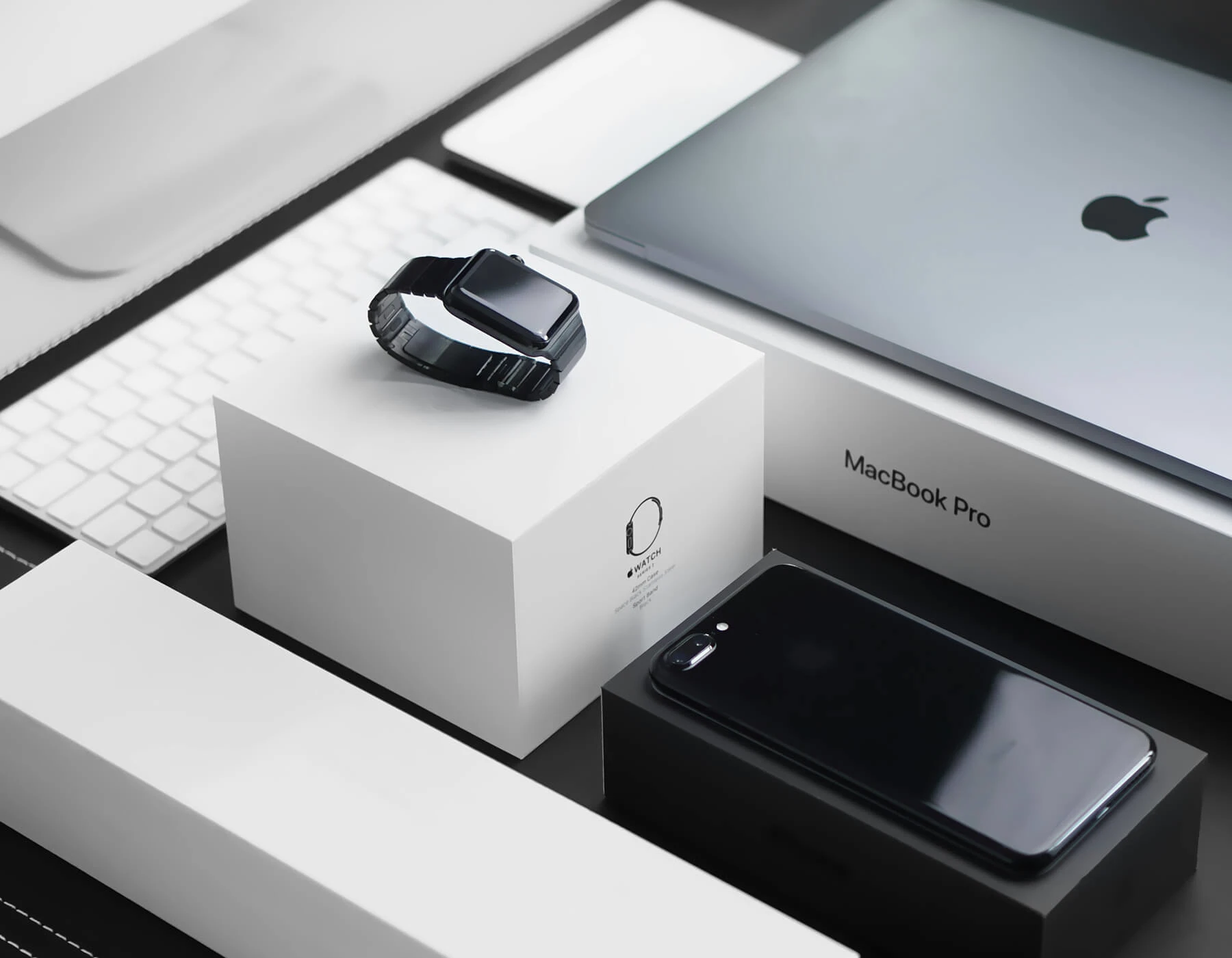
Apple's identity is built on restraint. The same principles (clean space, minimal color, precise typography, considered materials) show up on their website, their packaging, their retail stores, and the products themselves. Nothing competes for attention. Everything reinforces the idea that simplicity is the highest form of sophistication.
IKEA: transcending language barriers

IKEA's identity is built for global scale with its recognizable blue and yellow color palette, flat-pack boxes, the same typeface, and the same catalog logic. It has to work in dozens of languages and markets without losing its meaning. And it does, because the system is so clearly defined that no individual element needs to work too hard.
Uniqlo: simplicity as a statement
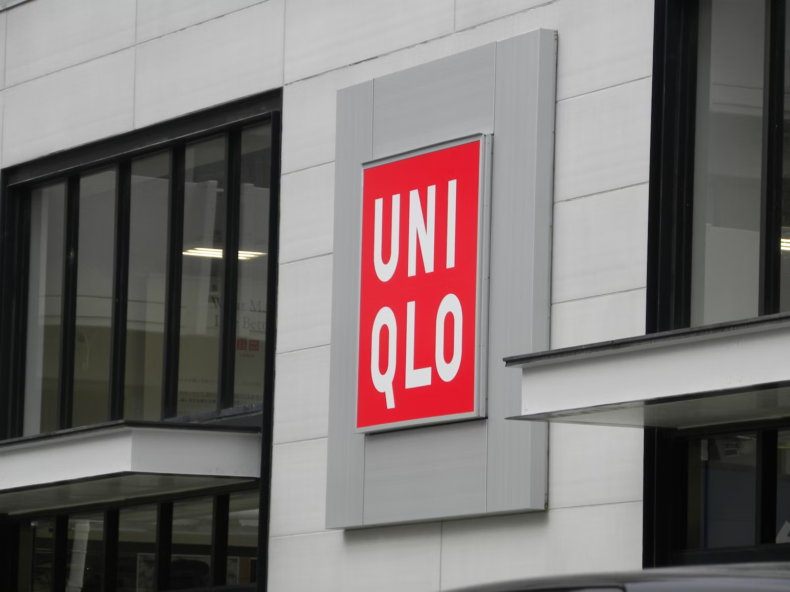
In a fashion industry that competes on noise, Uniqlo does the complete opposite. It uses bold typography on plain backgrounds, a limited color palette, and no visible branding on the clothes themselves.
Ben & Jerry's: personality in every element
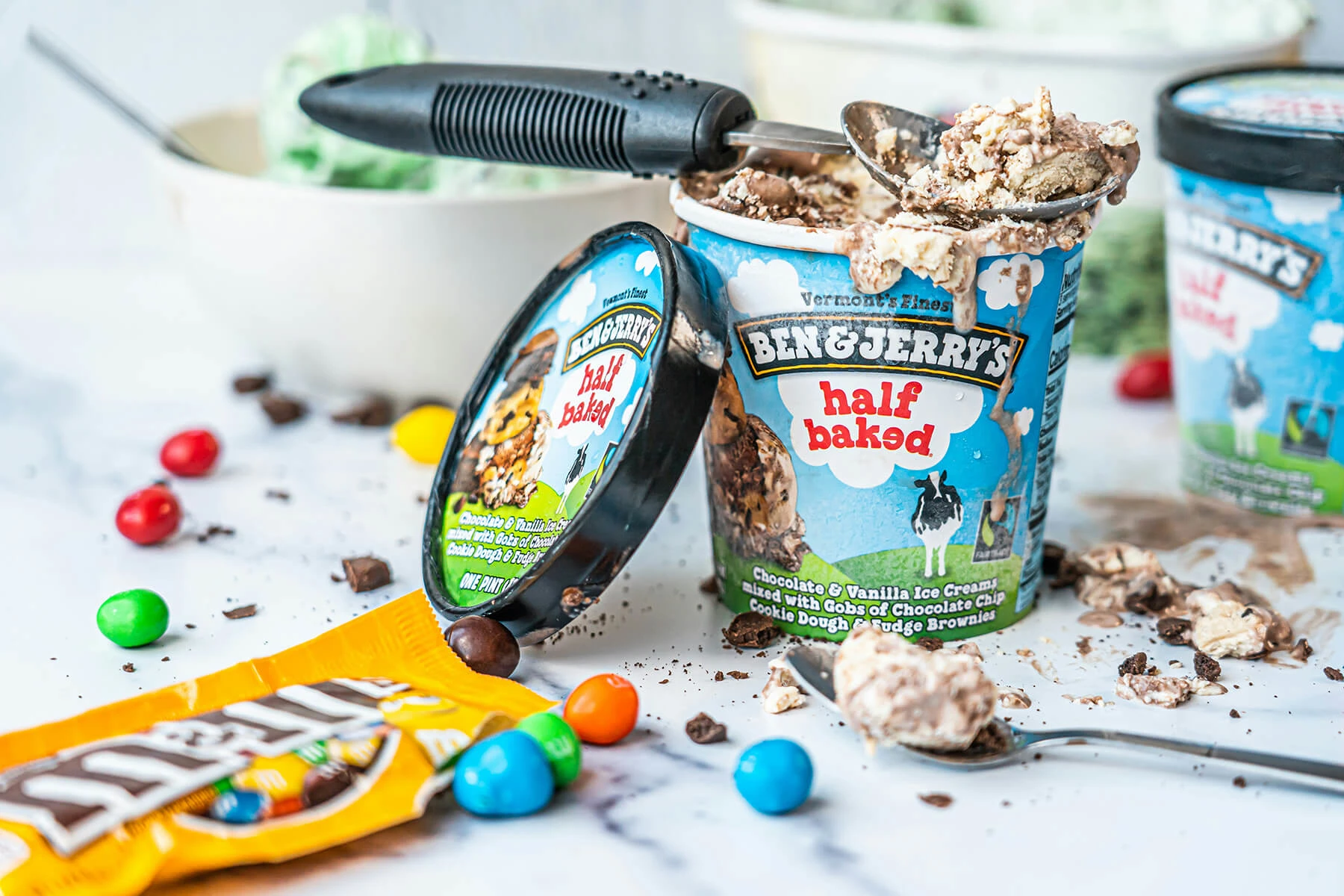
Ben & Jerry’s illustrated packaging, the irreverent flavor names, the activism, and the tone of voice all reflects the same values-led, warm, slightly anarchic character.
Tony's Chocolonely: mission made visible
Tony's uses its packaging to tell the story of its mission, which is ending exploitation in the chocolate industry. The unequally divided chocolate bar, the bold mismatched typography, and the loud colors is intentional. The brand looks like what it stands for.
Olipop: making health feel fun
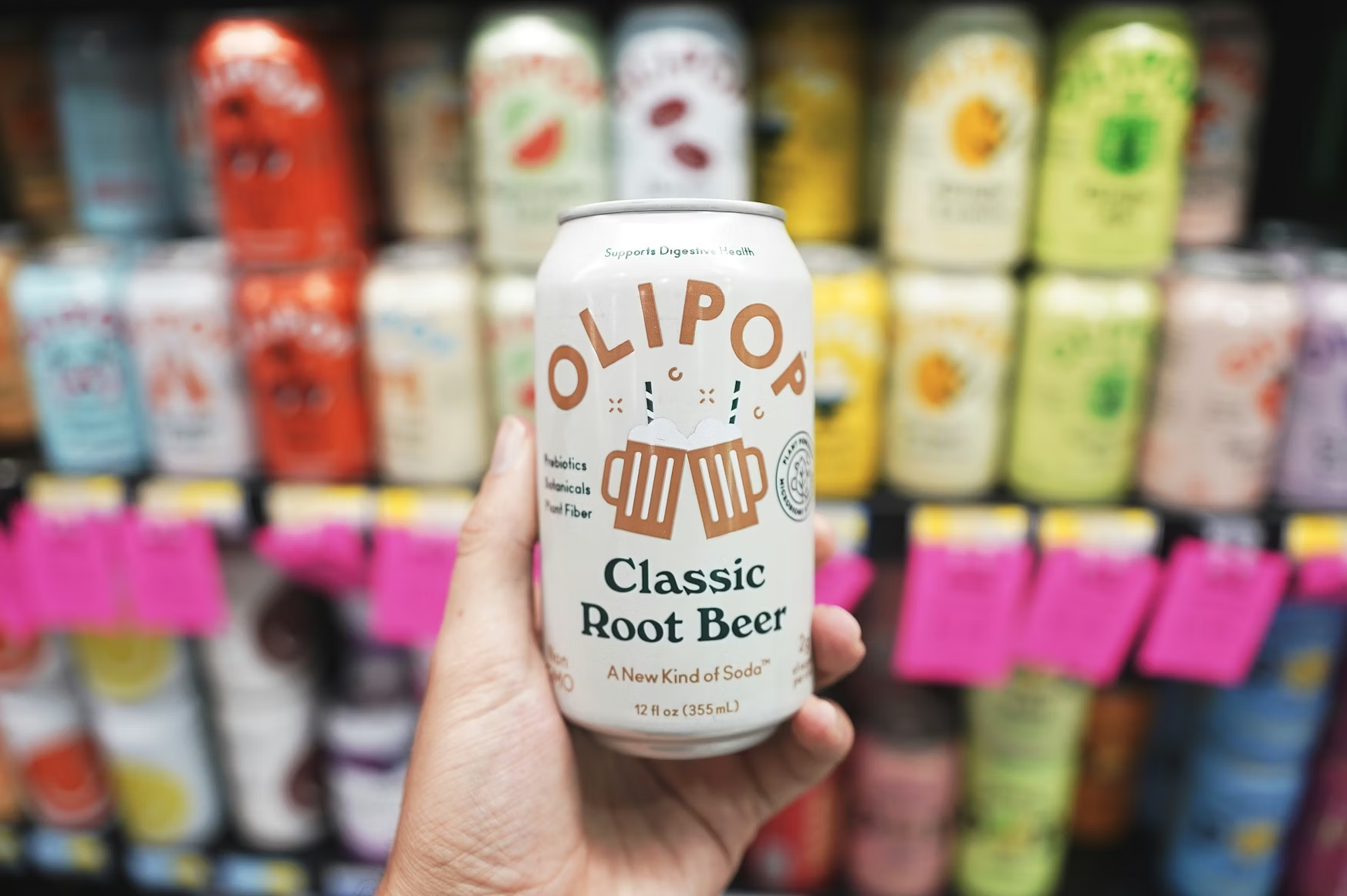
Most functional drinks brands default to clinical, clean, and serious. Olipop went the other way, with vintage illustration, warm colors, and nostalgic typography. It takes a category built on restriction and makes it feel joyful.
Hermès: restraint as luxury
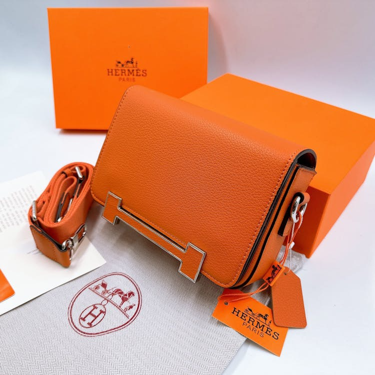
Hermès builds its identity through material, color, and craft, most clearly seen in its iconic orange packaging and refined finishes. The consistency across every touchpoint shows how physical experience can define a brand just as much as visuals.
Innocent: voice as identity
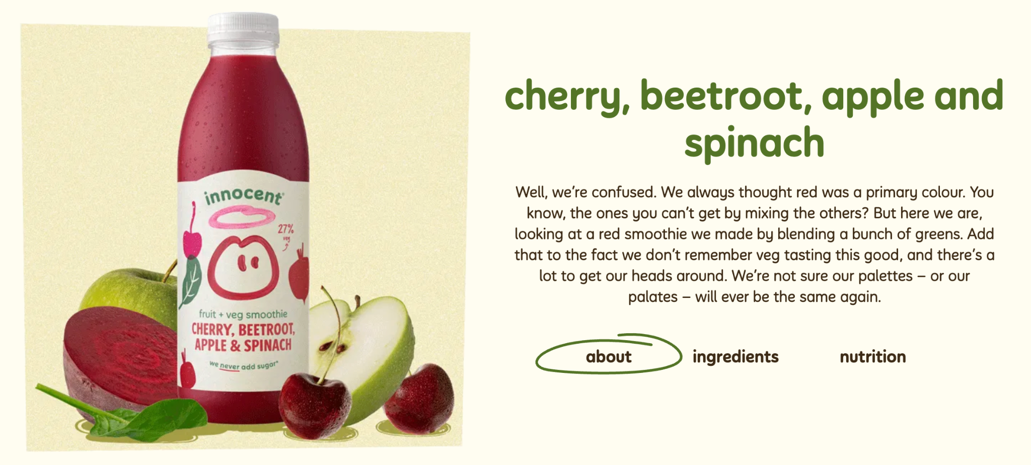
Innocent uses simple packaging, friendly typography, and conversational copy to create a distinct and approachable identity. The consistency across bottles and labels shows how tone and design can work together as a complete system. This identity is carried through to its social presence as well, where it’s renowned for its witty words.
Heinz: owning a single cue
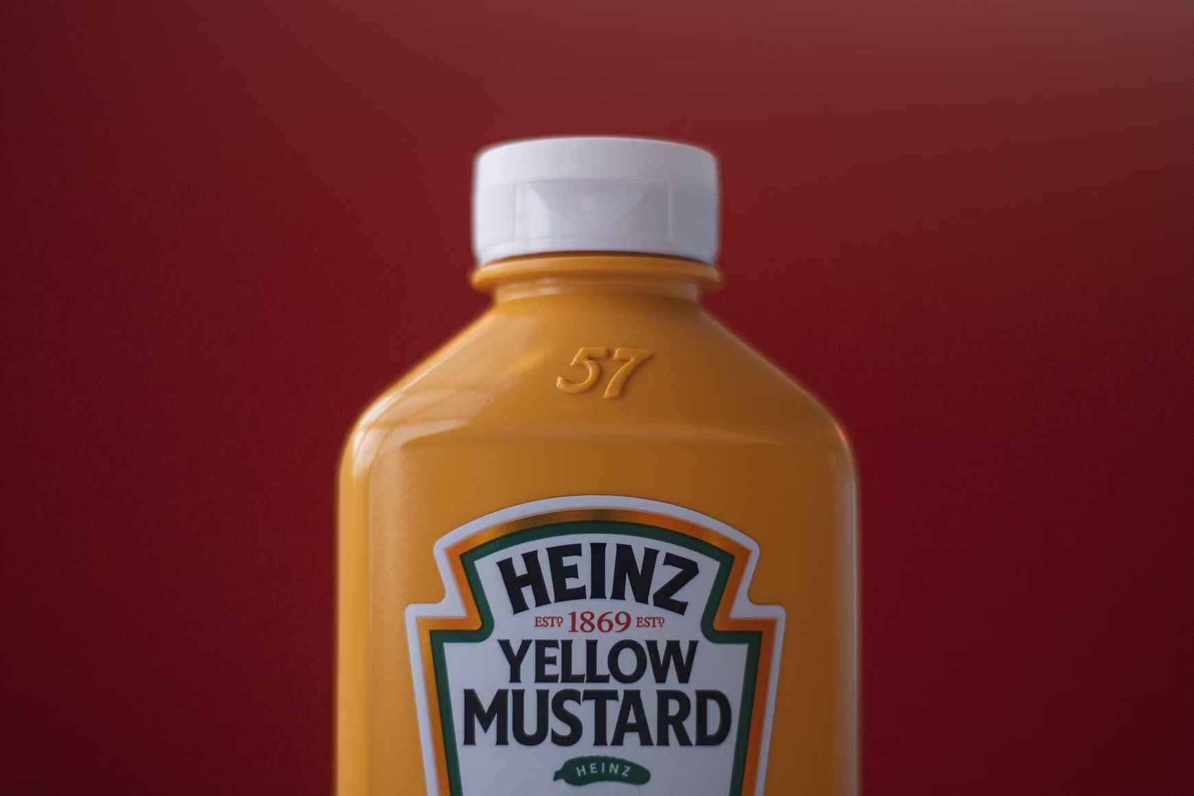
Heinz builds its identity through instantly recognizable packaging, using its keystone label shape, bold typography, and consistent color across products. The system has stayed strong over time, showing how repetition can build lasting recognition.
Duolingo: character as brand
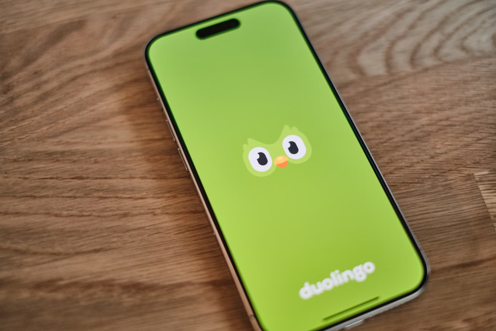
Duo the owl started as a mascot and became the brand's most powerful asset. It’s a recognizable, meme-able personality that carries the identity across social media, in-app, and beyond. The slightly unhinged tone on social works because it's consistent with the character.
Spotify: color and culture

Spotify Bright gradients, bold color shifts, and strong typography define this visual identity across campaigns and product. The system constantly adapts to different artists and moods, showing how a flexible identity can stay recognizable while always evolving.
Common brand identity mistakes to avoid
Building a brand identity is one thing, but building one that actually holds up is another thing entirely. These are the mistakes that can get in the way.
- Treating your logo as the whole identity. A logo is one element of an identity system, not the system itself.
- Designing just for screens. You’re brand identity should also include CMYK color values, print specifications, and guidance on physical materials.
- Building your visual and verbal identity separately. The two should be developed together using the same brief.
- Chasing trends. Trends move fast, so following them can sacrifice the consistency and recognition a brand needs to build equity over time.
- Inconsistency across channels. Your brand identity should be consistency across your website, packaging, social media, emails, and everywhere in between.
- Never testing it in the real world. It’s important to see how your brand looks in context, whether that’s on a piece of packaging or a small device.
Ready to bring your brand identity to life?
A brand identity that only lives on a screen is only half finished. The real test is how it looks in print, like on a business card someone picks up and keeps, on packaging that earns a second look, or on a sticker that ends up on a laptop lid.
Whether you're printing for the first time or refreshing materials that no longer feel like you, Jukebox makes it easy to get it right. From business cards and labels to custom packaging and stickers, every product is built to bring your identity off the screen and into the world.