

When you're designing new business cards or a custom sticker project, you're likely choosing between RGB vs CMYK color definitions. Understanding CMYK vs RGB for printing is essential, as each color mode is used for a different purpose. For projects that are for digital display only (web, online, social media etc.) RGB is the proper default, as it is the natural color language for screens. Before preparing artwork for print, you can also remove image background to ensure clean edges and accurate results. If you haven't locked in your colors yet, build a color palette first so your design stays consistent across every file.
When designing for print, you should use CMYK. CMYK is the standard color model used in printing, based on cyan, magenta, yellow, and black ink. Printers rely on these inks to reproduce color accurately, which is why converting RGB to CMYK is a critical step before sending files to print. Sending an RGB file to a printer can lead to unwanted color shifts or dull results. You can see exactly how your colors will shift by uploading an image to our rgb to cmyk converter and previewing the conversion before you send anything to print. Mastering CMYK for print projects is the key to achieving consistent, professional results.
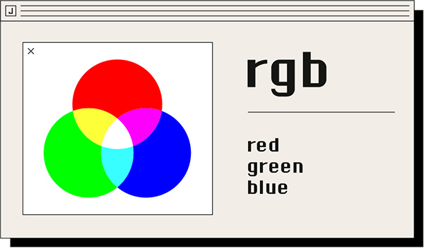
Why your screen and paper don't always match

Ever wonder why a bright design on your screen looks a little different once it’s printed? This wheel shows exactly why that happens. The RGB sections are the glowing colors you see on your phone or laptop, while the CMYK sections show how those same colors look when they are made with real ink. You’ll notice the biggest change in the bright greens and blues. Knowing how these colors shift is the best way to make sure your Jukebox prints turn out exactly how you imagined.
RGB vs CMYK at a Glance
| Feature | RGB | CMYK |
|---|---|---|
| What it’s for | Screens and digital designs | Printed products |
| Where you see it | Phones, laptops, websites | Physical branding and tactile products |
| How colors work | Light on a screen | Ink on paper |
| How it looks | Brighter on screen | More true to print |
| Best time to use | Designing and previewing | Final files for printing |
The basics of color
Most designers are introduced to color theory through the concept of gamut, or range. While there are technical models like Lab used in science, they represent many colors that can't be reproduced by digital or print systems. For your daily design work, we only need to focus on the two systems that matter: RGB and CMYK.
The RGB System: Light and Generative Design
RGB (Red, Green, Blue) is an additive color model that uses light to create color. In 2026, this is the foundational language of generative design and neural rendering. Whether you are creating assets via AI workflows or designing for spatial 3D environments, your colors are born from light on a dark screen.
Because these assets are made in a massive digital space, they often feature neons and saturated highlights that feel electric on modern HDR or mobile displays.
The transition to print can be tricky because these digital colors often sit outside the printable range. While the digital screen is limitless, the physical world of ink is governed by physics.
RGB works by adding light together—the more you add, the closer you get to white. You can’t actually create black with RGB; black is simply the absence of any light.
CMYK colour for design
CMYK uses Cyan, Magenta, Yellow, and Black ink to represent colors. It’s a slightly smaller range than RGB, and the two spaces don’t completely overlap. You can't always create the same range with both, which is why mapping colors between them is such an important step.

CMYK is a subtractive model—you start with a white base (the paper) and add ink to create depth. In theory, mixing Cyan, Magenta, and Yellow makes black, but in the real world, it makes a muddy brown. That’s why we add a fourth color—actual Black (K)—to give your prints sharpness and deep shadows.
The Secret to the Perfect Black
On a screen, black is just a dark pixel. But in print, not all blacks are the same. If you use only 100% black ink, your design might look more like a charcoal grey.
To get that deep, velvety black you see on premium Jukebox cards, we use "Rich Black." This adds a small touch of Cyan, Magenta, and Yellow under the black ink to give it extra depth. It’s the easiest way to make your design look high-end.
Designing for CMYK Printing
Modern design tools usually handle these conversions for you, but it can be a trap for designers who want total accuracy. When you design for a business card or brochure, designing in CMYK from the start ensures that what you see on your screen is what arrives in your mailbox.
Practical steps for your workflow:
Pro tip: If your tool doesn’t support CMYK, be extra careful using it for print. Modern tools like Canva now offer a CMYK export for Pro users, which we highly recommend.
If you are using InDesign or Illustrator, it’s a great habit to set your workspace to CMYK before you start designing. This keeps your colors print-safe from start to finish.
If you're using Photoshop, you’ll likely work in RGB for your edits, but remember to convert the file to CMYK before your final save.
Final tips for a flawless finish:
Don't worry if your CMYK design looks a little less 'bright' on your screen. It's perfectly normal! Unless you work with a fully calibrated monitor, it's best not to try and fix the colors visually on your screen—using a reference swatch book is much more reliable.
When you're ready to print, exporting as a PDF with CMYK settings is the best way to keep your colors consistent. Make sure all your images are converted to CMYK before you save to ensure everything looks exactly as you intended.

Take your design to the next level:
Ready to put your color skills to the test? Start creating in minutes with our Sticker Maker or explore our range of custom Sticker Sheets. If you're building a brand identity, our Business Card Maker is the perfect place to ensure your CMYK colors look flawless in hand.
For more inspiration, stay ahead of the curve with our latest look at the Graphic Design Trends for 2026.
Frequently asked questions
Use RGB for anything that stays on a screen, like social media or website banners. Use CMYK for anything you intend to print, like business cards or stickers.
RGB uses light (Red, Green, Blue) for digital displays. CMYK uses ink (Cyan, Magenta, Yellow, Black) for physical surfaces. Because paper doesn't glow, CMYK has a more natural, slightly smaller range of colors.
RGB can show millions of vibrant shades. CMYK is limited to the physical ink pigments available, which is why bright digital neons look more muted when printed.
While we always recommend CMYK for the best results, don't worry—our team is here to make your file perfect. We know that RGB colors often look more vibrant on your screen, and if you submit an RGB file, we will handle the conversion with the utmost care. You're in the right hands, and we'll do everything we can to ensure your finished project looks amazing.